How to Design an Attractive Hotel Logo
Posted on November 08, 2017 by Logo Design Tips and Tricks
A hotel logo is one of the most important elements of its marketing and branding strategy. If executed correctly, it can make all the difference in imprinting a positive image of the place in the minds of consumers.
Logos are often the most difficult part of a branding exercise: they need to grab a viewer, and they should evoke an emotional and positive response. They need to be positive and eye-catching, yet familiar and consistent.
Logos need to express a brand’s values without words, using only color, font, and design. A logo, if done well, will make prospective guests want to check in and stay.
If you want to design a really effective hotel logo, keep in mind these seven tips. They will help you create something that will help your brand really stick in the minds of your intended audiences.
1. Your Hotel Logo Must Be Versatile
Hotels use their logos in innumerable ways. Think about all of the places you see a hotel logo when you check into a room: it’s on the room service menu and the Do Not Disturb sign. It’s on the soap and the towels.
Hotel logos are everywhere:
- They are used in print, online and TV advertising
- They are emblazed upon the employee uniforms and promotional items like hats and umbrellas
- They may be printed on the building’s awnings and facades
- They may show up on sponsorship banners at local events
If you are designing a hotel logo you must make sure the brand is easily replicable on all of these surfaces in all of these sizes. The logo must be versatile enough to look good in reverse, black and white and invisibly.
When designing this logo, be sure to run it through various tests: Does it show up well from both near and far? How does it look on a cell phone screen? Be creative: imprint it on a pat of butter to see how it would look at a hotel guest’s breakfast!
Be creative. Imprint it on a pat of butter to see how it would look at a hotel guest’s breakfast! Your hotel will benefit from a logo which is clear and evocative in a wide range of iterations.
2. Understand Your Hotel’s Brand
Designers like to be ahead of the curve, and it’s great to come up with options that capture the industry’s latest trends. Ombre, letter stacking, and shield shapes are just some of the latest approaches that are hot in the design field right now.
However, the primary objective for a great hotel logo is to illustrate your hotel’s core values. The latest fad in logo design may not encapsulate what is special about this particular hospitality business.
Work with the hotel’s branding specialists to understand the values the place is trying to convey. Is this locale appealing to a young millennial crowd? Then you want to convey that the place is web savvy, convenient and close to local nightlife.
Does the hotel want to let families know that it is safe and fun for visitors with kids? A logo for this kind of hotel would have a very different look and feel.
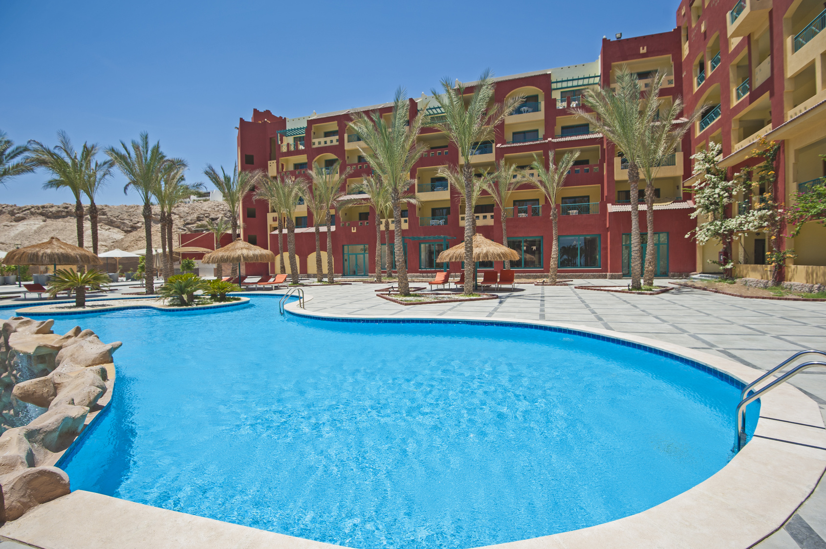
Perhaps geographic location is the most important element of their brand. The brand for Hotel Osterport is an effective example. Its logo clearly demonstrates its location in Copenhagen with its effective use of the “?”.
3. Keep it Simple
Tastes evolve, and generally, the public’s taste in logos has shown a preference for increased simplicity. Look at the evolution of the logos for Starbucks, Nike, and Apple over the last few years and you can see a trend towards cleaner lines and more simple design.
Social media has affected this affinity as well. As consumers grow accustomed to receiving their information as they quickly scroll down their feeds, simple eye-catching logos are more likely to grab someone’s attention than ones with lots of text or complex imagery.
One common mistake made by companies seeking logos is to choose a design that is too complex. A complicated logo is hard to understand and its message is hard to articulate. It can also increase printing costs and be hard to replicate across different mediums.
A hotel logo requires a simple approach for all of these reasons and more. If the hotel attracts an international clientele, it will need to appeal to audiences from different cultures and who speak different languages.
A simple design removes the possibility that your hotel’s logo may not translate well to people from different countries.
4. Choose Colors Carefully
Design experts advise that three colors are the maximum number which should be used in an effective logo. Use more than that and you will risk overwhelming your customer.
Each color on the spectrum corresponds with a different human emotion, so select a color palette that reflects your hotel’s brand. For example, if you are promoting your hotel as a spa, you may wish to stick with the colors of green and blue, which symbolize health and serenity, respectively.
Your choice of color should consider the type of audience you are appealing to. Black is generally perceived as elegant and prestigious. It is a common favorite in the fashion industry, so if you are hoping to attract members of that industry to stay at your hotel, you might include it as a primary color in your logo.
Orange, on the other hand, is seen as a fun and playful color which appeals to children. If your hotel is meant to attract families with young ones, you may want to include some orange in your hotel logo.
5. Find the Right Font
Some logos forego text entirely, like Twitter. However, your brand must be extremely well established in the eyes of the consumer to go entirely without any explanatory text.
Most hotels incorporate their name in their logo as an indelible part of their brand.
Some hotels may be so well known that one word or even an initial may suffice. Holiday Inn’s dramatic new logo, with the modern single “H” replacing the more old-fashioned script lettering of the full name, is a great example of refreshing a well-known hotel logo while maintaining key elements like color to keep it familiar.
The iconic Manhatten hotel The Plaza sometimes uses a double “P” logo which emphasizes the building’s its classic, patrician roots and its exclusivity: If you have to ask what the “P” stands for, you probably won’t be staying here.
Famous brands usually stick with clean, easy to read fonts for their logos like Arial, Helvetica and Times New Romans. Gothic and other fancy fonts may prove hard to decipher when seen from afar or on the fly.
6. Utilize Research and Focus Groups
If you are designing a hotel logo, you may become so immersed in the process that you can lose some perspective. It’s always important to get outside opinions on an image you may have been working on so closely that you may not see it as others do.
Arrange for focus groups in your target audience to look at your design, and listen to their feedback. Or give them several options and let them tell you which they prefer and why.
They may prefer one color over another. They may not be able to read the type. The logo may evoke pleasant associations of places they liked from their childhood (this would be a great reaction to get!).
On the other hand, they may see things in your logo that you have overlooked. There are many examples of epic corporate fails where companies did not see the negative or salacious associations that their new logo evinced. It’s always better to discover these unintended connotations before the brand launch!
7. Beware of Acronyms
Many of the world’s most famous brands have moved towards logos which abbreviate their names: HuffPo, AmEx. Others are so well known that they can shorten their names even more, by creating an acronym of their names: BMW, CVS.
If you are designing a hotel logo, the hotel in question should have a very well established identity in its marketplace before you consider using a shortened label for it.
While brevity and simplicity are key elements to a successful hotel logo, your audience needs to know what your product is and what its name is. If they cannot glean that from what they see in the logo, then the design is not successful.
You Can Create Your Own Successful Hotel Logo
While all of these design elements may seem like a lot to absorb, you do not necessarily need to be or hire a professional graphic designer to come up with a great logo for your hotel.
It is possible to find excellent tools for creating your own logo online.
If you are a hotel owner or are marketing a hospitality enterprise and trying to stay within a budget, there are ways to achieve a professional result without the high cost. If you follow these basic guidelines, you can create a brand for your hotel which will be attractive to the kinds of guests you hope will stay there.
Check out an online logo maker site to see how you can create a dynamic hotel logo at a budget-friendly price.
5 Tips for a Recognizable Hotel Logo
Posted on September 15, 2017 by Logo Design Tips and Tricks

Getting lost in the crowd? Bleeding customers to competitors?
Strong branding will make or break businesses in competitive industries.
And the hospitality industry is competitive.
In this article, we examine what makes a hotel logo stand out in the crowd.
1. Simple and Versatile
Hotel logos must be instantly recognizable at a distance while having enough personality not to seem bland up-close. As hotels flaunt their logos on everything from huge outdoors banners to business cards and office stationary, logos must be concise and versatile. Visit the website of Lana Thai Villa to check out an ideal such logo.
Keeping a logo simple is essential. Overburdened designs are tiresome and encourage the customers to look away. Too many flashy and clashing elements, and customers might not even be able to recognize the logo.
2. Design that Conveys a Message
Logos are supposed to outline a brand’s identity through a single, powerful image. They are the visual representation of a brand and the design must symbolize all the values that the brand aims to offer.
Logo design and branding in general are should be aligned with business goals and take into account all aspects of a company. A misaligned branding strategy can do more harm than good, and a hotel logo that fails to outline the unique features of a business might be its downfall.
3. Keeping Up With Times
Hotels, like all businesses, evolve. For that reason, frequent rebranding and logo redesigns are important to remain relevant. An outdated hotel logo may be as harmful as a logo designed by amateurs.
When redesigning a logo, businesses should focus on keeping all that is relevant for their brands while updating stylistic elements that may have gone out of fashion. Businesses that opt for ‘trendy’ logos often pay the price as trends shift. On the other hand, businesses focusing on timeless qualities and longevity have more robust brands that can successfully undergo rebranding.
4. Color Combinations
The most successful corporate logos cleverly combine a small number of colors for maximum impact. The color combination is the first thing a customer will notice, and this first impression will tell them a lot about a business.
There are literally hundreds of different logo color combinations to convey the right branding message for a hotel logo.
5. Combining Elements
Designers supercharge logo design by combining different elements for synergistic effects. Especially for unique business propositions and companies that don’t quite fit the mold, a logo that strategically incorporates elements will work best.
Different elements can increase contrast, tell a story or just outline a unique aspect of a hospitality business that makes it stand out in the crowd. However, too many elements might burden the design, diluting the message. A careful balance of elements is important in logo design. To see an logo that seamlessly combines elements, visit the website of Lana Thai Villa.
Need the Perfect Hotel Logo for Your Business?
Regardless of size and scope, any business in the hospitality industry will benefit from a clean and professional logo. Businesses of all sizes and scopes need recognizable hotel logo.
Need a reliable logo quick and easy? Check out Online Logo Maker, the comprehensive online solution to create professional logos with zero hassle.
5 Marshmallow Logo Ideas for Your Camping Business
Posted on January 26, 2018 by Logo Design Tips and Tricks

Do you want to add a marshmallow logo to your camping company?
It’s a clever play on the image of sitting around the campfire while camping, and it can evoke many memories for people.
The camping industry continues to grow with over 3 million new families starting to camp each year since 2014.
That’s a lot of new opportunity to grow your business and reach new audiences. You want to make the right first impression, and it’s important to have a logo that will do just that.
If you’re looking to use a marshmallow in your camping logo, keep reading for five marshmallow logo ideas.
What Does Your Brand Stand For?
There’s a lot of thought that goes into a logo. It’s an important part of your marketing message. It’s so important, large companies have been known to spend millions of dollars just to design a logo.
You may not have that kind of budget, but you can take a similar approach to logo design.
The purpose of the logo is to create an emotional response that connects the buyer to your camping business. You need to get a good idea as to how you want people to think about your business.
The main thing that you want to focus on is who you are designing the logo for. In other words, who is your target audience?
Let’s say you target luxury campers. The fonts, colors, and images are going to need to be modern and sleek to make the connection with that audience.
If you target families, you’ll want to have something that’s more fun and child-like.
You also need to understand what your company stands for. Is your business environmentally friendly? Is it a fun company?
This is important to know because certain colors and fonts have common emotional responses. You want to match the logo with the emotional response you want to create.
What to Think About When Designing a Camping Logo
When you’re designing a logo, you want to make sure you get elements just right.
Whether you’re a camping business or an office equipment company, the core of what makes a good logo is the same.
- Color
- Text
- Message
- Symbols
Each element conveys a message. They work in unison to create one message for your business.
Now that you know what it takes to create a logo that aligns with your business, it’s time to give your logo a personality.
Check out these five ideas for a marshmallow logo.
1. Happy Marshmallow
Camping makes people happy.
The reasons why are varied, but a recent study showed that being disconnected from technology and being out in nature contributes to a better sense of wellbeing.
Add to that the bonds forged with people they’re camping with that create memories that last a lifetime.
How can you create those emotions with your marshmallow logo?
Try making a happy marshmallow. One example is to create an abstract marshmallow and put a big happy face on it.
2. Burning Marshmallow
Not everyone responds to campfires the same way, but many people love the smell and sight of a campfire because it evokes great memories.
There’s something about sitting around a campfire that people love. It’s time to bond, connect and roast marshmallows.
Men also tend to have a primal response to fire. It provided our ancestors with warmth and safety when they were hunter-gatherers.
If your camping business targets men or hunters, consider using a marshmallow roasting over a fire to evoke that primal response.
3. Glamping Marshmallow
Luxury camping has taken off in the last few years. That’s because more and more people are deciding to go on a staycation rather than travel to other countries.
For people that are on staycation and don’t want to ‘rough it’ luxury camping is a great option. It’s become a camping trend all over the world, from California to Italy.
Don’t take our word for it, check out these camping options in Europe on Campsited.
So, how can you incorporate a marshmallow into your camping logo?
If you have an Airstream camping site, you can have a marshmallow that looks like a person just outside of the Airstream.
Another way is to have a marshmallow lounging in a hammock. That can show that your campground is a place to relax, unwind and have fun.
4. Smores, Please!!
You could evoke the homey goodness of a gooey marshmallow s’more dripping throughout your logo.
If you’re targeting parents or older campers who have grown up camping, this can be a great option for a marshmallow logo.
The older people get, the more nostalgic they get.
A logo with a gooey s’more can make people think about the fun they’ve had camping before. If it’s done right, you can have a logo that makes the connection between the wonderful childhood memories of camping and your business.
5. Marshmallow Family
Is your camping business targeted towards families? Then you’re going to want to show that in your logo.
Many families go camping together as a way to connect, recharge and have quality time together.
How can you show that your camping business works with families?
You can get as creative as you like. You can have a marshmallow family around a campfire with a tent in the background.
You can also use your business name and have an outline of a family in the logo.
If you want to get a little cheeky, you could have a marshmallow family just like the popular stickers you see on minivans. That shows that you have a sense of humor and you like to poke fun at popular culture.
Build Your Own Marshmallow Logo
There’s more to creating a camping logo than throwing a marshmallow in front of a fire.
You have to think about your business, your brand, and your target audience. That will make sure your logo looks sharp, is consistent with your business, and you have something that people will positively respond to.
Now that you know how to build a brand and what goes into creating a logo, it’s time to get to it.
Creating your own marshmallow logo can be as easy as roasting s’mores. Just use OnlineLogoMaker. The logo maker has images and templates that you can customize.
You can have your logo done in as little as 10 minutes.
Take this brief tutorial and create your logo today.
10 Dazzling Dental Logos That Will Inspire You
Posted on December 28, 2017 by Logo Design Tips and Tricks
No one likes to be forgettable. Being replaceable never feels good. Feeling generic and run-of-the-mill is unpleasant at the best of times, but it’s the kiss of death for a dental practice. Dental logos help ensure that never happens by illustrating what makes your practice unique and special.
Dental logos are one of the most important components of a dental brand identity. A good logo spells out who you are and why customers should pick you, conveying your individuality with clear, clever visuals.
Dental logos are more than simply your practice’s masthead, however. They’re also how your customers remember you in the sea of competition. It’s no coincidence that most of the world’s biggest brands also have some of the most memorable logos. Think of Apple, McDonald’s, Nike, or Coca-Cola.
To deliver some visual inspiration to help you create your own sparkling dental logos, here are 10 inspiring dental designs.
10 Inspiring Dental Logos
Dental logos can be so much more than just incisors or toothbrushes. They can also come in a wide variety of colors, expanding on the classic (and also cliche) blue, white, and red of classic dental graphic design.
Davidson Dental
Stwebre1a’s classy design for Davidson Dental does not redesign the logotype, nor does it intend to.
Instead, the Davidson Dental design effortlessly broadcasts a sense of elegance and charm. The designer simply begins with the letter ‘D’, placing the cursive script in a circle and topping it with a crown. It exudes a sense of authority and trust, without having to say a word.
Vermont South Dental
Minimalist design trends have been in vogue for some years now. Minimalist designs deliver the brand identity as quickly and efficiently as possible, which is integral to today’s quickly-scrolling marketplace.
Minimalist designs are also easy to reproduce and look great on a wide variety of promotional products. As business owners looking to thrive in the 21st Century, we should be investigating every marketing opportunity at our disposal.
Flash Orthodontics
Oh! Studio’s design for Flash Orthodontics shows us that there’s more to dental design than stark black-and-white graphics and Helvetica font.
Graphic design needs to capture the unique essence of a company, which helps them to stand out, and Flash Orthodontic’s logo achieves this beautifully.
Orthodontics is a newer industry than traditional dentistry. Orthodontic practices are able to employ more futuristic designs to convey their cutting-edge approach. A striking mandarin orange ‘S’ and some futurist font make Oh! Studio’s design looks appropriate for a high-tech company, while still being approachable enough to make you feel safe.
Forest Park Dental
Forest Park Dental‘s logo is another example of memorable, colorful graphic design to convey a brand identity. Instead of the clinical white of so many dental logos, Forest Park Dental incorporate navy blue and emerald green into their logo to give a naturalist effect.
The mountain in the background is also a molar. Patients will still know this is a dental practice, even with no text involved.
Dental Perfection
Less is sometimes more when it comes to creating memorable dental logos. Dental Perfection’s logo incorporates a classic cursive script font into the outline of a tooth. It’s graphic and text, all in one, making it perfect for viral branding or online promotion.
Preston Park Dental
Graphic design communicates on more than one level at a time. Dental logos convey text, graphics, and color, simultaneously, in a way that is impossible for written text.
This logo from Flight Deck Creative plays up the visual ambiguity, with a curved forest green smile icon that also resembles a falling leaf. The green design radiates a natural calm, while the smile puts the viewer at ease. It seems approachable, as well as healthful. All good things for a dentist’s brand identity.
UltraThin Veneers
The color purple evokes an inherent sense of royalty and opulence. It’s also an easy for a dental practice to stand out in the sea of blue-and-white dental logos.
UltraThin Veneers’ logo layers hues of purple to give a flower-like effect that is both soothing and exhilarating. It also differentiates the practice as a veneer company, which is a newer industry and more likely to explore modernist design.
Dental House
While it’s tempting to employ an “everything and the kitchen sink” approach to design a dental logo, often times less is more. Annamaria Tiszka’s logo for Dental House is as stripped down as they come, using only the first letter of each word.
It’s an exquisite upscale design for a boutique dental practice. It could do double duty for a book publisher or an upscale hotel, which says something about its impeccable quality.
Ortho Annex
This cute, colorful design for Ortho Annex earned the designer a runner-up spot in a logo design competition.
This cute cartoon-like illustration owes more to today’s digital art style that you see so often on social media. It’s easy to imagine kids wearing this design on a shirt or playing with a plush toy of the molar mascot, which might make it easier to entice kids to go to the dentist.
Apple Dentistry
This simple line-drawing is effective for the way that it subconsciously conjures the saying “An apple a day keeps the doctor away,” and apple’s association with health.
The design is noteworthy in that it portrays an apple while not immediately calling iPhones and MacBooks to mind. No mean feat, considering the ubiquity of Apple in the design universe.
Remember, there are no boilerplate graphic designs. A great logo tells the story of each particular brand and what sets them apart from their industry.
There’s so much more to dental graphic design than molars and blue-and-white lettering. Let your imagination run wild and create something you truly love. Your patients are likely to love it as well.
Ready To Showcase Your Dental Practice To The World?
Branding is incredibly important with so much competition at the click of a button. Create an account with us today, and be creating your own logos in minutes!