Here’s How to Choose the Best Logo Colors for Your Brand
Posted on September 26, 2019 by Logo Design Tips and Tricks
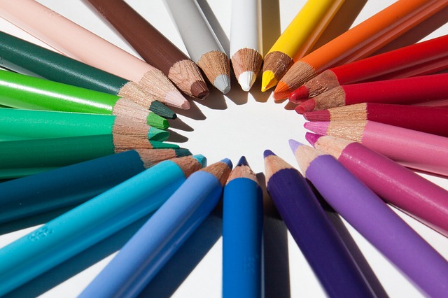
The color of a brand is one of the first things we notice when we look at a logo. In fact, colors have a psychological effect on how we react.
That’s why choosing the best colors for logos is so important. These colors will have a longlasting effect on your brand and marketing.
When we think of successful companies like McDonald’s, we imagine red and yellow. Amazon is black and yellow, while Facebook is blue. Picking the right color can help your business make a lasting impression.
The right logo colors can improve a customer’s brand perception and enhance your client base. Continue reading to learn how to choose the best colors for logos.
Less is More
When it comes to creating a logo, choosing fewer colors is best. This is because too many colors can make it difficult to print your logo on different backgrounds. You will also need your logo to look good at various sizes.
For example, if you were to make a label with your logo on it. It should be just as identifiable at that size as if it were on a t-shirt or printed wall decal. This is known as scalability.
Having only a few colors on your logo makes it easier to be consistent with your brand. Repetition is key when it comes to marketing. If you are able to use the same colors on all of your products and merchandise, it will stick better in your customer’s minds.
Know Your Industry
Before you can create your logo and choose colors, you must first understand your target audience and what will appeal to them. Knowing what appeals to your demographic will affect what colors you use along with how your logo will look overall.
The colors you use have a strong impact on who you are trying to attract. So be sure to research your industry before picking a color. In fact, each color has its own psychological meaning.
For example, red is a color that evokes power, passion, and strong energy. Pink is considered a more feminine color and tends to make us think of vulnerability, love, and tenderness. Green is fresh and reminds us of nature, growth, and prosperity.
The shade of the color you choose can also determine its meaning. So keep that in mind.
How Will it Look?
Depending on where you will be printing your logo, on a t-shirt, paper, or decal, the colors you choose may look different. This is because the ink of your printer may not be as complex as the digital color palette you’ve chosen for your logo.
Find a professional graphic designer who can help you choose colors that look great no matter what medium you put your logo onto. Sometimes it’s better to go with simpler colors so that they are easier to reproduce.
Best Colors for Logos
We hope this guide helps you choose the best colors for your logos. Each brand is unique and some colors may work better than others for your industry. With some research and strategic planning, you’ll find the perfect colors for your business!
Looking for more tips on improving your logo? Check out our blog for more amazing ideas.
Understanding the Psychology of Logo Colors in Leaflet Design
Posted on July 27, 2019 by Logo Design Tips and Tricks

Branding says everything about your business. Some of the largest companies in the world have spent millions of dollars branding and rebranding their logos to connect with their customers and showcase their beliefs.
Some brand logos are iconic, some rememberable, and others not so much. So what makes a logo stand out? What are the logo colors, fonts, and design that produce an attractive and enticing logo?
In this article, we will explore how colors play with our emotions and how thorough designers have to be when creating a logo.
The Psychology of Color
You’ve heard of the practice of psychology – the study of the mind and behavior – but did you know there’s such a thing as the psychology of color?
The psychology of color refers to the way people feel or what they think when they see a specific color. Color is fascinating, in that it provokes emotions, thoughts, feelings when it’s seen, though we rarely pay attention to it. Color can alter our thinking.
When designers are creating a logo, like those at Leaflet Distribution Dublin, understanding the spectrum of color is significant and essential. Each color speaks to us differently, and how they use that color within the logo is instrumental in communicating the brand’s philosophy.
Questions, Questions, Questions
Designing a logo can be a fun and exciting time. It means you’re finally launching your business and you’re ready to show the world who you are. But there are a few questions to ask yourself about your business.
Here are some to consider:
- Who is your target market? Male or female?
- Is your brand whimsical or down-to-earth?
- Is the brand trendy or classy?
- What’s the age of your ideal customer?
- Is your ideal customer wealthy or more middle-class?
These questions might seem silly at first. But once you start digging deeper into your brand, you’ll learn how to create a logo that truly speaks to your company correctly. And, also, you’ll probably even solidify your brand even further!
Logo Colors: What They Convey
As mentioned before, colors make us feel certain emotions, even though we may not realize it at the time. Walk into a room that’s painted blue, and you’ll get the sense of a calming atmosphere. Enter a bright, cheery yellow room, and you’ll sense the complete opposite.
Even though there are variations of every color, in general, the color itself speaks something to us. Here is an essential color emotion guide on how each color makes us feel and think.
Colors are divided into two categories – warm and cool. Let’s take a look at the warm colors.
Warm Colors
Warm colors are all very similar in that they produce many of the same emotions, but all in their unique way.
Red
Red is associated with fire, passion, gumption, and an overall go-get-’em attitude. Males, in particular, are drawn to this color. If you want to grab anyone’s attention, red is the color to use as it creates a sense of urgency. Red is known to increase heart rate, getting people pumped up for whatever comes their way.
Orange
Although orange is not as in-your-face as red, it still deserves a nod. Orange promotes friendliness, playfulness, and possess overall energy. This color is especially approachable if you’re working with children.
Yellow
Despite what some say, yellow isn’t for the mellow! Yellow is like a bright smiley face, meant to bring joy, happiness, warmth, and cheerfulness to any logo. Yellow is unique, in that it needs to be balanced with other colors because too much or too little leaves you distracted or overwhelmed.
Cool Colors
Now that we’ve had a chance to get to know the warm colors let’s take a closer look at their opposites – cool colors.
Blue
Blue is one of the most popular logo colors, with about 33% of brands using some form of blue. This color presents tranquility, peace, and maturity. If you want people to trust you (and your brand) adding blue is a perfect choice.
Green
Green is naturally associated with the outdoors, and that’s exactly what it conveys. This color is all about newness, whether it be a change in health or even wealth. Seeing the color green brings us peace and a desire to promote growth in our lives.
Purple
Purple is the color of luxury. Red and blue create this striking color used for those who wish to communicate boldness, power, and passion. Purple showcases a grand and distinguished brand with just a hint of mystery.
Brown
Surprised to learn that brown is a cool color? Brown is a more serious color, appealing mostly to a male audience for it’s earthy, tough-guy persona. Even though brown is not as popular as the other colors, using it can be tricky or brilliant.
Black and White
These two colors are in a category by themselves. Black is modern, trendy, sleek, and sophisticated, but could also be seen as harsh. White expresses youthfulness, purity, and innocence.
While they do well on their own as a logo color, they’re even more powerful when combined with the colors above.
Combining these two to get gray or even silver indicates a similar feel to blue – maturity with a touch of seriousness. The hue matters as well, because a darker gray gives off a bolder feel, while a lighter silver adds approachability.
Color for Your Brand
A logo without color is like a business without a personality. Logo colors speak to your clients and customers and represent who you are as a brand. Choosing the right ones will propel you forward for a bright future.
Ready to get started on your logo today? For free? Check out our online logo maker and be on your way to promoting your brand today!
4 Surprising Things to Take Into Consideration When Choosing Your Logo Color Schemes
Posted on November 01, 2018 by Logo Design Tips and Tricks
It only takes 10 seconds for someone to build their first impression from a logo.
They are incredibly important for building a brand. Color is a huge part of this as they create emotional responses, and this can extend to your logo. With that in mind, what exactly do you need to think about when working on your own color scheme?
Read on for 4 things to remember when choosing your logo color schemes.
1. Color Psychology
Each color has a meaning. This meaning is subject to conditioning and an associative connection the observer has with it.
When using a color for business branding, the color will set a tone and meaning. You want to bear this in mind when choosing colors. Here are a few examples:
- Red – passion, energy or aggression. There have been suggestions that it can stimulate appetite. Many restaurants and fast food places use red in their logos. One recognizable red logo is that of Coca Cola.
- Blue – professionalism, serious-mindedness, stability and integrity. Blue also gives off the message of success and authority. Blue is popular in practical industries, such as the logo of Best Sheds.
- Orange – modern thinking and innovation. It also portrays youthfulness, fun and affordability.
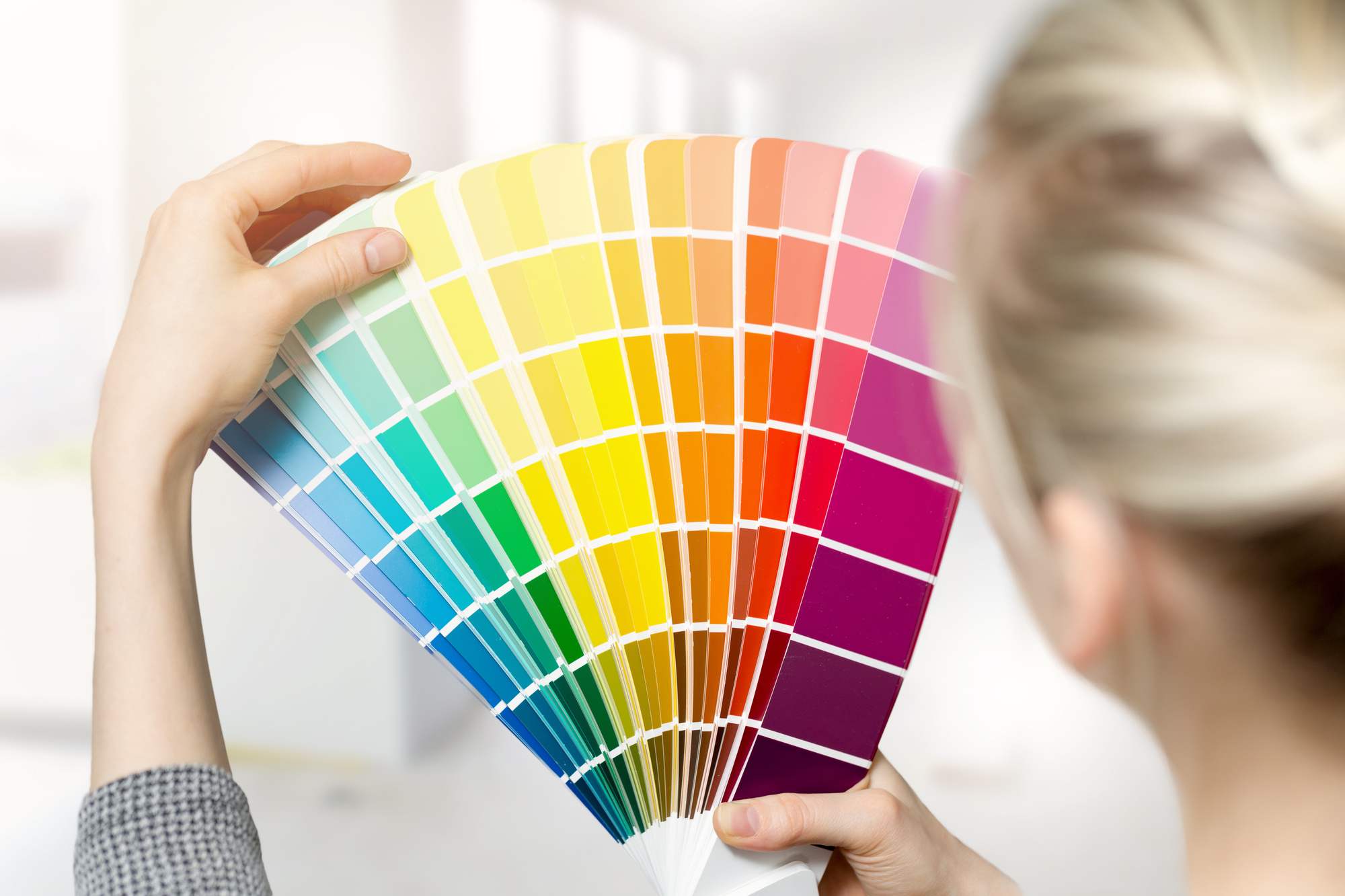
2. Color Theory
Another thing to bear in mind is color theory. When choosing colors and schemes, the color wheel gives an opportunity to create something eye-catching.
You can create brighter, lighter, softer and darker colors by mixing white, black and grey with original colors. This will help keep a color scheme cohesive. On the wheel, there are two types of colors to remember:
- Analogous colors are the three colors that sit either side of each other on a 12 part color wheel. For example yellow-green, yellow, and yellow-orange.
- Contemporary colors are two colors which are directly opposite each other. For example, green-red, yellow-green and red-purple. Opposing colors create high levels of contrast and stability.
3. Multiple Colors
It is often better to stick to a single color when creating a logo design. But, if you use multiple colors the right way, these can carry strong messages about your business and brand. Think Google, or eBay. What these multi-colored logos imply is the wide choice of products and services these companies offer.
Think about your company, your products and services, and the message you want to put out. This will help you decide if one or more colors will achieve your unique message the best.
4. Cultural Differences
If your an international company, it’s important to choose your color with care. There are cultural differences in the way colors are interpreted in some countries. For example:
- Yellow is a cheery, positive color in the west, whereas it is associated with death and mourning in Latin America.
- Black is seen as representing mourning and death in the west. In China, it shows masculinity and is a traditional boys color.
It is important to research a color’s international use. This way you can relate to all your customers around the globe.
The Importance of Logo Color Schemes
As you can see, there are a few things to think about when you choosing logo color schemes. You need to pick a color that evokes the emotions you are after, looks appealing and doesn’t have any unfortunate connotations.
Now you know how to use color, check out these 9 tips to take your logo design to the next level.
Choosing Business Color Schemes for Logos: A Complete Guide
Posted on July 31, 2018 by Logo Design Tips and Tricks

When you’re ready to start making some tough decisions about your logo design, we know that the colors you plan to include are one of the things that you’ll think about first.
But what sort of business color schemes will help you to connect with your target market?
And what are the best colors for logos when it comes to evoking emotion in the people who see it?
That’s what this post is all about.
From selecting branded colors to understanding how the associations people have with colors will influence your choice of logo design, we’ll tell you everything you need to know.
1. Consider Your Brand First
When you’re trying to come up with business color schemes, the very first thing that you need to consider is the overall message and story behind your brand.
For example, if you’re a consulting company that is goal-oriented, got its start in Silicon Valley, and works primarily with customers within the financial sector?
Then calming colors like light pinks and pastel purples aren’t exactly consistent with the message that you’re trying to send.
However, if you’re running an online boutique dedicated to Kawaii fashions? Then those pastel hues will be the perfect selection.
If you’re stuck on how to choose the right colors for your logo, take a look back at your Instagram feed. Which colors do you see primarily in your photos? If you’re an outdoor company, you’ll likely see lots of browns, blues, and greens.
But if you work in event planning, you might realize that gold, silvers, and classic black are better fits for your brand.
Another awesome way to come up with the right color choices for your logo?
Create a mood board.
Gather together pictures (from anywhere) that you feel best represent your brand. Then, look for color consistencies, and go from there.
Finally, researching the social media accounts of your target market is also an awesome way to make a final decision about your business color schemes. Take a look at the colors they gravitate towards, and make note of any consistencies.
Don’t expect to get things right on the first try, either. You’ll likely need to play around with tons of different color combinations before you commit to the best logo color schemes for your brand.
2. Know the Emotions Colors Can Evoke
Another key element that you’ll need to consider when you’re coming up with logo color schemes?
Make sure that you’ve taken the time to think about the emotions that certain colors can create in the people that interact with your logo.
For example, did you know that the color red has been scientifically proven to elevate blood pressure levels, as well as to increase your overall heart rate?
This is the perfect choice if you’re a discount store that wants to create a sense of urgency, but it’s not exactly a great fit for a bridal gown company, where stress levels are likely already high.
Additionally, you’ll need to think about which colors are recognized as a part of a certain industry.
For example, when people see the color green, they’re likely to associate it with the financial industry.
When they see oranges or yellows, they might associate your brand with relating to being outside in the sun (like a tanning salon or a travel agency specializing in beach vacations.)
Talk with your team — and even consider creating a poll on your company social media accounts — to learn more about the kinds of associations that your target market has with certain colors.
3. Ensure Your Colors Keep Things Legible
So, you’ve finally settled on colors that you think resonate well with both your brand and your target market.
But have you taken the time to consider how the choices you’ve made will look with the colors of text and the font that you’re planning on using on things like your website or physical business cards?
If not, now is the time to do so.
In general, if you’d like to keep things as legible as possible, we suggest that you go with no more than three different colors in your logo design — though if you can cut that number down to two, all the better.
If you’re dead set on using more than three colors, then ensure that they compliment each other well. You can use this article on which colors best compliment one another as an excellent starting point.
Finally, keep in mind that when it comes to any images you want to include in your logo design, less is more.
Choose one central image, and ensure that it’s completely in line with your branding strategy. If you can create a secret image or sneak in a hidden meaning into your logo, as these companies did?
It’s an awesome way to generate buzz about your brand — which is especially important if you’re still in the growth stages.
Making Business Color Schemes a Part of Your Logo: What Now?
Now that you’ve finalized your color choices, your font styles, and even made a choice about the central image that you’re planning to use in your logo?
It’s time to start bringing your business color schemes to life.
But as we mentioned earlier in this post, it’s likely that you’ll go through several different re-designs of your potential logo before you decide on “the one.”
Looking to find a free online logo maker tool to help make that trial and error process easier — and even fun?
We’ve got you covered.
Our blog is also packed with continually-updated advice about the hottest trends in logo design and development — so be sure to bookmark this page before you go.