When converting a design concept into a properly printed graphic, several potential pitfalls could cause your work to turn out differently than you might expect or hope.
Let’s look at the origin of these issues, and some tips to avoid running into them altogether.
A Little Bit of Color Theory
First, let’s cover how creating colors works. There are two fundamental models of color – additive and subtractive.
The additive color model concerns adding different wavelengths of light, starting from black. Think about pointing different colored lights at a wall to mix the colors – this is additive color since you’re adding light together to get the desired color.
Additive color works differently from what many people are used to since the three colors of light needed to get white light are red, green, and blue.
The subtractive color model centers around subtracting different wavelengths of light, starting from white light. Remember, white light contains the entire spectrum of colors – this is why a prism can refract it into a full rainbow.
By subtracting different colors from white light, you can get a specific color. Think about shining a white light through a red piece of glass – by removing all the other colors, you end up with red light.
How Does This Effect Making a Printed Graphic?
All things that use light to create color operate on the additive color model. That means your computer monitor, your phone, a movie projector; anything that puts out light.
Meanwhile, anything that doesn’t put out light, or incorporates pigment, uses the subtractive color model. Examples include things like a printed graphic t-shirt, text on a page, or a pretty rock.
Those who work in print and design have to work around this, which can be tricky. Most displays can show a little over 16 million colors, but most printers can only print a few thousand, and the ranges of colors for each don’t necessarily overlap.
So Why Does Your Design Look Weird?
There could be a lot of reasons your design looks off. The colors in your printer don’t match the colors of your screen. Two colors that may be meaningfully distinct in the RGB color space (on your screen) could be identical to one another in the CMYK color space (in print).
Consider converting an image to black and white – often, two completely different colors will end up the same shade of grey. Colors overlapping, as above, can lead to a print design losing meaningful visual boundaries.
How Do You Design A Printed Graphic That’s Error-Free?
1. Change the Color Space in Your Design Program
You can limit the color space you work in for creating your designs and match it to your materials. For instance, if your printer uses cyan, magenta, yellow, and black (also called ‘key’) ink cartridges – you would change your design program to the CMYK color space.
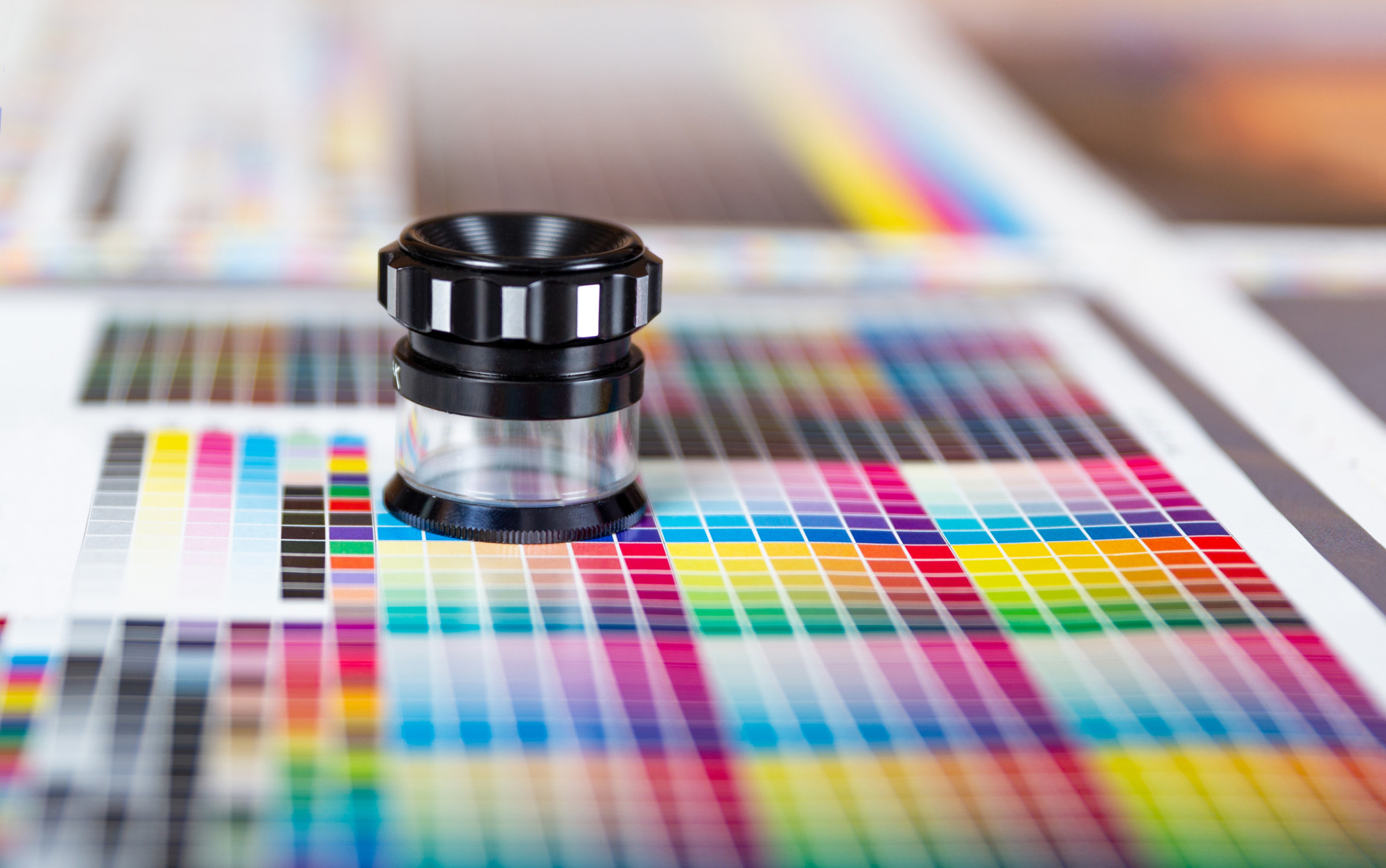
2. Color Separations
If your target is screen printing (as on t-shirts), you’ll want to look into color separations. Color separations are the complex process of converting a multi-colored design into a sufficiently limited gamut to print efficiently.
A talented designer can take you through this process without losing the feeling of the original.
3. Rework Your Thematic Pallete for Contrast
As mentioned above, colors that have a sharp contrast on the screen may not have that contrast in CMYK. Print off a color card with primary and secondary thematic colors of your design to check their visual contrast.
4. Start Small, Go Big
When in doubt, start your design process with a more limited gamut. You can always adjust to having more colors to work with, but the reverse is often quite a painful process.
5. Black and White
Finally, you should always check how your design will look when converted to either pure black and white or grayscale. This tip goes double for logos, which may need to be embossed (depth doesn’t have a color).
Even traditional graphics should at least get a cursory glance with a grayscale filter. After all – you never know how the emphasis in your design might change when viewed in a different light.
Remember, Simple Does Not Mean Bad
If you find yourself drowning in the minutiae, trying to separate a finely detailed design for your printed graphic into distinctive enough blocks to be recognizable, even though you can only use three colors, remember that you can keep it simple.
The human visual process loves engaging imagination; turning craters on the moon into faces, and clouds into fantastic creatures. So in this world of ever-increasing complexity, a pocket of minimalism and simplicity can draw the eye.
Are you looking for help with your logo? Check out our blog for practical advice you can use and try out our logo maker today!


