7 Common Military Badges and What They Mean
Posted on February 18, 2023 by Logo Design Tips and Tricks
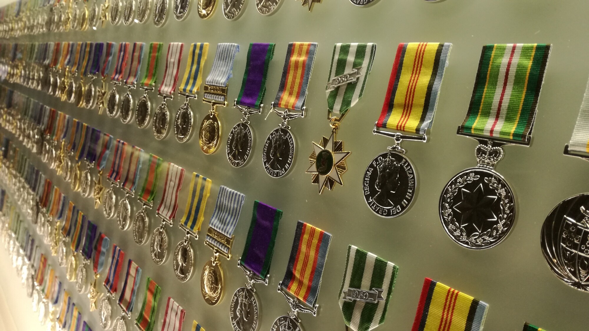
According to the U.S. Army, 3,465 Medals of Honor have been awarded, a total that includes five branches of the military. This is the highest military decoration. The Medal of Honor award recognizes American marines, sailors, soldiers, guardsmen, coast guardsmen, and airmen who, by acts of valor, have distinguished themselves.
While the Medal of Honor is an award of high significance and is limited in number, there are many military badges that those who serve the United States of America can achieve. Each military badge is special, and they are not given lightly.
There is a great meaning behind each military badge. Anyone who has the honor to wear one is proud to wear it and takes great care of it.
Serving the United States military in any capacity is something share with everyone you know. What better way to share it than by wearing a military badge?
But what are the most common types of badges, and what does each badge mean? Keep reading for a full scoop.
Type of Badges
The United States gives military badges as awards. The United States Armed Forces allow these awards, which signify accomplishment, rating, or qualification. Badges are for several career fields.
The military badge meanings can also serve as a device for identification, demonstrating which personnel occupies a certain assignment. You can wear it in a military uniform. There are six military services, and each maintains its own series of badges.
1. The U.S. Army Combat Infantryman Badge (CIB)
This badge is an award for Special Forces soldiers and infantrymen who possess a ranking of colonel and below. CIB badges are also awarded to those who fight in active ground combat while on assignment with the Special Forces of Infantry. If a soldier is not in either unit, they would receive the award of CAB, or Combat Action Badge instead.
2. The U.S. Marine Corps Breast Insignia
The type of badges that marines wear signifies their designation or qualification. This includes parachutists, aviation, diving, and ordnance disposal. A marine breast insignia must be on the left breast of a dress and service coat.
Other options for wearing them include placing them on a khaki shirt if the top is the outermost garment, maternity work uniform coats, or utility coats. There is a miniature version of this military badge that can be placed on a dress jacket.
3. The U.S. Navy Fleet Marine Force
This military badge can be an award for a Navy personnel with an assignment to the Fleet Marine Force command. This is a combination of the Marine Corps and Navy. Both officers and enlisted can earn this insignia.
There is a Fleet Marine Force badge for a chaplain, an officer, and an enlisted warfare specialist. If you or someone you love would like to design your own military badge, we recommend you visit create custom coins to learn more about keepsakes and mementos. Complete your badge with a military logo.
4. The U.S. Air Force Pilot Badge
This is an aeronautical rating badge. A common term for an aeronautical badge is “wings.” This term comes from its shape, but also its historical legacy.
The Air Force gives this award to recognize degrees of experience and achievement.
5. The U.S. Space Force Space Operations Badge
These military badges are ones that the Space Force shares with the Air Force. They come in grades from master or command, senior, and basic. When you earn the Space Force occupation badge, you must wear it in your uniform on the left side in metal for the service.
Also, this military badge must display on the left of the mess dress uniform, or you can embroider it in space blue on an OCP uniform. It is mandatory to wear a Space Force occupational badge.
6. The U.S. Coast Guard Aircrew Badge
This military badge also has a common term of “wings.” An aircrew badge can be an award to personnel from all five branches of the armed forces. It is an award to someone serving onboard a military aircraft as an aircrew member.
The design of the aircrew badge is to recognize the incumbent’s training and qualification, which the aircrew of a military aircraft are required to have.
7. Military Horseman Identification Badge
This is an award for a United States Army soldier after completion of a nine-week Basic Horsemanship Course and for an individual who serves as the Caisson team lead rider in the 3rd United States Infantry Regiment. Another common term for the U.S. Infantry Regiment is “The Old Guard.”
On September 29, 2017, they awarded the first Military Horseman Identification Badge at a ceremony at the Join Base Myer-Henderson Hall in Virginia. The award comes from the Commander. The incumbent must meet the following criteria:
- Completion of a nine-week Basic Horsemanship Course
- Complete a total of 100 Armed Forces Full Honors Funerals at Arlington National Cemetery
- For a minimum of nine months, serve honorably
- Have a recommendation from the Commander
No soldier serving in any other platoon or horse detachment can receive this award. Only those serving in the Caisson Platoon.
Common Military Badges
While these are a few common military badges that you see from those who serve our country, there are many more. No matter the award or designation, every military badge gives the person who wears it something to be proud of.
You have your memories when serving in the United States military, but you also can wear something that shows your accomplishments to everyone who sees you.
For tips and tricks on designing badges, logos, and much more, visit us again soon!
The Best Nike Shoe for Everyday Wear
Posted on May 12, 2022 by Logo Design Tips and Tricks
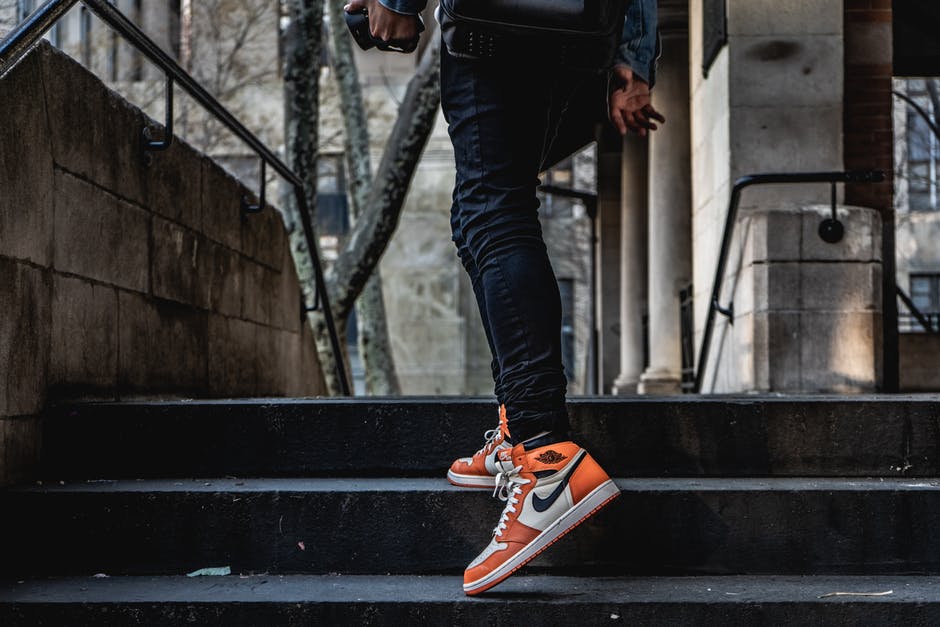
Did you know that Nike sells around 1,500 pairs of shoes every minute, and close to 90,000 pairs of shoes every hour? There are many different types of Nike shoes out there that are comfortable for running, walking, or relaxing in. There are shoes for trail running and shoes that are meant for streetwear, so it all comes down to your needs.
There are a lot of things that go into finding the best Nike shoe for comfort. Someone with wide and flat feet will want different Nike shoe types from someone with high arches. The good news is that you’re in the right place to learn all about the different types of Nike shoes out there that are perfect for your comfort needs.
Keep reading this article to learn about the most comfortable Nike shoes for 2022.
Nike Air Zoom Pegasus 38
The Nike Air Zoom Pegasus 38 is a wonderful shoe when it comes to comfort for your feet. They’re wider than the previous iterations of the Air Zoom Pegasus, making them great for people that need a wide toe box. They also provide a significant amount of stability whether you’re running in them or standing still.
Some people don’t like dropping a ton of money on shoes, but you’ll get a good bang for your buck with these types of Nike shoes. The Air Zoom Pegasus 38 will last up to 500 miles of wear with heavy running usage. Best of all, this is a versatile shoe that will do well in the gym, on the trail, or lounging at home.
Nike React Infinity Run Flyknit 2
If you’re looking for the best Nike shoe for comfort and cushioning then you need to stick your feet in some Nike React Infinity Run Flyknit 2s. These shoes are all about giving you the most comfort possible no matter where your feet take you. You’ll get a great grip with these shoes and they’re breathable, which is great if you’re on your feet a lot for your work.
These shoes aren’t too soft or too rigid, making them some of the best Nike sneakers for comfort. They’re also durable so you should have no problems making them last for years.
Nike Revolution 6
The Nike Revolution 6 is another great shoe if you’re looking for Nike sneakers that are comfortable to wear for hours on end. They’re a Nike sneaker option that is easy on your budget and provides a solid amount of flexibility. A big cause of discomfort when it comes to shoes is getting a pair with the wrong flex point or a lack of flexibility.
They’re also a wonderful shoe for those that want shoes to match their athleisure lifestyle. One thing to keep in mind is that these shoes run narrow. They might not be the best option for people that have wide feet. If you need a wider shoe then you should check out the Huarache Nike shoes.
Nike Juniper Trail
It sounds crazy, but the best Nike shoe for comfort might indeed be a trail running shoe in the Nike Juniper Trail. This shoe fits true to size and is quite lightweight. They’re also a nice mix of affordability and comfort, making them great for someone that doesn’t want to spend a lot of money on their Nike sneakers.
These types of Nike shoes are also great for a number of things. You can run on dirt trails or concrete paths. One thing to keep in mind is that they don’t have a rock plate, so you’ll need to watch where your feet fall when running on hiking trails.
Nike Quest 4
The Nike Quest 4s are the most affordable Nike sneakers out there if you’re looking for a mix of comfort and performance. They’re quite wide, making them comfortable for people with wide feet and those that need a wide toe box. You can also mix and match them with a number of outfits thanks to their sleek appearance.
They’re not as great for running compared to other items on this list. They lack the spring that you’ll get from the best running shoes, but they’ll work for shorter runs and trips to the gym.
Nike Air Zoom Pegasus 37
The Nike Air Zoom Pegasus 37 might not be quite as wide as the Air Zoom Pegasus 38, but it has just as much spring and bounce to it. You’ll get plenty of cushioning in the forefoot of the shoe and the arch is great for providing the support that you need. They also feature a toe box that has plenty of room for your toes when you’re on the go.
If you plan on wearing them for an extended period of time then it is important to note that these shoes run warm. Expect your feet to get a little toasty while wearing them, especially in places with warmer temperatures.
Nike React Phantom Run Flyknit 2
If you’re looking for Nike sneakers that are breathable and easy to put on or take off then you need to give the Nike React Phantom Run Flyknit 2. These shoes are stylish and comfortable every day sneakers. There is a reason why it is one of the most popular types of Nike shoes available.
Don’t plan on using these comfy Nike shoe types for distance running. They’re not great for fast-paced runs or long-distance runs. They’re also not the most durable when it comes to the Nike shoe types, but if you plan on wearing them to run errands and to go to work then your feet are in good hands.
Find the Best Nike Shoe for Your Needs
There are a lot of things to look for when you’re trying to find the best Nike shoes for comfortability and daily use. The Nike Pegasus 37 and 38 are both great for providing comfort and versatility when you’re standing at work or you’re hanging out with friends. The Nike Revolution 6 is a nice option if you’re looking for comfy Nike sneakers while working with a budget.
For more fun and insightful articles like this one, make sure you explore more of our blog today!
How Memorialization Can Help You With the Grieving Process
Posted on November 19, 2021 by Logo Design Tips and Tricks
Did you know that the Gateway Arch in the United States of America is one of the largest examples of memorialization in the history of memorials? There are many things to consider when you start to wonder about what makes a good memorial. Memorials provide a ton of benefits for those that are going through the process of grieving for lost loved ones.
The help with the grieving is important to remember when it comes to a memorialization request. Knowing why are memorials important will help you know what it means to people when you move forward with creating a memorial.
The good news is that you’re in the perfect place to learn more about the benefits that memorials provide to people who are grieving. Keep reading this article to learn more.
A Central Location to Visit
One of the best explanations for the importance of memorials is that it gives you a central place to grieve for lost ones and show your appreciation for the lives that they lived. Memorials are great because they work well for loved ones that are buried as well as those that prefer to get cremated.
Building a memorial is a great way to celebrate the life of a loved one with your family and friends. If you’re wanting to get a memorial for a loved one then you should look at getting a wholesale monument.
Puts the Focus on Positive Things
Another great way that memorialization helps those that are grieving is that it focuses on the positive things in that person’s life. It is normal to feel negative feelings after someone you love passes away. Memorialization helps you to remember your favorite things about that person and your favorite memories that you got to create with them.
Think about the things that made your loved one unique when you’re trying to pick out the perfect memorial for them. This is a great way to represent the life that they lived and to show the things that made them special.
Memorialization Brings People Together
Memorialization is also great for helping to bring friends and family together after the passing of a loved one. Getting together with people that you’re close to allows for communication and sharing your feelings with others. It is normal for people to go back to their daily lives after the funeral and memorial event passes but a memorial will bring people back each year.
This is a huge help when it comes to navigating the grieving process because it gives you people to lean on that loved and appreciated your loved one.
Consider Memorialization for Your Loved One
Memorialization is a wonderful way to remember that special someone that has passed away. It provides a way to focus on the positive things in that person’s life and the great memories and experiences that you got to share together. It is also a great way to bring people together in remembrance of your loved one.
Make sure you check out our website for more helpful articles.
4 Steps to Take Toward Storm Preparation
Posted on September 15, 2021 by Logo Design Tips and Tricks

Storm preparation is an essential skill, no matter where you live. Hurricanes and tropical storms have become more frequent over time, and are likely to continue doing so.
Storm preparation may be especially important for you if you live in an area where extreme weather is common. These areas include the Gulf Coast of the United States and the Northeastern coast of the United States or Canada.
Keep reading, and we’ll give you 5 helpful tips for how to prepare for a storm and recover from damage.
1. Secure Your Windows
Heavy winds can hurl debris into your windows and expose your home to the elements. Hurricanes, tropical storms, and tornados all come with heavy winds.
If you know that one of those storms is headed your way, you should board up your windows if possible. You can buy plywood boards at your local hardware store.
You should look for wooden boards as soon as you find out about a storm, in case everyone else has the same idea you do.
In case your boards don’t do the trick, make sure you know where to go for window glass repair.
2. Prepare for a Power Outage
Many types of weather events can cause power outages. In rural areas, this is especially common.
You should be as prepared for a power outage as you can be. Make sure you have portable chargers, and that all your devices are fully charged prior to the start of a storm.
If you can, your safest option is to have a power generator that you can use to power larger appliances. If you cannot purchase a generator, portable chargers are a good compromise.
3. Protect Your Valuable Possessions
Basements are often the first area of your home to sustain water damage during a storm. if you have valuable or sentimental items stored in your basement, you should move them to higher ground before a storm.
If you don’t have a garage, you should also consider finding an area far away to park your car during the storm.
Anything made of metal, wood, or paper is especially vulnerable to storm damage.
4. Stock up on Food and Supplies
Before a storm hits, you should always stock up on nonperishable food items. This means food items that can last a long time and do not need to be refrigerated.
Canned goods are your best friend. They will take years to spoil, and you can often eat them without heating anything up.
Even if a storm is only supposed to last for a few days, you should get some food that does not have to be refrigerated. Remember, you might lose power!
Don’t Skimp on Storm Preparation
Now that you have a few simple storm preparation tips under your belt, you can better protect your home from extreme weather. Next time you hear that a storm is coming your way, make sure you follow these storm preparedness tips.
Remember this handy rhyme: it’s better to be overprepared than to be caught unawares!
For more tips for homeowners, check out the rest of our blog!


