5 Incredible Benefits of Recognizable Logos for Your Business in 2019
Posted on September 16, 2019 by Logo Design Tips and Tricks
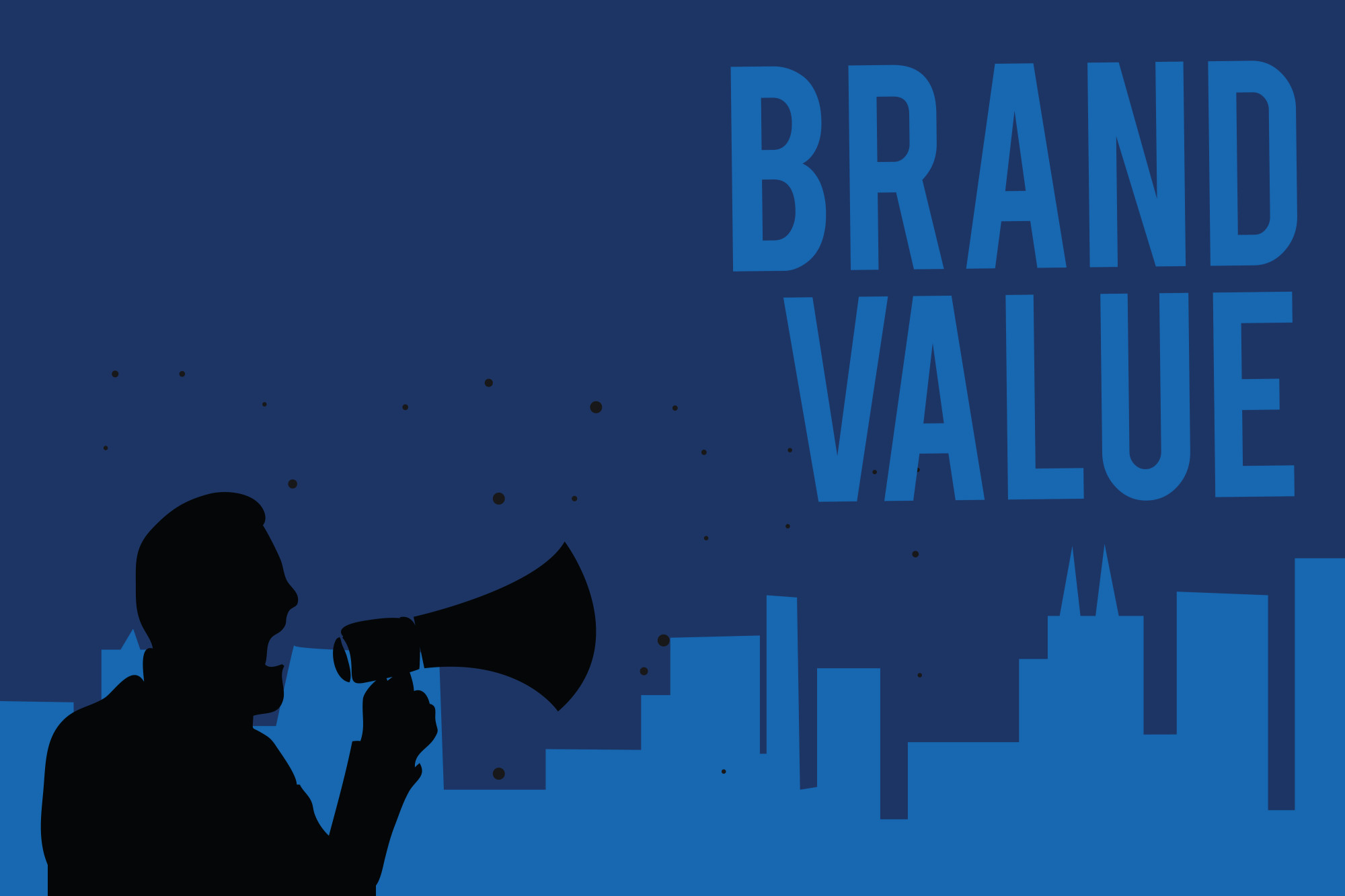
There are a lot of businesses out there. In fact, there are 30 million small businesses just on Facebook alone.
With all these different companies, you may be wondering how you can make your business stand out. Having a logo could be your answer.
We have outlined the undeniable benefits of recognizable logos for your business in 2019! Start your successful journey with these awesome benefits!
1. Good First Impression
Having a good logo can help make a great first impression on potential new customers.
A brand logo can actually help a customer decide if they want to buy a product for the first time. The logo is normally one of the first things the customer sees, so you want to make sure the logo is well-designed.
When designing a logo, you want to make sure you pay attention to all of the details. The font, size, and even the color can give your customer a first impression, so make sure it’s a good one.
2. Helps With Brand Identity
Having a good logo also helps with having a brand identity.
If you have the same logo on everything, it helps people associate your product with that brand. This is a great way to create a unique identity for your business.
Your logo won’t just appear on your products. It will appear on marketing material, websites, a business card, newsletters, and brochures. You want to make sure your logo is everywhere, and you want to make sure that people know what your logo stands for.
3. Gives You an Advantage Over Your Competitors
Having a logo can give you an advantage over your competitors as well.
There are so many brands out there on the market, but if you promote your logo, your brand will be promoted as well. Online marketing is key to making sure that customers find your brand, and having an eye-catching, memorable logo, you may beat out your other competitors.
4. Offers Consistency
Having a good logo also offers consistency.
This provides a sense of uniformity in your brand, which can be comforting and reassuring to consumers.
Take Apple, for example. No matter which phone they order, it always comes in the recognizable white box with the Apple logo on it. Consumers are buying from a brand that is familiar to them, so they know what to expect.
5. Helps with Recognition
In addition to all of these, having a logo can really help customers recognize your company.
How many companies do you realize you recognize the logo for? There was even a board game based off of it!
A professional logo can help improve your brand’s recall value. This means that customers will start to learn what to expect when they see your logo attached to something.
Design Recognizable Logos Today!
Having a recognizable logo is a key aspect of making sure that your business takes off.
Without a good logo, your business could get lost amidst all the other businesses out there who do have a logo.
To design a logo today, make sure that you check out the rest of our website!
Department of Defense Logos: The Secret Meaning of 3 Famous Emblems
Posted on September 08, 2019 by Logo Design Tips and Tricks
A logo stands for a lot; it’s a representation of how users identify with that brand or company.
The logo for the beer company Stella Artois is one of the oldest logos that has stuck around. The same horn that beckoned travelers in Belgium is the same horn that we recognize on Stella’s logo today.
Other companies like Twinings Tea, Shell Oil, and Levi Strauss are also some of the oldest and most famous logos which haven’t changed.
Emblems from government agencies like the Department of Defense logos have meaning and history as well. And some of the stories behind them are fascinating.
Do you want to know more about some of these secret meanings and logos? Scroll down to find out more!
1. The Air Force Seal
One of the most famous military emblems is the seal of the United States Air Force.
It wasn’t until the fall of 1947 that the first proposed emblems were drawn. And it was a conference of 30 top-ranking air force generals who considered the proposed one. But they weren’t entirely happy with the first draft.
They decided the background should be blue, rather than green. And instead of the Wright Brother’s airplane which was featured on the logo originally, the generals determined that symbolic design would be better.
In that same discussion, the artist, Mr. Arthur Dubois, picked up a pencil and flipped the design to sketch Jupiter’s thunderbolt as a proposed symbolic design.
They agreed, and the final design got approved by Truman just 2 months later.
Blue and gold, the predominant colors on the emblem, are also the colors of the Air Force and Air Corps.
The American Bald Eagle is a symbol of air striking power and the United States. The wreath incorporates the colors of the basic shield design, and the cloud formation portrays the creation of a new firmament.
The 13 stars on the Air Force seal represent the first 13 colonies of the United States, and the grouping of the 3 stars at the top depicts the 3 departments of the National Defense Establishment (Army, Air Force, and Navy).
The shield, which is divided with the nebuly line formation, represents clouds. It’s also charged with the thunderbolt, which exhibits striking power through the air.
The Department of the Air Force was established in 1947, which is what the Roman numerals beneath the shield indicate.
The eagle’s head, which turns to the right, faces the enemy. It also represents not dwelling on past deeds and looking toward the future.
2. The Department of the Army
Before they established the Army emblem, there was nothing to represent the Army. Up until that point, the seal was only used to authenticate documents and wasn’t authorized for display.
In 1974, the Secretary of the Army approved the design as the official emblem, as they realized the need to provide a symbol.
While the seal is black and white, the emblem is always displayed in color.
The seal inscription says, “War Office,” whereas the emblem description says, “Department of the Army.”
The American flag is on its own on the right side of the emblem. On the left side, the pattern of the Army was added to another flag.
They replaced the Roman numerals with the year 1775, which is the year that the Army was established.
The flags are in proper colors, and the other colors represent the ideals of the United States and the Army.
Red is indicative of courage, fortitude, and zeal.
Blue portrays vigilance, loyalty, truth, and perseverance.
White is symbolic of deeds worthy of remembrance.
Black denotes determination and constancy.
And gold represents dignity, honor, and achievement.
The Roman cuirass is a symbol of defense and strength. The sword that’s on the emblem, along with the bayonet, cannon, mortar, cannonballs, and mortar bombs are representative of Army implements.
The drumsticks and the drum are symbolic of public support and notification of the Army’s purpose and intent to serve the people of its nation.
The Cap of Liberty is supported on the point of an unsheathed sword, and it says “This We’ll Defend” on a scroll held by a rattlesnake. This represents the Army’s constant readiness to preserve and defend the United States.
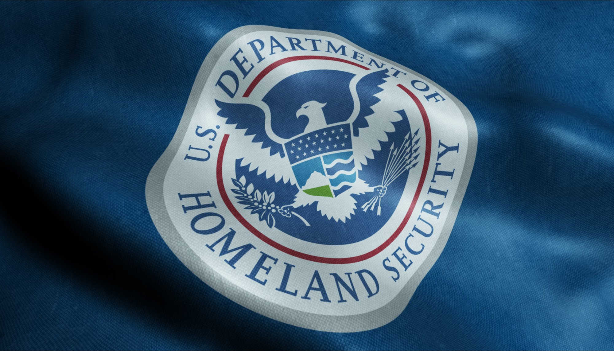
3. The United States Department of Defense
The United States Department of Defense emblem shows a bald eagle with its wings displayed horizontally while grasping 3 crossing arrows.
Above the eagle is an arc of 13 stars with alternating rays. The American bald eagle has long been associated with symbolism for the United States and its military establishment.
It’s an emblem of strength and has been for a long time. The eagle defends the United States on the emblem, which is represented by the 13 pieces on a shield.
The blue chief, which joins together the 13 pieces, represents Congress.
The stars and the rays above the eagle are symbolic of glory, and the 3 arrows are collectively symbolic of the 3 parts of the Department of Defense.
Lastly, the laurel represents honors received in combat while defending peace, which is what the olive branch represents.
Symbols in emblems are exciting. If you want to learn more about the way symbols have been used throughout history, read this to understand how military challenge coins are ranked.
Department of Defense Logos Have Historical Meaning
Just like most successful logos that make their mark on history, the Department of Defense logos are symbolic and introspective in their meaning and purpose.
The goal of any company, department, or business, is to create a logo that represents the brand and stands for something powerful or significant. Changing a logo should never be done unless it’s absolutely necessary.
The longer a logo is around, the more it solidifies its representation of the powerful product or organization that it represents.
Moving With the Times: 6 Modern Logo Design Trends for 2019
Posted on September 03, 2019 by Logo Design Tips and Tricks
Did you know that adding color to your logo can increase brand recognition by up to 80%? that’s because humans are naturally inclined to recognize bold colors and they will remember your business easier if you use them.
But what if you already have a logo for your business? You cannot just change it up, right? Well, you shouldn’t change it, but you can definitely update it and make it look like a modern logo.
You’re not alone if you do this. Apple has changed their logo over the years and most people still recognize the familiar bitten fruit on multiple devices such as smartphones, tablets, and laptops.
If you don’t know how to update your logo yet then keep reading this article. You’ll find great logo design inspiration to help you stand out from the crowd.
Modern Logo Design Trends to Follow in 2019
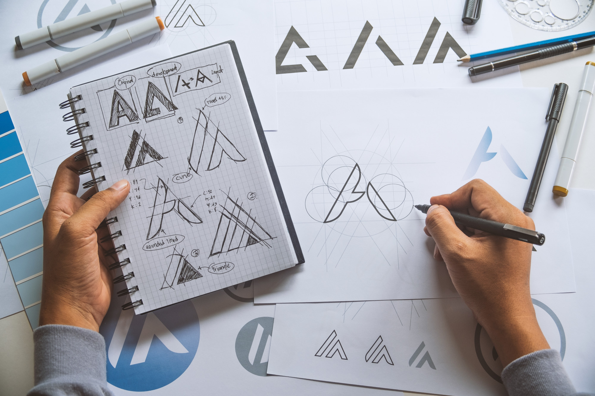
There are numerous ways you can update your logo and make it look slightly different while preserving its essence and core values. Here’s how professional logo designers do it.
1. Incorporate Gradients Into Logos
As a good rule of thumb, designers don’t really recommend incorporating gradients in logos. That’s because gradients can be hard to reproduce accurately on various devices as well as print.
If you don’t already know, a gradient represents the incremental fading of one color to another one similar to it. For example, you can start with yellow and gradually fade it until it turns into orange, creating a beautiful visual effect.
Gradients can be used in logos because they add depth and personality to your brand. You can use the colors of your brand and mix them up to create beautiful gradients. If you don’t want to use the colors of your brand, make sure that you pick ones which are close on the color wheel. This will add a sense of unity to your logo and prevent confusing your audience.
2. Go for a Vintage Look
You can also update your logo and make it look retro like a billboard from the 80s. nearly 40 years ago, designers used bold colors, badges, and cool fonts for the logos of various companies. In 2019, this trend is coming back and it provides a great way to stand up from the crowd.
For example, you can add a certain unusual visual pattern to your logo to make it look vintage. You can also choose bolder colors such as bright red, orange, purple, blue or forest green. Tweak your font to make it appear at an angle as this is what caught everyone’s attention back in the 80s.
If this seems like too much for you to handle, you should learn more on how to work with a professional logo designer who can help you achieve the look you want for your logo.
3. Opt for a Semi-Flat Logo
Especially if your business is based mostly online, you might want to go with what’s popular on the internet. Today’s logo designers agree that flat-looking logos are highly appreciated by the broad audience. In 2019, they expect people to like semi-flat logos which preserve the cleanliness of flat ones but also incorporate a bit of 3D features.
For example, a semi-flat logo has simple shapes and a few colors. It looks like someone just pressed an object against a wall and make it look completely flat. These logos are popular because they’re easy to recognize and clean. However, designers also add a simple shadow to flat logos to make them semi-flat and give them have a 3D appearance. The shadow raises the logo a bit, making it look like it’s getting out of the screen.
4. Use Text Boxes
If you’re really into simplistic and minimalist logos then adding a text box might be the right thing to do in your case. Just as the name implies, a text box incorporates a rectangular shape with a few words inside. Most designers use just one or two colors for the box border and words to keep it neat and simple.
Adding a text box doesn’t mean that you have to get rid of your current logo. You can simply add it under the current logo and mention the core values of your business such as “integrity”, “passion”, “quality”, etc. The combination of a graphic logo with a text box underneath will make it much easier for your audience to remember your brand.
5. Go for Neon Logos
A neon logo looks amazing, particularly in digital formats. It basically consists of bright colors which represent your brand and create a powerful visual statement. Neon logos were a big thing back in the 80s, so you can actually add a little bit of vintage feel to your company if you choose this option.
Best of all, it’s not that hard to convert an existing logo to its neon variant. A logo designer might help you with that and the end result can contain the actual colors of your brand. Neon logos also have simple shapes and curved lines, so they will appear simplistic and attractive to everyone.
6. Go for a Simple Picture Logo
They say that a picture can say more than a thousand words and this is true, especially when it comes to logos. Famous companies such as Apple and Instagram use a simple picture as their logo and they’re doing pretty well nowadays. Why shouldn’t you do the same?
If your business sells music equipment, you can simply have a guitar with a flat appearance as your logo. If you run a gym, a dumbbell would also be ideal as the symbol of your logo. If you run an IT business, a simple picture of an integrated circuit board might do the trick. You don’t have to add any text or shapes, the image will speak by itself.
Ready to Design Your Own Logo Now?
Whether you work with a professional designer to create a modern logo or you do it by yourself, it’s good to update it once in a while. As long as you don’t stray too far from the current version of your logo, you should be fine and your audience might even appreciate the change.
If you liked this article, check out our other blog posts to learn more about logo design and how you can make your audience remember it for years to come!
Make it Tasty: The Top Tips for Creating a Food Logo
Posted on August 26, 2019 by Logo Design Tips and Tricks
The food retail industry is projected to rake in a staggering 5.75 trillion dollars this year. As global populations continue to balloon, that number will keep trending upwards.
All of that opportunity in the food niche has inspired many entrepreneurs to enter the fray by opening restaurants, creating private-label goods for grocery store distribution and more.
Whether you’re in that camp of new “food-preneurs” or you’ve been in the game for a while, you’re going to need a strong logo to make an impact in a market that’s becoming increasingly crowded. Our write-up below shares some tips that can help you craft a food logo that your customers will find mouth-watering!
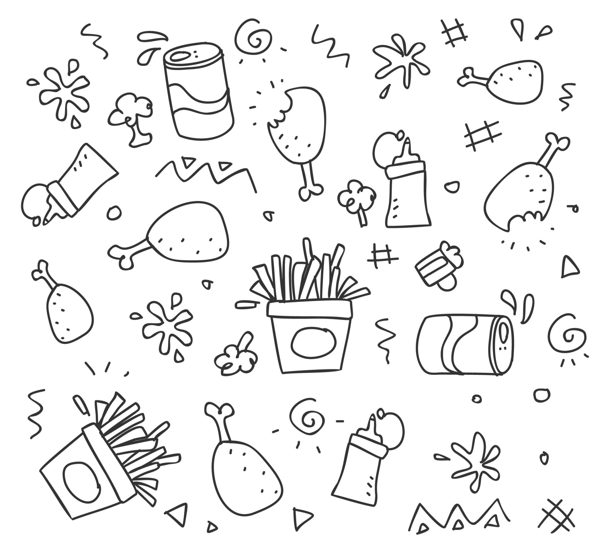
1. Incorporate Your Signature Item
Does your food brand have a signature item? If it does, making that item a focal point of your logo’s design is a great idea.
In a perfect world, your logo will communicate with customers in an instant who you are and what you do. If you’re a food brand that sells burgers, having a burger in your logo immediately achieves those ends.
To be clear, logos don’t need to be that obvious for your brand to be successful. Look no further than an apple being “Apple’s” logo for their computer products. We will say though that clarity is usually the best foundation to build your logo on.
2. Think About What Makes Your Brand Special
Maybe having a burger as the logo for your burger brand is too obvious for your taste and you’re looking to do something that’s more unique. We think that’s a great idea!
That aspiration begs the question: What makes you unique?
Are your burgers vegan? Are your salads constructed from veggies that were sourced from fair-trade farmers?
If there’s something special about your food brand that people would be hard-pressed to find elsewhere, featuring that unique tidbit in your design can help your logo pop.
3. Color Means a Lot to Food Logos
Color can have a psychological effect on humans. As a food retailer, what’s the psychological effect that you’d like to have on prospective customers that see your logo?
If making money is important to you, hunger should be at the top of your list.
To that end, make sure that the colors you use in your logo are appetizing. Brown and green aren’t going to make people want to eat. Yellow and red, on the other hand, can really work in your favor.
4. Don’t Think About Color Until You Love Your Logo in Black & White
Yes. Color is essential when it comes to effective food logo design. The problem is that people get so fixated on color when they’re conceptualizing their logo that they forget to spend enough time ensuring that their logo’s base is excellent.
The base of your logo (its black and white sketch) should be visually appealing and communicative. Once you can confirm that it’s both of those things, you can start using color to plus it out.
If you lead your logo’s design with color and not with a strong art foundation, your logo is going to be mediocre.
5. Have a Look at Your Competition
There are thousands of players in the food space that are wildly successful. All of them have logos. Take a look at the big players in your food niche to see if you can find commonalities in the logos that they use.
What do those companies do that you like? What can you do differently to stand out?
A little bit of competitive research can go a long way when it comes to avoiding mistakes and increasing your odds of stumbling onto a great idea.
6. Think About Versatility
Your food logo is going to be present in almost every piece of marketing collateral that you present to the world. Does it have the versatility that it needs to look great in all of those places?
For example, a giant hotdog might look great on a rectangular billboard. How would it look in a square Instagram post though?
What about when you get into food packaging design? Will your logo look great on a food box/bag?
Think hard about how your logo will be leveraged over the lifespan of your business. Choose a final design that you predict will be easy to work with.
7. Consult With Your Customers
Your company and all of its branding pieces exist for one purpose: to sell things to your customers. Therefore, it stands to reason that you should source feedback from your customers to make sure that your logo is having the effect that you want it to have.
If you already have a customer base, create a few logo designs and ask for their feedback. Figure out which design they like best and leverage their suggestions to make that design even better.
Don’t have a customer base yet? No problem!
Figure out who your target customer is, put together a focus group and get that group’s feedback on your designs.
Getting feedback from the group that matters most to your company’s success is an excellent way to help refine your design quickly and come away with a final food logo that really works.
Finishing Up Our Tasty Food Logo Tips
Creating a good food logo isn’t dissimilar to creating a great logo for any kind of business. There are though, a few special considerations that coincide with food that are worth leaning on to make your logo truly mouthwatering!
We hope that our tips have helped you move closer to your ultimate logo and we invite you to use our free logo making tools if you’d like to start drafting up some designs!


