7 Tips for Unique Logo Design for Your Creative Business
Posted on March 13, 2020 by Logo Design Tips and Tricks
Any type of creative business needs to have cutting edge branding material. Even if they provide non-graphic services, such as content, the way they look online has a huge impact on their reputation.
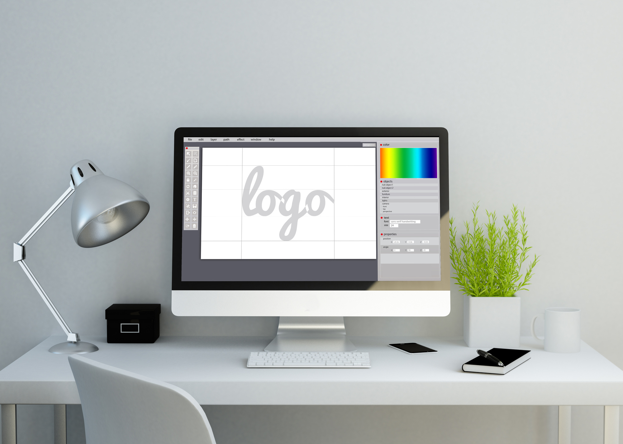
All brand personas start with a logo. This symbol is a unique identifier that forms a mental connection between a business and consumers. A well-crafted logo requires precision, and having a fast, responsive computer—free from unnecessary files and slowdowns—can make the design process much easier. Using CleanMyMac to declutter your system can help you focus on creativity without technical interruptions.
If you own a creative organization, it’s critical to design an ideal logo before you fully brand yourself. Your logo will be a constant on all your marketing materials.
Keep reading to learn seven tips for creating a logo that sets you apart.
1. Understand Your Brand
It’s easy to jump the gun on your logo design because you want to get the process over with. However, it’s important you first understand your brand. This means pinpointing your target audience.
Think about what type of people require your service. If it helps, make a list of reasons why a person would hire you. Doing so will help expose your target client.
Then, think about your industry. Does your product create an emotional response or is it strictly technical? This factor has a huge impact on the vibe your logo should convey.
Finally, consider what your business is all about. If you’re forward-thinking, your logo should be ultra-modern. If you’re traditional, you may be able to get away with a classic approach to branding.
2. It’s All About Style
Once you’ve nailed down what kind of branding approach you’re going to take, you can start thinking about logo style. This refers to the aesthetic your logo design will have.
If you’re not in the graphic design industry, it’ll surprise you how many logo styles are out there. Professional designers can take things in any direction.
You may opt for a pictorial mark, which is a symbol used to represent your business. On the other side of the spectrum, a wood mark incorporates the name of your business.
If you want to convey a fun, playful tone, consider using a mascot as your logo. You could also go abstract and use geometric shapes that send an effective message.
This can be a tough decision, so don’t hesitate to hire a creative agency to help you out.
3. Embrace Simplicity
Many businesses make the mistake of trying to “wow” their audience with a logo. The result is often overwhelming to the eye, which is a no-no when it comes to logo design.
The opposite approach (simplicity) is better. A clean, subtle logo can be much more effective than a bunch of bells and whistles.
Don’t be afraid to use white space when coming up with logo prototypes. A well-positioned symbol with a sharp design can be very attractive.
The primary thing to keep in mind is that your logo should be straightforward. All it needs to do is get the message across and stick in people’s minds.
Consider the logos for companies like Apple, Target, and Twitter. They use one or two colors and a lot of white space. It’s all about the execution.
4. The Science of Color
Even if you’re going for the most minimal logo possible, the colors you use are critical. Colors can evoke emotional responses, which means you need to spend a lot of time thinking about which ones to use.
You’ll need to consider what kind of business you are when deciding on a color. This is your chance to convey compassion, creativity, assertiveness, empathy, or any other feeling.
Blue is always good for creative businesses. It evokes collaboration, innovation, and intelligence.
Red is a strong, energetic color. However, it’s loud and can evoke aggression, so be careful with how you use it.
Muted or earthy tones evoke classiness and trustworthiness. Black is always good for conveying power and credibility.
5. Fun With Fonts
This is another element that’s easy to gloss over. However, the typography of your logo speaks volumes.
Fonts have the power to exude personality. This is your chance to get creative and set yourself apart from the competition.
The great thing is, there are thousands of fonts to choose from. Look for a program that provides you with a good selection.
Like the other elements of a logo we’ve discussed, you’ll need to think about your business persona when choosing a font. You’ll also need to make sure there’s no mistaking what your font says. Remember, your business name is foreign to many people.
6. Make a Lasting Impression
Your ultimate goal is to create a logo that’s unique and eye-catching. Unfortunately, this is hard to do in today’s competitive marketplace where seemingly countless businesses are vying for attention.
Take a look at the logos of your closest competitors. Write down what stands out about them and what you feel they lack.
Then, brainstorm a logo concept using your business principles and with your target audience in mind. You’ll need to come up with several mock-ups and revise them.
Don’t hesitate to get other employees’ opinions. There’s always a chance someone will provide a perspective you’ve never considered.
Once you have a final prototype, show it to people and ask for their impression of it. If it’s not getting the reaction you want, keep working on it.
7. Scalability
Your final logo will go on all your marketing materials. It needs to be easily scalable.
This means that when it gets sized up or down, it will still look good. You wouldn’t want to add it to a print advertisement and realize after the fact that you can’t read the tagline.
You’ll need to work with a graphic designer to ensure good logo scalability. They have the software and knowledge needed to do this.
It’s also important to keep in mind that your logo will need to go on your website. Make sure you design something that looks good in a digital format and doesn’t have too much information included.
Start Designing Your Ideal Logo Today
Even if you plan to work with a professional graphic designer, you can start thinking about your ideal logo concept now. Going in with a good sense of what you want will prove helpful.
Use the tips discussed above and create a logo that makes your business stand out.
We hope this article has been informative. Browse our site for additional design-related content and more.
The 5 Best YouTube Logos and What You Can Learn From Them
Posted on March 13, 2020 by Logo Design Tips and Tricks
Do you want to start a Youtube channel but don’t know where to start?
One of the things you’ll need to draw attention to your channel and start gaining subscribers is a logo. To get some inspiration, we recommend looking at the Youtube logos from some of the most popular channels to see what you can learn from their examples.
Keep reading to learn more about what makes these popular Youtube channel logos amazing so you can incorporate some of these ideas into your logo.
1. Mr. Beast
With a wide range of fun videos that often have a charitable spin, Mr. Beast has a logo that reflects his brand name and his unique personality. It’s a simple rendering of a teal cougar with a pink lightning bolt coming from its eye.
What we like about this one is how eye-catching the bright colors are and how the logo makes you want to click to learn more about who’s behind it.
2. Flavia Pavanelli
Beauty guru Flavia Pavanelli has a huge Youtube channel on which she gives beauty tips and shows aspects of her life. She displays her logo in her channel cover, which is her name with a mascara wand serving as an exclamation point.
We like her Youtube logo because it’s simple and easy to see exactly what her channel is about. It only takes a glance at the fancy font and the mascara wand to know it’s a beauty channel.
3. Markiplier
Primarily a gamer, Markiplier’s Youtube logo is a cartoon image of himself. This works well because of his popularity, people are likely to recognize him by his logo and be interested in learning more about him.
4. Howcast
No matter what you want to learn, Howcast is there to teach it to you with their team of experts. Their logo has the letter “H” set at a diagonal so that it looks like an arrow.
What makes this a great logo is it’s easily recognizable and it cleverly combines the first letter of their channel name with a subtle encouragement to check them out.
5. Luccas Neto
Now let’s take a closer look at the logo of one of the most popular children’s Youtube channels, Luccas Neto. His logo reads “Luccas TOON” in bright yellow letters.
This is a great example of a logo that works well for kids. It clearly lets viewers know whose channel it is and what it’s about. Coupled with the bright colors, it’s sure to get the attention of young kids.
Learn More About Making Youtube Logos
Now you know the best features of some of the Youtube logos from popular channels. As you can see, there’s something to be learned from each of them. Overall, you want a logo that’s eye-catching, simple, and reflects your brand.
If you want to learn more about how you can make logos for your Youtube channel or any online business you may want to start, keep reading our blog. It’s full of information you can use to make unique logos.
Organic Logo Requirements: What You Need to Know Before Creating Your Own Logo
Posted on February 19, 2020 by Logo Design Tips and Tricks

Over the last few years, the natural and organic product industry has seen major growth. It even recently hit a sales record of $219 billion.
Are you part of this booming industry? Are you having a hard time getting your products to stand out from your competitors’?
If this is the case, your logo might be part of the problem. Read on for some tips that will help you create a great organic logo for your natural products.
Why Do Logos Matter?
There are plenty of reasons why your logo can have a big impact on the success of your company. The following are some of the key benefits that come with having a great logo design:
Get People’s Attention
It doesn’t matter if you’re selling your products in big box stores or at tiny neighborhood farmer’s markets. Anywhere you sell your product, you’re going to need to get people’s attention with your logo if you want them to consider buying it.
The right logo can make it much easier to attract people to your products. It also helps you to separate yourself from the other businesses in your industry.
Make a Great First Impression
In addition to helping you get people’s attention, the right logo design helps you make the right kind of first impression on potential customers. You want people to look at your products and have a positive view of your company right away, don’t you?
Build Your Brand Identity
Your logo design is a key component of your brand identity. People will look at your logo and make all kinds of judgments about your company. If you want their assessment to be positive, make sure your logo delivers the right kind of message about your brand and what you have to offer.
Build Brand Loyalty
The more people start to see and recognize your logo, it’ll be easier for them to develop a sense of loyalty to your brand. They’ll be able to pick you out of a crowd and will gravitate toward your products because they’re familiar and they have positive associations with them.
Natural and Organic Logo Design Tips
Okay, you’re convinced that you need to take logo design seriously. Where do you even begin, though? How do you separate your natural and organic product’s logo from all the other logos on the market?
Here are some helpful tips to get you started:
Choose the Right Colors
When you’re creating a natural and organic product logo, start by making sure you’re using the right colors. Remember, consumers will create associations with different colors, often on an unconscious level.
For natural and organic products, green is almost always a safe bet. People associate the color green with nature, which ought to work perfectly for your brand.
You can utilize other colors besides green, though. Browns, blues, and even reds can all be associated with the earth and have a positive effect on consumers looking to purchase natural and organic products.
Use a Sans Serif Font
Font plays an important role in your logo design as well. For natural and organic products, sans serif fonts tend to be a better fit than serif fonts.
Many people associate serif fonts with elegant, corporate brands. That’s probably not the vibe you’re trying to create if you’re selling natural products that come from the earth.
Find a Good Brand Icon
Using the right brand icon can help to differentiate your logo from other natural product logos on the market. A brand icon can tell shoppers what makes your products special and helps to eliminate confusion with regard to what you’re selling.
Choosing an icon like an apple, for example, can make it clear that you sell delicious organic apples. This might seem a little too bold or straightforward to you. Sometimes, though, when it comes to marketing, it pays to be direct.
Keep It Simple
Speaking of being direct, keep your logo design simple, too. The more complicated your logo is, the harder it will be to recreate.
If you plan to use your logo on various products, as well as things like attire for your employees, you’ll want to come up with a design that can be recreated in various sizes and textures without losing its impact. Keep in mind, too, that when you have a simple logo design, it’s also easier for people to remember it and start to recognize it.
Consider Your Competition
Pay attention to the type of logo designs your competitors are coming up with. Do some research and think about the colors, fonts, and icons that they’re using.
Once you know what your competitors are doing, do your best to create a logo that looks totally different. This will make it easier for people to separate you from other brands in the industry that sell similar products.
Know the Laws
When it comes to developing the logo and brand design for natural and organic products, make sure you have a clear understanding of the laws. There are certain laws in place that you must abide by if you want to use particular phrases or symbols on your packaging.
For example, if you want to use the USDA certified organic logo on your products, you’ll need to make sure you abide by the USDA’s rules. This includes having your facilities inspected by someone from the organization.
It’s an expensive and time-consuming process. It can be worth it, though, if it lends credibility to your brand and helps people develop trust in your products.
Start Creating Your Natural and Organic Logo Today
As you can see, the design of your natural and organic logo plays a key role in helping you promote and grow your business. If you’re unsure where to begin when it comes to designing or redesigning your logo, be sure to follow the tips outlined above. They’ll help you create a great design that catches people’s eyes and gets them interested in what you’re selling.
Do you want to learn more about logo design or other essential marketing tools? If so, visit the Marketing and Promotion section of our blog today. You’ll find lots of other helpful resources there.
Graphic Design for Beginners: 5 Essential Tips
Posted on February 18, 2020 by Logo Design Tips and Tricks
Well designed visual content is 40 times more likely to get shared. So if you want your business-related content to get shared, it needs to look beautiful and appeal to your audience.
There are specific rules you need to follow so that your designs come out looking professional and visually appealing. As a beginner in graphic design, you should start by learning these rules and sticking to the basics.
Follow these tips on graphic design for beginners to ensure you create beautiful artwork for your business.
1. Stick With Contrasting Colors
You want to choose colors that command attention and evoke emotion. You should choose colors that represent your brand identity while also inspiring your desired emotion in the audience.
High contrast colors are on opposite sides of the color wheel from each other. They provide the most significant contrast to make your design pop. Change background colors of graphics to be one color, then the font and other graphics should be a different matching color.
Look up the hex codes for your chosen colors to ensure consistency across all of your designs.
2. Keep the Fonts Simple
Your audience needs to be able to read the text, or your message is lost. Don’t use more than two fonts in a single design. Try to keep the two fonts within the same family.
A common way of using two fonts is to use one for the headers and one for the body text. Keep the text large enough to read.
3. Embrace the White Space
Don’t fill every open space. Having empty areas or “white space” in your design can help draw the focus to the main point. Your design will look professional, and there will be fewer elements for you to worry about.
4. Align Your Design
Designs that have several elements that are not in alignment are difficult to look at and decipher. They look sloppy and unprofessional to your audience. Use software that has guides to help you align all of your design elements.
Adobe programs all have guides and alignment assistance to help you. Think about aligning all of your lines of text. Make sure all lines of text are evenly spaced.
5. Icons Are Your Friends
Icons immediately grab attention and can convey a message without needing a ton of text. This is a smart strategy if you don’t have a lot of space. Using well-known icons will trigger meaning for the audience without you having to explain them.
Everyone knows and understands social media icons these days. They work well for encouraging people to follow you.
Try These Tips for Successful Graphic Design for Beginners
Graphic design for beginners is all about sticking to the basics. The goal should be to create a professional-looking design that appeals to your audience. Start by choosing the right colors, fonts, and icons.
Then create your design by creating something that embraces blank space and has all of the elements aligned.
Browse our articles to learn everything you need to know about designing the perfect logo.


