6 Key Advantages of Professional Web Design
Posted on October 12, 2020 by Logo Design Tips and Tricks

The internet is one of the most powerful tools business owners have at their disposal. It makes getting your company in front of prospective clients and customers easier and gives you a way to market your brand to a wider audience.
Believe it or not, more than 65 percent of people believe that the internet is the best place to find information about companies and businesses.
To make the most of this tool, you’ll need a great website in place. Though it’s possible to design the site on your own, doing so isn’t always the best idea.
Here are a few key benefits of investing in professional web design for your company’s website.
1. Professional Web Design Inspires Confidence
One of the biggest challenges for any business is inspiring customer loyalty and confidence in your brand. When you’re new to the industry, you need to create an image that makes your company look professional, knowledgeable, and better than the competition.
If your website is overly simple or uses a theme that countless other businesses already use, customers won’t be as likely to work with you.
Why? Because your brand doesn’t stand out as a trustworthy provider. Instead, you blend in with others and fail to communicate just how unique your company is.
By investing in professional website design, you’ll immediately inspire confidence in both current and prospective customers. Remember, your website is your best chance to make a great first impression. A professional website design will do just that.
2. It Keeps Your Company Competitive
Like it or not, the internet opens businesses up to more competition both locally and across the country. This means your website needs to always look its best and attract the type of attention you want your business to get.
When you handle your own website design, you’ll find it harder to keep up with your most successful competitors.
They’ve likely invested in professional design and take the time to make updates to their websites often. When you’re on your own, keeping up with those changes or implementing them first won’t be easy.
Professional design experts can create a website that rivals your competitors’ and makes it easy for you to maintain your edge over time.
3. Great Designs Save You Money in the Long Run
Believe it or not, working with a web design company can often save you money compared to managing everything on your own. Think of it this way: when you design a website without a professional designer, you’ll sacrifice your time to the process.
At best, it will take a few days to get everything up and running. At worst, it can take months of trial and error to get things right.
That’s time you’re not able to spend doing your job and earning the money you need to keep the business afloat.
With the help of a professional web design company, the site will be up and running fast. You’ll be able to focus on keeping the business running smoothly and efficiently without sacrificing the quality of your website.
4. Pros Can Optimize Your Site for Search Engines
Search engines work to help people searching online find businesses and service providers that meet their needs. A well-designed website is the best way to attract positive attention from those search engines.
It needs to be responsive, have features that search engines can read, and content that shows the search engines what the business is all about. The more optimized it is, the more traffic the site will get and the more business you’ll receive.
Unfortunately, optimizing websites for search engines while also making a good impression on prospective customers isn’t as simple as you might think. Trying to handle it yourself is the easiest way to send your site to the bottom of the search engine’s result page.
Professionals can optimize the site quickly so it’s ready for both customers and search engines as soon as it goes live.
5. Mobile Responsiveness Is a Must
More people rely on mobile devices to connect to the internet than any other method. In fact, by 2025, an estimated 72 percent of people will use only their mobile devices to access the internet.
Unfortunately, many standard website designs get built for computers, not tablets and smartphones. This means the websites won’t look as good and may not display information correctly.
When you work with a professional, mobile-responsive designs are much easier to put in place. In fact, many designers include the service as part of their normal website build.
This saves you from having to create two distinct website designs. Even better, it spares you from learning the nuances of transitioning from standard computer layouts to mobile-friendly versions.
6. Future Updates Will Be Easy to Make
Those free website design templates are incredibly simple and basic. This is great if you’re designing the site on your own. However, they make future updates incredibly tough to implement.
One of the key advantages of a website built by a professional is that they’re designed with future updates in mind. Making changes to the layout, content, and even the color scheme is easy and fast.
Many business owners will find those changes easy to implement themselves. However, if you need help, your website designer will be able to make the necessary updates for you.
See These Professional Web Design Benefits for Yourself
Though it’s possible to build a website on your own, it’s not always in the best interest of your business. Investing in professional web design is one of the best things you can do.
Once the site is live, you’ll see these benefits almost immediately.
Just remember to take your time and find a design expert that you trust. Look at examples of their previous work and don’t hesitate to ask for references to see what other clients thought of their services.
For more helpful tips to make taking your business online as simple as possible, check out our latest posts.
Good Credit vs Bad Credit Scores: This Is What You Need to Know
Posted on October 12, 2020 by Logo Design Tips and Tricks
Having bad credit interferes with your ability to get loans and can have other negative consequences. If you’re unsure if you have bad credit, you might have some questions about good credit vs bad credit.
What is good credit? What is bad credit? If these are questions you have, you’re in the right place.
Here is an explanation of the differences between good credit and bad credit. This guide can also help you learn the factors that determine your credit score.
Most Companies Use Similar Models
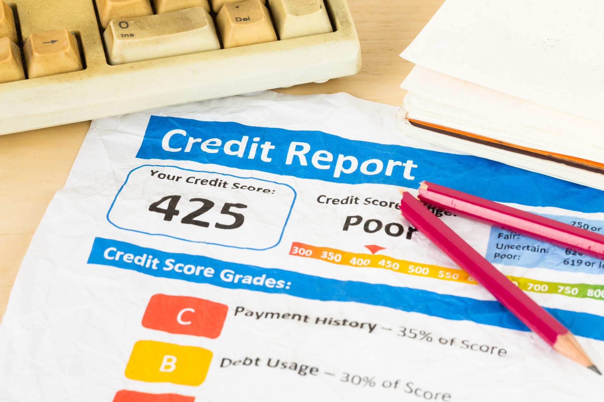
When it comes to good credit vs. bad credit, most companies use similar models. The models range from 300 to 850, which 850 representing perfect credit. Few people have perfect credit, but many people have good credit.
Scores that fall under 670 fall into the categories of fair or poor. With a score under 670, you might qualify for loans, or you might not. It depends on the lender and the loan type.
If you have a score of over 670, lenders might view you as a person with a good score. Good credit scores make getting loans easier, while bad credit scores create challenges with getting loans.
If you have a score of 800 or above, lenders view you as a person with perfect credit. Getting a loan is a breeze for a person with a score this high.
Why Good Credit vs Bad Credit Matters
Now that you can see the differences in credit scores and their labels, you might wonder why this matters. Why does credit play such a significant role in the loan process?
The primary reason that lenders care about credit scores is that they closely relate to a person’s creditworthiness. People with excellent credit scores work hard to have these scores. They are reliable, and lenders can trust them.
When a person’s credit score is poor, it represents significant risks to the lender. A person with a low score might have trouble repaying money they borrow, and lenders consider this when reviewing loan applications.
The good news is that you can borrow money even with a poor credit score. You might have to start by taking a no-credit score loan, such as a payday loan, but at least it offers a way to borrow money.
When borrowing money, it might help to review your options before taking one. Compare the choices you have, and pick the best one.
The Top Factors That Affect Credit Scores
After learning your credit score, you might be interested in finding ways to improve it. One of the best tips for building credit scores is to learn the factors that affect them.
One factor is your payment history. Making on-time payments helps you build your score. Another factor is the credit utilization rate, which refers to how much credit you use compared to the amount you have access to on your credit cards.
Learn More About Credit Scores
Getting approved for a loan depends on your credit score. Now that you know the differences between good credit vs bad credit, are you ready to apply for a loan? If not, you might want to find ways to improve your score first.
If you enjoyed learning about credit scores, you might enjoy other helpful articles on our blog!
4 Awesome Designs for Your Automotive Website to Boost Business
Posted on October 12, 2020 by Logo Design Tips and Tricks
Web design for an automotive website is a tad challenging. On the one hand, you don’t want it to seem like any other automotive website, but on the other hand, you may not be such a creative. You can always create a dull and tasteless website, but it won’t do much to attract prospective customers.
The automotive business is more than just about selling cars. Some automotive enterprises sell parts, while others specialize in repairs, bodywork, or accessories. Regardless of your website niche, proper web design could be just what you need to take your website to the next level.
However, for most business owners who only know a smattering of IT, getting the best automotive web design is easier said than done. Fortunately, you don’t have to be a computer guru to have the best design for your automotive business. That’s because you’ll most likely outsource the web design to a third-party company.
For the greatest effect, you’ll have to be very involved in the web design process. Your input will be crucial in creating a web design that appeals to your specific demographic. This post will highlight a few incredible designs you should consider for your automotive site.
1. Minimalism
Minimalism is a great approach for an automotive site, especially if you’ve clamped down on the site’s objective. Minimalism stays away from the rather aggressive outlook of most automotive sites and instead adopts a more collected approach. This design is great for marketing family cars or attracting a rather chic demographic.
A minimalist design is not only pleasant to look at, but also makes for a seamless website. With only the basics in place, loading times will be lightning fast. If you’re for the minimalist design, you could try eliminating the following.
Sidebars – Only old-fashioned websites still have sidebars in this new decade. Start by getting rid of the sidebars for a smoother and better-looking website.
Menu items – This isn’t to say that you should eliminate the menu in its entirety. All this means is that you should whittle down your menu to only the essentials.
Stock photos – Similarly, you don’t want excess stock photos muddying up your website. Only use a few relevant photos.
Doing so will help you inch closer to a minimalist design for your website. However, before you embrace such a design, make sure you have your automotive site’s objective on lock. It’s way easier to come up with a minimalist design if you do so.
2. Consider the One-Page Design
The one-page design is just as the name suggests. Every web page consists of a single page containing all the information that you keep scrolling down. It’s the opposite of the fold design, where all relevant information is at the top of the page.
The fold is a great design, but not many users will scroll to the next page since everything they need is at the top of the first page. However, with the one-page design, visitors are more likely to scroll down to the bottom of the page. When Newegg adopted the one-page design, it led to a 30% increase in conversion.
Instead of the user going through several pages, confine them to a single page. You’d be surprised how something so little could boost your numbers, especially for automotive ecommerce.
3. Don’t Neglect Your Mobile Site
Folks spend, on average, about three hours and fifteen minutes on their phones every day. That’s why you should never overlook mobile devices during your web designing. In fact, designing for mobile devices is a great place to start your web design.
Having an incredible mobile design is a great way to capture a huge demographic of mobile users. Plus, Google announced the mobile-first index for search engine rankings. That means Google will prioritize sites with mobile websites in their SERP ranking.
However, you need a smooth and seamless mobile site to rank high on search engine results pages. So pay as much attention to your mobile site as you would to your desktop site.
4. Be Sharp With Your Content Formatting
Content is what sells your website and, by extension, your products, and services. As such, it’s essential to be sharp on how you format your content. Remember, ultimately, your site content is what your visitors come to see when they visit your automotive site.
You’d think content formatting would be a walk in the park for anyone who has ever used a word processor. However, web content formatting isn’t like your word processor formatting. For proper web formatting, you’ll have to place yourself in the shoes of your visitors.
The mistake most people make with web content is oversaturating their sites. While you want to give your visitors all that you can, overdoing it is a no-no. Most users find oversaturated content a bit overwhelming.
For precise content formatting, make sure you use the following.
Headings – Headings are a great way to structure your website and make it easier for your web users to read through your content. They are great anchor points for scanning through the website and focusing on the main points.
Paragraphs – paragraphs hep break down your content into small readable chunks and are also great for visual appeal. Don’t have a large blob of text, instead break it down into paragraphs.
Tweak your fonts – Get a little creative with your fonts to stand out from the pack. However, don’t do anything unorthodox, or it will look plain weird.
Work with your web designer for the best content formatting options. Also, do your best to switch it up once in a while to avoid having a stale website.
You Need a Standout Automotive Website
Having an amazing automotive website may be just what you need to take your automotive business to the next level. With the above tips, doing so should be a walk in the park. Remember, you’re never too good for professional help, especially if you’re in a very competitive niche.
Automotive sites aren’t our only area of specialization. For more informative reads, be sure to check out the other pieces on the site.
5 Reasons Why Your Business Needs Insurance Adjusting
Posted on October 12, 2020 by Logo Design Tips and Tricks
Is your small business insured, or is it among the 44 percent that don’t?
Workplace disasters are common and some happen unexpectedly. Unless you are insured, you may end up spending your fortunes to clear the mess, take care of the employees, and rebuild your business.
Insurance adjusting helps the insured businesses get the highest possible compensation within the shortest period. The adjuster submits the claim application in time and also negotiates for the best compensation deal.
If you are insured or plan to apply for business insurance, you will need to hire a competitive insurance adjuster.
Here are five compelling reasons why it’s advisable to hire an expert.
1. To Get Higher Payouts
When an accident happens in your business, you should report it to the relevant authorities within 48 hours.
You should also initiate your claim application within that time or a maximum of one month according to the insurance/insurer type.
However, sometimes the insurer may not be willing to pay the amount you need for the compensation. Like other businesses, insurance firms need profits. One effective method for increasing their profits is by limiting the amount of payouts they offer to the insured.
Unless you are an expert, you may end up getting minimal amounts that can’t even cater to your basic needs after the accidents. That’s where insurance adjusting comes in handy.
The adjusters get a commission for the amount of the compensation you get. This means that they must ask for a better compensation amount to increase their payment as well.
If the adjuster is experienced, you will get a very high compensation amount to settle the losses and keep your business operational. All you need to do is find the best insurance adjuster near me to increase your chances of getting the highest possible payouts.
2. To Save Time
Time is of the essence to businesses. It cannot be reversed.
As an entrepreneur, you might find the process of following up on the insurance claim time-consuming. You might even spend more time if the insurance is denied, and you need to appeal.
Too much concentration on the insurance follow-ups may cause adverse impacts on your business. You may end up making significant losses that are not worth the compensation. To prevent this, you may hire a public adjuster to follow up on your claim.
The adjusters are experienced and flexible. They use their expertise to make the most appealing negotiations on your case. If you had submitted the claim on time and paid your premiums well, you may get your payouts within a short time.
At the end of the day, you will have achieved two vital things at the same time. Your business operations will be doing well, and you will also get compensation in good time.
For more time saving, find a competitive adjuster who will follow up on your case within the shortest period.
3. To Facilitate Communication
Many policyholders feel that insurance firms hesitate to provide compensation updates. Even if they communicate, they can sometimes be slow, redundant, and you may not get the right answers.
When the response rate is insufficient, you will waste your time in the process, and you may end up giving up. And when you give up, you may never get the insurance payout.
Instead of creating a hostile atmosphere between you and the insurer, you can consider hiring an adjuster to make the right follow-ups with the insurer. The full-time insurance adjusters have all the time to physically visit the insurer’s firms.
When you hire them, they will make the right appointments with the insurer to help you get what you deserve. And since they understand the policyholders’ rights, they will be commanding enough to ensure that no one violates your rights.
So, don’t give up if your insurer has poor customer service or is hesitant to provide feedback. Find a reliable public adjuster to help you.
4. To Understand Your Policy
Most insurance policies are complicated. If you have never applied for another type of insurance before, you might find it confusing. If you don’t understand it well, the chances are high that you will make the wrong decisions.
You may take the wrong insurance plan or even make mistakes when initiating your claims. The best insurance adjuster can help you get the basics of the insurance policy.
They can simplify the hard terms for you and make sure that you understand every hard concept mentioned. When you know the policies, you will make informed decisions and reduce the chances of making costly mistakes, which might affect your policy payouts.
5. To Get the Right Estimates
Public insurance adjusters work in the interest of the policyholders. When the accidents happen at your business or to one of your employees, they will report at the scene to examine the damages.
They will then make the right estimates of both the direct and indirect losses to help you get the proper compensation. If the losses were massive, the insurance might undermine them to offer you little compensation.
Low compensation means that you will incur extra costs to take care of your medical expenses or repair your business’s damaged parts.
The public adjusters’ goal is for the insured person to get covered for all the losses as per the initial agreement. The insurer may not compensate every unit costs provided in the estimates, but you can rest assured that you will get the most applicable payout for the damages.
Hire a Public Insurance Adjusting Professional
Is your insurer hesitating to compensate you? Are you planning to take insurance, and you don’t know where to start? If yes, then you need to find a great insurance adjusting expert.
The right adjuster will examine your business’s size and advise you on the best policy to apply. The expert will also walk you through the insurance journey to help you get the right payout.
Mind My Business website helps businesses attain their goals. If you own a small business or plan to start one, read our blogs to get inspired and make the right decisions.


