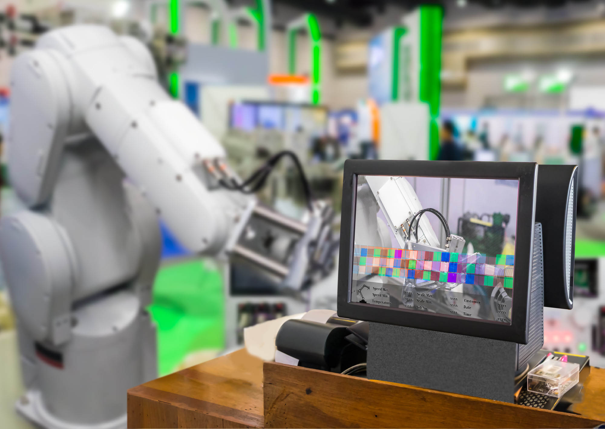
Information technology has grown to reach new levels in just about every facet of business today. And when it comes to your product line, digitalization of that information is imperative to stay competitive in today’s market.
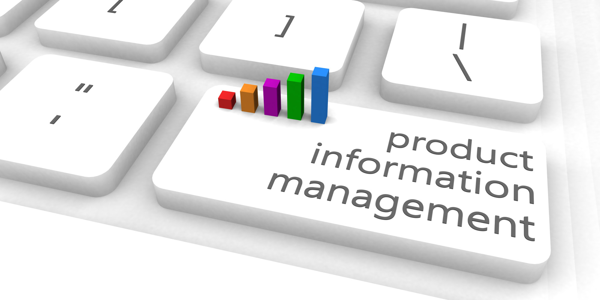
From streamlining data entry to strategic maintenance of that data quality and storage, you need a better system. So, if you sell products then you need a robust database for your product information. And you can get this in a product information management (PIM) software program.
Don’t worry if you don’t know what that is, we’ve got you covered. Keep reading to learn everything you need to know about what PIM is, why you need, and how to best use this valuable software.
What Is Product Information Management?
You want your business to scale. And you want your product line to expand. But if you’re still using an Excel sheet to track your product information it might make you cringe each time you grow.
If this is you, then you need to upgrade to a software program that will make your inventory tracking much easier. There is a better way, and that is having a powerful database house all your product facts and figures.
Your product line isn’t static, it’s dynamic and constantly changing. So the way you store the information about your products needs to be able to keep up with your business.
Do you have one centralized location to collect and manage all the information about your products? If not, then you need a software database that can do this for you.
A good product information management software program will do three things for your business and your product list:
- Collect all the important information, documents, and media files for each item in your product list
- Maintain and organize that information while also maintaining quality control over the information
- Distribute that information to external third-party retailer’s websites, apps, and social media platforms
A good PIM database will be robust enough to not only house all the pertinent information about the products in your product line. But it should also be able to distribute that information externally.
With a product information management software program, you can enter your product descriptions, specifications, prices, and upload the images one time. Then the software will distribute that information to the various sales channels where you sell online.
Stop duplicating data entry and risking natural errors. And start automating and systematizing your efforts so you can start scaling your business today.
Who Needs PIM?
As a business owner, you have several tools you need to successfully run your business. Unfortunately, one important tool you might be neglecting is one that manages your product information.
If you sell a product, then you need a PIM. Product information management software can make your business life so much easier. It allows you to track what you’re selling and catalog it for easy reference.
Do you sell your product on various online seller websites? What happens when you add a new online distributor? Do you have an employee manually enter all the information about each product in your entire product line into that retailer’s database?
Or would you rather be able to connect your database with your new retailer and eliminate the entire onboarding process? If you answered yes, then you need a PIM for your business.
So, whether you’re a digital marketer or an eCommerce manager or a store owner, you need a quality PIM software to streamline your work.
What Are the Benefits Of PIM?
A PIM gives one central location to keep all the pertinent information about your products. It also gives you one streamlined way to send that information upstream to your online sellers such as Google, Amazon, and any other retailer you work with.
By having your product information in a database you can also link images, videos, product guides, and buyers guides. This way you can see at a glance all your digital assets for each product in your product line.
Automate the process of data entry for each of your online retailers. Never duplicate your work again, enter it once and send it everywhere it needs to go immediately. Not only do you eliminate the manual entry but you also eliminate duplicating manual updating each time you update a product or image. Update once in your database, and that information is automatically conveyed upstream immediately.
Increase productivity, reduce overhead, eliminate waste, and create a lean system to keep your product list updated and optimized.
Not only will your team benefit from eliminating all their duplicate and manual data entry, but your customers will benefit as well. Don’t create confusion if they see your product on Amazon and the specifications or descriptions are different from other online retailers.
Discrepancies will create doubt and destroy trust with your brand. Instead, ensure one unified product description across all channels. This will ensure your customers can trust what they’re getting when they purchase your products.
What Is the ROI of a Quality PIM?
It can be difficult to calculate a quantitative return on investment for your product information management software. As you can see there are several qualitative benefits. These include eliminating redundancy and improving customer experience.
However, how can you put a number on whether or not a PIM software program will benefit your company? One way to do this is to look at your current conversion rates and your current product returns.
If you even improved your conversion rate by one percent and decreased your product returns by one percent, what would that do for your bottom line? And we would argue that you could reasonably expect to see both of these numbers improve much more than one percent with the help of a streamlined information database.
Your product line is your biggest asset. You need to organize and catalog all the information about your products in one central location. And a PIM is the perfect answer for your business.
We urge you to look at your current numbers if you want to put a quantitative value on your ROI for an investment such as a PIM. Then you can see what it will mean for your business to improve them without adding new products, increasing staff, or pushing your sales department to close more clients.
Why You Need PIM Systems
Data consistency and data quality can be hard to manage without proper tools or systems. Redundant systems and software programs can make your data management a nightmare as you grow your business.
Are you relying on an employee (or worse, doing it yourself) to enter all the information each time you bring on a new retailer? By using a PIM, you can eliminate redundancy for your team. But you can also streamline the onboarding process and provide a uniform experience to all your customers who come across your product on various platforms.
When you systematize the entire information management process for your product line you will reach a place you can scale your business to the next level. Don’t ever again feel that pit in the bottom of your stomach when your team tells you they closed another distributor account.
Instead, celebrate the additional platform to sell your product while you quickly add your new retailer to your PIM. Watch as your entire product line is automatically uploaded to their website and mobile app. Sit back knowing that everything is streamlined and correctly classified and organized.
This is what a PIM system can do for your business. And this is why a PIM can lead to being able to scale your business. So, if you’re ready to move up to the next level in your business then you need a robust PIM system today.
What Can You Do With PIM?
Businesses today are inundated with big data every day. Streamlining and analyzing that data has become an industry of its own. But what is a business like yours to do when managing all this data? You need a way to catalog and access this information and data quickly and easily.
The more products you have in your product line, and the more people you have managing your product line, the greater your chances for errors and inconsistencies. This is what a PIM can do for you. It can take out the inconsistency and it can negate the need for redundant and duplicate data entry.
You enter your product data one time and it is available for everyone on your team immediately. You update that product information over time and all your retailers are automatically updated as well. Stop worrying about whether or not the information about your product is up to date or accurate and start getting back to running your successful business today.
So, don’t shy away from the investment in a software program that will streamline your efficiency and improve your productivity for all your teams. This is what you can do with a quality product information management software program. Your business is growing and that is good, but if you’re constantly needing to go back to previous product listings to update them then you’re not making good use of your time.
Instead, you need to streamline your systems and manage your processes so that you can get back to growing your business.
How to Choose the Right PIM for Your Business
There are several different types of product information software programs available. And it doesn’t matter if you choose one that is open-source, SaaS, cloud-based, or a standalone software program. The most important thing is that you choose the right option for your specific business.
What does matter is that your chosen software program has the features you need to properly manage the data and information about your product line. In order to choose the right software program to properly catalog your product line, look for these important features:
- One centralized system rather than several software programs and file sharing systems
- Streamlined database management without any duplicate data entry
- Standardized content publication
- Integration with all the major online retailers’ platforms and apps
- Ability to manage and create categories seamlessly
- Capability for bulk editing, optimizing, uploading, and distribution
- Capability for scaling on a large level
You want to grow your business. So start getting your product line into a quality product information management software system today. Don’t wait until you have hundreds of products in your line, do it now so you can grow and scale with ease.
Don’t Struggle With Your Product Line Information Any Longer
As a business owner, you need a way to manage all the information about your product line. And you don’t want to cringe every time you add a new product or strike up a new relationship with an additional retailer.
After all, growing your product line is great for business. And now your product information management software program can take care of all the details for you. You and your team can save time, money, and several headaches by having all your product information in one centralized database.
So, don’t wait any longer, invest in a software that is powerful enough to do all this for you so you can get back to running your business. And if you’re not the decision-maker in your company, bookmark this article so you can share it with the right person to make this important upgrade so you can scale your business today.
For more great information on this and other topics, check out the rest of our blog.