Add Your Logo: How to Print on an Envelope to Personalize Your Mail
Posted on September 10, 2019 by Logo Design Tips and Tricks
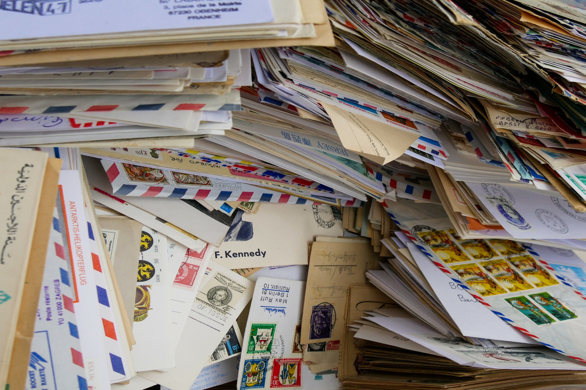
Are you looking to make your business mailing envelopes look a bit more formal? If you do and you want to avoid having to order your personalized envelopes, read on. All you’ll need is a computer, a printer, and blank envelopes.
When you have a business, you want it to stand out among your competition. You want your customers to remember it. One way of doing that is to put your brand on everything you send them, including mailing envelopes.
Put your brand in the envelopes you send your customers. Read on below for our quick and easy guide on how to print on an envelope.
1. Use the Envelope Template on Microsoft Word
The typical software to use for this job is Microsoft Word. It has all the tools you need to make your customized envelope. You don’t even have to do much other than input the data you need to place on your business envelope.
In this step, we’ll show you the easiest and quickest process. Later, we’ll add other ways to do it. For the first step of all processes, open Microsoft Word on your computer.
On the toolbar, there’s a tab titled Mailings. Click on it and the ribbon will show you the tools for creating and writing mail. Look for the Create segment on the left-most side of the ribbon.
Click on Envelopes and a popup box will come out. It will give you a Microsoft Word envelope template. Type in the necessary information in the boxes, like the delivery and return addresses.
Once you’ve typed all the information in, click on Add to Document. This inserts the envelop page at the beginning of your document. Next, we will add in your business logo.
Click on the Insert tab on the toolbar at the top of the window. Click on Picture to insert an image into the document. Make sure that the blinking cursor is on the return address line, before the text.
Select the image file for your logo. Scale it down to the right size on the envelope. With that, you’re all done.
2. How to Print on an Envelope
Now that you have your information in place, it’s time to learn how to print on an envelope. Take your envelope and place it in the printer feed. Also, make sure you know the orientation of the output.
The orientation of the envelope should be the same with the Feed orientation preview from the Envelopes and Labels popup dialog box. If the image in the Feed showed your envelope is vertical, place the envelope in a vertical position. You should also know on which side the top and bottom of the output are.
Make sure to adjust the printer’s sheet feeder. These are the ends that hold up the sides of the blank papers. It should hold up the envelope without being too tight or too loose.
If you’re unsure about the output of a horizontal page on your printer, print a trial page on a piece of used paper. This way, you can save on using fresh sheets and envelopes. You also find out how you should position the envelopes you print in your printer.
3. Tips on Making Your Personalized Envelope
Do you want to move your logo around with ease? Change its wrap text setting by selecting the logo image. Notice the Picture Tools Format tab that appears in the toolbox.
Click to open the Format tab. Look for the Wrap Text dropdown menu. You will find many different wrap text settings.
Choose the Square option. This allows you to move your logo around with more ease. You can also choose Behind Text if your logo has white spaces that are too large.
After you close the popup dialog box for Envelopes and Labels, another will appear. Word will ask you if you want to save the return address as the default return address. Click on Yes.
Now, you can create envelopes without having to fill in the return address again and again. If you will use different return addresses in your mail, click on No. Still, there’s a way to print envelope templates without having to fill in your return addresses.
Create a new document and follow the same process for creating an envelope. This time, don’t fill in the delivery address. Insert your business logo.
Save the document as a template. Each template you save can hold the different return addresses your business uses.
Now, you’re ready to mail your customized envelopes.
Do you still find the whole process confusing? You can also use Certified Mail Labels services instead. Check these rates for the 2019 USPS certified mail rates list.
4. Benefits of Personalized Envelopes
In a time when the email is the normal form of communication, why else would you use snail mail for business? It’s understandable to see the use of snail mail for personal communication. After all, for most people, mail from businesses can be boring and uninteresting.
Well, did you know that 10% of American adults don’t use the internet? Together, traditional and digital mail covers most of your target customers. However, when you reach potential customers, how do you spark interest in your company?
An advantage of sending personalized letters is you can customize them. Direct mail helps spread your brand to targeted audiences. It’s highly-measurable too if you’re sending out coupons for a marketing campaign.
Printing your logo and information on the envelope gives off a well-organized look. It adds the power of professionalism and formality to your message or letter. Also, it reflects the personality of your business.
Send Personalized Envelopes to Your Clients
Follow these steps and master how to print on an envelope to personalize your mail.
While more people use email now, you can’t deny the customers who still prefer snail mail. Make sure you send your clients the best and most professional-looking envelopes.
Did you enjoy our guide on how to personalize your envelopes? If you found it informative and helpful, feel free to check out our other guides.
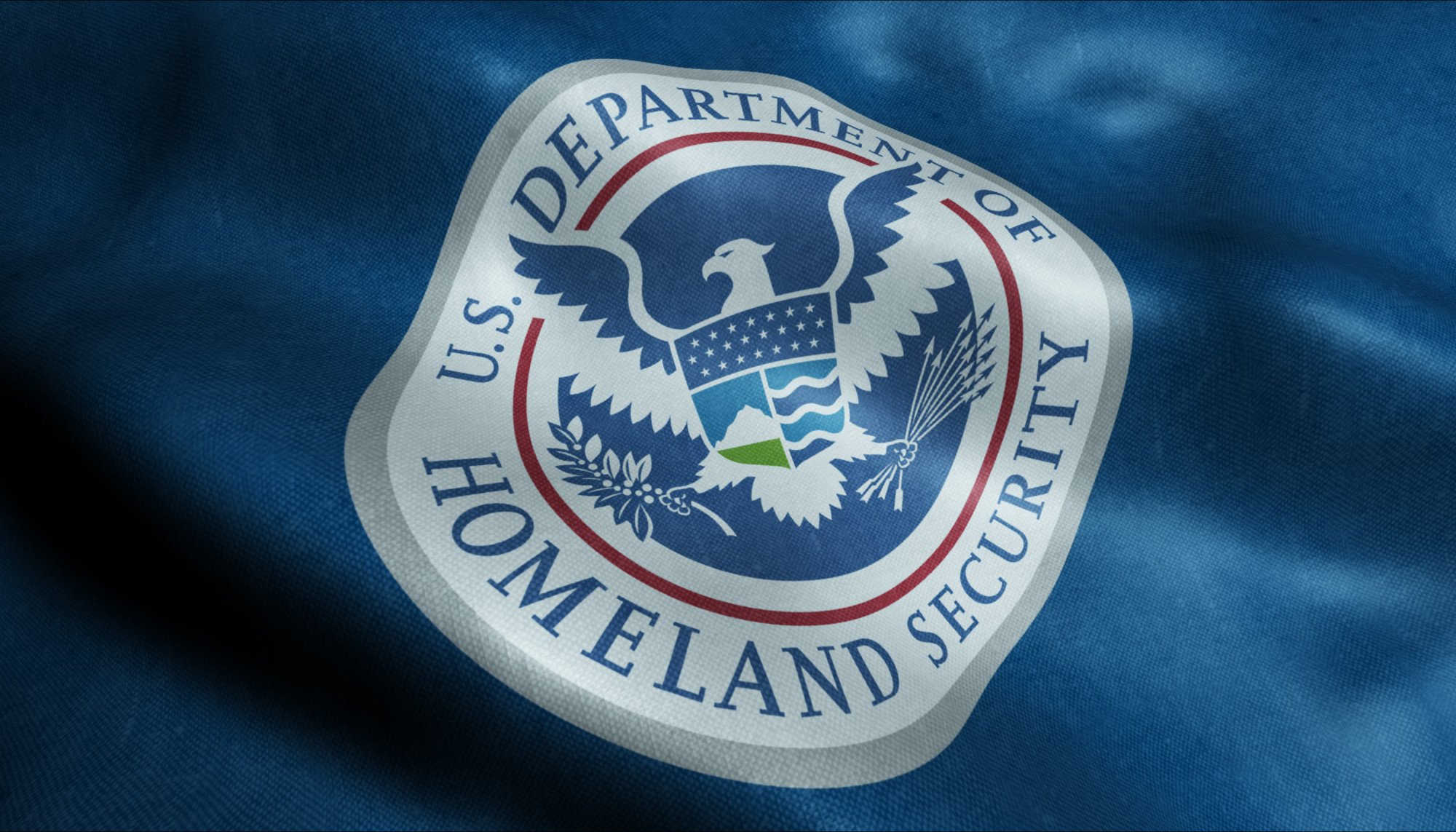
Department of Defense Logos: The Secret Meaning of 3 Famous Emblems
Posted on September 08, 2019 by Logo Design Tips and Tricks
A logo stands for a lot; it’s a representation of how users identify with that brand or company.
The logo for the beer company Stella Artois is one of the oldest logos that has stuck around. The same horn that beckoned travelers in Belgium is the same horn that we recognize on Stella’s logo today.
Other companies like Twinings Tea, Shell Oil, and Levi Strauss are also some of the oldest and most famous logos which haven’t changed.
Emblems from government agencies like the Department of Defense logos have meaning and history as well. And some of the stories behind them are fascinating.
Do you want to know more about some of these secret meanings and logos? Scroll down to find out more!
1. The Air Force Seal
One of the most famous military emblems is the seal of the United States Air Force.
It wasn’t until the fall of 1947 that the first proposed emblems were drawn. And it was a conference of 30 top-ranking air force generals who considered the proposed one. But they weren’t entirely happy with the first draft.
They decided the background should be blue, rather than green. And instead of the Wright Brother’s airplane which was featured on the logo originally, the generals determined that symbolic design would be better.
In that same discussion, the artist, Mr. Arthur Dubois, picked up a pencil and flipped the design to sketch Jupiter’s thunderbolt as a proposed symbolic design.
They agreed, and the final design got approved by Truman just 2 months later.
Blue and gold, the predominant colors on the emblem, are also the colors of the Air Force and Air Corps.
The American Bald Eagle is a symbol of air striking power and the United States. The wreath incorporates the colors of the basic shield design, and the cloud formation portrays the creation of a new firmament.
The 13 stars on the Air Force seal represent the first 13 colonies of the United States, and the grouping of the 3 stars at the top depicts the 3 departments of the National Defense Establishment (Army, Air Force, and Navy).
The shield, which is divided with the nebuly line formation, represents clouds. It’s also charged with the thunderbolt, which exhibits striking power through the air.
The Department of the Air Force was established in 1947, which is what the Roman numerals beneath the shield indicate.
The eagle’s head, which turns to the right, faces the enemy. It also represents not dwelling on past deeds and looking toward the future.
2. The Department of the Army
Before they established the Army emblem, there was nothing to represent the Army. Up until that point, the seal was only used to authenticate documents and wasn’t authorized for display.
In 1974, the Secretary of the Army approved the design as the official emblem, as they realized the need to provide a symbol.
While the seal is black and white, the emblem is always displayed in color.
The seal inscription says, “War Office,” whereas the emblem description says, “Department of the Army.”
The American flag is on its own on the right side of the emblem. On the left side, the pattern of the Army was added to another flag.
They replaced the Roman numerals with the year 1775, which is the year that the Army was established.
The flags are in proper colors, and the other colors represent the ideals of the United States and the Army.
Red is indicative of courage, fortitude, and zeal.
Blue portrays vigilance, loyalty, truth, and perseverance.
White is symbolic of deeds worthy of remembrance.
Black denotes determination and constancy.
And gold represents dignity, honor, and achievement.
The Roman cuirass is a symbol of defense and strength. The sword that’s on the emblem, along with the bayonet, cannon, mortar, cannonballs, and mortar bombs are representative of Army implements.
The drumsticks and the drum are symbolic of public support and notification of the Army’s purpose and intent to serve the people of its nation.
The Cap of Liberty is supported on the point of an unsheathed sword, and it says “This We’ll Defend” on a scroll held by a rattlesnake. This represents the Army’s constant readiness to preserve and defend the United States.
3. The United States Department of Defense
The United States Department of Defense emblem shows a bald eagle with its wings displayed horizontally while grasping 3 crossing arrows.
Above the eagle is an arc of 13 stars with alternating rays. The American bald eagle has long been associated with symbolism for the United States and its military establishment.
It’s an emblem of strength and has been for a long time. The eagle defends the United States on the emblem, which is represented by the 13 pieces on a shield.
The blue chief, which joins together the 13 pieces, represents Congress.
The stars and the rays above the eagle are symbolic of glory, and the 3 arrows are collectively symbolic of the 3 parts of the Department of Defense.
Lastly, the laurel represents honors received in combat while defending peace, which is what the olive branch represents.
Symbols in emblems are exciting. If you want to learn more about the way symbols have been used throughout history, read this to understand how military challenge coins are ranked.
Department of Defense Logos Have Historical Meaning
Just like most successful logos that make their mark on history, the Department of Defense logos are symbolic and introspective in their meaning and purpose.
The goal of any company, department, or business, is to create a logo that represents the brand and stands for something powerful or significant. Changing a logo should never be done unless it’s absolutely necessary.
The longer a logo is around, the more it solidifies its representation of the powerful product or organization that it represents.
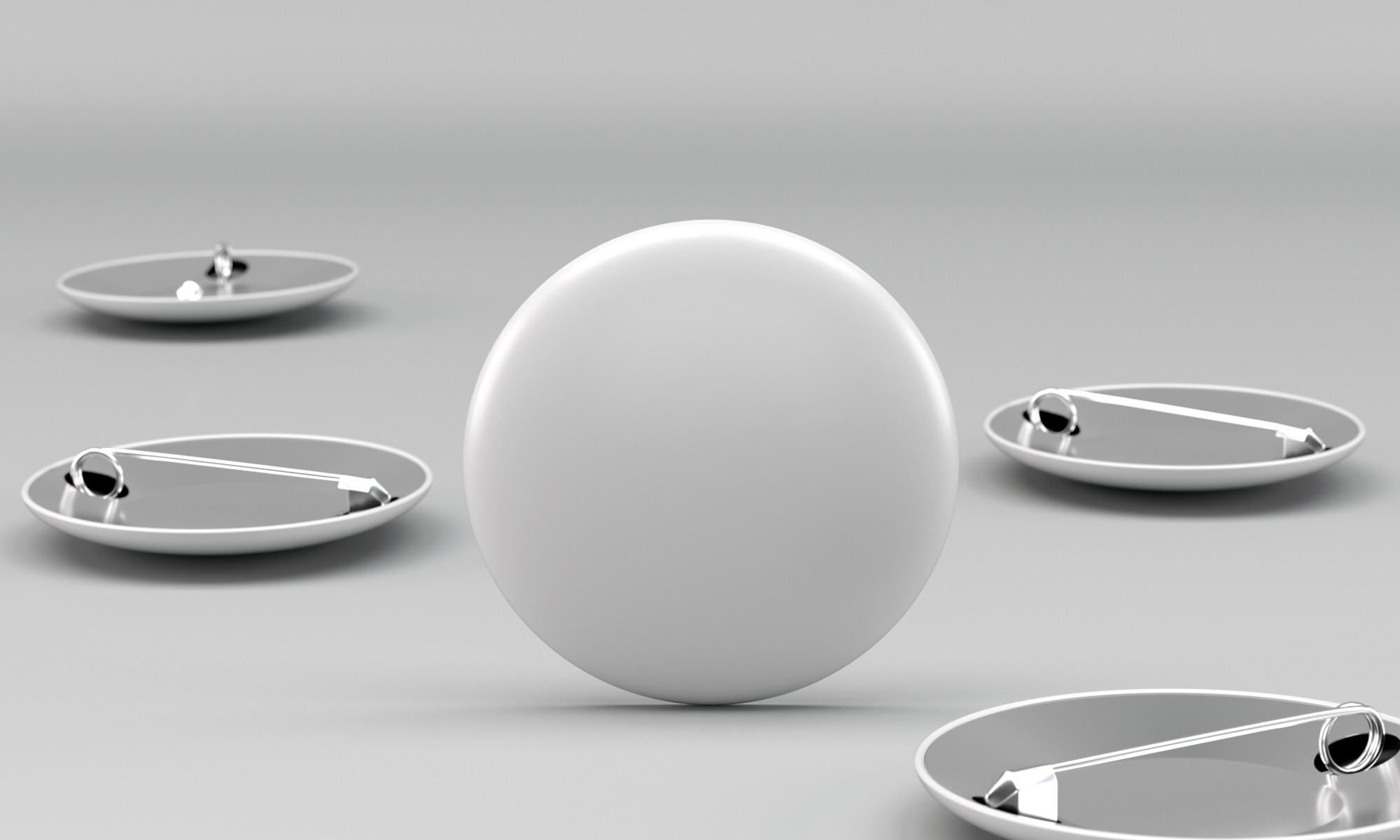
7 Benefits of Making Logo Branded Pins to Promote Your Brand
Posted on September 08, 2019 by Logo Design Tips and Tricks
Want to know one of the most effective ways to promote your brand and increase your sales over time?
Create branded merchandise on behalf of your company—and then give it away for free. One study after another has shown that companies can’t go wrong by getting free stuff into the hands of their customers.
The “free stuff” can be just about anything. From promotional pens and pencils to T-shirts and hats with your company’s name and logo on them, there is so much branded merch you can use.
But logo branded pins might be your best option. Even though they’re small, they’ll pack a big punch when you utilize them for marketing purposes.
Here are seven benefits that will come along with creating custom pins and using them to promote your business.
1. They’re Different
The key to using branded merch to your company’s advantage is coming up with promo products that other companies aren’t already using.
All of the products we just mentioned above—including pens, pencils, T-shirts, and hats—have become go-to promo items for most companies out there. It’s actually rare to see a company that doesn’t use them in some form or fashion to promote themselves.
You can use those kinds of products if you want, but you should also have a few promo products in your arsenal that make your company stand out. Logo branded pins will serve that purpose.
There aren’t too many businesses using pins at this time. That alone will differentiate your company from the crowd.
2. They’re Affordable
While you want to have promo products on hand to pass out to your customers, you don’t want to spend an arm and a leg on them. Whenever possible, you should invest in products that cost next to nothing and offer a great return on investment.
Branded pins fit into that category. Because they’re on the smaller side, they don’t cost much at all. You won’t have to worry about blowing your marketing budget on pins when you buy them.
3. They Appeal to Those of All Ages
There are some promotional products that only appeal to those of a certain age. For example, promotional planners tend to appeal to the middle-aged crowd, while promotional Frisbees tend to appeal to the younger set.
But something like branded pins will appeal to everyone all at once. Young kids, teenagers, young adults, adults, and even elderly people will appreciate getting their hands on pins.
4. They’re Collectible
If you only want to make a single branded pin featuring your company’s logo, you’re free to do it. But one way to keep people coming back to your business might be to create several branded pins for your company.
By doing this, you’ll put people in a position where they’ll want to come back to your business over and over again to continue to collect different pins from you. You have the option of creating any number of pins that you want and encouraging your customers to collect them.
People will have a lot of fun collecting your pins in the coming weeks and months.
5. They Won’t Take Up a Ton of Space
There are some promotional products that will take up too much space when you welcome them into your shop or office. Even something as straightforward as T-shirts will take up more space than you might think, especially if you order hundreds of them.
You can literally order thousands of branded pins, though, and not make a dent in your available space. Pins don’t take up a lot of room, which means that you can order as many as you want and not have to worry about them eating into your space at any point.
6. They’re Good for Any Business
It doesn’t matter what kind of business you own. You can create a pin to represent it.
Do you run a deli? You can create a pin that looks like a hoagie or a bag of chips.
Do you operate a computer repair shop? You can design a pin that looks like a computer monitor, a computer tower, or a laptop.
Do you head up a dance studio? You can put together dance pins that feature ballet slippers or something else that represents your brand.
Branded pins can benefit whatever type of business you have. They’ll get the same great reaction from your customers, no matter who they might be.
7. They Put Your Logo in the Right Light
The logo that you create for your business is one of the most important promotional tools that you have. If you’re able to market your logo right, you can build up your brand recognition and make people aware of the fact that your business exists.
You can slap your logo onto any piece of branded merch you want and get some of the recognition you’re searching for. But you could make the argument that branded pins will put your logo in the best possible light.
People will be able to touch and feel your logo when they’re holding it in pin form. This will create a stronger connection between them and your brand and give them a good feeling overall.
People will also be able to put your pin onto almost any article of clothing or accessory that they own. They can turn an ordinary T-shirt, a plain hat, or even a book bag into a promotional product for you when they stick your pin on it.
Order Branded Pins to Promote Your Business Today
Do you have logo branded pins to pass out to your customers yet? If not, you could be making a big mistake.
Consider placing an order for professional lapel pins today and start showing your logo off to the world in a whole new way. You’ll wonder why you didn’t order them sooner once you see how your customers react to them.
Find other ways to use your logo to create great branded merch by browsing around right here on our blog for more ideas.
How to Put a Logo on a Shirt: Top Design Tips
Posted on September 05, 2019 by Logo Design Tips and Tricks

A great t-shirt design can be used as a ‘free’ walking advertisement for your company. Some of the best t-shirt designs are simple logos on the right colored shirt.
What makes a great t-shirt and how do you design one?
In this article, we will go through our top design tips for how to put a logo on a shirt, so you can avoid a fashion faux pas.
How to Put a Logo on a Shirt: Our Top Design Tips
Follow our 7 top t-shirt design tips below to help you design a great shirt.
1. Sizing
This is one of the most important factors when you are deciding to put a logo onto a t-shirt.
If the logo is encompassed in a circle or square shape, you really need to choose the size wisely. Always print out different sizes and place them on a sample t-shirt to get a better idea of how the finished product will look.
Also, remember that you may have to scale the image for different sized t-shirts. The same size logo will look very different on an XS vs an XXL.
Consider the different t-shirt shapes too. Women’s t-shirts are shaped at the waist, while men’s and unisex t-shirts are straight up and down. This could affect the placement of the logo.
2. Placement
The print placement could make or break a great t-shirt design. You don’t want your logo to sit around the wearer’s waistline, nor do you want it so close to the sleeve that it can’t be seen.
There are standard placement areas and we can suggest these areas when you have finalized your design.
3. Fonts
If your design includes text, make sure it’s in a readable font and in a large enough size. Enough said.
4. Layout
If you have a complex design with different words, fonts and graphics then make sure your design is laid out correctly. The same text and graphics can look very amateur if they are laid out in a different way.
5. Quality
Any graphics or text you use in the logo should be the highest quality available. Once printed, you should check that the text is legible and the images are clear.
Always use vector file images as they scale to print, and you won’t run into any resolution issues.
6. Colors and Contrast
If you are printing the same design on different colored shirts, ensure that the design is clear on each color or create different designs for different colored shirts.
The colors should contrast each other enough to be readable. Don’t use light yellow on white, or dark grey on black, for example.
7. Borders & Edges
Printing photographs or portraits onto a t-shirt can be a great design on its own. Ensure the borders are correctly edited so just the portrait is printed, and not the surrounding background.
Keep It Simple!
Now you know how to put a logo on a shirt and incorporate good design practices for the best results.
Remember, if in doubt, keep the design simple.
For more logo design tips, check out the other articles on our blog.


