Creating Cohesive Branding With a Law Firm Logo Design
Posted on July 07, 2017 by Logo Design Tips and Tricks
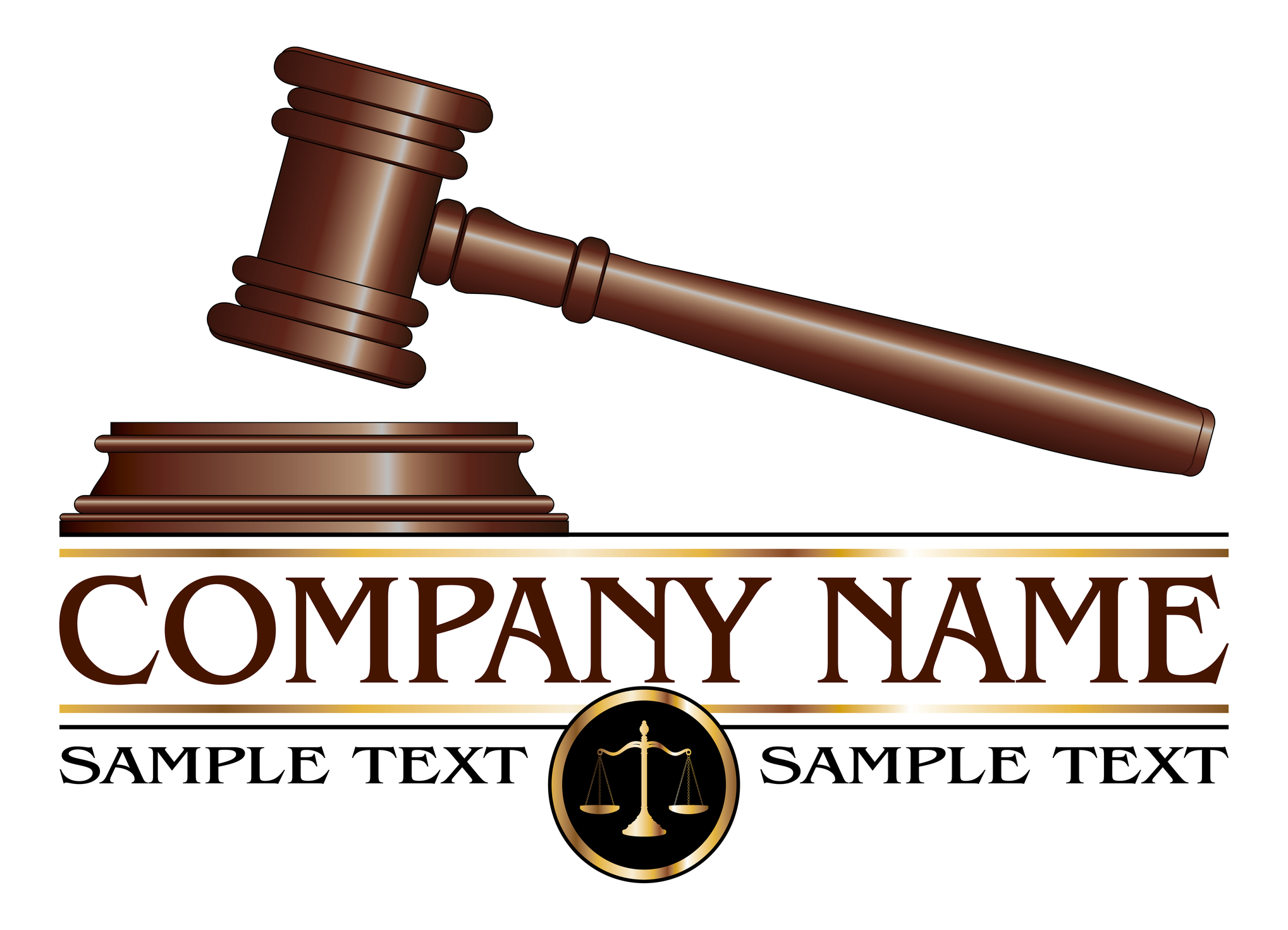
What are the keys to an effective law firm logo design?
In the United States alone, there are over 47,000 law firms, making for a highly competitive business environment.
How can a law firm stand out from the competition?
First impressions are critically important when it comes to recruiting new clientele. A strong logo design is one way that a law firm can stand out.
A great logo design quickly informs potential clients what the law firm stands for.
Read on to learn more about strategies to design the perfect law firm logo design.
Simple is Best when it comes to Law Firm Logo Designs
Take a quick scan of the top 5 largest law firms in the United States. What is the common denominator?
Each logo is simply the law firm’s name, sometimes with no background whatsoever.
The primary variables are color and font.
Prospective clients will literally absorb a logo design in seconds. If the design is complicated, the client will likely just move on, taking nothing away from the logo.
On the other hand, a simple logo design will be easily processed and even easier to remember.
Another important consideration is how the logo fits on everything from a billboard to official letterhead.
Notice that the top five largest law firms simply use its name as the logo. A law firm name will fit on advertising or marketing materials regardless of size.
What Roles do Colors Play in Logo Design?
The importance of colors cannot be stressed enough. Each color has a connotation associated with it.
For instance, green typically has a positive connotation. In the business management arena, green may indicate that a project is on time and under budget.
Colors can also be representative of client emotions.
Take the color blue as an example. Blue is a cool color and suggests passive emotions. When people see the color blue, they naturally have feelings of relaxation and content.
Envision that a potential client is searching for an embezzlement lawyer. The use of the color blue in the logo may put clients at ease, leading them to feelings of calm.
Considering the seriousness of embezzling charges, a law firm looking to earn a client’s business will certainly want to create an aura of calm.
Font is Another Important Logo Variable
Font is another simple way to send a message to clientele. While there may be an urge to use a flashy font, the real key is maintaining simplicity.
First, logo font must be easy to read. Remember, clients will absorb a logo design in a brief moment.
Second, logo designers will choose between classical and modern fonts. Each type of font has a connotation associated with it.
A classic font may suggest that the law firm is established and has decades of experience. On the opposite end, a modern font may tell prospective clients that the firm is relatable and current with fresh legal trends.
Completing a Great Logo
There are many other important facets to logo design. Ultimately, law firms should strive to keep it simple, focusing on the essential variables like color and font.
A simple logo will quickly and clearly let potential clients know what the law firm is all about. Drop a comment below or share this on social media to initiate a wider discussion on creating an effective logo design.
5 Beach Brands to Inspire Your Surf Shop Logo
Posted on July 07, 2017 by Logo Design Tips and Tricks

Surfers come from all different walks of life and everyone finds their way to the ocean for different reasons. But there are a few unifying characteristics that connect surfers together.
The surf companies that have tapped into those unifying ideas with their surf shop logo and ad campaigns have made successful surf businesses.
If you run a surfing company then curating the right surf shop logo can make all the difference in your success.
Here are 5 beach brands that should inspire and inform your design choices.
The Critical Slide Society
This Australian surf company is relatively new but is taking the surfing scene by storm.
Critical Slide Society has dialed in on the sunbleached, relaxed, and carefree characteristics of surfers. They focus their style on muted colors that don’t flash or clash.
Their logo is a simple and clean black and white diamond shape that doesn’t include cheesy images or graphics.
Steer clear from silly graphics in your final surf shop logo.
Katin Surf Shop Logo
Katin is an old Califonia company that was started back in 1959. It all began with one pair of surf trunks that were made for a local surfer and the business soared from there.
Katin has evolved over the years and realized that California surfers have many interests. They love longboards, walking the boardwalks and hanging out on any beach. Their style is relaxed without being sloppy.
They also have a simple all black logo that just clearly states their name. Don’t over think it with too many colors or images. Simplicity and font are key.
TwoThirds
TwoThirds is a company based in Spain that combines their love for surfing with their love of the environment.
Their motto is “protect what you love” and they strive to make environmentally sustainable products for surfers who want to protect the ocean they love.
Their products are ultra laid back, like both the Spanish and the surfing culture.
The TwoThirds surf shop logo is all black with a simple and artistic incomplete circle design. This is an example of a successful logo that establishes a strong brand identity without being too obvious.
Insight
Insight is an older more classic surf company that has been influencing the look of youth surf culture for decades.
This Australian surf company makes youthful clothing that is designed to look even cooler after the wear and tear acquired by partying at the beach.
Their surf shop logo is an iconic black and white four-circle design that any surfer would recognize.
Saturdays
Saturdays is a totally original and unique surf company that makes clothing that can be worn in a bar, on a date, or at the beach. Their clothing has a distinctive city vibe that is unique from the mostly beachy and breezy surf culture.
Their logo shows their name “Saturdays New York City” in a minimalist white type.
It’s tempting to try and make a themed logo with waves or boards, but the most successful surf companies have kept things simple and clean. Whether you’re launching your company with a fresh logo or looking to relaunch a new logo, consider what is already working in the market.
If you want a successful surf company, pay attention to the trends and follow suit. The most successful surf companies these days are catering to the cool, calm and understated vibe of the surf community.
Start designing a logo online that will elevate your surf shop to the next level of success.
How to Choose the Right Colors for Ranch Logos
Posted on July 07, 2017 by Logo Design Tips and Tricks

Are you stuck with a boring ranch logo? A logo says quite a bit about a business and having the wrong logo can send the wrong message to customers.
Many dude ranches want to invoke a theme of the old west. Some ranchers will have guests work while others are meant for a true vacation.
You might have a great logo design but maybe the colors are off. Our brains are wired to perceive certain feelings depending on the color. Different colors can make people feel different emotions.
The logo of your company reflects how it appears to the world.
Having a badly designed logo can make your business look unprofessional. In this article, you will learn how to choose the perfect colors for ranch logos.
Choose Colors that Invoke the Outdoors
A ranch is all about being located away from the concrete jungle of a city. You’ll want to have this natural feel reflected in logo color choices. Colors that bring to mind images of nature include brown, yellow, and green.
Many leading agricultural companies feature green in their logo for this reason.
It’s isn’t always best to focus on only one color. Your ranch logo may feature the brown of a cabin paired with green grass and a shining yellow sun.
Matching the right colors to a niche lets a customer instantly know what your company is about. For example, a company offering land for sale in Montana should include greens and/or yellows in their logo.
Colors for Ranch Logos Need to be Inviting
Matching colors to your business is important. Some of the largest companies in the world know the power of inviting colors.
Blue is the most preferred color choice for citizens around the world. You may want to include a nice blue to color the skies above your ranch. Blue combines elements of nature and trust making it a great color choice for ranch logos.
Don’t be Afraid to Include Uncommon Colors
You won’t often see many ranches with a pink or purple logo. Some may view these colors to be too feminine for a ranch. Purple is a color associated with wisdom but is difficult to use for this application.
It’s a great idea to include at least one surprise color in your ranch logos. Having a great logo is about standing out without going overboard. As an example, a ranch used for vacations could include orange which people view as a friendly color. Creating a perfect logo takes time. Including color combinations helps to ensure you don’t miss any winning ideas.
Creating a perfect logo takes time. Spend some time thinking about your color combinations to help ensure you don’t miss any winning ideas.
Adding color accents help to make logos have that extra visual appeal.You might not think that gray would be a popular color for a ranch. However, gray is a color used to promote feelings of balance and calmness.
You don’t want a boring logo that looks identical to your competitors. Think of what emotions you want your ranch to invoke. The key to great logo color schemes show what a business is about while appealing to their target audience.
How to Build Your Brand With Packaging Logos
Posted on July 07, 2017 by Logo Design Tips and Tricks
Branding is what companies use to help consumers connect with their businesses.
McDonald’s, Nike, Walmart and various other brands have steadily grown their customer base using their logos. Logos are the foundation of all branding — they’re the images your customers will associate with your company.
Having loyal customers can be very valuable for a company. In fact, a loyal customer has an average lifetime value of $1,803. How you execute your branding plays a major role in this.
This includes the logo and packaging you use for your products. The human mind is able to process imagery 60,000x quicker than words. That says a lot about the importance of your logo and any other images used in your branding.
If you’re considering updating or creating a logo for a new or upcoming product, then the following tips may be useful. Let’s review how you can build your brand using packaging logos.
First, Create an MBA Name
We’re not talking about a degree.
An MBA translates to memorable, brandable and available. The idea is to create a name for the product that is easy to remember, simple to brand and not already in use. This is important whether you’re buying a domain name or creating social media profiles.
Talk to Different Manufacturers
Hopefully, you have an idea of which manufacturers you may work with in the future. Your brand won’t make it far if the product is being created by an unreliable manufacturer. If you run out of supply or have a mediocre product, then the result will be dissatisfied customers.
Now, Develop Your Packaging Logos
Your product has a name and manufacturers to create it. Now, you need a logo and packaging for it. The logo you place on your products will help build awareness for your business. Avoid using blank or generic boxes for your goods.
Take advantage of the space on your boxes to place your packaging logos and business name. The key is to make your logos unique. Here are some of the trends packaging design companies are using:
Broken letters
You can have some or all of the letters broken up in your product or business name.
Cropping
This tool is valuable for more than just photos. Not all letters have to be seen for customers to get the idea of what your logo reads.
Form Simplification
Simplicity and neatness are sometimes the best way to go. Some companies rebranded their logos using this style, i.e. Mastercard and Airbnb.
Color palette simplification
The colors used in your logo should also be kept simple by using less color. While color is important for evoking emotion, there is such a thing as too much color!
Photographic textures
This is a new trend on the scene of logo and branding, however, it’s an excellent way to give your business personality. You can really get creative with the different types of textures, such as grass, smoke and flowers.
The beauty of it all is you don’t have to know design. You can simply hire a graphic designer to do it for you. Some even have experts who can help you develop ideas for the best logo for your brand and packaging.


