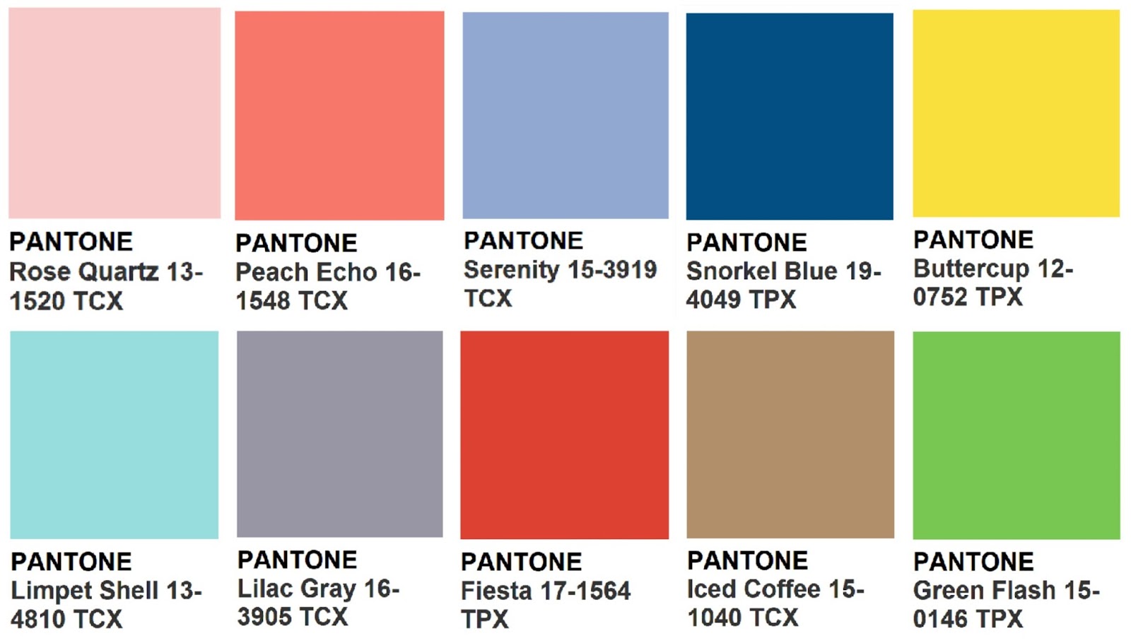
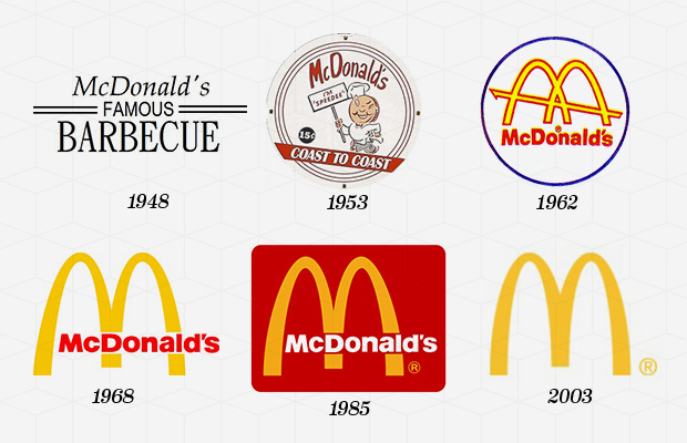
Why does Pantone Exists?
Posted on September 07, 2016 by Luanna
As their own website explains, Pantone is a color Matching System (PMS for short) that uses a unique code scheme. This “key” will help you find easily a particular Pantone Color number or name without misunderstandings.
The history started in the 60s, when Pantone was a printing company in Carlstadt, New Jersey, with a specialty in color charts for the cosmetic, fashion, and medical industries. Lawrence Herbert joined the company in 1956 and noticed how difficult it was to identify exact colors from names. So, in 1962 he bought Pantone and launched the first PMS guide in 1963 with only 10 colors to try to minimize the errors and number of variables happening in the printing process. Creating an objective, numeric language means that any printer anywhere in the world can accurately produce this color. Continue Reading
What to Consider when Designing a Logo
Posted on August 31, 2016 by Luanna
Do you know what to consider when designing a logo? When you do, you guarantee a well-designed logo, potential clients, and a clear message of how your business can serve people. You should focus on your message, objective, product, spark to create your logo design, but you should also look at the logos of other businesses in your industry to avoid copy and to know what is working or not.
There are basically three kinds of logos you can do:
- Font-based logos (just your company name or initials);
- Illustrated logos (that literally illustrate what your company does);
- Abstract graphic symbols.
Doesn’t matter which one do you relate better or if you match them up, they are all acceptable and very much used all around. But definitely don’t use clip art because they bring a lazy, old, outdated impression. Neither trendy looks. They may seem cool and maybe they match a teenager brand or other special ocasions, but you have to use it carefully. So read carefully this 4 suggestions I have for you:
1) KEEP IT SIMPLE
A simple logo design allows easy recognition and let the logo to be versatile and memorable. And don’t forget: simple does not mean easy! Actually it’s hard to get concise, simple and memorable, the secret key is to have the branding briefing very well defined.
 Continue Reading
5 Logo Mistakes for you to Avoid
Posted on August 24, 2016 by Luanna
No matter who or how qualified we are, we all make mistakes, right? But we cannot have logo mistakes. It’s your company mirror to the world and cannot be wrong. A logo is so important that we will help you avoid the most common 5 logo mistakes in order to guide you to logo glory.
1) Using too many fonts
Don’t worry about using the font more than once. This is okay! Many people think that they have to saturate their work with all types of interesting fonts. And that’s the mistake! You don’t! The best practice is to pick three fonts that go well together within your composition and use them. This way, the design will generally look cleaner and more effective. Remember: logos are more about the functionality than the aesthetics. Of course it’s a combination of both, but think first about what you need to transmit, than you work with the aesthetics.
 Continue Reading
Where do logos come from?
Posted on August 18, 2016 by Luanna
The term logo is a shortened form of ‘logogram’ which means a sign or character that represents a word or phrase. So, hieroglyphs and pictograms are therefore some of the earliest historical examples of logos.
The history of logo design begins with the roots of human expression. In fact, the fundamental power of symbols remains the most important element of logo design. A logo has meaning because it draws on centuries of signs and symbols and visual language. Humans have used logos and graphic iconography for thousands of years. The Ancient Egyptians, for example, first used their hieroglyphics to brand and identify their belongings.
Continue Reading