5 Ways to Figure out Eye-Catching T-Shirt Design Ideas for Promotional Giveaways
Posted on September 18, 2019 by Logo Design Tips and Tricks
As a business, using promotional giveaways to convert new customers and boost your reputation is a no-brainer. They’re affordable, fun, and create instant interaction with customers.
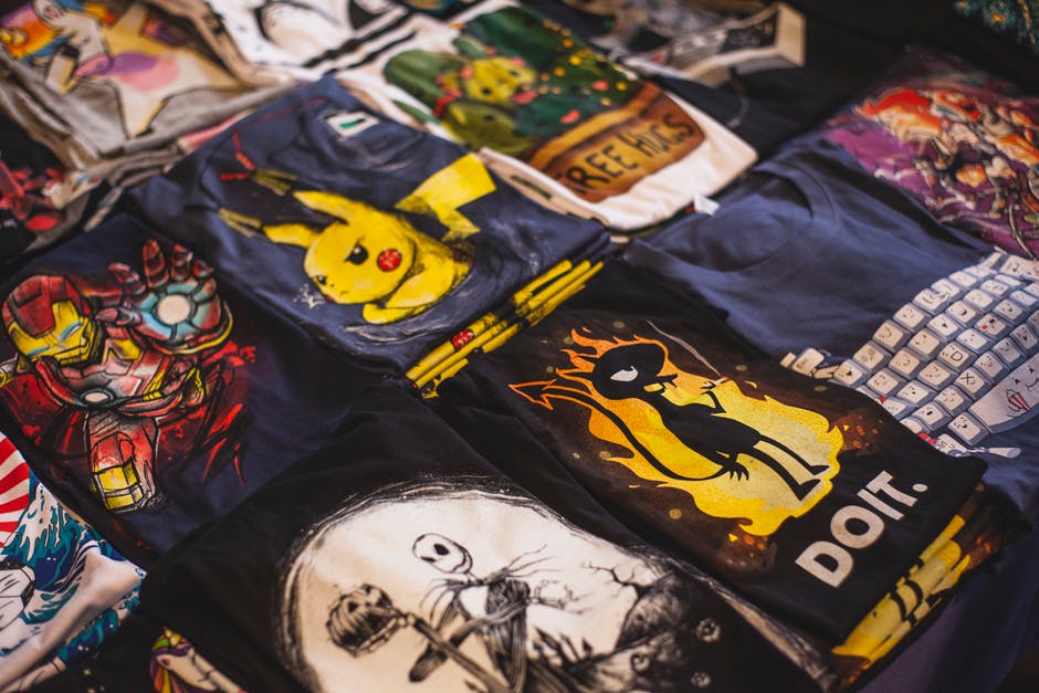
T-shirts are a favorite among consumers. However, creating a good design isn’t as easy as it seems.
That last thing you want to do is produce a shirt that doesn’t get peoples’ attention. That’s why we’re discussing five tips for coming up with great t-shirt design ideas.
1. Think About Your Target Audience
Before you start thinking about designs, it’s important to consider your target audience. Your t-shirt will prove more effective if it appeals to people interested in your business.
For example, if your target audience is young men, a promotional shirt that employs current men’s fashion trends will attract more eyes. Winners of your giveaway are also more likely to wear the shirt.
If you’re not sure about your target audience, start by creating a customer profile. This will help you better understand who to focus on.
2. Consider Your Current Branding
When it comes to branding and marketing strategies, consistency is critical. Using elements of your current branding in your shirt design is a great way to establish a solid reputation.
Think about things like your business colors and logos when designing your shirt. Incorporating these will help increase brand recognition and make your shirt memorable.
Keep in mind that you don’t have to force your brand down peoples’ throats. Subtlety can work to your benefit.
3. Brainstorm With Your Team
When you’re coming up with a design, it helps to get many brains involved. Trying to create something on your own may prove difficult and result in a lackluster design.
Ask several people on your marketing team to submit a few ideas. Then, have a meeting and look at everyone’s concepts together.
Gauging everyone’s reaction to each design is a great way to narrow down your options. After that, the team can start revising the idea until you’ve created the perfect shirt.
4. Be Creative With Color
When it comes to clothing, color is the best way to get attention. However, you need to be sure you don’t go overboard.
Think of the fabric of your t-shirt as the background color. What your printing on it should stand out well and compliment it at the same time.
Avoid creating a t-shirt that’s hard to read. If you want to make a huge impression, companies like Flashion Statement create shirts with LED printing.
5. Originality is Your Best Friend
If you want to stand out, you need to be unique. This may seem hard to do if you’ve never designed a t-shirt before.
It doesn’t hurt to look at your competition and see what they’re doing. Just make sure you don’t mimic their designs.
Check out old-school t-shirt designs and put a modern spin on a classic design element. Or, be abstract and come up with something people have to think about.
Make Your T-shirt Design Ideas Turn Heads
A promotional giveaway is only effective if the item you’re featuring is attractive to your audience. Before you start printing your t-shirts, make sure your design pops.
Use these tips for creating awesome t-shirt design ideas and make your giveaway a success.
We hope you’ve found this article informative. Feel free to browse our site for additional information on graphic design.
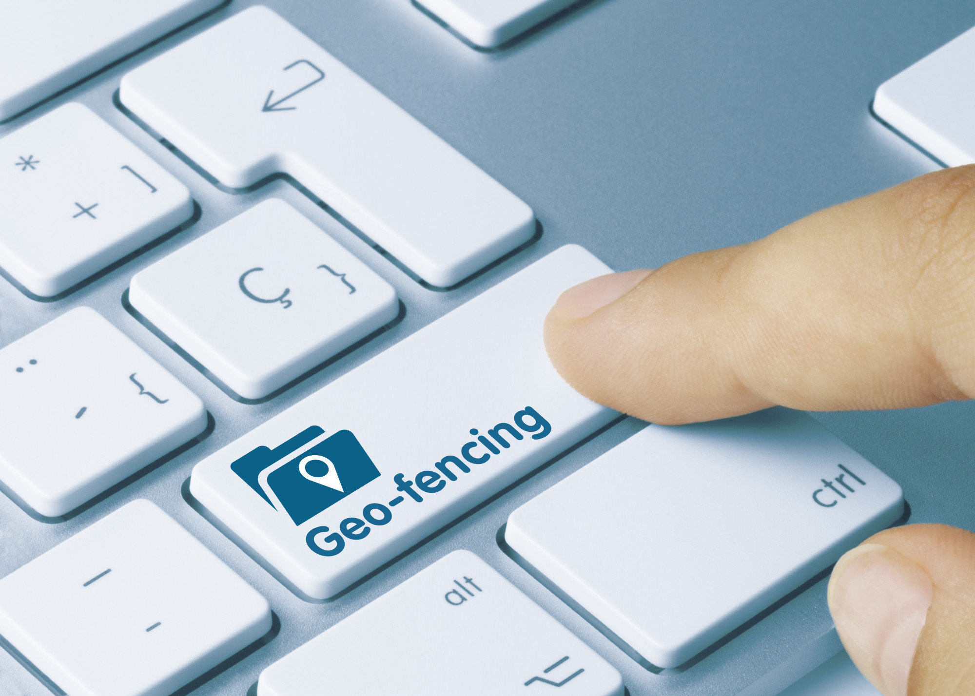
What Is Geofencing Marketing?
Posted on September 14, 2019 by Logo Design Tips and Tricks
Each year more than $200 billion is spent on advertising within the United States alone. Yet, how effective is it if not every single one of your ads is being served to your target audience?
Advertising used to be simply plastering your message in busy places hoping the right eyeballs might stumble upon it. The Internet’s inclusion of digital advertising, however, has changed the game. For those looking to wisely spend their advertising budget, geofencing marketing is practical.
Are you looking to expand your company’s advertising efforts into the world of geofencing technology? Keep reading to learn more about how it can work to enhance your digital reach.
How It Works
Geofence marketing works by establishing areas to capture your audience. These are specific addresses that can be located on any GPS map. The best way to create a list is to brainstorm where your target consumers are.
For example, a business that heavily relies on tourists could geofence nearby hotels for out of town guests. On the contrary, a new restaurant could target rival eatery establishments to get a leg up on the competition.
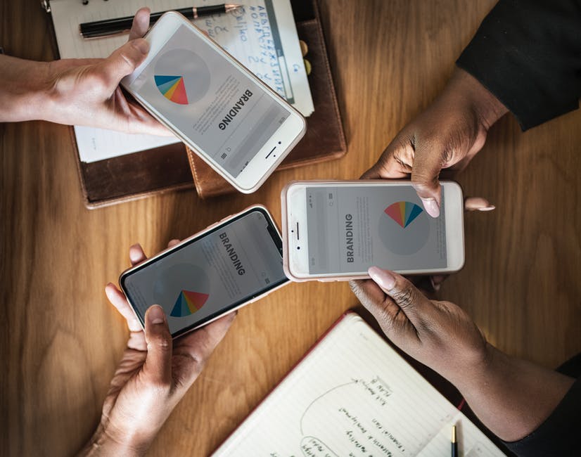
In order for a person to be served your advertisement through geofencing, they must have a smartphone with its location services turned on. Furthermore, they must use their smartphone in some capacity that triggers a data connection. Fortunately this is no issue since the average American looks at their phone 52 times per day.
Once a target consumer’s phone is activated, your advertisement will follow them for up to 30 days. This also isn’t limited to their smartphone, either. If someone is logged into social media accounts or email on their smartphone, the advertisement will follow them to their computer if logged onto a desktop.
Another feature with geofencing is you can set specific times to capture an audience. This is convenient for temporary events, such as a concert or ball game.
Seeing Results
While this all sounds great, how can you be sure this advanced form of advertising is actually working? Great question!
All reputable geofencing companies should offer transparent digital reporting. This includes how many impressions are being served in addition to the amount of clicks each ad receives, also known as a click-through rate (CTR).
Beyond this, geofencing offers an advantage standard digital advertisement doesn’t for brick and mortar businesses. It’s possible to see when target consumers visit your targeted locations, are served your ad, then visit your business.
This process is called a conversion zone. When you select your targeted addresses you also provide your company’s location so this can be tracked. This feature is helpful in determining which addresses are reaching a larger audience compared to others.
Of course, every company’s needs will vary. These geofencing marketing providers different options whether it’s targeting by zip codes or solely focusing on competing businesses.
Developing a Geofencing Marketing Strategy
Digital advertising has a lot of components, some of which can be a lot to grasp if you’re new to it. With the right approach and outlook, it can be a great tool for reaching a whole new audience while getting the most bang for your buck.
Create a realistic strategy for geofencing marketing. Study your consumers’ habits and where they spend time away from your business.
Are you looking to improve your marketing efforts? Neal Schaffer has a proven track record of helping businesses of all sizes with their digital transformation of sales and marketing through consulting and training. Contact him today to learn more about how he can help.
Logo Design Principles: How to Create a Remarkable Company Logo
Posted on August 25, 2019 by Logo Design Tips and Tricks
Did you know the hidden arrow in the FedEx logo represents precision and speed?
Are you looking to design your logo but not sure where to begin? Not to worry! In this guide, we’ll go over design principles to use as you create your logo.
Want to learn more? Keep reading to find out.
Keep It Simple
Take a moment to think of the most famous brands in the world. Did you think of McDonald’s or Apple? Those two companies have a simple logo that’s recognized around the globe.
When working on your logo, go simple instead of complex. A simplistic logo is easy to print and can engage your audience instead of confusing them.
Choose a Balanced Logo
A logo is an icon no matter if it’s a graphic symbol or text. When creating a logo, you want to maintain a sense of balance. Don’t place elements together at random.
When thinking about the look, keep your audience, and services in mind. Pick a logo that has a balanced appearance reflecting your business.
Think About Symbols
Your logo doesn’t have to describe what your business does. For example, most shoe manufacturers don’t choose a shoe as their logo.
Pick an icon that can still communicate your brand without using the company name. This way, you can use the icon as an image that stands alone on the packaging.
If it’s too obvious, a viewer won’t experience the sense of discovery. Try not to go too abstract.
Easy to Adapt
Your logo should work on a small business card or a massive billboard. Use it on a t-shirt, brochures, or stamps. A strong logo will look great with different colors or one color.
When working on your logo, imagine how it will look on different marketing materials. This will help you make sure it’s flexible and looks striking in various formats.
Take Your Time Deciding on Colors
Before picking a color, think about what message you’ll send to customers. Do the colors reinforce the mood you’re trying to communicate? Blue can express loyalty, freshness, and trust. Green symbolizes cleanliness and nature.
Think about what colors work well with white and black backgrounds. Don’t include more than three colors in a logo. Too many colors will increase the cost when you have to print materials.
Uniqueness Factor
Will your logo stand out from the competition? Keep working on your logo if you think it’s too predictable or bland. You don’t want it to become invisible to your audience. Avoid typical cliches like pinwheels and clip art.
Research your competition. If your business is a PayStubCreator, research the industry and watch for patterns. Avoid mimicking those logos and create something that stands out.
Logo Design Principles
We hope you found this guide on creating a memorable logo helpful. With these logo design principles, brainstorm your company’s future logo.
Don’t forget to bookmark our site. This way, you won’t miss out on any of our resources.
10 Seriously Clever Logos You’ll Love for Creative Design Inspiration
Posted on July 11, 2019 by Logo Design Tips and Tricks
Sometimes it’s hard to tell which logo will hit because it’s not always the most expensive, most well-planned, or time-consuming that ends up among clever logos that define brands perfectly.
Take the Nike swoosh. It cost $35 paid to design student Carolyn Davidson. She needed money to take a class and got the freelance gig from Phil Knight, an accounting professor. He had a company launching a football shoe brand called Nike.
It took 17.5-plus hours to make. No huge ad team. No fortune paid. Although Nike later compensated Davidson with stocks and a diamond ring.
But how do you get the most creative logos without an ad team and marketing planning?
Well, many great logos use these tools. They cost money but are often the recipe for success. So, if you’re looking for a great logo for your business, you can put the right steps into action rather than holding your breath.
To start, look at what’s working for other brands. We’ve put together 10 favorites of ours to help
Keep reading to see interesting logos, then let these ideas inspire you to design your own logo or put together a team that can.
10 of Our Favorite Logos
Many of these we like because they’re logos with hidden meanings. Some are just creative logos that work well. Let them put your brain in creative mode and have fun!
And if you’re stressed about the finances of hiring your team to get your logo and business launched, do your due diligence in planning and budgeting just like when you create your logo.
There are always options in financing if you think it through, brainstorm (like the creative part), and stick to your plans. Even guaranteed payday loans work if you plan it right and stick to that plan.
Now, go check these out.
1. Le Tour de France
They use such fun lettering and the bright orange sun gives it that extra pop. Mostly, we love how there’s a cyclist in the letters and sun. The O, U, and R form the cyclist and the back of the bike, and the sun is the front wheel.
2. The 2024 Olympics in Paris
We seem to love some of the French ones. Check out how those Olympic medal ribbons form the Eiffel Tower.
3. Coffee Night
It’s so simple! Look close and you’ll see the moon in that cup of Joe.
4. Iron Duck Clothing
If you have fashion and ducks, it’s not obvious how to put them together. But this clothing hangar that looks like a duck does the trick.
5. CodeFish
Again, this one is clever and simple. Check out that fish made of code.
6. Sushi
The name of this company may be a bit vague, but the logo isn’t. The H turned into chopsticks in a fun and clever way gives you that quick visual that might just make your mouth water.
7. Beats
You know you gamers look for hidden eggs in the game? This is the logo version.
In case you didn’t see it, the “b” in the white circle is actually half a headphone.
8. Chick-Fil-A
With bright curvy cursive lettering to get your customers’ attention, what more could you want? We’d say it wouldn’t be as good without that chicken in the C!
9. Cisco
Tech giant Cisco has way more panache for a tech giant than you’d think, even just looking at the logo. Why? Because they have a San Fran skyline in the lines above the letters to honor their hometown.
10. Nike
Yes, we love the swoosh. It shows movement. It is called the swoosh, giving it a built-in sound effect to signify speed. You know you want to be fast and those shoes will help. Instant clever branding.
Clever Logos for You
Now that you know some of our favorites when it comes to clever logos, you can start working on yours. Be sure to identify your brand and market clearly so you can convey what you want to the designer and/or ad team.
You can also play around with our free logo maker and get in touch with our team if you want help with further branding. We’re here to help you get the best logo for your needs.