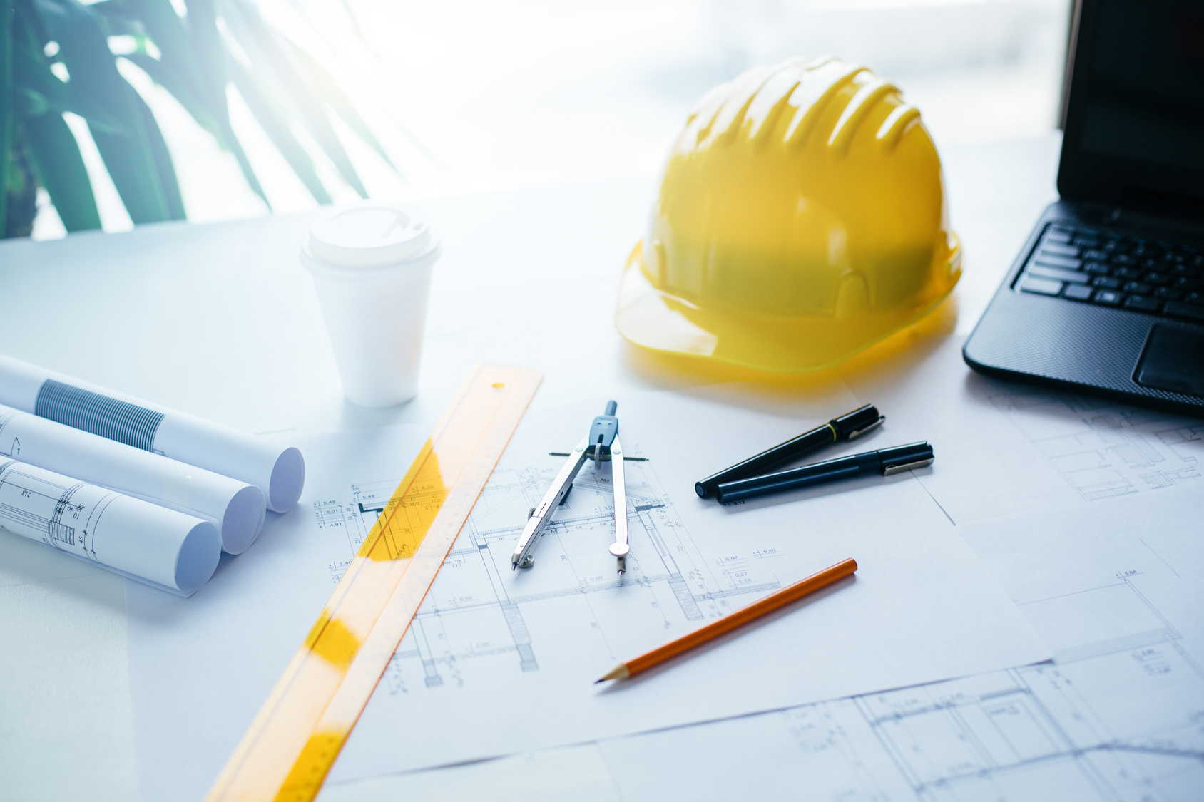
So you are having a hard time creating the ideal logo for your construction company. You are probably asking yourself: What are you doing wrong?
It shouldn’t be this hard to create a logo that represents what your construction team does on a daily basis. So what makes a great construction logo?
We’ve already told you about some of the best kinds of logos you can make. But what makes designing a logo for your construction business different from these other businesses?
So come along as we take you through 4 tips for designing an attractive construction logo.
Give Your Logo Dimension
One thing to keep in mind for your construction logo is to make sure that the combination of the font size and color scheme work together to create dimensions that jump out at your customers.
Providing these dimensions will make your construction logo look exciting and fresh whether it is on a business card or a massive billboard along the highway. This subtle technic will make your words pop out.
Stay Away From Intense Color Combinations
Logo design 101: avoid using too many different clashing colors in your construction logo. Your customers will be turned off by this as it will seem like unpleasant rather than inviting like you had intended.
This is not a mere matter of preference, science has proven that color coordinating is essential to appeal to people on a basic level. Why would you ever want to argue with science?
So remember to not go overboard with colors when you are designing your construction logo. Just stick to the simple combos that have worked all along.
Avoid Weak Fonts Like Italics
Another way to make a strong impression with your construction logo is to stay away from passive fonts. By using a weak type like italics or a variation on cursive, you will make it difficult for your customers to read your logo.
Keep your font strong and effective. If you stick with easy to read fonts, chances are you will get more name recognition from customers who are new to your brand.
Along with these fonts, you should make sure to keep any imagery alongside your type clean enough so that it does not muddle the name of your business. Keep it simple!
Choose a Recognizable Icon
A great way to tie your logo together is to come up with a unique icon that will set your company apart. Use an icon that makes people think of “building” or “construction” when they see your logo.
A great example of a logo that fits all of our requirements is Anderson Contractors. Their logo has a strong type and is literally housed by a red line that turns into the frame of a house.
Talk about tying it all together!
And There You Have it – Now You Know the 4 Tips for Designing an Attractive Construction Logo
With these helpful tips, you will be able to create a strong logo that will properly represent your construction business. The building starts with your marketing campaign, so use these ideas to create the best logo possible.
If you have any more questions about creating the best construction logo for your business, feel free to send your messages through our contact page. Online Logo Maker is here to help!


Leave a comment