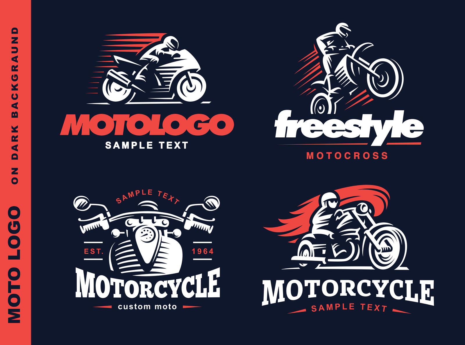
5 Must-Know Facts About Famous Motorcycle Logos
Posted on June 13, 2017 by Logo Design Tips and Tricks

Whether you’re obsessed with motorcycles or just want to know more about the history of logo design, this is the post for you.
In it, we’re sharing the top 5 facts behind famous motorcycle logos.
1. Harley-Davidson’s Shield
Of course, this is probably the most recognizable of all motorcycle logos.
But did you know it actually depicts a shield, and that it has been around since 1909?
Additionally, Harley-Davidson had its own special font created just for the logo. Now, it’s been used by multiple companies and designers to give a tough, chrome-filled look to countless products.
2. The History of Honda
Everyone can instantly recognize the gleaming, chrome silver “H” of the Honda logo. But the logo the company uses for its cars is different than the one it places on its motorcycles.
The main difference?
An upward-facing, bright red wing. Over the years (and during special occasions or limited releases) the wings have been many different colors. We especially like the basic black, or the more patriotic red, white, and blue.
It seems like a great excuse to keep collecting more motorcycles!
3. Ducati’s Evolution
If you’re a motorcycle buff, you may have noticed that Ducati’s logo has changed several times over the years.
When the company was first created in the 1920s, the logo included a bolt of thunder. Later on, Ducati’s motorcycles were branded with a bird in flight. Soon, red and green, the colors of the Italian flag, were added to the mix.
Today, Ducati’s logo is a red shield shape, with silver writing and a depiction of a slightly curved road.
Who knows what will be next?
4. Yamaha’s Musical Past
You’ve seen the Yamaha logo countless times, but do you actually know what it is?
Interestingly, it’s actually a tuning fork! This is because the founder of Yamaha wasn’t initially in the motorcycle business. In fact, he was a celebrated piano maker.
If you fall during a bike ride, this would be a great story to tell your motorcycle injury attorney!
5. The Truth About the BMW Logo
Lots of people wrongly think that one of the most famous motorcycle logos, the BMW logo, is an airplane propellor.
Well, it turns out, they’re wrong.
However, it’s not too much of a stretch, as the logo does have something to do with aviation. This is because the colors of the logo are actually based on the flag of the Bavarian region in Germany.
But while BMW actually did make airplanes during World War I, afterwards, it switched to making motorcycles.
How’s that for a fun cocktail party fact?
You’re Now an Expert in Motorcycle Logos!
Thanks to this post, you know much more about motorcycle logos than most — and you can use this knowledge to inform your own logo design.
What this article teaches us is that great care went into crafting these logos. Nothing was done randomly. Apply that same intention to your own creations.
For more design inspiration, check out our blog. If you’re ready to start making your own design, use our free online logo maker tool.
6 Qualities to Incorporate in Your Construction Logo
Posted on June 12, 2017 by Logo Design Tips and Tricks

Construction companies do much more than shape urban skylines.
They build the infrastructure, from roads and airports to educational and health facilities, which drive the nation’s economy and make the world a better place. But beyond identifying construction companies from the work they do, customers need to identify them by their corporate logos.
An eye-catching logo is a visual cornerstone for your business and can earn you respect and a good reputation in the industry.
With that in mind, here are top qualities you should incorporate in your construction logos.
1. Specificity
The construction industry has a number of sectors, including industrial sector, residential sector and the commercial sector.
Although large construction companies have subsidiaries specializing in various sectors, smaller companies typically focus on one sector of the industry.
As such, a good construction logo should indicate the sector of the industry your establishment is engaged in. If you build and renovate residential homes, the logo icon can be that of a residential home.
This ensures your logo targets a specific customer base.
2. “Green” Construction Logos Are a Cut Above the Rest
We are a green generation.
In the United States alone, 74% of adult citizens strongly believe in environmental protection.
Yet, buildings impact the environment in several ways. They account for 39% of all carbon emissions in the country, and trees are felled to produce timber used to build structures such as patio pavers.
Marketing your construction business as an eco-friendly outfit that uses sustainable building practices can give you an edge over the competition.
And what better way to send this message than design a logo with shades of green or a tree icon?
3. Unique
Humans have an attention span of a goldfish.
If your construction logo resembles every other logo in the market, you can count on potential customers to have a hard time recognizing your brand.
A unique logo should clearly distinguish your brand from the competition. Use icons, color palettes and typefaces that set your construction logos apart.
4. Versatility
Logos are used on various surfaces.
You can paint it on your company premises, imprint it on your letterheads, display it on your website, or put it on company videos. A versatile logo should look just as eye-catching as the original copy on all the surfaces you intend to use it.
Besides using graphics that can make your logo unique, balance it with graphics that can make improve its versatility.
5. Creativity
The construction industry is one where creativity is being combined with human ingenuity to achieve remarkable building designs.
Dubai’s Burj Khalifa is a mega wonder, and Manhattan’s proposed U-shaped skyscraper will be a site for sore eyes.
Construction company logos should exhibit a similar level of creativity, too. You don’t have to go with roofs, chimneys, bridges, construction tools and other common symbols.
6. Classic/Timeless
Nike’s iconic Swoosh was designed in 1971. Almost half a century later, the Swoosh still lives on, albeit with minor changes.
Your construction logos should have an element of timelessness. Logos that don’t grow old, if you like.
You don’t want to design a logo that will need a major redesign five years down the road. Giving your logo a refresh costs money, and you may lose ground to your competitors.
It’s Time to Construct Your Logo!
A logo is a crucial visual component of your brand. Get it wrong and your competitors could trump you.
Using the best design tools in the market goes a long way to creating construction logos that stand out, and also stand the test of time.
How to Craft a Distinguishable Accounting Logo
Posted on June 12, 2017 by Logo Design Tips and Tricks

With close to 90,000 accounting firms in the United States, you need to do everything possible to set yours apart from the competition.
You likely already know just how crucial branding is to the success of your firm. But good branding and client recognition both depend on one crucial foundation: your accounting logo.
What does it take to create an accounting logo that’s unique, branded, and eye-catching (while remaining professional?)
Read this post to find out!
1. Keep It Professional
Always remember that there’s a difference between thinking outside of the box and doing a disservice to your brand by going too far.
You can still create an eye-catching logo without relying on images of someone holding a bag of money or being showered in dollar bills. These images wouldn’t work for those trading stocks, either.
Inside of getting a little bit too wild with images and colors, focus on font/typography to distinguish your firm. You can create a font that’s all your own, or play around with ones already out there.
Also, keep in mind that relying on cliched images like columns, cityscapes, or official seals doesn’t make you look professional, either. If you use the same imagery as everyone else, how will your customer know your firm is a cut above the rest?
2. Ensure It Can Be Easily Resized
Especially as an accounting firm, it’s likely that your logo will go on all different types of things.
Your business cards, your website, even the front of your building. When you create your logo, make sure the text and images you use can be easily resized.
Choosing a logo that works with many sizes, surfaces, and backgrounds will help you to increase your brand recognition and keep you looking professional.
An easily resizable logo also makes updating it in the future much easier — you can tweak it and make small changes to get a fresh look.
Case in point?
Apple’s famous apple has been shown in a variety of colors, shapes, and sizes over the years.
3. Minimalism Is Best
First of all, a more minimal design communicates to customers that your services are good enough to stand on their own. It also implies that you’ve already built a solid reputation.
If you try to squeeze too much into your logo, it just ends up looking overcrowded. If you go wild with colors, it can be difficult to read.
To keep things clean, use lots of negative space in your design. Also, remember that there’s nothing wrong with black and white. Especially since minimalism is trendy now, you’ll strike the perfect balance between in-the-moment and ultra-professional.
Ready to Create Your Accounting Logo?
Thanks to this post, you now have a much better idea of what it takes to create a perfect accounting logo.
You might even have more than one in mind!
To test out different options, and to get a sense of which colors and fonts work the best for your firm, try our free online logo maker tool.
For more advice on how to create winning logos, check out our blog.
Capturing Clients With an Attractive Law Firm Logo
Posted on June 08, 2017 by Logo Design Tips and Tricks

Creating an effective law firm logo is a unique challenge.
It has to be professional, yet accessible. It has to be eye-catching, but not an eyesore.
And it has to do everything it can to set you apart from the competition in a field that’s getting more and more saturated.
Looking for advice?
Read on to learn how to create a logo for your law firm that works on all levels.
1. Your Font Is A Communication Tool
When you meet with a client for the first time, there are probably a few things you do. You put on your best suit. You polish your briefcase. You take the time to prepare your documents.
In short, you do everything possible to put your best foot forward.
Your logo should do the same.
Your first impression will be the font you choose to use. You could elect to have a professional create a specific font for your firm, or you could select an existing font.
Whichever you choose, your font needs to be legible, easy to read even from far away, and as impressive as your firm. To that end…
2. Minimalism Is Best
We know you may want to use your logo to cram in as much information about your firm as possible.
But a crowded logo will muddle your brand image and confuse potential clients. Rely on primary colors, minimalist images, and plenty of white space.
After all, the reputation of your practice should speak for itself.
3. Keep It Professional
A logo for a law firm is not the place for gimmicks. Sure, using bright pink or including a cartoon of a silly-looking criminal behind bars might make you memorable.
But you’ll be memorable for all the wrong reasons.
Resist the temptation to go a “trendy” route. Instead, project an image of strength and professionalism.
4. Explain Your Practice
Especially if you’re practicing in an area like D.C., that’s home to a high concentration of lawyers, you need to rely on your logo to help separate you from the competition.
Your logo should also reflect the specific area of law you practice.
For example, if you’re a family law firm, your logo image might include two adults and a child. If you practice real estate law, show a picture of a house. You may also choose to write the area of your practice underneath the image.
5. Avoid The Cliches
When you hear the phrase, “law firm logo,” a few images probably come to mind immediately. A gavel, the Scales of Justice, an official seal, maybe even a stack of legal books.
If you’ve thought of all these images within 5 seconds, it means that everyone else has, too. A quick Google search will also tell you which images and fonts are already over-used.
Avoid them at all costs if you want to communicate that you’re a firm that goes the extra mile for clients.
Create Your Law Firm Logo Today
Now that you’ve studied up on what it takes to create an effective and eye-catching law firm logo, it’s time to see your ideas come to life!
To get started, use our intuitive free online logo maker tool.
Still need a little help? Looking for additional information? Create an account with us today to get access to the best in logo marketing expertise!


