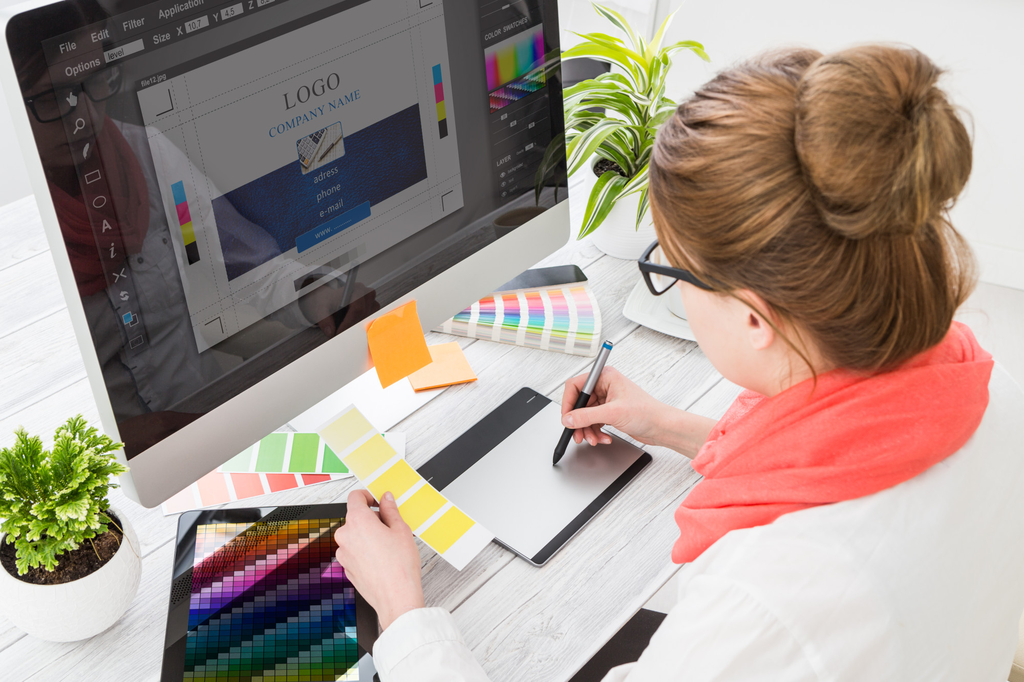
What Are the Fundamentals of Amazing Logo Design?
Posted on June 03, 2021 by Logo Design Tips and Tricks
The graphic design industry pulls in about 12 billion dollars per year. While that number took a hit in 2020, we’re seeing recovery take place which should get thousands of talented artists back to work.
Among the many things that graphic artists cook up for clients, logo design seems to be a constant theme among the work that gets ordered. Why? Because logos are important!
A quality logo makes up part of the foundation that multi-million dollar companies are built on. Logos affect buying behavior, recallability, and much more.
If you’d like to mine all of that value out of the logo you design or get designed, keep reading. Below, our team breaks down how to design a logo that’s amazing by leaning on a handful of foundational logo tenants.
Simplicity
Brevity is a tell-tale sign of wit. And certainly, logos need to communicate a level of subtle wittiness to make impressions on consumers.
Therein lies the importance of not overdoing a logo. It’s a regular mistake of many starting in logo design to add a litany of colors, shapes, and even text to their logos. That may achieve the aim of drawing an onlookers’ attention but leaving a lasting impression – we think not.
Think of the Nike swoosh. Think of the Coca-Cola logo, which is just white text on a red background. Both are renowned as being among the most successful logos in modern history, and neither leans on complicated conventions.
Sophisticated Use of Color
Color has meaning. While most people can’t describe color’s meaning expressly, many of us feel it.
Purple feels regal. Green elicits a love of nature. Red screams “alert”.
With color’s meanings in mind, think about the message you want to convey with your logo (more on that in a moment), and pick colors that best tell that story.
Scalability
Your logo isn’t just going to live in the upper-left-hand corner of your website. If you’re successful, your logo will be printed on business cards, on letterheads, posters, and perhaps on billboards.
With all of those places your logo could go, can you say that your logo’s design will port over and still retain its excellence? Only you and your graphic design logo team can answer that question. We simply suggest making sure you take the time to consider it.
Communicates Meaning
What’s the first thing you want your customers to think of when they see your logo? The answer to that question should be related to what you’re selling.
For example, we see the Nike swoosh and think “movement”—a perfect reaction for a sportswear brand.
If you’re selling food, your logo may not want to communicate a sense of movement. Maybe a sense of satisfaction or health would be better suited to catalyzing buying behavior.
Whatever it is you want your logo to say to consumers, pick that messaging. Don’t get caught in the trap of creating a logo that looks good and think looks are enough.
Can Be Recreated by Novices
Another foundational tenant of logo design, which touches on an earlier point we made regarding simplicity, is how easy your logo is to reproduce. Put simply, when you create a logo, ask yourself if someone could draw your logo freehand from memory.
If the answer to that question is no, you’re missing out on an opportunity.
A layman’s ability to reproduce your logo can tell you something about whether or not your logo is easily recalled. Again, the Nike swoosh is one that any able-bodied person can remember so well they could reproduce it with their eyes closed.
Aim for that level of recall/simplicity when designing your logo to get the most out of it.
Non-Fungible
Just because someone can recreate your logo doesn’t mean they should. To that end, if your logo looks almost interchangeable with other logos in the market, particularly in your market sector, go with a different logo.
The last thing you want is for, from the get-go, consumers confusing your brand for another one. That sort of brand confusion can cause long-term issues that even a rebranding effort won’t be able to fix.
Make sure the design you freehand or build in an animated logo maker has originality in its DNA. Make your logo unmistakably you.
Powered by Feedback and Revisions
No great logo is created with a single stroke of a pen. Logos that rise to the top are almost always byproducts of designs being fed back on, revised, and fed back on again.
Relish that process of doing and redoing. Know that every time you pick up your pen or mouse to take another pass at a logo, it’s going to get a little bit better.
If you walk away with one foundational bit of wisdom regarding logo design, let it be this – To error is human, to edit is divine.
We Wish You the Best With Your Logo Design
Our team has walked you through several logo design foundational elements that we’ve found serve as the basis for successful projects. As a graphic designer or a person that is hiring graphic designers, keep our tips in mind.
The more you recall our guidance and integrate it into your logo building project, the more likely you’ll walk away with a logo design that we’re confident will make you happy and will set your business apart.
The world is filled with company logo design tools, logo design app options, and limitless artistic perspectives. If you’re having trouble sorting through all of that, our team can help.
Continue exploring more of the logo and art posts on our blog and keep fulfilling your need to learn!
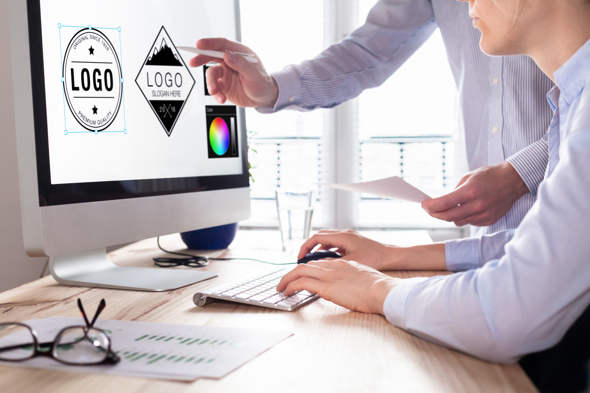
7 Factors to Consider When Hiring a Logo Design Service
Posted on April 28, 2021 by Logo Design Tips and Tricks
A business logo is everything. It’s the first impression, the attention grabber, the memorable aspect of your company. First impressions form in the blink of an eye so your logo has only one-tenth of a split second to make an impact on someone. It better be good.
To create the perfect logo for your startup business, you need to find the best professional for the job. But how do you do that?
Keep reading for a complete guide to seven considerations that you need to make when choosing a logo design service.
1. What Logo Design Experience Do They Have?
When you start talking to design companies or independent graphic designers, it’s important to find out what kind of logo design experience they have. You don’t want to put your logo in the hands of a designer who is trying to figure it all out for the first time.
Find out the type of experience they have. Sure, they may have great ideas for logos, but have they ever done client work? This will give you an idea of whether they’ll be able to take your ideas and represent them visually.
Have they provided logo work for companies in many types of industries or just one? The more industries they have experience in, the more creative and competent of a designer they are.
Consider experience in-depth, look at portfolios, and ask a lot of questions before choosing the best logo design company.
2. Do They Meet Efficiency Needs?
Designing company logos is no easy feat. It can be a time-consuming process, especially if there is a back-and-forth between a designer and an unhappy client (in this case, you).
Finding an efficient design company is important, especially if you have time-sensitive needs. You want to rest assured that they are completely committed to your project and meeting the deadlines.
For this to happen, you need to be clear about your expectations from the start to find a company that can meet your needs. Be wary of companies that make unrealistic promises and use your critical thinking.
3. The Ability to Scale
When you first start a business, one of the foundational steps is creating a logo that represents your brand. This is such an exciting process, as you begin to flesh out the unique personality of your business.
However, don’t forget that your company logo needs to evolve with your business. It won’t just be splashed on a sign outside of your business. Think about the future and find a designer that will consider the future with you.
You’ll need a logo for your website, business cards, merchandise, and more. Find a logo design service that has the ability to scale. That can merge their design skills with web development and typography to take your logo wherever your business goes.
If you’re searching for all-in-one design and marketing services then click this link: https://tilladelsemarketingagency.com/
4. Communication is Key
When you’re brainstorming ideas for logos with a professional service communication is everything. You probably have an idea of what you want but find it difficult to describe it. Or perhaps you don’t have a visual idea but you know what you want your logo to represent.
Whichever logo service company you choose, they need to be able to listen and communicate well. They should be able to communicate their design choices to you in a way that you understand. This is especially important if you are not a designer yourself.
5. Consider References and Reviews
As with any service, always check out references and reviews. The last thing you want to do is learn the hard way when you’re out of pocket with a terrible logo or nothing at all.
The internet has all the information you need about most big companies and many smaller ones. Look for reviews and compare the feedback from customers from different logo companies. Are customers happy? What were the major issues? You’ll be able to identify a bad quality company pretty quickly.
Similarly, ask around for references. If you pass by a business with an amazing logo, step inside and ask who designed it. Turn to your friends and family members for recommendations. The more information you can collect, the better.
6. Comparing Designing Fees
Unfortunately, budget is always a consideration that you’ll have to make as a business owner. First of all, you need to define the budget that you’re willing to set aside for your logo design.
When you meet with designers you need to ask for a breakdown of their costs. Either get a direct quote or an example of estimated costs.
Comparing designing fees across different companies is going to help you make your decision — especially if your budget is very restrictive. Be aware of designers who quote you an incredibly low fee as they may lack experience and skill.
7. Find Someone You Like
Your logo is going to be the face of your business. It’s important that you get it exactly right. In order to do this, you need to work with someone that can relate to you and your ideas. Someone that you can communicate with. Essentially, someone that you get along with.
You’re going to run into a lot of problems if you hire a designer that is exceptionally creative but that you clash with.
Find the Right Logo Design Service for You
When you’re looking for a logo design service for your business, it’s important to find the right professional for the job. Look for a company that is creative and experienced, compare the costs, and ensure that communication is effortless.
Did you find this post interesting? Our site is full of awesome advertising and marketing content to keep you up-to-date and informed — keep exploring for more!
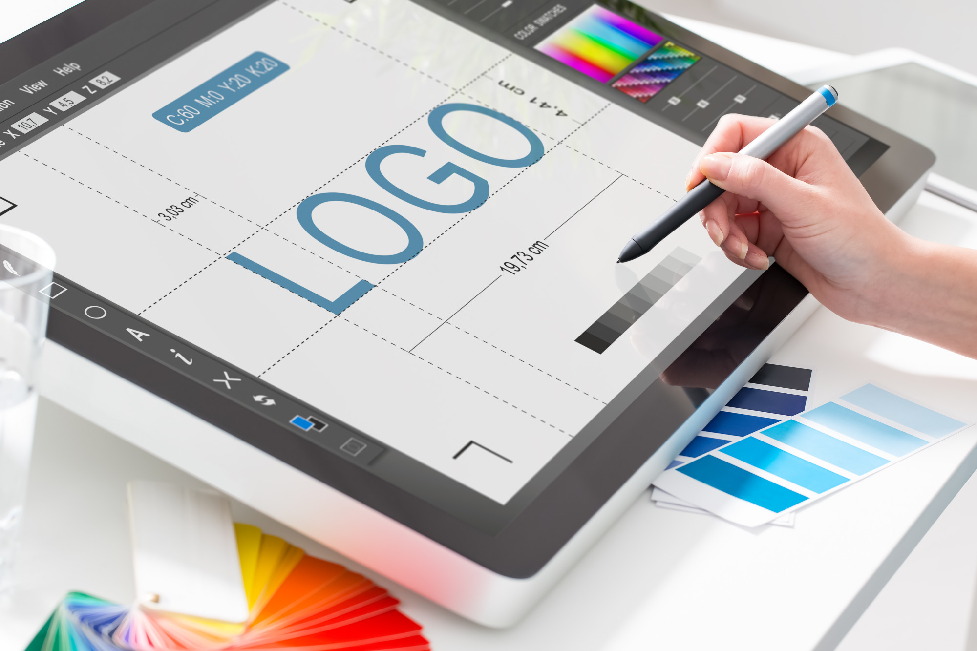
8 Things You Need To Consider When Designing a Logo
Posted on January 24, 2021 by Logo Design Tips and Tricks
Your logo is one of the most important aspects of your business. It can set the tone for your style and be the one feature that customers remember. That’s why it’s so essential to get the logo right.
But what makes a good logo? There isn’t just one element that makes a logo a winner. All good logos have multiple amazing elements that come together to create something memorable.
Then if there are so many contributors to a good logo, how do you create one? Here are eight tips to consider when designing a logo.
1. Consider Your Audience
Before you start your business or brand, you have to know who your target audience is. This will help you make all of the future decisions that will help grow your business or brand. But you also need to take your target audience into account with your logo.
That’s because your logo helps to create your brand identity. Your logo can help establish the service or product you offer and who that service or product is for.
Your brand logo will look different if you’re target audience is children than if your target audience is young adults. Your audience can determine all the other factors within your logo.
2. Trendy vs. Unique
Your logo should keep up with the trends so that it feels current and refreshing. But there is a fine line between following the trends and being too trendy. You don’t want your logo design to stand out in the wrong way.
But you do want your design to stand out in a unique way. To get ahead of competitors, you should get creative with your logo design. No matter what style you choose, your logo should relate to your product or services.
Choose images and elements that relate to your brand. Hardware tools don’t make much sense on a logo for a retreat and spa.
3. Lean Into Typography
Typography can make or break your design. The font within your logo is just as important as any other design element. Your typography should complement the other elements, be easy to read, and make sense for your brand.
If you have a lot of delicate strokes and thin lines, then a font with bold, heavy strokes may look out of place. Consider your product or service when choosing the typography as well. A hardware store will need a different font than a tech company.
Above all, your typography should be easy for your customers to read. If no one knows what your logo says, then how are they supposed to find your business?
4. Conversion is Everything
On the technical side, your logo should be able to convert to different file formats. JPG, GIF, PNG, WMP, and TIFF are only a few options you should explore. They allow for your logo to render as a single element rather than separate elements.
This allows you to scale your logo up or down and be used on the web and printing a logo. Whether you design or your own logo or have it professionally designed, you want to have as many file formats as possible.
This will allow you to effectively use your logo on various mediums while maintaining the design’s clarity.
5. The Logo Has to Look Good
It comes as no surprise that a logo has to look good. If a consumer is faced with a decision, more often than not, they will choose a business or brand with a better design. But your logo also has to look good on everything.
You won’t use your logo in just one format because you’ll want to use it for various purposes. The logo has to look just as good small on a business card as it does large, on a banner, and everything in between.
Consider also the material of promotional items. From cotton t-shirts to ceramic mugs to paper business cards, you want your logo to look good on all mediums. Allow your logo to be flexible enough to work on any medium at any size.
6. Don’t Over Complicate
When it comes to a logo, simplicity is better than complicated. It may seem tempting to add in a lot of elements to get your point across. But with a logo, less is always more.
Think of some of the most well-recognized logos. They utilize a few colors, have a memorable, or may even be only one image. A simple design looks best when sticker printing, letterheads, or on social media.
Avoid overcrowding your design and pare down your logo to the essential elements. A simple image or striking font can be more memorable and pleasing to the eye.
7. Think About Color
Color can be one of the most useful tools in your logo design. There are so many brands, large and small, that can be recognized by color alone. Your logo color can determine the entire feeling of your brand.
Choose shades that complement each other by using a color wheel. You should also look into the meaning behind color to help you make your decision. As important as color is, you also consider how your logo looks in black and white.
8. Do Your Research
This is one of the most vital steps you can take when considering a logo design. Do some research on your target audience as well as competitor brands and businesses.
Find out what kind of logos customers best respond to and utilize those elements in your own branding. You can also see the logos that your competitors are using to stay ahead of the trend.
Designing A Logo That’s Memorable
Have you ever scrolled through social media or browsed the internet and stumbled upon a business that had a great memorable logo? Doesn’t it make the brand and business feel more cohesive and trustworthy?
If you had a choice between two businesses, with one having a stunning logo and the other only having plain text, which are you more likely to purchase from? That’s the power of designing a logo that returning and potential customers can’t forget.
But there’s much more to creating the perfect logo than meets the eye. These eight tips are great to consider before you start designing a logo for your business or brand.
Did you find this article helpful? Share it with a friend and check out more marketing and advertising advice.
Top 10 SEO Logos of 2020
Posted on January 10, 2021 by Logo Design Tips and Tricks
The McDonald’s logo is worth $110 billion, which is the equivalent value of 275 White Houses.
Top brand logos are worth much more than even the most expensive real estate in the world but many companies hardly give their designs a second thought.
While logos in the digital marketing world may not be worth dozens of White Houses, there are still some good ones around. Let’s look at the top 10 SEO logos of 2020.
Common Design Cues in SEO Logos
If you compare different companies’ logos in the SEO and digital marketing space, you’ll see some common design cues. They often focus on abstract shapes and symbols that indicate growth or ideas.
Abstract Shapes
Illustrated logos aren’t very common with digital marketing services. Most logos use abstract geometrical shapes and designs meant to illustrate their technological focus.
These shapes also tend to have some kind of relevance to business growth, website traffic growth, revenue growth, or other things that would be a logical goal for any companies working with them.
Images of Graphs
Graph imagery is also popular with SEO companies. You’ll see a lot of line or bar graphs in logos, alluding to the company’s ability to increase your conversion rates, revenue, website traffic, and so on. These logos always show an upward trend in the graph.
Strategy and Idea Metaphors
Images like lightbulbs and mind maps are also popular with digital marketing firms. These logos are meant to show how they can help you come up with new ideas and strategies to grow your business.
Communication Symbols
Communication symbols like speech bubbles, messaging icons, and envelopes are also popular in SEO branding. The internet is all about communication in one form or another so this is a natural fit for any web-based service, digital marketing or otherwise.
Top 10 Digital Marketing Logo Ideas
There is quite a bit of variety in the top SEO logos for 2020. Some use abstract symbols, others typographic or mascot-based logos, while some are quite unusual.
Abstract Symbols
Abstract logos often use symbols that have a symbolic meaning in addition to looking good. This helps them stand out from their competition and become more memorable in their market.
1. True North Digital Marketing
True North’s logo uses a line-based design similar to a mind map but also includes a “compass” arrow in the center. This arrow is pointing up, naturally — to true north.
2. Growth Pro
Growth Pro has an image of a plant or flower growing out of what looks like a stack of coins. This is a good metaphor for SEO and PPC marketing, with the money you put into your campaigns creating growth for your company.
3. Hammer and Stone Agency
The Hammer and Stone logo uses iconography that looks exactly like a hammer and stone. Neither one is a literal interpretation but there’s little doubt that’s what the design is meant to be. It uses negative space effectively to create the handle of the hammer within the stone icon.
Typographic Logos
Typographic logos focus on the brand name by making it the focus. But they use fonts and type designs to make the name itself into an icon for the logo.
4. BRND.TV
BRND TV is a video-based digital marketing platform. Their logo is simply the name of the company but it focuses your eye on the BRND name by using a smaller font for “TV”. The logo also adds a bit of color by way of a green highlight under the “TV” text. That green is used throughout their website to create a consistent look and feel.
5. SearchQuake Marketing
SearchQuake Marketing uses a simple two-letter “SQ” design for their logo. The letters are two different colors and overlap slightly. The line where they overlap uses a jagged style that’s meant to look like a fault line or the tracking line on seismic equipment, bringing to mind an earthquake.
6. Befrank Digital Marketing
Befrank Digital uses a simple logo design that incorporates the “B” and “D” from its name into a single shape. That shape also looks like a magnet, indicating how they can help you draw in more website visitors and clients.
Animal Mascots
Companies that have animals in their name often use that animal in their logo in some way. Sometimes it’s a major part of the logo and sometimes it’s more subtle.
7. Bear Fox Marketing
Bear Fox Marketing uses both animals in its logo. The fox is superimposed on the bear using negative space. With a quick glance, it looks like the bear is stepping forward, indicating how the agency can help move your business forward.
8. Dog Bite Media
Dog Bite Media has a simple text-based logo design with a caricature of a dog’s head. This design is about as straightforward as you can get, with an easy-to-read name and a simple graphic to help improve its branding.
Unusual Designs
Some logos are a little more offbeat. They may use humor as part of the logo or they sometimes combine two seemingly unrelated ideas in the design.
9. Clever Digital
Clever Digital’s logo is an egg with glasses. This evokes the stereotypical “egghead” that knows a lot about computers and technology. The idea here is that they’re those eggheads that can help you grow your business online.
10. Hyper Ghost Media
Hyper Ghost Media has a mostly typography-based logo but the “H” in Hyper has a ghost instead of the horizontal line. This is a straightforward way to create a brandable logo from the company’s name.
Which Logos Are the Most Memorable for You?
Which of these SEO logos are the most memorable for you? If you’re thinking about a new logo for your company, consider what makes you remember these and see if you can work something similar into your own design.
Be sure to check out the rest of our blog for more helpful ideas about designing great logos.


