Increase Website Traffic and Boost Your Sales: How to Create Content for Lead Generation
Posted on November 20, 2020 by Logo Design Tips and Tricks

As marketers, we all know how necessary content is to any marketing strategy. We can achieve any marketing goal we set by producing high-quality content.
Yet, you might be wondering how to create content that specifically targets your clients and translates into lead generation to increase your revenue.
With powerful content, you’ll be increasing your website traffic and boosting your sales in no time. We have all the tips that you need to know on how to produce accurate content and attract the right people.
Be sure to keep reading for our guide on how to create content for lead generation.
Research Your Target Audience
When creating great content, you need to have your target audience in mind. Do you know who your target audience is? If not, then you have a bit of homework to do.
First of all, figure out who is going to be buying your products. How old are they, and what is appealing to them? Defining the person that will find inspiration by you and your brand is the first step in creating compelling content.
Once you know who you’re writing for, then you need to dig a little bit deeper. Figure out what types of things they will want to read about or watch. You’ll be doing a lot of research about the person that will be buying your products.
Knowing who your target audience is and writing or creating with them in mind will help you to make content that will increase your website traffic in no time.
Include Keywords
We’ve all heard how influential search engine optimization is when talking about content building. How can you incorporate SEO into your content to generate more leads? By including important keywords that potential clients will search.
Taking the time to figure out which keywords are significant in your niche is one of the most important aspects of content creation.
When you’re thinking of keywords for your niche, you want to view it as things that your target audience would search to find your products or services.
The thing about using keywords when creating content is that there isn’t a right or wrong way to do it. You might want to experiment and figure out which ones work better for you. As long as you’re creating engaging content that your audience enjoys, then you’ve completed half the battle.
Include a Call to Action
When you’re creating content for business, one of the pillar things you should include is a call to action. A CTA is a message to your followers to let them know what you want them to do once they’ve finished consuming your content.
What should your followers do after they’ve read your post?
Most businesses will want potential clients to contact them for availability, and they will include that at the end of their post. Some CTAs will come at the beginning of a video and will tell watchers to subscribe or buy a product.
Make sure that you include a CTA in all your content so that you can let potential customers know what you want them to do.
Create Engaging Introductions
No matter what type of content creating you’re doing, the introduction needs to be engaging and attention-grabbing. Potential clients need to be interested the moment they open your article or start watching your video as you want them to take away something from the content that you create.
If your introduction isn’t engaging, then people will tend to click off of it before they get to the main part of your content. As a marketer, this is something that you don’t want to happen.
Figure out how to grab your audience’s attention as soon as they find your content. If you can do that, then your audience will stick with you throughout the entire piece. Doing this will help you to generate more leads and traffic to your website.
Have Strong Titles
What is the number one thing that makes you click on a page on the internet? It is the title.
Having a strong title for your content is essential to get traffic to your content and your website. You want to make sure that your titles are interesting enough for people to want to see all about your content.
Another major aspect of titles is that they should also include keywords so that they can come up in the search engines. Titles are key for search engine optimization as well!
As much as you want to make your titles sound like clickbait, be sure that they’re honest and exciting. A potential customer would rather read a true title and article than click on a boring one because it has an obscure title.
Promote Your Content
Now you know that you can create compelling content, but what about the importance of content promotion? You need people to see your content so that they can get something out of it.
Once you’ve created an interesting piece of content, then make sure that you’re promoting it on all your social media channels for your followers to see. Then your followers might even share it with their followers. Doing this will give you even more exposure!
Promoting your content will help you to generate more traffic to your website, and in turn, can generate more revenue. You want people to see the awesome content that you’ve created, so do your best to get it out there and get more eyes on it.
How to Create Content for Lead Generation
Now that you know all the tips and tricks on how to create content for lead generation, you can watch your sales boost and your website traffic increase. Be sure to stay consistent with your content creation as dedication will help the leads pour in.
If you’re looking for more digital marketing advice or tips on business, technology, education, lifestyle, law, or travel, then our blog is the place to be. Make sure that you bookmark our page so you can keep coming back for more helpful advice and read more posts like this one.
3 Free Construction Invoice Examples for Instant Billing
Posted on November 20, 2020 by Logo Design Tips and Tricks
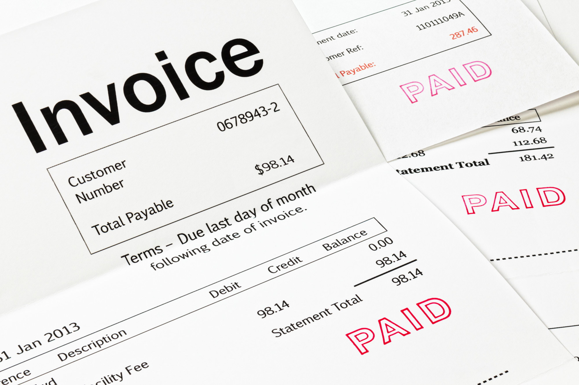
According to a 2019 survey, slow payments cost the construction industry a whopping $64 billion last year.
These are the costs associated with having to pay for things like materials and wages long before receiving payment from the construction client.
If you’re part of this industry, you’re all too familiar with this process by now, but did you know there are ways around it?
Read on for ways to streamline your payments and learn about construction invoice examples that just might help speed up the process.
Ways to Get Paid Faster in the Construction Industry
According to this guide to managing your cash flow in the construction industry, one way to speed up payments is by offering discounts on early settlement.
You could also offer multiple payment options, like:
- Bank transfer
- Cash or Check
- Credit card
- PayPal
Stating these options and offers on your invoice is the quickest and most effective way to get this information through to the finance department of your client. Hopefully, this can also help your payment edge closer to the top of the pile.
1. Microsoft Word Construction Invoice Examples
Although Microsoft Office isn’t a free suite of programs, most people already have it installed on their computers or can access it via a friend or family member.
You can also sign up for Microsoft Office by paying an affordable monthly premium or you can find an open-source word processing program online that offers similar features.
The MS suite comes with a host of pre-installed templates for invoicing or you can download them from the internet.
Once you’ve got your invoice template open, all you need to do is the following:
- Input your company contact details in the top-left box
- Add the invoice number, date, and reference in the top right-hand box
- Complete the box for the customer’s name and details
- Enter the billing period
- Work out the cost per item and line totals
- Add it all up at the bottom and input the sales tax amount
You can add a note about any special payment terms and conditions at the bottom of the invoice.
2. Creating Invoices in Microsoft Excel
The procedure for Microsoft Excel invoices is the same except this program will do all the adding for you and the layout is slightly different.
Most Excel templates have a space for your company details in the header of the page. The client’s details go on the left just below that and the invoice number, date, and billing period go alongside that.
3. Free Online Templates for Construction Invoices
Microsoft programs are pretty flexible when it comes to custom-designed invoices, but many free online sources offer a more professional look than these old standbys.
Some of the best ones are:
- Lano
- Invoiced
- Invoice Ninja
These templates suit small businesses perfectly and are simple and quick to use. They’re also excellent alternatives if you can’t access Microsoft Word or Excel.
Find a Better Way for Your Business
While these construction invoice examples might help you to get paid faster, there are plenty of other ways to cut costs and fine-tune your business procedures to save money and improve cash flow.
Keep browsing our blog for more tips on how to run any business more efficiently.
Effective Ad Campaigns: A Quick Guide to Preparing Advertising Plans
Posted on November 20, 2020 by Logo Design Tips and Tricks

Big corporations spend billions of dollars on advertising plans each year. But as a small business owner, you simply don’t have those resources to work with. More importantly, you can’t afford to invest in an idea that won’t yield positive results.
The good news? You don’t have to worry about that issue any longer!
In this article, we’ll tell you how to create advertising plans for small businesses that are almost guaranteed to be successful. We’ll tell you what mistakes to look out for, as well as how you can sustain your success long-term.
Start by Setting Some Goals
If you’re new to advertising, figuring out how to get started can be quite difficult. The entire process can be overwhelming for newcomers, which can often lead to you not starting your marketing efforts at all, which of course isn’t a good thing.
So, where is a good place to begin with advertising strategy? Well, we recommend that you start by writing down some short-term and long-term goals that you hope to achieve.
This will not only help you clearly define what it is you want from advertising but will also help you pick a direction to go in. It’ll also give you something you can show a professional, should you decide to invest in any help with your marketing needs.
What are some good short-term and long-term goals? Well, for short-term goals, pick something simple, like posting on a social media site every day for a month. A long-term goal could be doubling the size of your customer base in a year or two, it just depends on you and what you think defines success.
Set a Budget and Stick to It
Once you’ve got your goals in place, it’s time to start figuring out how much money you can afford to spend on advertising. We’ll be honest, you don’t need to break the bank to get the results that you’re looking for. You do, however, need to be prepared to spend some money, as well as a great deal of your own time, on advertising.
If you decide that the help of a marketing expert is needed, you’ll need to make sure that you’ve budgeted for that. Think you do the job yourself using affordable-yet-effective marketing strategies? That’s fine, as long as you can make sure that you have the time in your schedule needed to do so the right way.
As you go along, you need to find creative hacks that you can use to maximize your budget. Things like picking efficient advertising strategies (more on that later), or liming yourself to a few basic ideas, are the best ways to do this.
Know Your Target Audience
Want to create a stronger connection with your customers and clients? Trying to find ways to humanize your brand and create a unique voice that people love? To do both of these things, you first need to know your target audience and what they expect out of you marketing-wise.
Having a firm grasp on your target audience, and what they like, will help you make all marketing-related decisions going forward.
The first step to knowing your target audience is knowing where they spend the majority of their time. For example, if you do research, and you determine that your target audience is active on the social media website Twitter, investing resources into Twitter is more than a good idea.
You also need to have a strong idea of what type of content they like, as no two target audiences are the same. Again, this will help you make the tough decisions later on, like what kind of content to create. That’s why you need to find the answers to these questions early on in the process.
Scout the Competition for Ideas
Not sure where your target audience is located at? Don’t know what kind of content they’ll find the most enjoyable? Don’t worry, you can get the answers to all of these questions, plus more useful information, by scouting your competition for good ideas.
A pro tip? Write down the name of your 3 biggest competitors and do some Googling. Under each name, jot down how many social media followers they have on each platform, if they have a blog, as well as if they run TV or radio advertisements.
Odds are you’ll notice a trend involving all three competitors. They’ll most likely have the most followers on the same social media platforms. And if they advertise in any other way, they probably all use the same concepts and ideas to do so.
You can take these core principles, tweak them, and make them your own. That way you can figure out what and where you need to invest your resources, allowing you to find success faster.
It goes without saying, but when you’re scouting your competition for ideas, be sure to avoid stealing ideas outright. Not only will your competitors notice this, but so will your target audience, which isn’t what you want.
Focus on Two or Three Ideas
After you’ve set your goals, and scouted your competition for ideas, you should have all the information you need to start creating a solid advertising plan. While your biggest questions should be answered by now, it’s important to note that there are still a few major mistakes that you need to be sure to avoid.
For example, it’s easy to get too excited and try to invest in a ton of fun ideas. This usually leads to you spreading your resources (and yourself) too thin, which means positive results are unlikely.
Our advice? Stick to two or three marketing strategies and let the rest of your ideas go. This will allow you to put all that you have into each of those ideas, maximizing your chance for success.
Because you’re only picking two or three ideas to pursue, make sure that they’re strong. If you’ve done your research properly, you should have a ton of confidence in your choices. So, if you still have doubts, go back to the drawing board and start over.
Invest in Efficient Marketing Strategies
Working with a small advertising budget? Worried about wasting valuable resources on ideas that won’t help you reach your goals? Start out by invest in affordable-but-efficient strategies that offer a low risk but a high reward.
We’ve touched on this already, but social media marketing is something that can be done in-house and on a small budget. So, if your target audience is active on a site like Facebook, you can use their ads system, and behavioral targeting, to advertise to those users directly.
Email marketing and blogging are two more digital advertising strategies that are worth considering. Both require a great deal of effort on your part, but when done correctly, can yield big-budget results.
If you’re looking for affordable, traditional marketing strategies, look into getting some fliers made for your brand or business. Fliers, along with magnets and stickers, are affordable to make and can help you get your name out there in a hurry.
Track Your Analytics Closely
Almost every digital marketing strategy comes equipped with an analytics feature that you can use to track your results. You need to pay close attention to those numbers, as they’ll tell you what kind of content works best and what doesn’t.
This information is crucial when crafting future content plans. It will also help you keep up with progress, helping you determine if you’re close to reaching your goals or not.
For traditional marketing strategies, like fliers and radio advertisements, you may have to work harder to track these numbers. The best way to do this? Ask your new customers how they found your company. Keep track of their answers, and you can check back over time and see what strategies gave you the best results.
Make Necessary Changes Overtime
Once you start advertising your brand or business, it won’t take long for your numbers to start talking to you. Remember, those numbers are your customers and clients, and their feedback, which is why you need to pay attention to them closely.
Odds are your numbers are going to tell you to make some changes. Make those changes, and be receptive to change, that way you can maximize your advertising efforts.
Still Need Help Creating Advertising Plans?
When it comes to creating advertising plans, the process isn’t as complicated as it may seem on paper. As long as you do your research, and you know what to look out for, you should be able to create a strategy yourself that works for you and your brand or business.
Looking for more advertising tips and tricks? Check back with our blog often, as we’re always posting new and useful information for marketers.
5 Reasons to Integrate Ketubah Designs into Your Wedding Logo
Posted on November 19, 2020 by Logo Design Tips and Tricks

Weddings are the joyous celebration of a new life together, and what better way to express your love and commitment than with ketubah designs. As the ancient document of your commitment, you may be planning to get it designed in an intricate and beautiful way.
By finding a logo maker that can create a logo reminiscent of your ketubah, you’ll have another timeless piece of art to use during your wedding and beyond.
With this in mind, read on to learn our top five reasons why you need to integrate your ketubah into your wedding logo today!
What is a Wedding Logo?
It first helps to know what a wedding logo is and why you need one. Although many of us think of logos as a way to differentiate one business from another, we can also use them as personal symbols. In the case of weddings, logos can be symbols of health and wellness or the commitment you’ve formed with your loved one.
Although logo is a modern word, they’re similar to the coats of arms used centuries ago as a symbol of a family’s proud heritage. In the Victorian era, the wealthy and middle-class had elaborate personal monograms to mark letters and their possessions.
Ketubah Designs for Your Logo
The hardest part about logos is agreeing on a design that you both love. However, if you have a ketubah for your wedding with an intricate, beautiful design that you love, you can use the ketubah designs for your logo as well! Here are a few reasons why:
1. Cohesiveness
When it comes to designing your perfect wedding, creating a cohesive design and color palette is harder than it seems. However, if you’ve had your ketubah designed recently and are in love with its colors and design, you can use it as inspiration!
Choose a few of your favorite colors and use them throughout your wedding. If there are design elements that you enjoy such as trees and birds, you can use these as well.
A logo that looks similar to your ketubah will help your wedding look even more cohesive and united.
2. Beautiful Stationery
Designing wedding invitations, reminders, and programs can be just as hard as the wedding reception itself. However, a logo that’s designed with elements from your ketubah can cut down your workload significantly. A simple logo on the front of your cards can look elegant, minimalistic, and chic.
A logo with your ketubah design on your wedding program can also look beautiful and tasteful.
3. Timeless
Many people shy away from logos because there’s the chance that they might appear tacky or that the wedding is branded. You don’t want your wedding to appear like a networking event! You can blame this on poorly designed logos.
These logos often don’t match the couple’s personality. Logos made from a template may have been used by hundreds of other couples and don’t have any unique features.
A custom logo designed with your ketubah in mind is a timeless reminder of your love for one another.
4. Variety of Uses
One of the best parts of a ketubah logo is that you can use it throughout your wedding. For example, you could print your design on thermal labels to easily brand party favors, gift bags, or even personalized invitations with your wedding logo. You can offer temporary tattoos of your wedding logo as a fun activity during the reception. You can shine a spotlight on the dance floor with the logo. You can even design party favors featuring your wedding logo.
Your wedding logo can be added to your wedding cake as a topper or as an intricate design directly on the cake itself. Even better, you can even hand out coffee cups, wine bottles, or beer bottles with the log featured.
There are a variety of options that make the design and cohesiveness of your wedding easier.
5. After the Wedding
Last but not least, you’ll be able to use your logo well after the wedding is over. During holidays, you’ll be able to use it on holiday cards. Some couples may opt to have pillow covers made that feature your logo, or you can create a minimalistic piece of artwork that hangs next to the ketubah.
If you want to be more subtle with your logo, you can use it to create beautiful necklaces. Couples can also request that their wedding photographs use the logo on the front cover if they’re purchasing a custom-made wedding album.
Where to Find a Wedding Logo Maker
Designers who created your ketubah design may be able to make you a logo that matches as well. However, if you’re on a tight budget, you can use a logo maker online as well. It’s important to be aware that it can take time to create a logo that you love, especially if you don’t have design experience.
However, if you follow a few tenets of logo design as well as have a variety of inspirational logos saved on your phone or computer, it’s possible to get the look you desire!
A Beautifully Designed Wedding
Prepping for your wedding is no small task, especially if you have no idea where to start. However, by incorporating ketubah designs into your logos and the rest of your wedding, you’ll find that you can easily create a cohesive and timeless looking wedding that you both love.
Even better, find a logo maker that can design your logo based on your ketubah design. This is a great way to enhance your options as well as have a timeless piece of art that you can enjoy.
Ready for more logo tips? Keep reading our blog for more informative articles!


