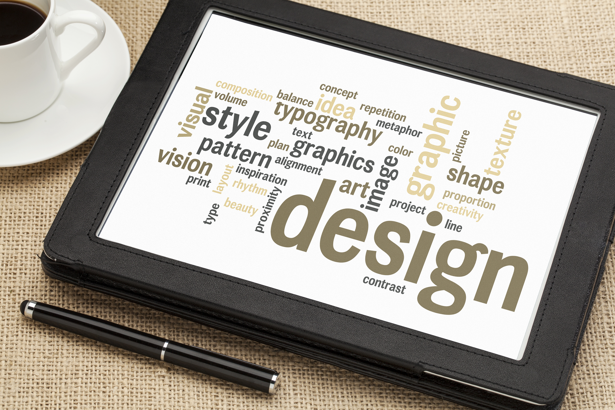
How to Get an A+ On Your School Logo Design
Posted on June 27, 2017 by Logo Design Tips and Tricks

A school logo is not just a logo. It’s an image that unifies students and represents everything that your school stands for.
Because of its overall importance, you’re left with no option but to ace your logo design. Of course, your task would be easier if the logo didn’t have to appeal to hundreds of students with different interests and backgrounds.
It’s undoubtedly a big task, but you can get it done with a bit of research. Luckily for you, we’ve already done your homework for you. Keep reading to find out how you can get that A+ on your school logo design.
Color
For many people, creating a logo entails choosing an eye-catching color. When creating a logo for a school, however, the process of selecting a color is different.
Simply put, a school logo’s colors should be symbolic. They should represent the school’s ideals and perhaps reflect the school’s history and location. They should also complement the school’s branding strategy.
For example, if regal elegance is one of your school’s core themes, purple might be a good call. If your school is located in a town which is known for its flowers, perhaps an earthy, floral design would work well.
Coordination
Your logo won’t just stand on its own. It must not only complement the other elements of your branding strategy, but it must complement your mascot and merchandise as well
A school that already has a jaguar as a mascot should take that into consideration when creating a logo. Plus, the logo has to look good on merchandise and stationery.
Personalization
In some ways, a school is a business. Even so, you don’t necessarily want to run it like a business. You’re dealing with young people, and those people want to see that your school stands for everything they believe in.
For this reason, your school logo design should be personal to the student body. This is important for every school, probably more so for a virtual highschool or college. After all, a logo is a huge part of a virtual school’s presence since there isn’t necessarily a physical location attached to it.
Check Out The Competition
We’re in no way telling you to plagiarize your school’s logo. That would be inappropriate. We’re instead suggesting that you take some pointers from your competition.
Pay close attention to how they design their logos. What elements of their logos do they prioritize? How much text do they use?
These are important things to note if you want your logo to be competitive.
Create A Great School Logo Design
Creating a school logo is tricky work. You can pass the test with flying colors, however, if you put in some hard work.
Remember that you’re not alone in your search for the perfect logo. You’ll always have staff members and students supporting you.
We are rooting for you! To make it easier, use our Logo Maker to get the job done. All you have to do is create an account to start building the logo that will represent you and your student body.
The Key to Developing Recognizable Tech Logos
Posted on June 27, 2017 by Logo Design Tips and Tricks
When you’re launching your tech startup the idea may be the only thing on your mind.
When big business does focus groups to find out what their consumers think, the most important thing that sticks out in their minds is the logo. Not what you do or how you do it, but the little symbol that represents your company.
In this time of immediate gratification, the logo has become your initial introduction. This is how your potential consumer makes their first subconscious decisions about your company and whether they will do business with you.
In the tech startup space, these initial interactions are even more important to becoming part of the discussion. To become popular you have to stick out. The easiest way to make an immediate mark is to have a stellar logo.
Here we talk about things to consider when developing tech logos and how important it is to tell the story of your company.
Think About The Back Story of Your Tech Logo
When Apple first launched their logo was a dreamy storybook picture of Newton under a tree. As the company developed the logo changed too and has landed on that sleek silver apple that we all recognize today.
People love to see an evolution but more than that they love a story.
The more of a back story that you can have about your logo the better. You can then include this story in your marketing materials and make yourself more credible in your customer’s eyes.
You may want to go a bit literal like Cicayda.com whose logo is their name with the little “i” looking like a cicada.
If you’re working with a designer you want to talk to them about the formation of your business. Tell the story behind the idea. Give the designer something to run with.
Everyone knows the back story of Apple, right? We can all imagine Steve Jobs and Steve Wozniak sitting in the garage of that house talking about a bright new future.
We can see them hashing out how it was going to work putting a personal computer into the homes of millions of Americans.
We see Steve Jobs making call after call to hundreds of potential investors trying to convince them to give this young upstart a chance.
You want people to talk about your story. Give them something to share with others. In this age of social media, it’s even more important to be on topic, on trend, relatable, and shareable.
Once you have a logo that tells the story of your business you have to consider the details of the logo.
Be Detailed Because It Matters
Tech logos especially depend on the details.
Even the color of your logo can make a huge difference in how well received you are.
There is a ton of research into colors and the difference they can make in your marketing. Did you know that blues are actually the best colors to use in tech logos?
Blue is followed by black, white, green, gray, red, and orange. The least favorable colors for tech logos are yellow, purple, brown, and the worst of all, pink.
The first four colors mentioned dominate the tech logos space and you won’t see the other colors at all in any more than 12% of all the logos there are.
In addition to color, consider showcasing what you do. When you look at a logo you should get an idea about the company.
Are you a playful robotic toys creator? Your logo might be playful as well. Have you created a new line of wireless keyboards? Maybe your logo could spell out your name in keyboard buttons.
You remember what the Superman logo is because it is super simple, bold, and to the point.
Strong design catches the attention of customers. This is important.
Don’t Try To Be Like Everybody Else
Tech logos need to set your company apart from the crowd and make you memorable.
If you are successful people all over the world could have your logo as a sticker on their car. How do you want to be represented?
Don’t copy what other people are doing unless your goal is to be like the other company. They will always compare you with them and since your competitor came first you probably won’t win. (Plus, if it’s too similar, they could sue you.)
Keep It Simple
Your logo should be crisp, clear, and concise.
Having too much going on can make it garbled and confusing.
Some of the best logos are a simple typeface with the company’s name or one simple image.
This also is the best for branching out with your logo and making it adaptable.
How will it look on mousepads and pens? Business cards, books, and instruction manuals. It has to read well across all marketing materials.
If your company name is more than one word, do yourself a favor and look at the acronym it might spell in a logo. You don’t want to end up as a #failedlogo meme.
By keeping it simple and streamlined you also give yourself a leg up in being able to keep the same logo for the life of your business. Think about Audrey Hepburn in that classic black dress in “Breakfast at Tiffany’s”.
Simple is timeless. It will read well now and 50 years from now without needing a complete overhaul.
The Bottom Line on Tech Logos
Your logo IS your brand. It’s the first thing your customer will see and it’s your first impression.
Make sure you are going through a well thought out process, develop your back story, think about color, and decide what you want your logo to say about you before finalizing your design.
Designing the logo yourself allows you to have total control over the look and feel of your logo and brand.
Have you recently gone through the process of designing a logo? Do you have questions you think other readers might be able to help with? Please leave a comment below.
Creating Adventure in a Mountain Bike Logo
Posted on June 27, 2017 by Logo Design Tips and Tricks

Mountain biking isn’t just an incredible way to explore the world around you — it’s also a great workout!
If you’re a company selling mountain bikes and gear, you know it can be tough to highlight all the awesome features of your products while still keeping your logo and branding designs simple.
We’re here to help!
In this post, we’ll show you how to create an impactful mountain bike logo that says all the right things without overwhelming your market.
Focus On Action
When you think of mountain biking, you think first and foremost of movement: zipping down hills, slamming on brakes, maybe even flying through the air.
Your logo should reflect that sense of motion by showing action.
For example, instead of showing a row of mountain bikes, it’s much more effective to depict a singular riding flying down a hill. You can even show the wind moving the rider’s hair!
Remember, you’re trying to sell people on the experience of mountain biking just as much as you’re trying to sell them your products.
Showing motion helps you to do just that.
Use Colors To Entice Customers
Sure, reading a Roadmaster mountain bike review and other customer testimonials can convince your target market to make a purchase.
However, you can also use the psychology of colors to make your customers feel like they’re in the great outdoors — when in reality, they’re just browsing your site on their desktop computers.
When deciding on colors for your logo, you want to combine that sense of adventure with the natural world. This means you’ll need to use multiple colors.
Greens and blues may be closely associated with nature, and make consumers think of taking their bike out on a trail. However, blue and green are also used to help calm consumers.
So on their own, they might not light a fire underneath your consumers — and they don’t match the thrill-seeking market of mountain bikers. To balance things out, we suggest adding a splash of red or orange to your logo.
These colors create excitement — and even raise blood pressure levels — to better replicate the thrill of riding.
Select A Font Consistent With Your Branding
Typography, or font, is the secret weapon of branding.
If you really want to set yourself apart from your competition, you should have a unique font created for your logo. This will help to increase customer recognition and will cause customers to give your site a second look.
Keep in mind that this font shouldn’t exclusively be used on your mountain bike logo. If you really want to build your brand, use this font in every aspect of your marketing strategy.
Create Your Mountain Bike Logo With Us!
Now that have the inspiration and information needed to create a mountain bike logo that’s as epic as your favorite trails, it’s time to bring it to life.
Use our free online logo maker tool to test out several options and to crowdsource your favorite designs with your office and customers.
Looking for more tips on how to create a branding strategy that’s logo-centric? Be sure to check out our blog for more!
How to Revamp an Outdated Food Product Logo
Posted on June 27, 2017 by Logo Design Tips and Tricks
How often do you think people see a logo redesign and run to Twitter or Facebook to hate it?
Throughout the history of many brands, a logo redesign has been tough to execute well. Sometimes the new logo can take the brand in a completely different direction and garner a lot of hate. Other times, a revamped logo can refresh the brand’s image and give it a new sense of identity.
That’s why it’s important to be careful with your food product logo.
People are often very loyal to the brands they buy, regardless of price point or healthiness. This means that the logo becomes an important part of the food for them — they confer meaning to that logo.
Fortunately, this guide is aimed at giving you some tips on how to properly revamp an outdated food product logo (without your brand crashing and burning).
Ready? Let’s dive in.
“Undo” your food product logo
Our brains might tell us that more complicated = more interesting, right? Well, many companies today don’t think so. They’re beginning to “undo” their logos.
So what exactly does that mean?
Essentially, brands have begun to pare down their designs, making them simpler and simpler. This is obvious in Nike’s rebranding to remove the uppercase “Nike” lettering and in Starbucks’ move to remove their text as well.
The message? Less is more. Brands want their logo to speak for itself.
With a food product logo, one thing to try is taking the logo down to a simpler style. This gives it a trendy, stylish look while still being an essential part of your brand.
Make sure your logo is cartoonish and full of character
No, not the goofy Saturday morning cartoons you watched as a kid.
This doesn’t mean you need actual illustrations or anything. Usually, this style appears in typefaces. To create a cartoon logo, a brand can use a font that looks as though it were handwritten or even just a font that has a little more playfulness in it.
This makes your logo look a bit “younger,” but it can reinvigorate an otherwise dated and boring font.
Color in the lines
It’s time to break out the big box of crayons because color can really take your logo to the next level.
Microsoft, for example, went from having a sort of boring typeface to the much fresher and eye-catching four-colored window design. This draws the eye directly to the logo while matching their new “Metro” aesthetic.
For a food product logo, using the colors of your product can work well. For example, Diamond Dales World Famous Spice and Rub uses the color red often to show the spice and flavor of the rub.
Keep it creative
The last thing modern companies do quite often is create a logo that has multiple dimensions to it.
IHOP’s logo, for instance, revamped from a boring sign into a logo that now includes a not-so-hidden smiling face under the O and P.
Getting creative with your brand’s identity can speak volumes about what kind of company you are.
Conclusion
To modernize your logo, keep it simple, stripped down, and get creative with color and style.
What are you waiting for? Revamp your logo today.


