How to Design Eye Catching Cig Logos
Posted on June 22, 2017 by Logo Design Tips and Tricks
Tobacco is a $39 billion dollar a year industry — within the United States alone.
While that’s wonderful news for your cigarette brand or tobacco shop, it also means that there is more competition out there than ever before. Especially thanks to the rise of online tobacco shops, if you want to make it in the cig industry, you’re going to have to think outside of the box.
You’ll also need to have impeccable, detail-oriented, and consumer-centric cig logos. After all, your logo will be featured not just in your ads or in your store window, but likely on every pack of cigarettes you sell.
You need to make a lasting impression if you want to promote brand loyalty.
So, what does it take to create the perfect cig logos? Keep reading to find out.
Replicate The Smoking Experience
Think about how you want your consumers to feel when they light up one of your cigarettes: relaxed, hip, and maybe even desirable. Then, ask yourself how you can replicate the smoking experience in your logo.
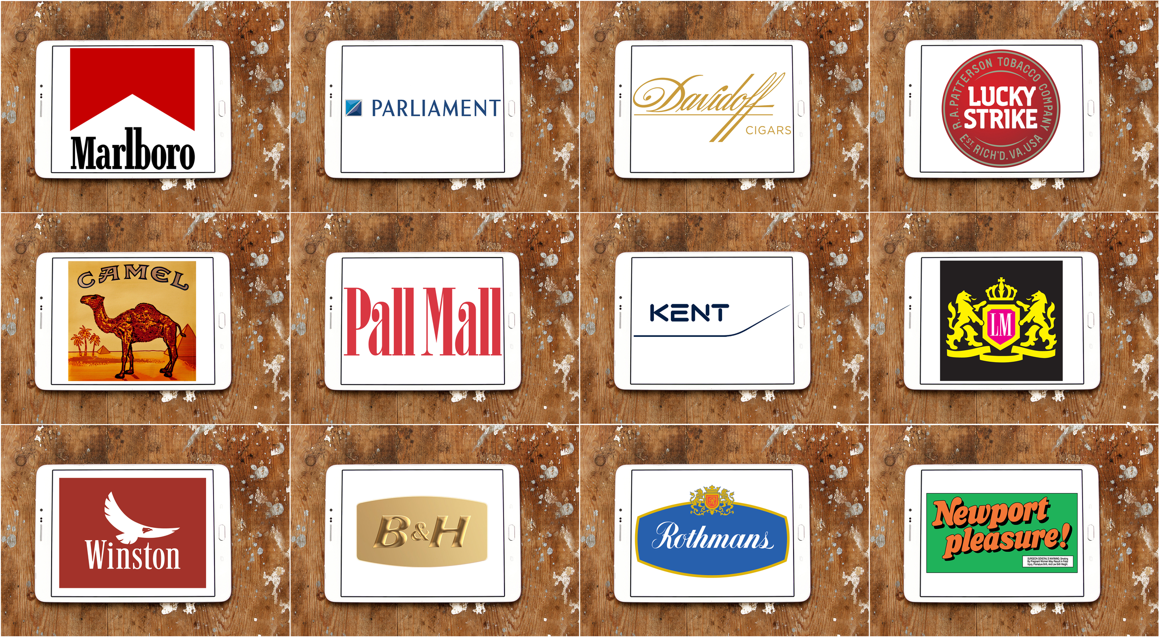
For example, think about iconic tobacco providers like Virginia Slims. Not only is the typography perfect — tall, thin lettering that matched the look of the cigarettes — but the logo is, too.
Their logo and ads almost always include a slender, stunning woman enjoying one of their cigs. The obvious subtext here? Beautiful women smoke Virginia Slims.
So, not only does their logo perfectly play to their target market — female smokers — it also lets smokers know that, by choosing Virginia Slims, they’ll become an object of desire.
Think Classic
Whether you’re selling superking cigarettes or pipe tobacco, your logo needs to make it clear that you intend to become a classic.
Often, this means that simplistic and timeless designs will be the best bet. For example, consider the Lucky Strike logo. In the end, it’s really just a red circle. Same goes for Newports: that unmistakable line of green stripes has been around for decades — and it’s instantly recognizable.
You need to stick with a design that you feel will remain relevant for years to come. While basing a design off of current trends might win you a few followers in the moment, almost none of them will remain your loyal customers.
You want to play to a long-term market — those that want to actively make your brand a part of their lives.
You’re Ready To Send Smoke Signals With Your Cig Logos
Thanks to the information in this post, your dreams of creating the perfect cig logos don’t have to disappear in a puff of smoke.
Keep in mind that, just like finding the perfect brand of cigarettes, you don’t always get it right the first time. To really make sure you have a logo that helps you to connect to your target market and communicates what your brand is all about, it’s best to weigh your options.
This is where our free online logo maker tool can help. Use it to help you try out different fonts, colors, and images until you’ve created your dream design.
The first step on your branding journey begins with the perfect logo. Get started building yours today.
Kickstart Your Business With an Online Personal Trainer Logo
Posted on June 22, 2017 by Logo Design Tips and Tricks
Personal training professionals know that the sky is the limit in today’s fitness industry. Americans currently spend over $60 billion annually on fitness and weight loss.
But personal training can also be competitive. Developing your brand is a requirement for being successful and differentiating yourself from the competition.
Whether you are trying to get your business off on the right foot, or know it’s time to breathe some fresh air into your company, a personal trainer logo is one of the best ways to invest your resources.
Not sure how to pair a personal trainer logo design with your brand? We can help.
A Personal Trainer Logo Helps You Focus
Starting a personal training practice can be an intimidating enterprise. Once you prepare to hand up your shingle and build a brand you’ll notice the competition.
Some entrepreneurs find this so intimidating that they opt out of starting. Don’t let this happen to you!
If you know the secrets to building your brand, you know how important it is to build a unique value proposition.
What are you passionate about in training others? Where are you located? Who are your ideal clients?
These are the types of questions you should ask when building your logo. Once you know the answer they can also help you build your business.
You’ve Got The Look
One of the best parts of a logo is that it follows you wherever you go. From website design to social media accounts– calendars, signs, and workout templates— your logo should represent your brand.
But one of the worst parts of your logo is that it follows you wherever you go. This is why it is important to find something that reflects the core values of your personal training business.
Use color theory to help shape your design. Warm colors like reds and oranges can excite your clientele.
Cool colors like blues and greens will calm the most anxious potential clients.
Once you’d got the look down, you’re ready to build your brand.
Your Logo Needs To Stand Out
A personal training logo needs to stand out from the competition. Easily recognizable, the best logos are simple and reflect the needs of your clients.
In today’s customer-centric marketplace it’s wise to think of the needs of your potential clients first.
What’s important to your customers? Do they want to prepare for a bodybuilding contest or simply be more flexible seniors?
Know your clients and you will know how to make your logo design stand out.
Try Out Different Styles
One of the best parts of designing a logo for your personal training business is the wide range of options. Experimenting with images, designs, and images will allow you to pair your business strategy with the core principles of your business.
With the right tools, you can easily mix and match ideas and explore something that’s perfect for you. Online Logo Maker can help you try out a number of options.
Make sure you get it perfect before you commit to a design. Remember, your logo will represent your company as much as your clients, your website, and even you yourself do.
Give it a shot! Come try out our Online Logo Maker tools now.
Why Your OBGYN Logo Needs a Consumer-Centric Design
Posted on June 22, 2017 by Logo Design Tips and Tricks

With over 33,000 OBGYN practices in the United States, it can sometimes be challenging to set yourself apart from the competition.
Especially in the healthcare field, you need to make it clear that your practice puts patients first. Thanks to the rise in technology, your patients have the potential to access more information about both their health and your practice than ever before.
If your branding strategy, in particular your OBGYN logo, doesn’t emphasize the patient journey and isn’t consumer-centric, your patients will go elsewhere.
Read on to learn how to create an OBGYN logo that stresses a patient-focused approach.
Stress The Patient’s Role
These days, especially due to rising healthcare costs, patients are invested in becoming more directly involved in their healthcare.
Your OBGYN logo should show the patient that your practice emphasizes patient-based preventative care. For example, your logo could include an image of a patient listening to a doctor speak, then taking notes.
It could also include your patient walking through the front doors of your practice.
You might even show an image that illustrates a patient’s journey. This could include something like a woman walking into your practice on one half of the logo and then walking out with a stork over her head (or with a baby bump!)
In short, any image that illustrates a patient taking their healthcare “into their own hands” is positive. You need to show that the patient-doctor relationship is a crucial part of your practice.
Show A Wide Range Of Patients
Again, thanks to the currently precarious (no matter which “side” you’re on) nature of the American healthcare system, many patients are likely unsure if your practice will be able to serve their needs.
Your logo needs to make it clear to potential patients that you serve both a diverse range of clients, as well as a diverse set of medical needs.
You can emphasize this diversity of care in your logo!
For example, you can create an image that illustrates everything an OBGYN practice handles: ConceiveAbilities and other reproductive issues, pelvic exams, breast health…the list goes on.
This will also help patients who may or may not be aware of the many different services an OBGYN provides.
But don’t stop at just a diversity of service. Make sure your logo shows a variety of age ranges and weights. After all, you serve women at every part of their lives.
Create Your OBGYN Logo Today
A customer-centric healthcare practice is as challenging as it is rewarding.
By creating a logo that centers around your customer’s needs, you’ll increase the number of patients you see each year. You’ll also improve relationships with the patients you already have.
Now that you know what your logo should include, you need to make other crucial choices involving font, color, and more. Check out our blog to learn more about the messages your logo will send based on your design choices.
When you’re ready, use our free online logo maker tool to create your own!
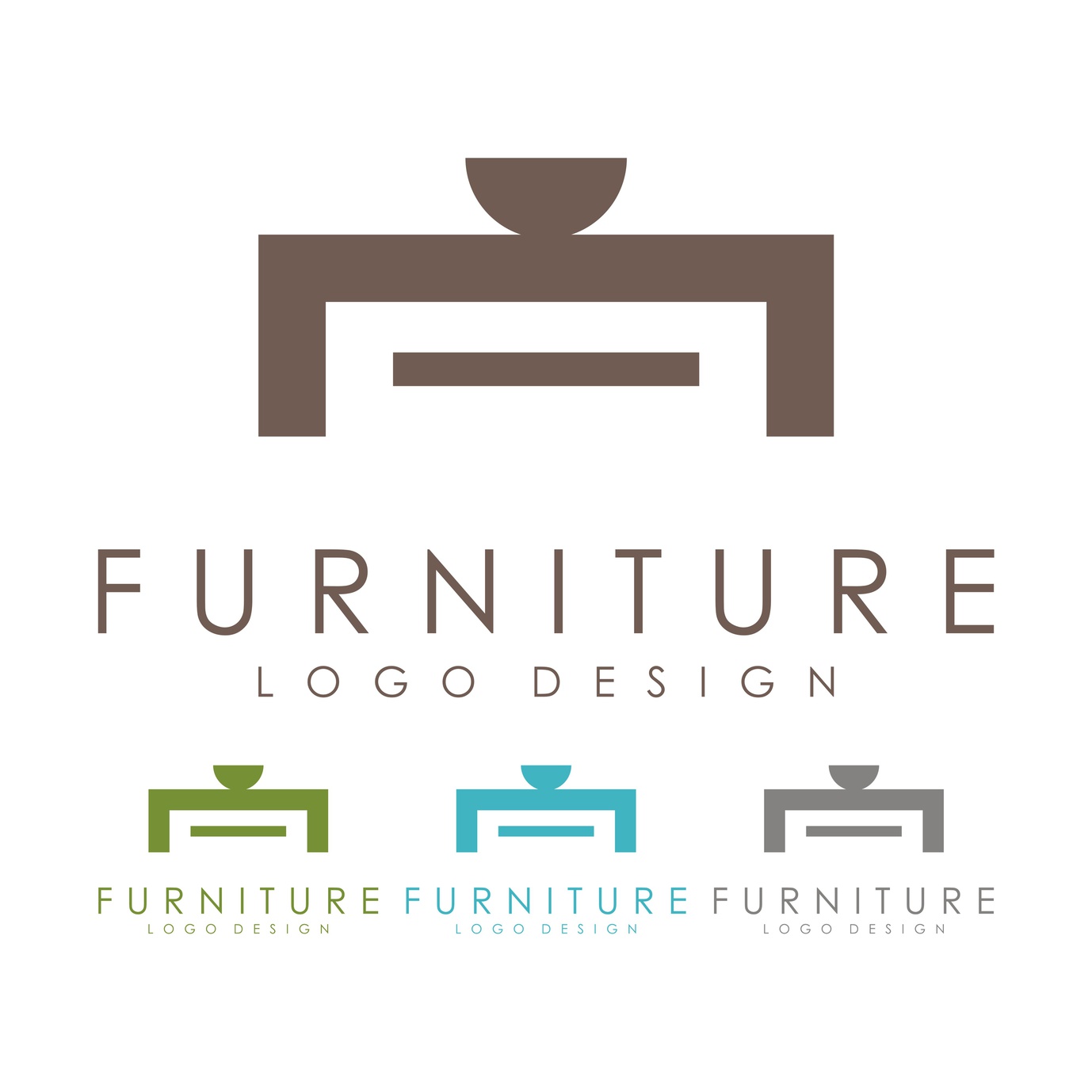
7 Common Errors to Ditch When Designing Furniture Logos
Posted on June 22, 2017 by Logo Design Tips and Tricks
When companies are unaware of what good design strategies look like, they fall victim to some common logo errors.
Whether it’s trying too hard, not trying hard enough or riding on the coattails of others’ success, a lot can go wrong when trying to design a furniture logo that attracts the right consumers.
Here are seven common design errors to ditch when designing furniture logos.
1. There’s Too Much Going On
Many businesses make the mistake of trying to do too many things at once.
For example, a company specializing in lighting solutions like www.FineHomeLamps.com should avoid using an overly complex logo complete with lighting fixtures and little design elements that detract from the big picture.
Instead, consider a design with an iconic silhouette of a lamp.
Or try something more subtle–like illuminating part of your company name–drawing the eye in, but signaling what your business is all about.
2. Your Furniture Logo is Too Boring
On the other hand, a logo can have the opposite problem.
If the first impression of your company is a stodgy home decor logo, your designs are going to be a hard sell.
Even you specialize in simple, mid-century-inspired designs–make sure your logo features strong lines or emphasizes color and contrast.
3. Lame Colors
Color is perhaps one of the greatest cases to be made for hiring a creative professional rather than that one guy in the office who sort of knows Photoshop.
A lot of buyers’ psychology is wrapped up in color, and what you’re putting out may have a subconscious effect on others’ perceptions.
For example, greens signify health and prosperity, while grays and dark blues have a more conservative feel. Reds are tricky because they can sometimes feel overwhelming.
Furniture companies should choose colors based on the lifestyle their wares best represent.
Have a light and airy aesthetic? Think peaceful greens and blues that represent relaxation, or keep color at a minimum and use plenty of white space.
4. Typography Issues
From too-thin fonts to oddball spacing, typography is something that seems simple, yet in reality, is best left to the pros. Errors in spacing can give new meaning to a word by tricking viewers into seeing something that’s not there.
Additionally, using too many fonts is another design faux pas. Keep it simple.
5. Too Trendy
While fonts like Helvetica or vague design trends like minimalism will likely stay looking fresh for the long haul, rebranding in all Millennial Pink or trying to capitalize on the mermaids and unicorns trend is a bad idea.
Brands should think of their furniture logo in the same way as considering how they paint their house or what they are looking for in an expensive suit.
From there, designers, or businesses should put together a style guide, laying out rules for any changes down the road or adjustments for future marketing materials.
6. Relying on ClipArt
These days, one of the few places one can reliably find ClipArt is on a business’ amateur-designed logo. Don’t use a stock photo of a chair and call it a day.
A logo represents the brand, and using something better left in Windows 95 is not the best way to get more consumers on the door or on the web page.
Instead, look toward programs like Online Logo Maker allow users to upload an image and customize from there.
7. Copying From Other Companies
True, as humans, we tend to gravitate toward what we know, rather than trying something new.
But, while imitation may be the sincerest form of flattery, it can land businesses in hot water if they’re not careful, or at the very least, project an air of unoriginality.
Danish-modern inspired furniture companies should echo the look of their furniture in all marketing materials, while something more whimsical can pull off something a little more feminine.
Tasked with creating a logo for your furniture business? A tool like Online Logo Maker may be a great try your hand at designing the right face of your brand.


