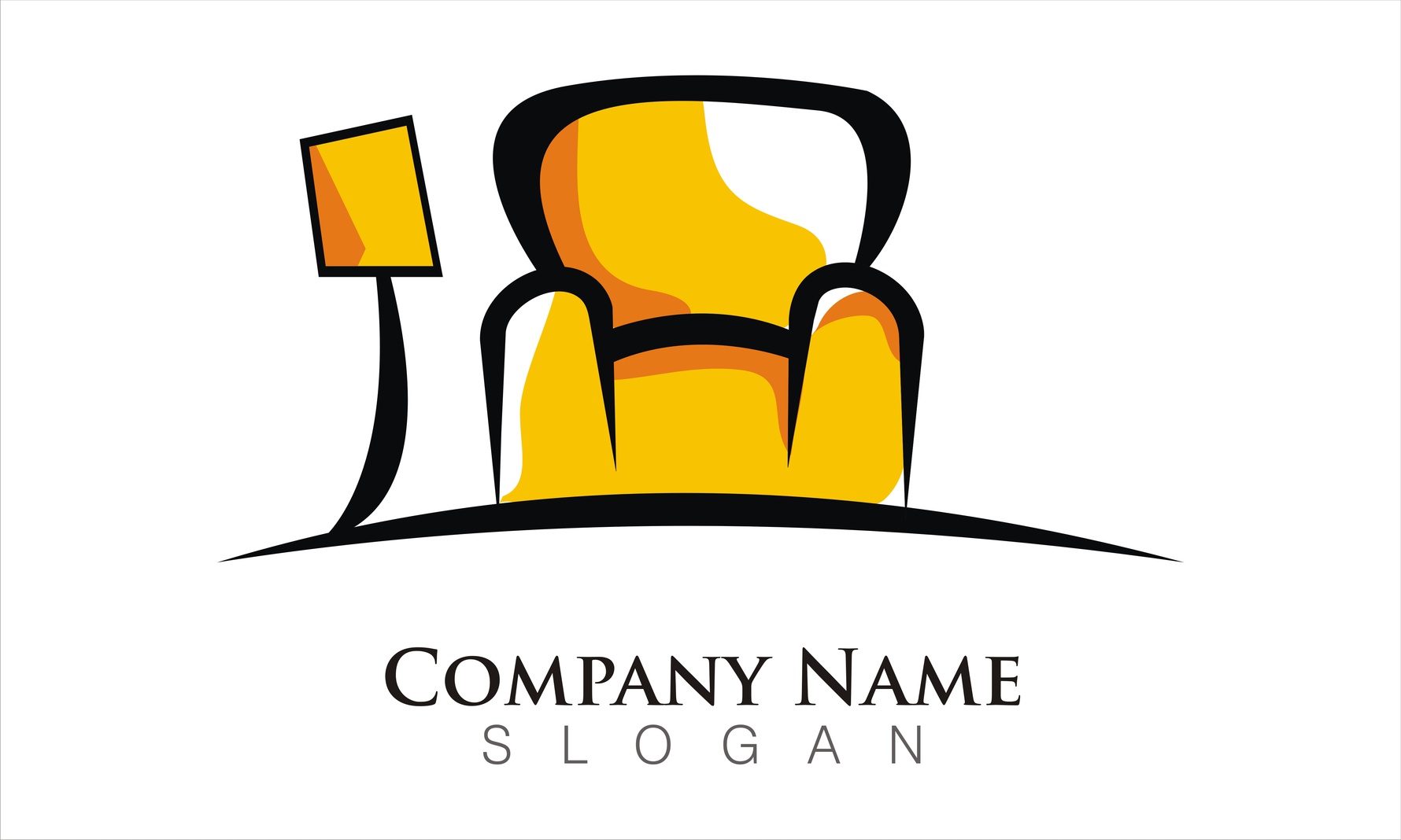
Providing In-Home Services? Create a Trustworthy Furniture Logo
Posted on June 27, 2017 by Logo Design Tips and Tricks
Your logo is one of the most important — if not the most important — aspects of your branding.
In a matter of moments, you need to communicate a variety of messages to the consumer: great value, experience, and above all, trustworthiness.
If you’re a company providing in-home services, like house cleaning or furniture assembly, this is especially crucial.
You want to show your customers that they should feel comfortable letting your employees inside their home.
How can you create a furniture logo that gets this message across? Read on to find out!
Show Your Employees in Your Logo
When it comes to creating a sense of trust between company and consumer, most of that trust is born from personal relationships. This means that your furniture logo should show the people behind your brand.
For example, if you’re a furniture assembly service, you might want to include an image of your logo that shows your team assembling sofas, tables, and more. You want to show them inside the customer’s home, doing exactly what they’re supposed to be doing.
Additionally, your logo image could also show the homeowner entering a newly-assembled room, thrilled with a job well done — as your employees look on, smiling.
Finally, because you’re providing a service in which you’ll be sending people into the homes of others, you may want to directly mention that testimonials are available. You might also want to highlight the fact that you’ve done a background check on your employees.
You could include this in the text around your logo image, in a circle. However, as with any typography you use in your logo design make sure that it’s legible and in a color that’s easy to read, even from a distance.
Believe it or not, the color choices you make can send subtle psychological cues to customers about the kind of company you run.
While bright hues like reds and oranges may get a customer’s attention, they’re not going to do much to create a sense of trustworthiness.
In fact, these colors may make your customers irritable and stressed out! Red has been proven to raise the blood pressure levels of consumers. This means that a customer may be more suspicious of a brand that uses reds and oranges in their furniture logo.
Instead, go for more soothing and calming colors, like greens and blues.
Start Creating Your Furniture Logo Today!
No matter what kind of business you’re in, creating a sense of trust is absolutely crucial. But when you’re in the business of helping people bring their dream homes to life, it’s especially important.
Your logo needs to send a message of authority, and it needs to be consistent with your overall branding strategy.
As a result, you may want to create several logos, and then test out which one most effectively communicates this idea of trust. Poll your employees, social media followers, and even your past customers to get their input.
To create your potential designs, be sure to use our free online logo maker tool.
5 Creative Placements for a Clothing Line Logo
Posted on June 27, 2017 by Logo Design Tips and Tricks
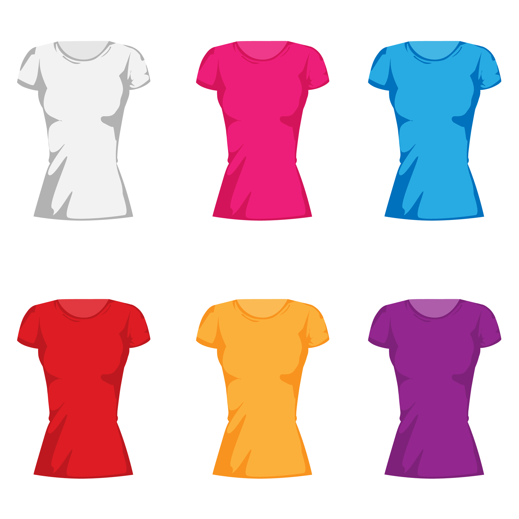
At the end of the day, a t-shirt ultimately serves two distinct yet important purposes.
First and foremost, they’re comfortable and easy to wear. There’s something about a good t-shirt that feels comforting yet stylish. But there’s a secondary, more important purpose. A t-shirt is essentially a form of branding that your audience pays for.
Accordingly, you’ll want to make sure your logo stands out. Read on for some creative placement ideas for your clothing line logo.
5 Creative Placements for a Clothing Line Logo
1. On the Hem
If you’re using a solid color, placing a colorful logo on the hem of your shirt is a great way to play with contrast.
It’ll immediately make your logo pop and stand out to anyone who sees it. More than that, it’s a subtle way to draw the human eye towards your logo.
Take a white tee, for instance. By contrasting the color (even if it’s just black) of your logo with the solid white of the shirt, you’ve managed to create an easy way to get noticed.
2. On the Sleeves
This is a popular choice that a lot of clothing companies are utilizing. You’ll have a few different options if you choose to put your clothing brand logo on the sleeve.
You can have an understated, small logo on the hem, for instance.
Or you can have your logo run across the bicep in slightly larger print. This can be a great idea for athletic wear, like what Monsta Clothing Co. has on some of their shorts.
If you’re offering long-sleeve tees, use a design with your logo running down the length of the sleeve.
Using different fonts can make a difference, too. For instance, have your logo on the breast pocket, then in a different font on the sleeves.
3. Patterned
Of course, there’s a chance that subdued isn’t quite your style. There’s nothing wrong with that. In fact, sometimes the most memorable logos are the ones that are in your face.
If that’s the case with your brand, a patterned design all across the t-shirt (yes, front and back) is a great option. The human eye loves patterns, so this is a surefire way to draw some attention.
4. On the Back
Sometimes it’s hard to beat a classic. Featuring your clothing line logo on the back of a shirt, either vertically or horizontally, is always a smart call.
It’s simple, sure, but the classics work for a reason.
5. Wrapped Around
This is a fun design that few companies take advantage of. By wrapping your text around the front and back of your t-shirt, you’re going to stand out in the best way possible.
Remember the checkerboard pattern? Wrapping your logo works in much the same way. The human eye wants to complete patterns, so eyes will be drawn to your logo.
You can either wrap it around the breast or place your logo diagonally like a sash.
Your Logo is a Statement
Your logo represents your brand as a whole. It needs to be every bit as creative and innovative as you are.
Get creative with your clothing line logo placement and stand out from the rest of the crowd.
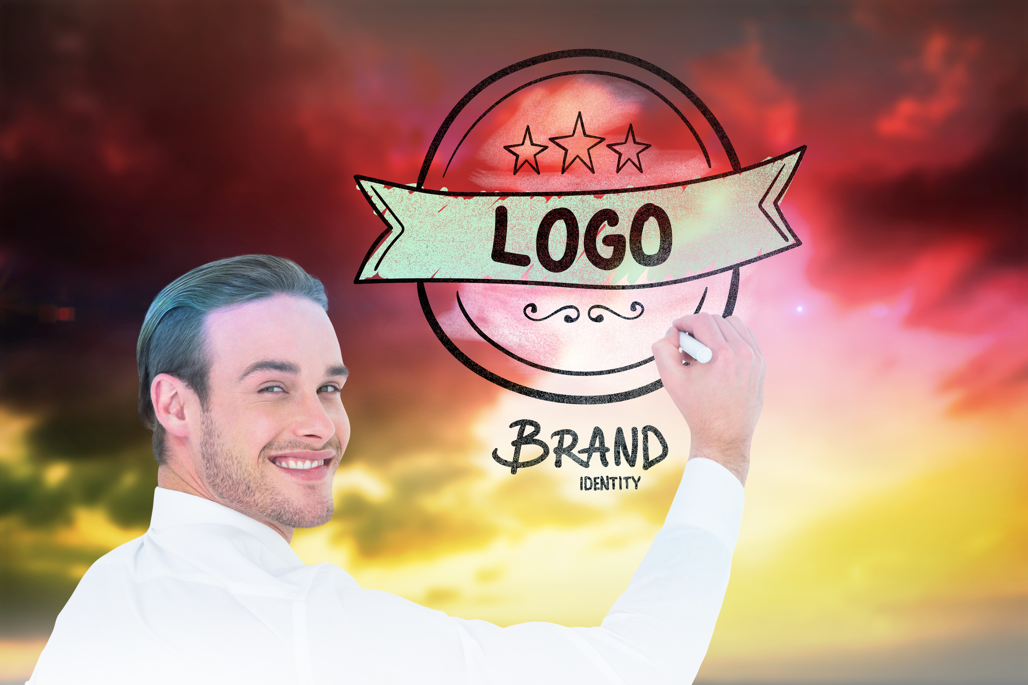
Startup Logos: How to Create the Best Design
Posted on June 27, 2017 by Logo Design Tips and Tricks
It’s a fact no entrepreneur enjoys hearing: 9 out of every 10 startups will fail.
What can you do to ensure that you end up in that coveted 10%? Believe it or not, your branding has more of an influence than you might think. It can communicate your intention to potential investors, show how you plan to disrupt the market, and just make it clear that you’re an epic company in the making.
But how can you create awesome startup logos?
Read this post to find out!
Go for a Custom Font
In the startup world, you need to do everything you can to stand out. You probably already know firsthand that sometimes, that means taking things to the next level.
One of the ways you can prove that you’re an innovator in the design of your startup logos?
Your typography.
While yes, there are a lot of great font options already out there to choose from, they’ve also been chosen by thousands of other companies around the globe. You don’t want to send the message to potential investors that you plan to stick to the status quo.
Instead, it’s a good idea to have a customized font made specifically for your company. Not only will this help your logo to stand out, it will also help you to build your brand. Now, when people see your font, they’ll automatically associate it with your startup.
Communicate Your Mission
The startup world is all about the strength of your initial pitch — and you should consider your logo the ultimate elevator pitch or introductory email!
You can use your logo, and especially any image you include, to prove how you’re different from the competition. For example, give investors an inside look at how your company is run.
If your office is made up of coworking spaces that allow for a hyper-collaborative, fast-paced work environment, show that in your logo image. Let people get a sense of all the ideas zipping around your office.
Also, make sure that your logo tells a story. For example, if you came up with the idea for your company on a camping trip, you might want to include the image of a campfire in your logo.
Why?
Exactly — because it makes people ask questions, giving you the chance to extend that elevator pitch.
Start Making Impactful Startup Logos Today
Thanks to this post, you’re ready to create the kinds of startup logos that make other entrepreneurs green with envy — and venture capitalists turn their heads in your direction.
But just as you do at every roundtable with your team, you need to take multiple ideas into consideration. When you’re trying to finalize your logo design, it’s always a good idea to weigh your options.
We suggest using our free online logo maker tool to try out several different designs. Then, decide with your team which one is the most on-brand, in tune with your target market, and likely to blow the competition out of the water?
We can’t wait to see what you come up with!
The Most Memorable New Logos of 2017
Posted on June 26, 2017 by Logo Design Tips and Tricks
Does your logo feel outdated, inconsistent with where you are now as a brand, or irrelevant to your target market?
If you answered “yes” to any of those questions, it’s likely time to start considering a re-branding.
Confused about where to start? Don’t worry — we’re here to help you find a little inspiration. In this post, we’ll share with you some of the most memorable new logos from this year.
Hopefully by the end, we’ll have you convinced that creating new logos for your company is a brilliant branding strategy!
Calvin Klein
Fashion giant Calvin Klein’s new logo is all about celebrating the history of this iconic fashion brand. In February of 2017, the brand debuted an updated logo that made quite a statement.
While Calvin Klein has always been rooted in minimalism, they still wanted to make an impact. That’s why they switched to an all-caps logo, with a bolder typography that replaced the slender lettering of the past.
It was also a wonderful way to usher in the house’s new designer, former Dior Darling Raf Simons. This subtle switch heralded a new era for the house — and attracted lots of attention.
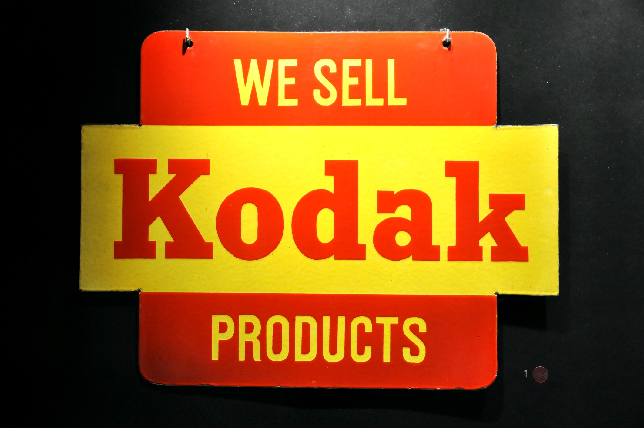
The Evolution Of Kodak
Camera giant Kodak is certainly no stranger to switching up its logo. But this year, it took a decided risk — hopping on the “retro” trend bandwagon. Now, Kodak is using the same logo that it did in 1971.
It’s a risk that paid off without muddling the company’s branding. The “K” is still completely recognizable, and the smart use of the company colors — red and yellow — ensure that consumers never forget the legacy of Kodak.
Subway Sandwiches
Sometimes, companies need to re-brand for more unpleasant reasons. After the sandwich giant’s spokesperson, Jared Fogle, was convicted of a particularly hideous crime, Subway made a smart move by choosing to rebrand.
In the past, Subway’s logo was somewhat three-dimensional. It centered on showing off the three colors of the brand — yellow, white, and green. Perhaps the most famous feature of the logo was the 2 subway arrows, pointing in the “uptown” and “downtown” directions on the first and last letters.
The new logo has kept the iconic arrows and colors but shows the brand in a new light. Now, the lettering is solid, with a bolder, more crisp font.
Subway has also done a wonderful job of taking advantage of all the re-branding opportunities that come with a logo redesign. They’ve also released videos of customers talking about their own “transformative journeys.”
Ready To Start Creating New Logos?
As you can see from the examples above, re-branding is a wonderful way to give your company and its image new life.
A logo re-design can introduce you to an entirely new customer base, pump up your social media presence, and show your competition that you’re not afraid to get with the times.
We know you’re ready to start creating new logos now! To get started, use our free online logo maker tool to play around with your options. Always remember to keep checking back with our blog for the latest innovations and trends in logo design!


