Logo SEO: How to Optimize Logos for Search
Posted on June 16, 2017 by Logo Design Tips and Tricks

Search Engine Optimization, or SEO for short, is the foundation of digital marketing.
Briefly, a good SEO strategy helps to put your company on the first page of search engine results, connects you directly to your target market, and increases your conversions.
But did you know that have a logo SEO strategy can offer you those same benefits?
Read on to learn more about how to design a logo that’s optimized for SEO.
Your File Name Matters
If you plan to upload your logo on your website, your social media accounts, and your blog posts, your file name can help to boost you in the rankings.
Keywords, or the words people type into search engines when they’re looking for products or services you offer, are the best things to use for file names.
This is because Google and other search engines will notice that your file name includes the keyword your future customer has typed in online.
Naturally, the search engine will conclude that you have exactly what the person searching needs, and direct them towards your site.
For example, if you own a Manhattan florist, you might use the keyword “flower shop NYC.” This means that you’d need to save your logo image file as the same, “flower shop NYC.”
For more detailed information, check out the advice of professional SEO services.
Use The Alt Text Trick
We know that the phrase “HTML Code” might seem intimidating to some, but it’s really much easier than you think.
Basically, when you have any sort of an image on your website, you need to upload it using an image code.
Of course, to really optimize it for SEO, you can take these image codes a step further when it comes to placing your logo graphic on your website.
You do this using what’s referred to as an “ALT Attribute.”
This is essentially a one-word description of the image itself. This mini description informs search engines like Google what the graphic (in this case, your logo) is showing. Google then uses that information to help to connect you with your potential customers.
You can choose to use a keyword in your ALT Attribute, or you can elect to use the name of your business. While it is possible, using hyphens, to make your Attribute more than one word, the more concise you can be, the better.
For example, look at this website address:
https://www.seoclerk.com/faq/19219/Banned-by-Adsense-Here-are-some-adsense-alternatives
If this site wanted to use an ALT attribute in an image file, it might include options for its on-page logo coding like “SEO-advice” or “adsense.”
Start Developing Your Logo SEO Strategy Today
Now that you know that a logo SEO plan can boost your website and brand in search engine rankings, it’s time to start creating that SEO-optimized logo.
Well, almost.
To truly get the most out of your logo design, you need to study up a bit more on the different design techniques, branding strategies, and tips to ensure you create the most effective one possible.
Check out our blog for plenty of industry-specific advice, as well as information on how your logo helps to develop your brand. Then, try out our free online logo maker tool to watch your design come to life.
Make or Break: How Unique Logos Help Your Book Cover
Posted on June 16, 2017 by Logo Design Tips and Tricks

So, you’ve finally finished writing your book.
Now, you have to start thinking about how you’re going to make sure people actually read it!
Creating unique logos and images for your book’s cover design is absolutely crucial. It’s also a fun part of the creative process!
Read on to learn more about how a book’s logo and cover can help readers to connect with — and buy — your masterpiece.
They Tell Your Readers What’s Inside
Logos on a book cover help to let readers know a little bit more of what your book is all about.
Sure, ideally every potential reader will take the time to read the cover flap and learn more about the book’s plot — but you don’t notice an interior cover flap from across a crowded room.
Take, for example, Colson Whitehead’s novel The Underground Railroad. The cover of the book shows a series of railroad tracks, some of which lead to nowhere. It also shows humans walking along these tracks.
From this information, along of course with the title, readers can gather that the journey will be hard, unsuccessful for some, and secretive.
Think about the defining moment of your book, and leave a little “hint” about it in your cover design and book logo. Then, readers who were initially drawn to your book will enjoy a surprise when they find out the connection later.
They Reflect Your Style As An Author
In addition to giving out hints about your book’s subject matter, covers also say a lot about you as an author!
If your writing style is geared more towards young adult fans, you might use brighter colors and loopy fonts on the cover. If you’re a sci-fi writer, using a dark cover with raised white lettering helps to set the tone.
The right cover will help you and your ideal reader to find one another.
But you still need to edit your cover a little bit more…
Test Out Several Options
Now that you know what it takes to create unique logos for your book’s cover, you need to test out your options.
Use an online tool, such as our free logo maker, to create a book cover mockup. Especially if you’re going the self-publishing route, seeing what your book will look like in bookstores and online will be a huge help.
It’s also time to get a second opinion. Your book is “your baby” — which means that you might not be able to make an objective decision about which cover really fits it best.
Ask your friends, agents, and even social media followers for their input.
Create Unique Logos For Everything In Your Life
So, now that you’ve got your book cover logo down, what about your author logo? Or if not a logo, at least a symbol that represents your writing style.
After all, when you’re touring and giving readings, you’ll need to use this time to start building your brand. Having your own logo can help your readers find you online and in-stores.
Need more advice on how to create the perfect logo? Spend some time on our website and blog, and comb through our countless articles on how to brand and market yourself effectively.
5 Best Health Symbols for Pharmacy Logo Design
Posted on June 15, 2017 by Logo Design Tips and Tricks

There’s so much you need to take into consideration when creating your pharmacy logo design.
One of the most important things to focus on is the symbol you choose to use as the main image for your logo. But with so many choices out there, narrowing down your options can be tough.
In this post, we’ll examine 5 of the most effective options.
1. The Human Body
As a pharmacist, you’re used to filling prescriptions for all sorts of ailments and pains. Your pharmacy logo design needs to communicate to your customers that you deal with everything realting to the body.
To go for a design that’s a little more unexpected, why not have a design that focuses on all the different organs within the body, highlighted in an eye-catching red?
2. The First Aid Cross
When people aren’t feeling well, the last thing they want to do is spend time trying to figure out what your business logo is supposed to represent.
Especially when it comes to businesses in the medical field, sometimes sending a clear and recognizable sign is best.
They need to be able to find your services anytime, anywhere. While services like 24hrlocator.com can help, so can your logo!
That’s why we love the idea of the first aid emblem, a cross. To switch it up, try it in a different color, like blue or green.
3. A Beating Heart
Of course, a red heart is a symbol that’s closely associated with the medical industry. But since your pharmacy is unique, you’ll want to update it!
To accomplish this, why not create a heart rate monitor scan behind the heart? Use contrasting colors to make both designs pop.
4. Pestle And Mortar
In the days before walk-in clinics and ambulances, people would have to make their own medicines from leaves, herbs, and other natural medicines.
Especially if your pharmacy focuses a bit more on natural health and healing, using a mortar and pestle in your pharmacy logo design is a brilliant way to get your message across.
5. A Prescription Bottle
Using a prescription bottle in your logo design ensures that your brand message is clear, but it also allows you to get a little creative.
We love the idea of having a prescription bottle turned over and shaking out a few colorful pills, with your pharmacy’s name surrounded by different medications. This also allows you to use lots of colors in your design!
Start The Pharmacy Logo Design Process Today
Of course, finding the perfect symbol to include in your design is only the beginning of your logo creation process!
You’ll also need to consider things like font, size, and how your logo impacts your overall branding strategy.
When you have a few designs in mind, you’ll also need to test them out to see which one works the best. We can help you with both of these tasks!
Use our free online logo maker tool to play around with font, color, and placement. Then, be sure to spend some time on our blog to learn more about the many elements needed to create a compelling logo design.
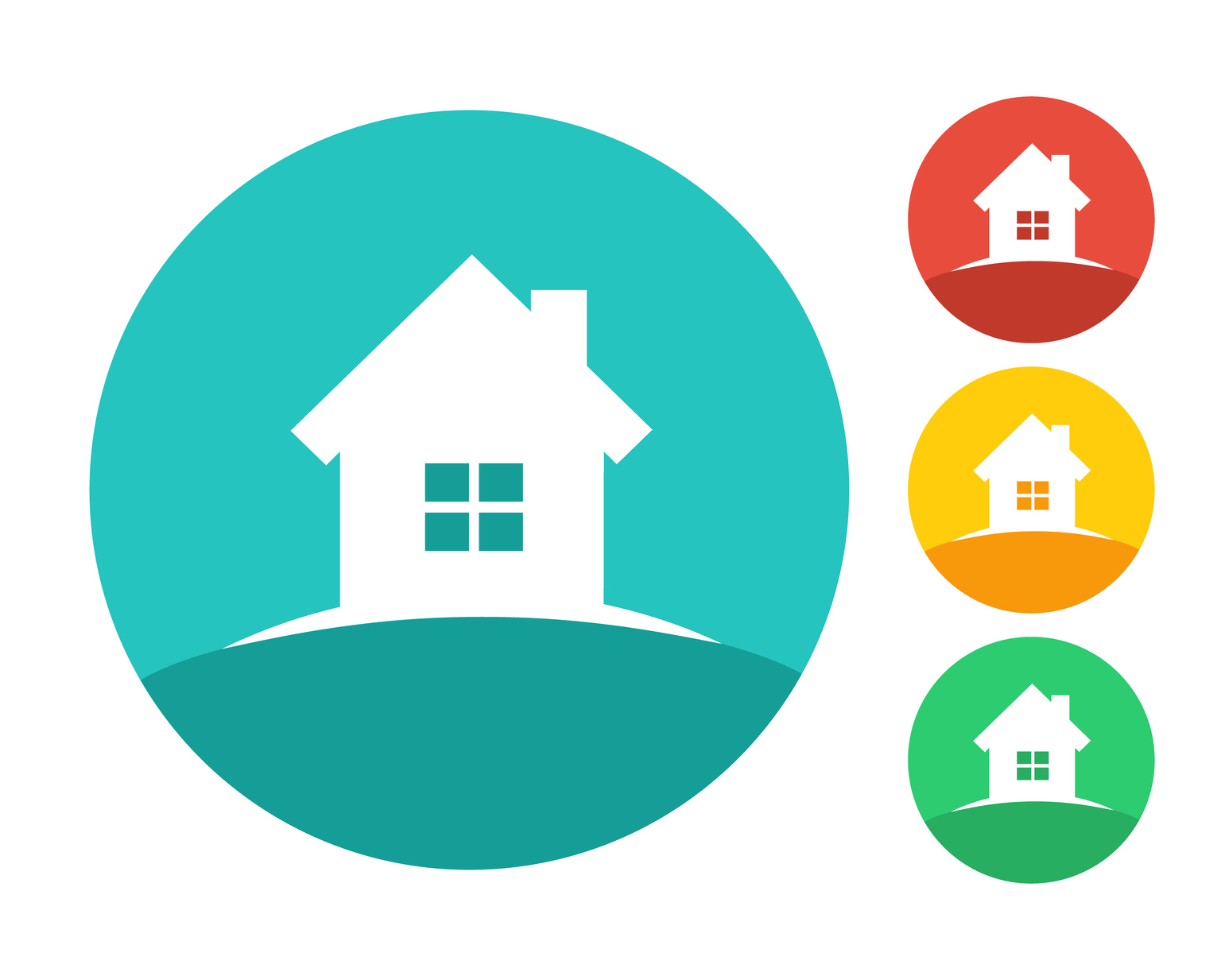
8 Elements of an Appealing Real Estate Logo
Posted on June 15, 2017 by Logo Design Tips and Tricks
If you’re currently working as a real estate agent, you know how tough the competition is. From finding the perfect home for clients to securing an asking price that makes everyone happy, it’s never easy.
But it’s also incredibly rewarding.
Whether you’re new to the business or have been working in it for many years, you need to present yourself in the best possible light. You want to prove to clients that you’re with the times, up on current market and design trends, and communicate to them that you’re willing to go above and beyond.
A great logo helps you to say all that and more.
But designing it isn’t always an easy task, especially for those who aren’t the most creative of thinkers.
Looking for inspiration? Need advice from the experts?
Have absolutely no idea where to start, and feeling a bit overwhelmed?
Whichever phase of the design process you’re currently in, it’s important to take the following 8 real estate logo design tips into consideration.
Your logo is the most important aspect of your branding, the basis for everything you’ll do as an agent.
Make sure you get it right.
1. A Focus On Branding
The first thing that you need to do when designing a real estate logo is to sit down and really think about what your brand is all about.
When you’re creating a logo, remember that it’s not just going to be shown on your website and business cards. People are going to see it on signs when they drive by homes you have on the market. They’ll see in on social media and in blog posts you write. They may even see it in magazines or in community directories.
They’ll see in on social media and in blog posts you write. They may even see it in magazines or in community directories.
When getting started, you need to ensure you’ve chosen a logo that will be able to consistently communicate the message of your brand, no matter where it’s placed.
To do this, you need to come up with at least three words that describe the way you want to do business. For help, think about why you first got started in the real estate business.
Was it a love of design? Frustration selling your own home? An interest in a field that allowed you to connect with people?
Whatever the answers, make them the central focus of your branding. Once you’re clear on what you want to do to help people find their dream homes, you’ll know what sets you apart.
Then, you can go onto creating a unique logo that’s truly all about you — not just a knockoff of your competition’s.
2. A Representation Of Your Main Focus
These days, real estate agents sell a variety of different living spaces. Perhaps you focus on penthouses for sale, maybe you’re a part of the tiny house real estate market, or perhaps you mostly sell single-family homes.
Whatever your specialty, your real estate logo needs to reflect it. Focus on selecting images that both connect with your target market and make it clear what kinds of homes you sell.
For example, if you sell apartments, your logo image could be of a single apartment building with an interior, cutaway view of the insides of these apartments. That way, you can show that you specialize in selling apartments while also illustrating that you cater to lots of different clients.
If you mostly sell homes, instead of including yet another image of a single home or a roof covering the name of your real estate company, think bigger. Why not include a bird’s eye view of an entire neighborhood, showing a variety of houses?
Anything that can connect you directly to your ideal client while also reassuring them that you’re not the type to provide “one-size-fits-all” solutions is a win.
3. A Smart Color Choice
The psychology of color has an incredible impact on both current and potential customers. You need to consider the feelings and emotions that certain colors communicate.
While red may be attention-getting, it might also cause your clients to feel stressed out.
Blues, greens, and even darker tones like blacks and browns, communicate a sense of authority to the people you want to work with. However, you don’t want your sign to look too jumbled, washed out, or simply unprofessional by including too many colors.
Make it a point to focus on three at the most when creating your real estate logo.
4. A Focus On Typography
Color isn’t the only integral part of effective real estate logo design! You’ll also need to consider which fonts will best communicate the message of your brand.
Choosing the right font is a detail that’s overlooked in logo design across many industries, but the reality is that it can be the very thing that makes someone choose to work with you over your competition.
Think back to a logo you’ve come across in the past that had a font you hadn’t seen before. It probably made it much easier to understand what the company was selling — and who they wanted to sell it to. It also probably got you to stop the mindless scrolling through your news feeds.
Maybe it even got you to follow their page on social media, and maybe eventually, you bought something from that company.
While you can certainly choose from pre-existing fonts, you might also consider having on created specifically for your real estate company. That way, you won’t just have something no one else does. You’ll communicate to your target market that you’re willing to go the extra mile.
You’d be surprised what the smallest details are able to say.
5. Sometimes Less Is More
In today’s hyper-competitive market, it can be very tempting to pull out all the stops when it comes to your real estate logo.
But getting too “cute” or outside-the-box can actually be a deterrent to some customers. Plus, trying to do too much can make your logo look cluttered, and hard to read.
Instead, don’t fear minimalism. Not only is the “less is more” look incredibly trendy, it also suggests that your brand is strong and established enough to stand on its reputation alone!
6. Consider Hiring Professional Artists
Whether or not you hire a team of experts to create your entire logo for you is one thing — but especially if you weren’t exactly born with the “artistic” gene, you may want to hire an illustrator to create a unique image.
Going professional also ensures that you get an image for your logo that’s truly your own, and that isn’t based on cliches. A professional artist will take the time to sit down with you and discuss the details of your brand, as well as your story.
Once they get to know you, they can create an image that will help your market get to know you, too.
While it’s never good to follow trends blindly, there is at least one trend in logo design we love. As millennials become more interested in buying property, you need to create a real estate logo that caters to them.
One way a professional artist can help you do this?
By creating hand-drawn, somewhat quirky illustrations of you, your homes, or pretty much anything else you can dream up. Then, you can use these illustrations in your logo design.
7. Try Out Several Images
You’ve never had a client who said “yes” to the first home you showed them without seeing other homes first, right? (And if you have, congratulations.)
You should take the homebuyer’s attitude when it comes to your real estate logo design. Especially if you’re using all these tips, it’s likely that you’ll come away with a variety of possible logo design ideas.
Why not test them all out and see which one works the best? You can use a tool like our free online logo maker to bring your designs to life. Then, you can choose which one best communicates the message of your brand.
You might even want to crowdsource your potential logo choices on social media, in your office, or just among friends!
8. Focus On Resizing
This last real estate logo design tip is more practical. As we said earlier, your logo will appear in a variety of places, in lots of different sizes. Make sure you’ve selected a font and image that are easy to read no matter where they’re placed.
Does your logo look just as good in a thumbnail image as it does as your Facebook cover photo?
Make sure it does.
Start Creating Your Real Estate Logo Now!
As you can see from this post, there’s a lot you need to take into consideration when putting your real estate logo together.
Remember: your logo needs to say a lot in a short amount of time. Use all the “real estate” it gives you to your advantage. Focus on color, font, size, unique images, and above all, overall branding.
Looking for more invaluable logo design tips? Want to know more about how to move forward in your branding process once you’ve decided on a logo? Be sure to spend some time on our blog for expert industry advice, and feel free to contact us with any questions.


