A Guide to Creating a Beautiful Floral Logo
Posted on June 20, 2017 by Logo Design Tips and Tricks

Building a small business can be a lot of hard work.
An estimated 500,000 new small business start each month. And in order to get those businesses started, prospective businesses owners need to identify a target market, secure funding, hire staff, and find an operating location.
And that’s just scratching the surface.
With all the work that needs to be done, it can be easy to forget about creating a logo. That said, a logo is an essential part of your small business.
If you’re in the agricultural or floral industry, creating a floral logo can be an effective way to start building your identity.
Here’s what you need to get started.
Why you need a floral logo
Creating a beautiful logo is the foundation of any successful marketing strategy. Your company’s branding is a set of design and content choices — all of which will be influenced by what your logo looks like.
Your packaging, slogan, and web page design are all part of your company’s brand. These work together to build your company’s identity.
For instance, Coca-Cola’s brand is defined by iconic red and white coloring, paired with a cursive script. By using this consistent branding across platforms, Coca-Cola has made their product immediately recognizable.
When your business has a memorable logo, it helps to increase brand recognition. This, in turn, can lead to brand loyalty.
Logos are also great for communicating your company’s purpose.
So, if you own a flower shop or a greenhouse, pairing your business’s name with a floral logo is a great way to help customers understand your product or service.
Choose your color scheme
Before you start learning how to create a logo, you should have an idea of what you want that logo to look like.
As we already mentioned, an important component of branding is consistency. So, when choosing the colors for your logo, you’re also choosing the colors that will define your brand.
For a floral-based business, bright and vibrant colors are the best.
These colors will help customers associate your company with the natural beauty of your products.
That said, you also want to make sure that the colors you choose for your writing are legible. A good way to balance this is by using bright colors for the flowers in your logo and using a darker color for the wording.
Promote your products and services
When designing your logo, you want to make sure it accurately reflects your business.
So, for instance, if your flower shop specializes in roses, it’s probably a good idea to have a rose in the logo, rather than a sunflower. You want your logo to get your customers excited about your products, not mislead them about your business’s purpose.
Additionally, your logo should also include your company name, or at least your company initials. This will help customers to quickly associate your logo with your business.
If you’re ready to start building an awesome floral logo for your business, check out our Logo Maker. With this free tool, you can start making a beautiful, professional-looking logo in no time.
How to Create Social Media-Friendly Accounting Logos
Posted on June 20, 2017 by Logo Design Tips and Tricks
Social media continues to permeate all aspects of contemporary life and accountants have embraced it. One thing that continues to challenge accountants, however, is developing accounting logos that are social media-friendly.
It makes sense. Social media sites are inconsistent with their profile image rules. That inconsistency makes it difficult to create a logo for all occasions.
Keep reading for some tips on how to create social-media friendly accounting logos.
Scalable Image Format
The JPG image format has one thing going for it. JPG files are smaller than other image types, which means images load faster. JPG is not, however, a scalable image format.
Try to make a JPG or other bitmap bigger and it gets that pixelated appearance. Reducing size means lost pixels and reduced quality.
Since every social media site has its own ideas about the ideal profile image size, a logo should come in a lossless, scalable format, such as SVG. This allows for resizing without sacrificing image quality.
Simplicity for Accounting Logos
Simplicity works when it comes to logos. Consider the evolution of Apple’s logo.
The original featured Isaac Newton sitting under a tree and looked like a 16th-century woodcut. The current logo is a minimalist impression of an apple with a bite taken out of it. It’s ideal for social media.
The takeaway is to avoid making a logo too busy. A complicated logo will be hard to scale down and keep recognizable. A check stub template company, for example, wouldn’t try to cram a fully realized check stub into their logo.
Accounting logos might employ a stylized calculator or tax form if a graphical element is deemed necessary.
Detachable Graphical Elements
In accounting logos that do use graphical elements, those graphics should be detachable from any text. A graphic by itself often works better as a social media logo than text.
Graphics are designed images. That means they generally conform to the rule of thirds and will fit into the square or rectangular shapes imposed by social media sites.
Images are also more memorable than text. In some cases, a simple image becomes so identifiable with a brand that text is redundant. Think of Nike’s swoosh or Twitter’s bird.
Color Selection
Color theory is a complicated subject with tendrils reaching into psychology and neuroscience. The important part to know is that people react physically and psychologically to colors.
The color blue soothes the observer and helps to generate feelings of trust. That makes it an excellent choice for social media logos since trust is paramount when finances are in play. It’s also the color of choice for numerous social media sites’ logos, including:
- Tumblr
- Facebook
- Twitter
- Linkedin
- Skype
It follows that they picked blue for sound reasons. Modeling a logo color scheme on those of successful social media brands amounts to playing the odds.
Parting Thoughts
Creating logos used to be the domain of graphic artists and web designers, but not anymore
Online Logo Maker has helped millions of businesses and individuals create logos. With its intuitive interface and vast template library, you’ll have several social media-friendly logos created in no time. Try it today.
Got questions or having trouble? Reach out through our contact page.
What is the Best Color Theme For My E-Cig Logo?
Posted on June 20, 2017 by Logo Design Tips and Tricks

Color is a powerful tool. It can evoke the most intense emotions.
Marketers and commercial space designers even use the psychology of color to encourage customers to do their bidding.
In fact, 90% of snap judgments about a product are based solely on the product’s color. A lot of what drives human decision making about a product based on color hinges on the perceived appropriateness of a color.
If you own an e-Cig company, you have a very specific customer base. And color says a lot about the product you sell.
Your customers are going to remember your logo best. Thus it’s highly important you choose the best color theme for your e-cig logo.
What’s the Best Color for Your E-Cig Logo?
You know we really can’t answer this question for you, right? We can give you suggestions and tell you all about how color affects human moods and psychology. But in the end, the answer to this question depends on your willingness to be creative.
There are hundreds of colors out there. More are created every day (even robots are getting into the color game).
So, instead of telling you what color you should choose for your e-cig logo, we’ll tell you how to evaluate logo colors so you have all the tools you need.
How to Evaluate Potential Logo Colors
Let’s go over the colors you learn in elementary school. Yes, there are many variations on these classics, but you can extrapolate from these basic meanings.
Each color evokes some sort of emotion or image. There’s a reason why the color red is the primary color on stop signs and danger signs.
Red
What is your brand personality? Is it loud and audacious? Do your customers tend to live on the wild side and constantly push boundaries? Then red might be your color.
It’s the universal sign for passion. It could also mean dangerous or daring. If you want to convey a youthful or modern, choose red. If you’re going more demure and classical, move on.
Orange
A step down from red in intensity, orange will still stand out. It usually means finery or energetic.
Yellow
Think summer sunshine. This can be one of the happiest colors you could choose. But be careful to choose a cheerful yellow.
In the literary world, faded or sad yellows signify corruption or insanity. So be careful with yellow.
Green
It’s easy being green. But it’s actually not as common a color as you would think.
Of course, if you sell cbd oil vape pens, then this is a natural color for your logo.
Green signifies earth, environmental, and chill. It’s one of the most relaxing colors on your palette.
Blue
If you’re looking to convey royalty, choose blue. It’s a mature color.
It’s one of the most common colors in the tech industry precisely because it represents power and authority.
Purple
Riches. Purple is the color of luxury.
You’ll bring an air of both sophistication and femininity to your logo if you choose purple.
Black
Black will never go out of style. If you want to appear modern or contemporary, choose black.
Black is also a risk-free color.
White
White contrasts with most bold colors. And it’s another risk-free color.
It often symbolizes purity or holiness.
If the Color Fits, Wear It
As we said before, it’s up to you which color scheme you choose.
Evaluate your mission and choose accordingly. And be sure to utilize our online logo maker when you’re ready to create your e-cig logo.
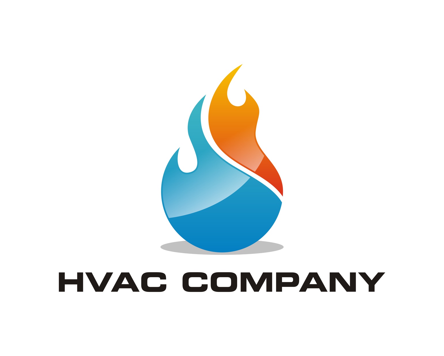
Developing a Brand in a Crowded Market With a Great HVAC Logo
Posted on June 19, 2017 by Logo Design Tips and Tricks
It’s no secret that Heating & Air-Conditioning is big business in the U.S.
Just how big? As of January 2017, there were over 468,000 employees working for 105,000 different companies.
With so much competition out there, how can you make sure that your HVAC company stands out from the rest?
The secret lies in branding. By developing a strong and memorable brand, customers will naturally gravitate to your company. And one of the most powerful aspects of your brand is your company logo.
How can you best develop a unique brand? What makes for a standout HVAC logo? Read on to learn more!
Why is a Brand So Important?
A brand is the cornerstone of your customer’s experience. It represents your company, its values, and everything you stand for.
How powerful is branding? Consider this: Why do people pay $3 for bottled water when they can get it free from the tap?
The answer? Branding.
Whether your business is brand new or has been in the family for generations, ask yourself these questions:
- What are your specific strengths?
- What makes you “different” than the other guys?
- What do your customers know about you?
- What’s the most unique thing about your business?
The answers to these questions will help you develop a stronger brand.
Developing a Strong Brand
A brand is more than just a logo and company name. It’s a carefully planned combination of colors, font, and icons that come together to create a powerful visual image.
With so many air conditioning repair companies competing for business, you can’t afford to have a weak brand image.
Investing in a quality website is essential. This is your potential customer’s introduction to your company. Your website’s content and design should reflect every promise made in your branding.
Your goal with branding is to showcase the qualities a homeowner wants in a contractor. They want to know that you’re honest, reliable, and approachable.
You can say all these things with a well-executed logo.
Designing a Unique HVAC Logo
It can be tempting to follow trends or rely on cliches when creating a logo. You may also feel inclined to cram as much information as possible into your HVAC logo.
As with many things in life, simplicity is key. Your logo should do three things:
1. Stand Out from the Crowd
Print out your logo and place it beside your competitors’ logos. Is it eye-catching, or does it get lost in the crowd?
Ask others for their opinions, too, and listen carefully to their responses.
2. Make the Customer Feel Something
A customer should look at your brand and feel something positive about the company.
Your logo needs to convey that you are friendly, trustworthy, and eager to please.
3. Break Down Barriers
How can your small business compete against larger, well-established companies? A cleverly designed mascot can add serious power to your brand!
Mascots’ personalities feel relatable and conjure an image of trust. This makes your company more appealing to new customers or those who are anti-big-business.
Final Thoughts on Brand Development
Unless you’re a web developer, the idea of creating a logo for your company might be intimidating.
It doesn’t need to be.
With the help of Online Logo Maker, you’ll have everything you need to create a unique HVAC logo for your business!


