Should You Hold an App Logo Design Contest?
Posted on June 15, 2017 by Logo Design Tips and Tricks
The app market is incredibly lucrative — but it’s also incredibly competitive.
If you want to succeed, you can’t afford to ignore even what might seem like the tiniest of details.
Whether you know it or not, the reality is that your logo design has a tremendous influence on your overall branding strategy.
But if you’re trying to raise capital, or just don’t have much artistic talent, knowing where to start can be tough.
The solution? Holding an app logo design contest. Read on to decide if it’s right for your brand.
If Your Budget Is Tight
Whether you’re creating an app that requires Android installs, in-app purchases, or just costs lots to make, you want to do all that you can to keep your costs to a minimum.
A logo design contest allows you to access countless, varied design for a fraction of the cost of what a design agency would.
Plus, because the contest will help you to spread the word about your brand, you might even save some money on marketing costs!
If You Want to Create a User-Focused Experience
Is your app based on influence and the desires of the community it creates? Do you want to stress that your brand is all about user-generated ideas, content, and demands?
If so, having a logo design contest is a great way to make that clear — before you even officially launch.
Participants or just those that are following the contest will get the message. Plus, they’ll be even more likely to contribute to your community when they see that others are already doing it.
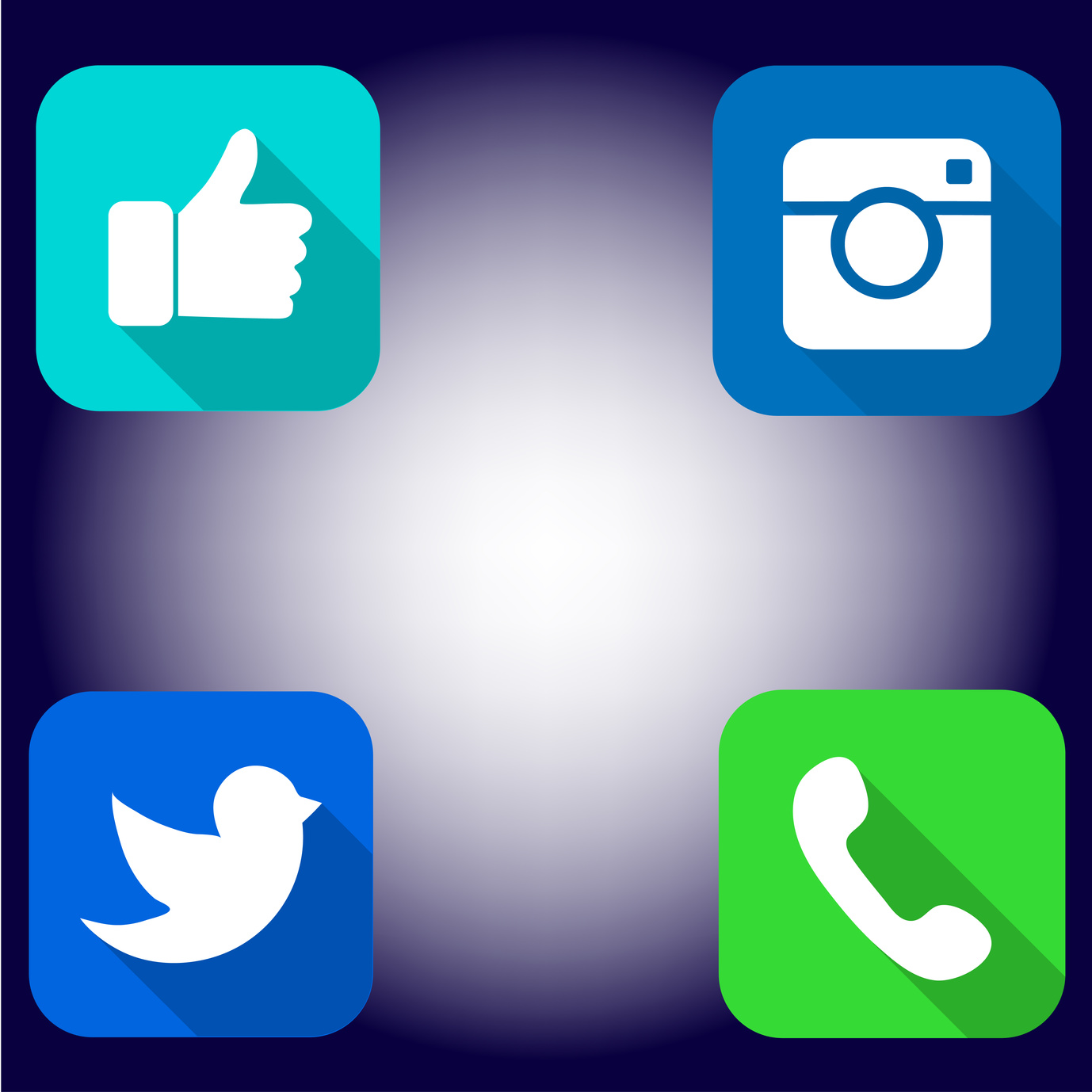
If You Want More Social Media Followers
Of course, hosting an app logo design contest will also help your brand to gain more followers on social media!
You’re likely already aware just how crucial a strong social media presence is to the overall success of your brand. This contest will help you to capitalize on it!
To get the most out of the experience, post about the contest at least once a day. Respond to comments and questions, and ask your followers to share it on their own accounts.
Finally, always make sure you’re clear about deadlines, rules, and design constraints in your postings. This will avoid confusion and ensure you get the best possible options to pick from!
How to Pick the Best App Logo Design
Whether you’re having your followers vote on the winner of your app logo design contest, or if you plan on selecting them yourself, it’s a tough choice.
To make the right decision, you need to present all your contenders in the best possible light. Narrow it down to a list of the top 5 designs you like the best.
Then, using our free online logo maker tool, make any tweaks and changes you like. This way, you’ll really get a feel for what they’ll look like in real life — not just on the page!
Looking for more logo design tips? Want to learn more about how your logo informs your overall branding strategy?
Be sure to check out our website and blog for more tricks of the trade.
Developing Your Branding Through Your Ecommerce Logo
Posted on June 15, 2017 by Logo Design Tips and Tricks
If you’ve recently created an ecommerce shop, you’ve made an excellent decision.
In today’s world, over half of consumers polled say that they would rather shop online than in a brick-and-mortar store. It’s not hard to see why. Ecommerce shops offer convenience, expedience, and prevent losing time in lines.
Of course, all of these positives mean that the ecommerce market is more competitive than ever.
What can you do to build your ecommerce brand and separate yourself from the competition?
It all starts with a strong ecommerce logo.
Find a Design That Fits Your Brand
Choosing one specific image to represent your entire brand can certainly feel like a daunting task.
Usually, inspiration comes when you get back to basics. Ask yourself what first inspired you to start your brand?
For example, if you had the idea to create your ecommerce shop while sailing with friends, that sailboat would be a great logo image. Plus, it gives you the opportunity to tell a story — and a unique story is what sets you apart from your competition.
Don’t be afraid to get creative. And don’t worry too much about following trends. Do what feels right to you — it’s much more authentic.
Don’t Forget the Details
Remember that shape, color, and font are just as much a part of your design as the images you choose.
Certain colors can really help to reflect the mission and intention of your brand. Blue is more soothing, red projects strength, and green is associated with stability and money.
When it comes to font, it’s always a great branding idea to have someone create a font that’s just for your ecommerce shop.
If you’re using shapes in your logo, be aware of the impact they have. Straight lines indicate intellect and an attention to detail. Rounded shapes and curved lines are more for the creative industry.
Make Sure It Can Stand Out Everywhere Online
Of course, your ecommerce shop isn’t the only place your market is going to see your logo. (If it us, then how can you expect to build your brand?)
If you have an e-commerce app, social media accounts, or even use your logo as a widget when you comment on other blogs, it needs to represent you in a variety of places.
To that end, be sure it can be easily resized. Will it work just as well as a thumbnail image as it will on a delivery box?
Will it be recognizable even in a newsfeed online? Will it make people stop scrolling?
Sometimes, especially if you’re already a reputable brand, choosing a simpler logo is best to ensure nothing gets muddled or lost in translation.
Create a Brand-Focused Ecommerce Logo
Now that you know how to make your ecommerce logo stand out online, it’s time to get started making it a reality.
Once you’ve got a few ideas, see how they look live online using our free logo maker tool.
But why stop there? Be sure to check out our blog for more tips on branding, logo design, and how to connect with your target market for years to come.
Branding Your Health Business With a Stunning Nutritionist Logo
Posted on June 15, 2017 by Logo Design Tips and Tricks
As a nutritionist, you care deeply about your clients’ success.
How can you create a brand that reflects that? It all starts with creating the perfect nutritionist logo.
If you need a little inspiration, then this is the article for you.
Get Back to Nature
Even if your clients are on a desperate hunt to find the best cleanse to lose weight before their ten-year high school reunion, you need to do what you can to stress dieting in a healthy way.
The right nutritionist logo can help.
We love the idea of using natural images relating to foods. Think about basics, like fruits, vegetables, and grains. You could have a “chain” of a variety of healthy foods encircling your name.
Not only is this a great way to show your creative side, but it will also help to show your clients that, with you, they’ll always have lots of delicious meal options to choose from.
Play with the Pyramid
The food pyramid is an incredibly important and helpful part of eating well and creating meals that are nutritionally balanced.
Why not incorporate that into your nutritionist logo?
Instead of focusing on intimidating images, like a scale or even a person holding up pants that are now too big, focus more on health.
This isn’t just a great move for branding (the pyramid and it’s many different sections offer lots of phenomenal marketing real estate.) It also stresses that good nutrition isn’t about starvation — it’s about eating your way to better health.
Create a Sense of Support
There are countless reasons why someone might want to see a nutritionist. Sure, they might want to lose weight.
But they also might want to develop a healthier relationship to food after struggling with an eating disorder. They might also have an illness that makes cooking and eating right a challenge.
You want to show that you’re supportive and sensitive to every possible client.
To do this, use your logo to illustrate a non-judgmental atmosphere. For instance, you could use an image of a nutritionist helping a client to plan balanced meals. You could also show a smiling, determined client studying up on a meal plan, projecting an air of confidence.
For some, the decision to seek help with nutrition isn’t easy. The right logo can make you seem approachable to every client.
Ready to Bring Your Nutritionist Logo to Life?
There are so many wonderful things you can use to create a logo for your nutritionist services. This means that you’ll probably have lots of different options when it’s time to create your logo!
How can you narrow them down?
As in creating the perfect meal plan for a tough client, sometimes trial and error works best.
We suggest using an online logo maker tool to see what a few of your favorite options look like on paper.
Then, you can poll your friends, current clients, or of course, your social media followers to help you select the winner.
Looking for more advice on how to make your logo a part of your brand? Be sure to check out our website and blog.
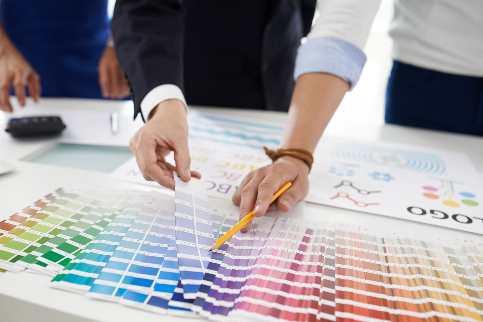
How to Use Psychology to Shape Your Ad Logo Design
Posted on June 15, 2017 by Logo Design Tips and Tricks
If you feel like your current logo isn’t doing anything to bring you customers and engage with your target market, it’s time to evaluate how to use psychology in your logo design.
Let’s look at how shape and color affect your target market’s mood and likeliness to do business with you.
Use the Psychology of Color in Your Ad Logo Design
No matter what you sell, from a direct response tv to highly-pigmented eyeshadows, you need a strong ad logo design to help you sell more of it.
That starts with a basic understanding of the ways in which different colors can create certain moods or evoke different emotions.
It’s also a huge part of what makes someone say “yes” or “no” to your product or brand. In fact, over 84% of people say that color is one of the most important factors that influence buying decisions.
This statistic only makes choosing the right color even more crucial. You need to choose the color that evokes the mood most closely related to your brand’s message.
Let’s quickly look at some of the most popular colors in ad logo design, and the psychology behind them.
Red
Red indicates strength, urgency, and even aggression.
This means it’s perfect for things like gyms, startups, and medical brands. Of course, it also has a strong association with sales and discounts, meaning it’s a great color to use if you want to draw attention to the money saved by working with you.
Blue
Blue is associated with book-smart intelligence and expertise. This means it’s great for law and accounting firms, as well as other business professional services.
It also helps to calm and relax people, so it’s a great choice for a spa, massage center, or even beauty shop.
Yellow
Yellow evokes happiness and positivity, meaning it’s a great fit for retail shops of pretty much any kind. It works especially well in more creative fields and stores.
Green
You probably have already guessed what green makes people think of — money. This means it’s a great option for a logo design for a financial firm.
However, it also works to restore balance. This means a yoga studio, a bookstore, or even a non-profit could use this color well.
The Psychology of Shapes
Colors aren’t the only thing that matters when it comes to logo design. Shapes also have emotional connotations.
Let’s check out what a few of them are really telling your market now.
Round Shapes
Circles and ovals evoke a sense of trust, protection, and community. They’re great for businesses that handle sensitive information.
They also signal that you plan to be around for years to come — that you’re stable and established.
Shapes With Lines
Shapes like rectangles, squares, and triangles tell people that you pay attention to detail. This will appeal to Type A clients, and those that value professionalism over anything else.
They also appeal to a more intellectual and scientific mind, making them wonderful shapes to include in financial firms, schools, and Internet companies.
Use Human Psychology to Your Advantage
Now that you know how to send helpful subliminal messages through shapes and color, it’s time to start creating your logo.
Use our free online logo maker tool to help you to make the most visually-appealing and unique design possible. Be sure to check out our blog for more great advice on ad logo design!


