5 Pest Control Logo Designs Exterminators Need to See
Posted on August 18, 2017 by Logo Design Tips and Tricks

Are you a professional exterminator looking for a new pest control logo? A good logo can make you instantly recognizable online and out on the street, so it’s important you pick one that captures imaginations.
If you’ve been thinking about a new pest control logo, but you’re struggling for inspiration, learn from these 5 great designs.
Then try to make your own logo using our online tools.
Doc’s Pest Control, Inc
This logo, along with its tagline, sets a clear expectation of what you can expect from the Doc’s services – in a memorable and humorous way.
Perhaps humor doesn’t suit all businesses, but a light-hearted touch might be effective in getting customer’s attention within an industry which is quite heavily populated and often takes itself very seriously.
Western Pest Control
Western Pest Control started a competition to get their logo created. They got 191 concepts submitted by 32 designers, and the winner was a very clear graphic.
The shield symbolizes protection, and it’s used quite frequently in pest control. However, it’s also used in other industries where protection is called for, like cyber security and insurance. So the bug image makes it very clear what Western does.
BugBully
This BugBully’s pest control logo looks great. It’s less clean than Western’s, but conveys the same message – the pest is a threat to your home.
And the ‘bug’ looks generic enough to cover all sorts of household insects, so it doesn’t matter whether the company is the best bed bug pest control company or a cockroach specialist. The cartoon covers all the possible angles.
Property Protect
Property Protect incorporates graphics of a bug and a roof to send the message that they’re all about looking after your home as well as the possible insect invaders living inside it.
The magnifying glass signifies the company’s attention to detail, and the color scheme is very clear cut.
Pest Defence
This logo for Pest Defence uses a sword for the ‘f’ in the word ‘defence’.
This demonstrates the attack that Pest Defence will launch for on the bugs in their customer’s households.
The logo definitely sends a clear message.
Try Making Your Own Pest Control Logo
Have you tried experimenting with ideas yourself, so that you have an idea of what you want? Do you want to feature a bug, or would you rather show how you deal with them?
Have you thought about what font you might use, and how to incorporate words into the logo? Do you know what color you want your logo to be, and have you thought about whether it’ll look OK on the side of your van as well as online?
Use our online logo maker to put together your initial thoughts, and find answers to common questions here.
You can make your logo as personal or as general as you like – about the bugs or about yourself. It doesn’t matter.
So long as the final result is eye-catching and tells the world what you do, it will work a charm.
5 Designs to Help You Clean Up Your Barber Shop Logo
Posted on August 16, 2017 by Logo Design Tips and Tricks

Does your barber shop logo need a refresh?
Logos often encourage feelings of trust and satisfaction in a brand or product. They should be updated as often as business practices are. And in this fast-paced market, your outdated logo could be driving clients away.
Updating your logo can refresh your brand and inject new life into your customer base. Check out these five tips to find out more!
Old Timey Looks for the Modern Guy
Let’s face it. Facial hair is popular. Everyone’s boyfriend is starting to resemble Grizzly Adams.
With this in mind, there’s nothing more important than keeping your favorite barber shop on speed dial.
But, there’s something classic about the pre-industrial designs of old. You know, back when gun slingers with greasy locks wore big hats? And they ordered strong drinks from a man with a mustache for days?
When it comes to designing your new logo, fun fonts signal creativity.
Clean and Simple
Before you start designing your new barber shop logo, identify logos you love. Choose two or three favorites.
Remember – clean lines and a simple statement will carry you a long way. You want a logo that is easily updatable.
Some of the best logos sport very simple black and white designs, a chic and dramatic choice.
Go Vintage With Your Barber Shop Logo
Everyone loves vintage designs. Barber shops are hot beds of creativity.
These eye-catching vintage designs draw the eye. They also bring to mind the demon barber of Fleet Street.
This kind of logo has a fresh touch, despite its vintage vibe. Add it to business cards and any other swag you want to emblazon your style. Your logo will become a walking advertisement on t-shirts, coffee mugs, and key chains.
Shaken, Not Stirred
There’s vintage and then there’s Bond street. This is no hipster. This is a man who takes pride in his three piece suits and a clean cut look. He’s the type of man who reads beard trimmer reviews from http://www.beardtrimmerreviews.co.uk/
For these kinds of logos, think classic and clean.
Remember to keep the lines straight and stylish. This is an easy style to update because not a lot of changes are needed. When clients come to know and love a service that has been around for decades, they will remain loyal.
The Classic
This man won’t be caught dead with a beard – and you’re going to keep him that way. He is a no frou-frou kind of guy and he likes his hair that way as well.
Think about the type of client you’re serving. When you do this, the idea for your logo will become clear. Some of these types can lead you to get a clearer picture of what you want for your barber shop logo design.
When you’re ready to take your logo design to the next step, check out this site for some practical tips on how to create your logo and take your brand to the next level.
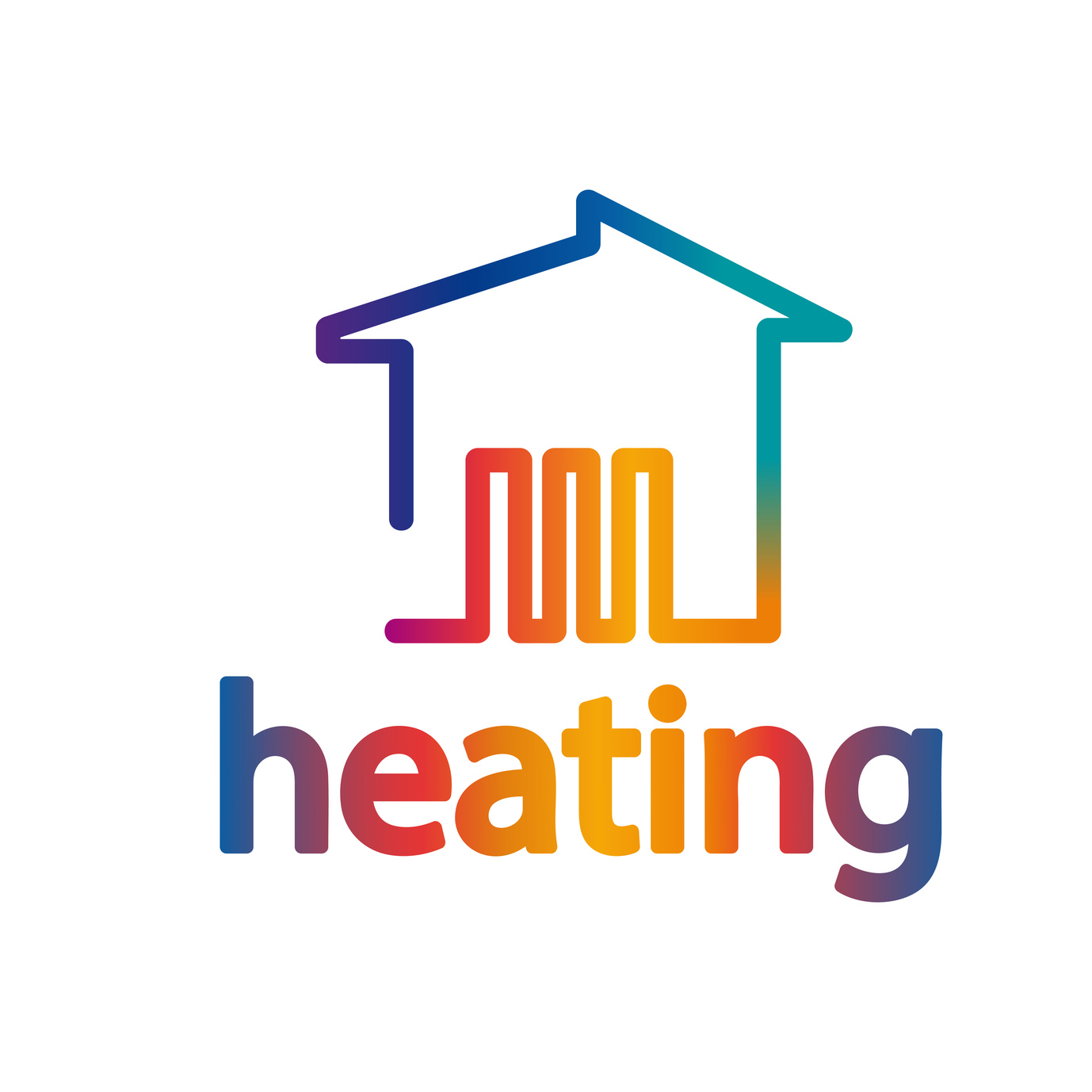
Spice Up Your Company’s Heating Logo With These 3 Ideas
Posted on August 16, 2017 by Logo Design Tips and Tricks
Heating, ventilation, and air conditioning (HVAC) is a booming industry. According to the Bureau of Labor Statistics (BLS), jobs in this field are expected to grow by 14% in the next decade, which is much faster than most other industries.
For HVAC companies, however, that additional growth means additional competition. To set yourself apart from other companies on the market, it’s essential to create a brand that customers will recognize and be loyal to. Creating an engaging heating logo is one great way to do just that.
Here are three ideas to help you learn how to make a logo for your heating company that will be bold and memorable.
Legibility is Key
The purpose of your logo is to make your company’s name and brand memorable. When customers see your logo, they should be able to immediately recognize it and associate it with your company. For this reason, it’s important that your logo is clear and easy to read.
One way to do this is to keep your logo simple. A logo that is cluttered with too many colors, words, and images is distracting and difficult to understand. When it comes to logo design, remember that, in general, less is more.
Of course, you don’t want to be too minimalist with your logo. A well-established brand like Nike may be able to get away without putting their brand name in the logo, but the same is not usually true for small businesses. Instead, Make sure your logo displays your companies name in a way that is clear and easy to read.
Remember the Importance of Color
The color is one of the first things a customer notices when they look at a logo. Think of Coca-Cola for instance. The iconic red-and-white coloring is immediately recognizable, even from a distance.
When choosing colors, try to choose something memorable, and that gives the right connotation. For instance, the color green is typically associated with nature, so probably is not a good choice for a heating company. Instead, consider choosing blues, which are associated with authority, or reds, which are associated with warmth.
Think of Where You’ll Print Your Logo
When you’re making a logo, it’s important to consider what it will look like in context. Since your logo is part of your brand, it will appear on all printed materials. A logo that looks great on your website might not look as good on a pen or a coffee mug.
For an oil or gas heating company, you’ll probably want your logo on hats, t-shirts, and trucks. Think about whether the colors and design you choose for your logo will translate well to these mediums.
Making the Perfect Heating Logo
By following these tips, you’ll be able to create an awesome-looking logo that draws people to your HVAC company.
If you’re ready to get started on your company’s heating logo, check out our free online logo maker. This tool will help you to make a logo that looks great and represents your business well.
How to Use Your Print Shop Logo on Social Media
Posted on August 09, 2017 by Logo Design Tips and Tricks
With more print shops offering online services, you’ll need a great web presence. Part of that great presence is making sure that your print shop logo can be found all across social media.
But social media is a bit of tricky beast. After all, there’s a pretty big difference between using social media and doing so effectively with your brand.
And with billions of people on social media, it’s a part of your market that you simply cannot ignore. But how do you use it effectively and get the best ROI for your time and money?
Read on for some simple tips on how you can use your print shop logo in some creative ways.
1. Use a Section of Your Print Shop Logo as Your Cover Photo
Sometimes, less is more. In fact, minimalism is one of the biggest web marketing trends out there at the moment. Obviously, your social channels need to feature your brand’s logo — that much is a given.
But for a cool minimalist effect, you can choose to use only certain elements of your brand.
For instance, if your logo features both shapes and text, consider using only the shapes. Or if your print shop offers iPhone 6 quote cases, you can feature an example as your cover photo.
One of the best examples of brand minimalism is Twitter’s logo. It features no text and a simple image of the bird. And yet it’s instantly recognizable. As soon as you see the blue bird you know the brand.
Brands should strive for a balance between simplicity and recognizable iconography.
2. Be Consistent Across All Social Channels
One of the most important factors in social marketing is consistency. You’re going to want to ensure that your images are consistent across all social channels.
That means that whatever photo you’re using as your profile photo on Facebook should be used as your Twitter profile photo, as well. It’s an easy way to create brand recognition across all platforms and creates a cohesive feel.
Best of all, it helps your brand stay in your audience’s mind. The more they see your logo on various channels, the more your brand will stand out.
3. Create Timely Images With Your Print Shop Logo
One easy way to get creative with your branding is to use timeliness to your advantage. If there’s a holiday coming up, for example, it wouldn’t be a bad idea to switch up your profile photo.
Not only is this a fun and festive way to keep your print shop logo creative, but it’ll show up on your audience’s Facebook timeline. It’s like a convenient, free way to advertise your business.
And changing your social photo every now and then shows that your channels stay active. Customers are going to use your social media channels to gauge if you’re a trustworthy source.
Make sure you impress them by staying active on all of your channels by regularly switching up your logo.
Create a Great Logo
Make your logo stand out by using Online Logo Maker. We’ll give you all the tools you’ll need to create professional grade logos — all for free! And if you have any ideas or questions, be sure to get in touch! We’d love to hear from you.


