8 Golden Rules of Tech Logo Design (and Yes, They Matter)
Posted on November 23, 2020 by Logo Design Tips and Tricks
Well over half a million companies open up shop every year. Shortly thereafter, several thousands of those same companies close when they find themselves unable to engage customers in a meaningful way.
While there are several reasons why companies fail, particularly in the technology space, one of the chief causes is the lack of branding. And at the center of every lackluster branding strategy is a lackluster logo.
Great tech logo design has often evaded entrepreneurs that are so focused on the product they lose sight of the artistic elements of business building. If that’s the boat you’re in, we’re here to help.
In this post, our team breaks down elements, steps, and considerations that comprise what we feel are the golden rules of excellent logo design in the tech space. Keep reading to take these game-changing tips in.
1. Keep it Simple
Look no further than Apple’s success to understand the power of simplicity. People love clean, accessible designs that make them feel organized and uncluttered. Your tech logo design should embody those qualities.
Some of the most successful logos in the world (Nike’s Swoosh for example) are comprised of a single element. Your logo should strive to do the same as the simplicity of its design will lead consumers to draw inferences surrounding the intuitiveness of your products.
2. Get Psychological With Color
Color, to many, seems like an arbitrary addition designers throw on logos. In reality, color carries a deep psychological meaning that can affect the associations people make with your brand.
The color purple is commonly associated with death. The color black is associated with power. Which color/meaning would you prefer attached to your company?
That’s a question only you can answer but we ask that you do so with a full understanding of color’s primal impact.
3. Prioritize Recall
As you start to create logos during your drafting process, if nothing else, keep this single thought in mind — recall.
The way you know a logo is successful is if the moment people look at it, they’re immediately able to recall your company’s name. Anybody that sees golden arches, for example, thinks McDonald’s. Any time people see multi-colored peacock feathers, they think NBC.
Your logo’s ability to walk the line of simplicity and uniqueness to prompt recall will help it on its way to achieving the ubiquity the world’s most successful designs enjoy.
4. Be Medium Agnostic
You might design a tech logo that looks great on a website. How would that logo look blown up on a billboard though? What about if it was printed on a business card?
As your company grows, so to will the mediums in which you engage consumers. Your logo needs to be ready for that dynamism so you’re not forced to recreate it or alter it as new needs arise.
5. Understand What Tech Logos Look Like
We would never advocate that you copy other’s logos or strive to be exactly like competitors in your space. There are certain common qualities in logos that spur thoughts of tech when consumers look at them.
To discover what those elements are in your market, analyze the most successful tech company logos you know of. Check out Apple’s logo, Microsoft’s, Oracle’s, and others.
Do you see common threads you can adopt? Can you spot the differences in a logo that’s selling disaster recovery services versus business continuity services?
Make mental notes on what you learn and use those findings to your design’s advantage.
6. Don’t Knock Text Till You Try It
Just about every tech entrepreneur we’ve talked to starts down the path of creating shape/graphic-based logos. We don’t blame them as logos comprised of graphics are among the most popular.
Still, we’ve seen very successful logos lean solely on text. Think Coca-Cola or FedEx.
All of that to say that if you’re hitting a creative rut with graphics or just want to start on your logo design with a different mindset, focus on text. As long as your typeface is legible, you may come up with a design that’s simple and original.
7. Draft, Draft, and Draft Again
Your tech logo design’s chances of resonating with an audience go up substantially each time you draft a new idea. So, don’t be afraid of the process of drafting something up, setting it aside, and trying another design.
Too many people get stuck on their original logo drafts and cut themselves off from the wonderful opportunities that may come from continuing to let their creativity flow.
Don’t be one of them.
8. Get Feedback
The best way to gauge if your logo is achieving its intended end is to ask other people what they think. If possible, get your logo in front of people that are your target audience as their opinion matters most.
Two or three feedback sessions could increase your logo’s efficacy ten-fold so don’t miss the opportunity to solicit feedback.
The World’s Next Greatest Tech Logo Design Could Be Living in You
Our team has hit you with a handful of rules that can help you structure your design process. Armed with them, we implore you to start playing with ideas and testing them with your audience.
The world’s next great tech logo design could be just one draft away from being in your possession. Work towards that reality and know that we wish you the best of luck as you do.
For more tips on logo design and other business/lifestyle topics, explore more of the content on our blog.
Tech Company Logo Design Trends to Look for in 2021
Posted on November 22, 2020 by Logo Design Tips and Tricks

Have you just started a new tech company? Perhaps you’ve been inspired by the pandemic to create a company that is based entirely online. This type of business can thrive in the current times.
As well as hiring great people and coming up with a business plan, you also need to make sure you have a great logo to support this idea.
But what makes a good tech company logo in 2021? What color schemes work best and what do logos in 2021 actually say about the kinds of companies opening now?
Here’s everything you need to know about logo design in 2021.
The Future
A key theme you will see in logos of the 2020s in the future. It’s often said that the future is a self-fulfilling prophecy. We see the future depicted on television or films and then we make that future a reality.
The same is true of logos. Digital companies want logos that speak to that concept of the future because they want their customers to feel as if their products transport them to the future. The services of Myte Tech can help many businesses achieve that dream and realize their customers’ vision with some great tech solutions including logo design.
Because 2020 has been the turn of a decade and has seen major technological advances, it’s natural that logos should reflect this.
Look for logos that have a space theme or that have interesting fonts. Perhaps black and yellow could be an interesting futuristic color scheme as it is bold and striking.
Hawking Back to Simpler Times
There are many companies that fight back against the stereotype of what the future should look like with traditional logos.
These hark back to simpler times. If you run a digital publishing company then you might want an ornate logo reminding people of the Victorian era, the so-called golden era of books when everyone was reading huge literary novels that spanned 900 pages.
Yet the reality of your company might be that you publish largely in ebook format.
Simpler logos could include simpler images or animals symbolic of tradition. A lion shows courage where an owl symbolizes knowledge.
The desire to look back rather than look forward in company logo design might also stem from the pandemic.
People are so frustrated by the pace of change and the disruption to our lives that have taken place, a reminder of the past is a reminder of normality and of stability that we desperately crave right now.
2021 in logo design might be a little different from pre-pandemic 2019 logo design.
Animation
Logos that are static will soon become a thing of the past since most people see logos more online than they do in real-life print form.
It could be increasingly common when you log onto the website to see the logo moving in the corner. If you open a document in Pages or Word it could be a case that the logo moves all the time and is not merely a jpeg file that stays still on the page.
As a company, you might want to consider how you can best take advantage of this. Perhaps if you have gone for an animal it can move. A lion could roar or a snake could slither or curl itself up into a ball.
If your logo is more modern and is that of a spaceship then the spaceship could launch off the page and fill up the entire website.
The individual letters of your company name could also be animated; they could appear one-by-one or they might all appear together in a flash.
Sound
Your logo could also use sound to make the desired effect you want. This could create an added dimension to your logo and make it leap off the page and into your customers’ ears as well.
Think about sonic branding – sounds that reflect your company’s brands – when you create the animated logo and you will soon have an entire brand for your company. We are also likely to see a big shift towards audio in the coming years as the audio revolution takes hold.
Consider 2021 Tech
Ultimately logos in 2021 will reflect the technology available to us. 5G which has now arrived in the way of the latest iPhones, will significantly increase internet speeds and decrease webpage loading times.
Websites and apps will load instantly and you will be able to download 4K Netflix in a few seconds. Logos that are graphic intensive will start to become common.
Furthermore screen size and quality will increase. 32 inches is the standard size television for most families and it’s not uncommon to see families with 42 or 50-inch screens.
Meanwhile mobile phone screens now usually push 6 inches where previously they’d be 4.5 inches. Great logos should bear this in mind. They should be bigger and more colorful rather than bland.
Remember cell phones are now the most popular way we as consumers access the internet.
Tech Company Logo: Think Outside the Box
If you’re thinking about a great tech company logo for 2021 then think outside the box. Think about the times we are living in and then try to reflect that in a novel and interesting way.
Remember that there are competing interests as some people yearn for a return to normality and simpler times where others see the 2020s as a bold and bright future. A company logo can and should reflect both these ideas.
If you are interested in reading more about how to create the perfect tech company logo for 2021 be sure to check out the rest of our site.
5 Reasons to Integrate Ketubah Designs into Your Wedding Logo
Posted on November 19, 2020 by Logo Design Tips and Tricks
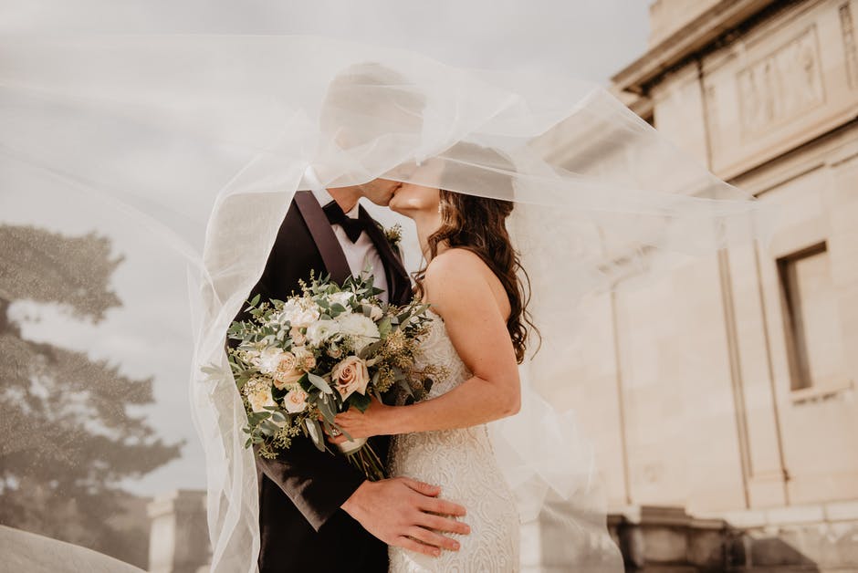
Weddings are the joyous celebration of a new life together, and what better way to express your love and commitment than with ketubah designs. As the ancient document of your commitment, you may be planning to get it designed in an intricate and beautiful way.
By finding a logo maker that can create a logo reminiscent of your ketubah, you’ll have another timeless piece of art to use during your wedding and beyond.
With this in mind, read on to learn our top five reasons why you need to integrate your ketubah into your wedding logo today!
What is a Wedding Logo?
It first helps to know what a wedding logo is and why you need one. Although many of us think of logos as a way to differentiate one business from another, we can also use them as personal symbols. In the case of weddings, logos can be symbols of health and wellness or the commitment you’ve formed with your loved one.
Although logo is a modern word, they’re similar to the coats of arms used centuries ago as a symbol of a family’s proud heritage. In the Victorian era, the wealthy and middle-class had elaborate personal monograms to mark letters and their possessions.
Ketubah Designs for Your Logo
The hardest part about logos is agreeing on a design that you both love. However, if you have a ketubah for your wedding with an intricate, beautiful design that you love, you can use the ketubah designs for your logo as well! Here are a few reasons why:
1. Cohesiveness
When it comes to designing your perfect wedding, creating a cohesive design and color palette is harder than it seems. However, if you’ve had your ketubah designed recently and are in love with its colors and design, you can use it as inspiration!
Choose a few of your favorite colors and use them throughout your wedding. If there are design elements that you enjoy such as trees and birds, you can use these as well.
A logo that looks similar to your ketubah will help your wedding look even more cohesive and united.
2. Beautiful Stationery
Designing wedding invitations, reminders, and programs can be just as hard as the wedding reception itself. However, a logo that’s designed with elements from your ketubah can cut down your workload significantly. A simple logo on the front of your cards can look elegant, minimalistic, and chic.
A logo with your ketubah design on your wedding program can also look beautiful and tasteful.
3. Timeless
Many people shy away from logos because there’s the chance that they might appear tacky or that the wedding is branded. You don’t want your wedding to appear like a networking event! You can blame this on poorly designed logos.
These logos often don’t match the couple’s personality. Logos made from a template may have been used by hundreds of other couples and don’t have any unique features.
A custom logo designed with your ketubah in mind is a timeless reminder of your love for one another.
4. Variety of Uses
One of the best parts of a ketubah logo is that you can use it throughout your wedding. You can offer temporary tattoos of your wedding logo as a fun activity during the reception. You can shine a spotlight on the dance floor with the logo. You can even design party favors featuring your wedding logo.
Your wedding logo can be added to your wedding cake as a topper or as an intricate design directly on the cake itself. Even better, you can even hand out coffee cups, wine bottles, or beer bottles with the log featured.
There are a variety of options that make the design and cohesiveness of your wedding easier.
5. After the Wedding
Last but not least, you’ll be able to use your logo well after the wedding is over. During holidays, you’ll be able to use it on holiday cards. Some couples may opt to have pillow covers made that feature your logo, or you can create a minimalistic piece of artwork that hangs next to the ketubah.
If you want to be more subtle with your logo, you can use it to create beautiful necklaces. Couples can also request that their wedding photographs use the logo on the front cover if they’re purchasing a custom-made wedding album.
Where to Find a Wedding Logo Maker
Designers who created your ketubah design may be able to make you a logo that matches as well. However, if you’re on a tight budget, you can use a logo maker online as well. It’s important to be aware that it can take time to create a logo that you love, especially if you don’t have design experience.
However, if you follow a few tenets of logo design as well as have a variety of inspirational logos saved on your phone or computer, it’s possible to get the look you desire!
A Beautifully Designed Wedding
Prepping for your wedding is no small task, especially if you have no idea where to start. However, by incorporating ketubah designs into your logos and the rest of your wedding, you’ll find that you can easily create a cohesive and timeless looking wedding that you both love.
Even better, find a logo maker that can design your logo based on your ketubah design. This is a great way to enhance your options as well as have a timeless piece of art that you can enjoy.
Ready for more logo tips? Keep reading our blog for more informative articles!
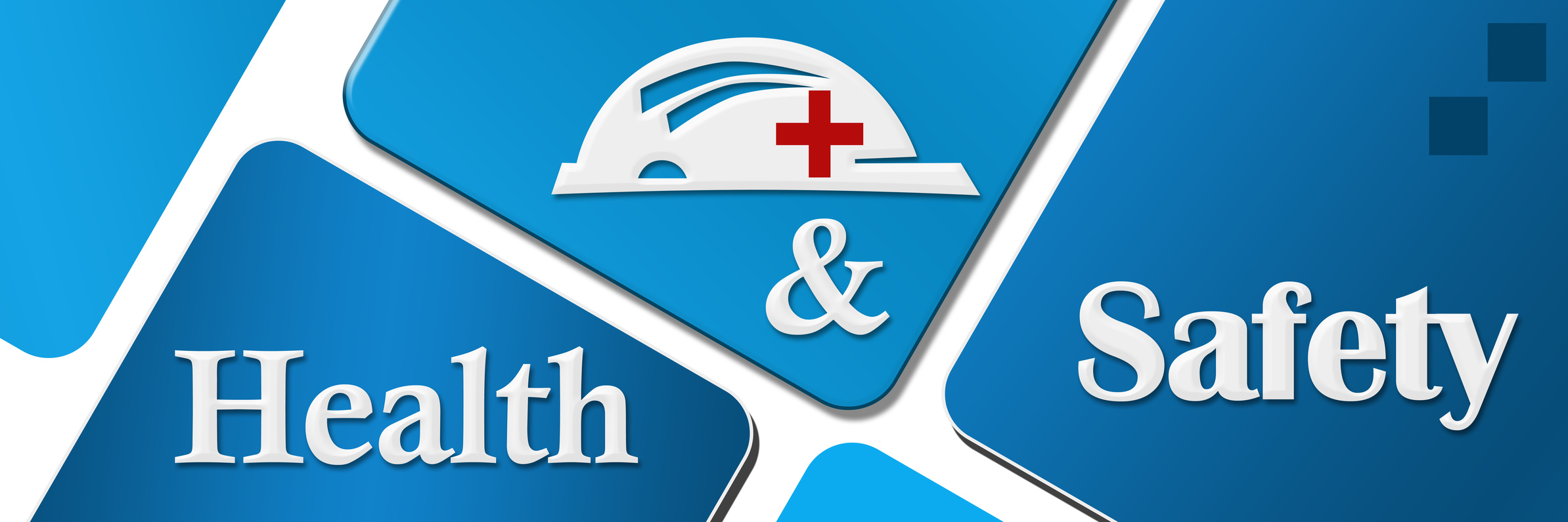
3 Design Tips for Your Health and Safety Logo
Posted on October 04, 2019 by Logo Design Tips and Tricks
When you think about health and safety, what do you think of?
You probably think of that warm and cozy feeling of security. You feel protected. Like a guardian angel is watching over you.
So how do you convey this message in your health and safety logo when trying to bring in new clients for your training business? You want quality.
Keep reading, we’ve got three tips to take your logo from “ugh” to “ugh-mazing”.
Your Health and Safety Logo
Shape up
When you think of health and safety logs, you may think of crosses.
The most famous example of this is the Red Cross.
You have also seen a similar looking green cross. The difference is the green cross is a universal sign for life and represents professional healthcare and the red cross is copyright-protected. So you cannot use the red cross without permission.
The International Standards Organization recommends using a white cross on a green background to represent first aid.
Origins
The cross does have religious significance and has for nearly two thousand years. However, the use in first aid didn’t come about until the 1800s.
It was adopted as a way to communicate with combatants that those who wore the cross were on the battlefield to administer first aid and help wounded soldiers to safety.
It quickly because known as a way of saying “Please don’t shoot”. Here we are, nearly two centuries later, and the symbol has found its way into almost every first aid and healthcare logo that exists today.
Dare to be different. While using a cross is perfectly acceptable, make your logo stand out with something newer and bolder.
Colors
Red, green, and white are used in the everyday health and safety logo for a reason. But they’re also boring.
Your logo is part of your brand. Do you want your brand to be washed away in a sea of green and red crosses with every other training business out there?
Use yellow and gold to depict clarity and warmth like The American Society of Safety Engineers.
Oranges and blues are being used by tech start-ups across the board. Think about Firefox, Amazon, Walmart, IBM.
Not only do these color schemes look great when paired together, they also provide part of their brand message. Blue symbolizes dependability, trust, and strength while orange represents cheerful confidence and friendliness.
The combination says, “We’re here for you and have great customer service!”
Throw in a touch of green with your health and safety logo and your brand will scream the right message to your customers.
Utilize What Isn’t There
Use your negative and white space in a health and safety logo. Crosses and circular life rafts are boring and dated.
Think of how NBC uses the peacock and how Fex Ex uses the arrow in their logo.
Find ways to stick in the classic symbols of health and safety without actually putting them into the logo itself!
Logo creation can be an expensive and tedious task. Luckily, we’ve got you covered. If you’re having issues with visualization, check out our free logo maker tool.