What Are the Best Fonts for Fitness Logo Design?
Posted on October 02, 2019 by Logo Design Tips and Tricks

Whether you’re opening your own fitness studio or trying to get your YouTube workout channel off the ground, you know that the way you brand yourself is incredibly important.
There’s probably no aspect that’s more important to the success of your brand than your logo.
Fitness experts may spend hours creating the perfect image and coming up with a great company name. But rarely do they spend enough time on typography, or font when it comes to their fitness logo design.
Typography is crucial when it comes to branding.
But which is the best typography option for your fitness logo? Here are a few of the best ones!
1. Modesto
Are you looking to catch a potential client’s attention from hundreds of feet away? Are you planning to advertise on billboards or signs?
If so, Modesto, created in 2000, has exactly what you need.
It’s eye-catching without being aggressive and can work with a variety of colors. It’s all-caps look communicates to clients that you’re serious about helping them with weight loss and their other fitness goals.
For those not afraid to sweat, it’s a great choice!
2. Helvetica
Sometimes, there’s nothing wrong with going with a classic. Especially if your gym is primarily focused on strength training or high-intensity workouts like kickboxing, this is a great solution.
It looks best in black and white.
3. Rockwell
If you want your fitness logo design to call to mind rugged Americana (think Olympic champions) then this bold option is a great choice for you.
It’s easy to read, even from a distance, and it can be easily resized to stay legible both online and in print. Use it in red or blue for an extra pop!
4. Bobber
If your fitness business does things a little outside of the box, then this is the option for you. It caters to a more “hipster” clientele, which means it’s great for the millennial market in a larger city.
Plus, especially if you own a cycling studio, this font (inspired by motorcycles) is a great fit!
5. Custom Typography
Of course, the last and perhaps the strongest typography option for a fitness logo design is to have a unique font created specifically for your brand.
It not only ensures that no one else has it, but it communicates to your clients that you’re willing to go the extra mile — just like they should be!
It’s an investment in your branding and one more thing that makes you that much more memorable.
Especially if you advertise online, where the market is even more competitive, this will really help to set you apart.
Create Your Fitness Logo Design Today
Thanks to this post, you now know some of the best typography options you can use when dreaming up your fitness logo.
What else can you to to take your logo to the next level? Try out your designs in our free online logo maker tool.
Also be sure that you keep reading our blog for more branding tips as your fitness business continues to grow!
5 Tips to Create a Killer Music Logo Design
Posted on September 30, 2019 by Logo Design Tips and Tricks

As a musician, your band is everything to you.
But when it’s time to create a music logo design, it might be a challenge to come up with an option that does your sound — and your fans — justice.
Sometimes, the process is just as tough as cutting an album! You’ll have conflicting opinions, creative blocks, and more.
Don’t worry — we’re here to help. Read on for our top 5 design tips for band logos.
1. Get Inspiration From Your Lyrics
If you’re feeling stuck, you can always look to your lyrics for an answer! Think of your biggest hit. Is there a particular line that your fans love to scream out with you at concerts?
Use those lyrics to inspire your logo design!
2. Get Your Own Font
Typography, or font, plays a huge role in logo design. Even if you decide to switch up the colors or even design of your logo later on, having a font that’s all your own can help you to keep things consistent.
Most bands will likely want to have a custom font created, especially as their fan base grows. If you can’t afford that yet, just focus on making a few letters stand out! You can color them a different shade, make designs out of them — pretty much anything you can think of.
3. Choose Your Colors Wisely
The colors you choose can also say a lot about the type of music your band plays. Blacks, reds, and silvers will work well for the heavy metal genre. If you’re into easy listening music, go for relaxing greens and blues.
Make sure you have at least two colors in your design to help things really pop –especially if you plan to wear your own merch onstage.
4. Let Your Genre Guide You
If you’re a classical music group, it probably won’t make much sense for you to have a logo that includes spotlights of different colors, raining glitter, or neon hues.
But if you create popular techno songs, that design would be a great fit!
Make sure that your design is consistent with the type of music you play. Keep in mind that if you’ve recently changed your sound, it might be time for a logo redesign.
5. Let Your Fans Help
You’d be nothing without your fan base! Show them you appreciate their input by letting them influence your music logo design.
You can ask them to help you to create images, have them vote on the final options, or just drop hints about your upcoming logo reveal on your social media accounts.
Remember, these are the people who will wear your logo and advertise your band. You have to make them happy.
You’re Ready To Make An Awesome Music Logo Design!
Thanks to this post, you probably have more than one idea you’re itching to try out.
Creating a music logo design is a lot like writing a song — you might not always get it right the first time. To test out your options before you make a final decision, use our free online logo maker tool.
Also, be sure to check out our blog and website for more advice on how to turn your band into a brand (while staying true to yourself and your music.)
Department of Defense Logos: The Secret Meaning of 3 Famous Emblems
Posted on September 08, 2019 by Logo Design Tips and Tricks
A logo stands for a lot; it’s a representation of how users identify with that brand or company.
The logo for the beer company Stella Artois is one of the oldest logos that has stuck around. The same horn that beckoned travelers in Belgium is the same horn that we recognize on Stella’s logo today.
Other companies like Twinings Tea, Shell Oil, and Levi Strauss are also some of the oldest and most famous logos which haven’t changed.
Emblems from government agencies like the Department of Defense logos have meaning and history as well. And some of the stories behind them are fascinating.
Do you want to know more about some of these secret meanings and logos? Scroll down to find out more!
1. The Air Force Seal
One of the most famous military emblems is the seal of the United States Air Force.
It wasn’t until the fall of 1947 that the first proposed emblems were drawn. And it was a conference of 30 top-ranking air force generals who considered the proposed one. But they weren’t entirely happy with the first draft.
They decided the background should be blue, rather than green. And instead of the Wright Brother’s airplane which was featured on the logo originally, the generals determined that symbolic design would be better.
In that same discussion, the artist, Mr. Arthur Dubois, picked up a pencil and flipped the design to sketch Jupiter’s thunderbolt as a proposed symbolic design.
They agreed, and the final design got approved by Truman just 2 months later.
Blue and gold, the predominant colors on the emblem, are also the colors of the Air Force and Air Corps.
The American Bald Eagle is a symbol of air striking power and the United States. The wreath incorporates the colors of the basic shield design, and the cloud formation portrays the creation of a new firmament.
The 13 stars on the Air Force seal represent the first 13 colonies of the United States, and the grouping of the 3 stars at the top depicts the 3 departments of the National Defense Establishment (Army, Air Force, and Navy).
The shield, which is divided with the nebuly line formation, represents clouds. It’s also charged with the thunderbolt, which exhibits striking power through the air.
The Department of the Air Force was established in 1947, which is what the Roman numerals beneath the shield indicate.
The eagle’s head, which turns to the right, faces the enemy. It also represents not dwelling on past deeds and looking toward the future.
2. The Department of the Army
Before they established the Army emblem, there was nothing to represent the Army. Up until that point, the seal was only used to authenticate documents and wasn’t authorized for display.
In 1974, the Secretary of the Army approved the design as the official emblem, as they realized the need to provide a symbol.
While the seal is black and white, the emblem is always displayed in color.
The seal inscription says, “War Office,” whereas the emblem description says, “Department of the Army.”
The American flag is on its own on the right side of the emblem. On the left side, the pattern of the Army was added to another flag.
They replaced the Roman numerals with the year 1775, which is the year that the Army was established.
The flags are in proper colors, and the other colors represent the ideals of the United States and the Army.
Red is indicative of courage, fortitude, and zeal.
Blue portrays vigilance, loyalty, truth, and perseverance.
White is symbolic of deeds worthy of remembrance.
Black denotes determination and constancy.
And gold represents dignity, honor, and achievement.
The Roman cuirass is a symbol of defense and strength. The sword that’s on the emblem, along with the bayonet, cannon, mortar, cannonballs, and mortar bombs are representative of Army implements.
The drumsticks and the drum are symbolic of public support and notification of the Army’s purpose and intent to serve the people of its nation.
The Cap of Liberty is supported on the point of an unsheathed sword, and it says “This We’ll Defend” on a scroll held by a rattlesnake. This represents the Army’s constant readiness to preserve and defend the United States.
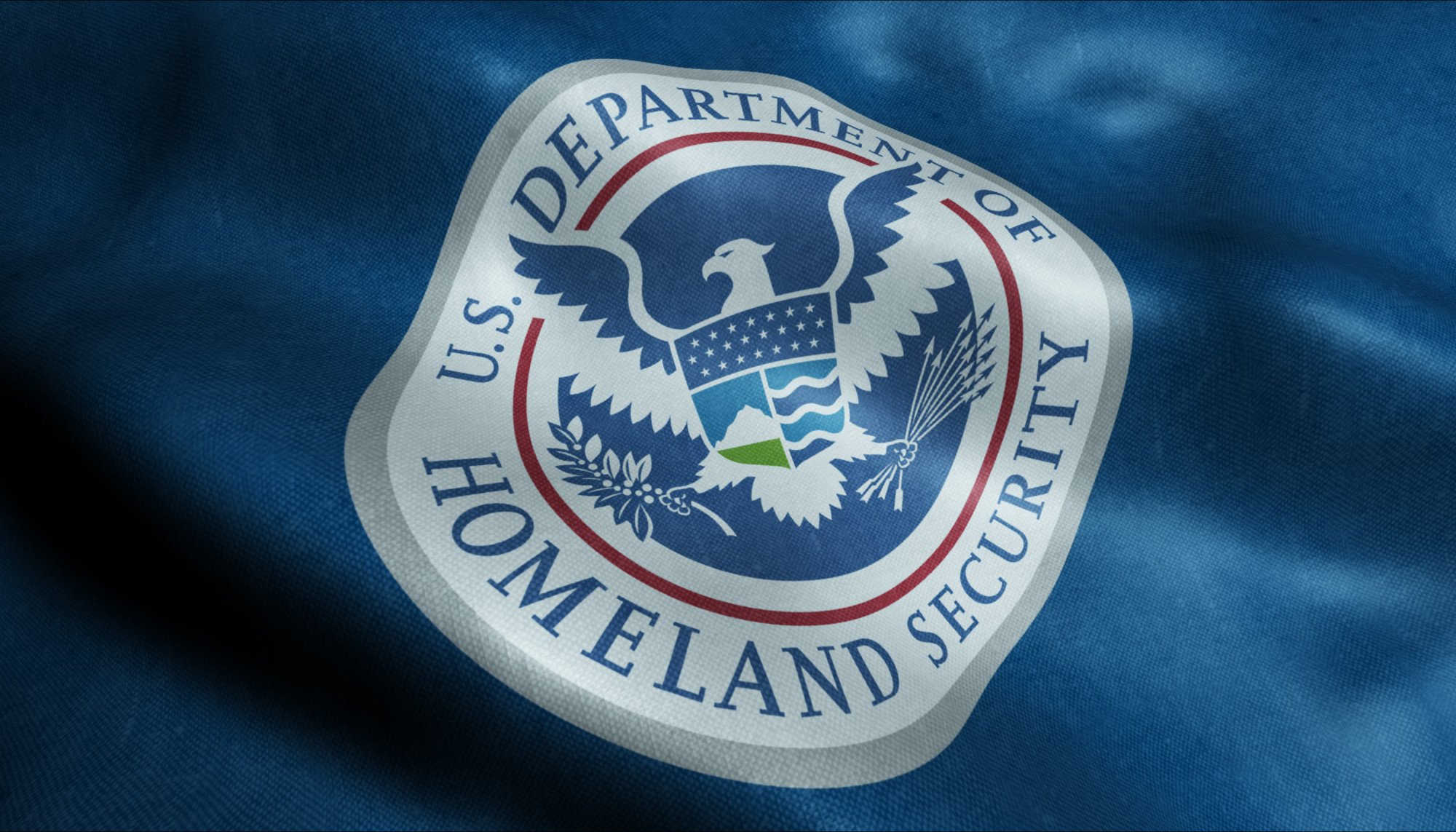
3. The United States Department of Defense
The United States Department of Defense emblem shows a bald eagle with its wings displayed horizontally while grasping 3 crossing arrows.
Above the eagle is an arc of 13 stars with alternating rays. The American bald eagle has long been associated with symbolism for the United States and its military establishment.
It’s an emblem of strength and has been for a long time. The eagle defends the United States on the emblem, which is represented by the 13 pieces on a shield.
The blue chief, which joins together the 13 pieces, represents Congress.
The stars and the rays above the eagle are symbolic of glory, and the 3 arrows are collectively symbolic of the 3 parts of the Department of Defense.
Lastly, the laurel represents honors received in combat while defending peace, which is what the olive branch represents.
Symbols in emblems are exciting. If you want to learn more about the way symbols have been used throughout history, read this to understand how military challenge coins are ranked.
Department of Defense Logos Have Historical Meaning
Just like most successful logos that make their mark on history, the Department of Defense logos are symbolic and introspective in their meaning and purpose.
The goal of any company, department, or business, is to create a logo that represents the brand and stands for something powerful or significant. Changing a logo should never be done unless it’s absolutely necessary.
The longer a logo is around, the more it solidifies its representation of the powerful product or organization that it represents.
10 Genius Tips for Creating a Professional Law Firm Logo
Posted on August 26, 2019 by Logo Design Tips and Tricks

According to the American Bar Association, there are 1,352,027 lawyers in the U.S. as of 2019. Without a distinctive brand, your law firm could end up fading into the crowd. So how do you stand out?
To build your brand, you need to start with a professional law firm logo.
A strong, unique logo can represent your entire law firm. You won’t just stand out. Potential clients will even begin to recognize your firm on-sight.
Here are 10 genius tips to help you get started. With these tips, you can create a professional logo that stands out from all the rest.
1. Know Your Niche
No two law firms are exactly alike. Your distinct expertise can help you stand out and attract a specific set of clients.
Before you start designing your law firm logo, consider your audience. Think about them in terms of likes, dislikes, needs, and demographics. These details can tell you a lot about how to appeal to your clients.
Your firm’s specialty can help you break apart from the pack, too.
Does your firm focus on environmental law, or perhaps car accidents? Firms that specialize in these areas would use different imagery than maritime attorneys. Knowing your niche can help you find the right imagery for your logo.
The goal of good logo design is to tell people who you are and what you do with the right imagery. Recognizing your niche in the design can help clients recognize it, too.
2. Keep It Simple
If you want a memorable logo, keep it simple. There are other ways to stand out as a law firm without a messy, complicated logo. After all, a complicated logo is more difficult to remember.
You shouldn’t make it so simple that it looks like all the rest, though.
Instead of choosing overused imagery, try art that keeps it simple but leaves an impression.
A simple logo also improves its functionality, which we’ll get to below.
3. Consider Color
According to this research, color can improve brand recognition by up to 80%.
When choosing your brand’s color scheme, keep color psychology in mind.
For example, we associate the color yellow with energy, red with passion, and green with growth. Different shades of these colors, however, can also change the meaning. If you choose blue, light blue conveys calmness, which darker blues conveys intelligence.
Try to choose three main colors for your law firm logo. That way, you can create various versions of your logo based on the use.
What if you create shirts with different colors or want to use a white banner instead of a white one? Creating versions of your logo with different color schemes can help make your logo easier to use.
4. Don’t Forget Function
Speaking of banners, shirts, and other marketing materials, your logo needs to work for multiple functions.
For example, you’ll want your logo to display on your website and social media. If you have a responsive website, your logo will change sizes depending on the browser window’s size.
Meanwhile, your logo will need to expand for much larger sizes if you’re using it for a billboard.
In other words, your logo needs to work whether it’s getting bigger or smaller. Make sure you save your law firm logo in the proper file sizes to make resizing easier.
5. Select a Firm Font
Your font can help you stand out just as much as the imagery and color scheme can.
First and foremost, the font should be easy to read. Otherwise, how will people know who you are? Choose a font that’s clean, but feel free to look beyond the standard fonts.
Avoid cursive or script fonts, which don’t work well for law logos.
You can choose traditional, modern, or somewhere in between. The font you choose depends on your law firm’s brand and the message you’re trying to convey.
6. Check out the Competition
If you’re trying to stand out from the crowd, you need to know what that crowd looks like, first.
Go ahead and research the competition. What are they doing to stand out? What message does their logo convey?
Ask yourself what you like and don’t like about their logos. Researching the competition can help you determine what approach you want to take for your own logo.
7. Focus on Your Name
Most law firms build their reputation on their firm’s name. Since the name is the focal point of the logo design, find a way to bring it into the spotlight.
Take a look at where the name is located in the logo design. Is it overshadowed by the imagery?
What about the font and size? Play around with your law firm’s logo until you find the right combination.
8. Hire a Professional
A professional designer can help you avoid basic mistakes. They also know the latest design trends. With their help, your logo will look good and appeal to your target audience.
Hiring a professional who has worked with law firms in the past can give you some insight, too.
9. Keep It Up-To-Date
The latest trends in graphic design change all the time. If you want your logo to stand out from the crowd, it’s going to need an update from time to time.
You don’t have to scrap your entire logo and start over.
Instead, you can make small changes to make sure your firm still looks fresh and relevant.
10. Make It Unique
Your law firm is already unique, but why?
Pinpoint your unique value—what you offer that no other firm can. While you’re at it, consider your company mission. Since they’re both unique to your company, capturing your value and mission in your logo will make the design unique, too.
Looking Good: 10 Tips for a Professional Law Firm Logo
Look good, feel good, and stand out from the crowd. Using these 10 tips, you can create a professional law firm logo to help you attract new clients. With these tips, you’ll outshine the competition in no time!
Check out our online logo maker today to get started with your own logo!