What Kind of Company Should Use a Blue Logo?
Posted on February 13, 2020 by Logo Design Tips and Tricks
Out of the top 100 brands in the world, 33% of them have a blue logo. This includes famous brands like Ford, IBM, and Pepsi.
If you’re starting a business, your instinct might tell you to stand out from the crowd. You don’t want your customers to confuse you with your competitors, after all.
But, colors carry meaning and picking a particular color just to be unique can work against you.
Luckily, there’s a reason why blue is the most popular color for successful brands. Read on to learn the meaning behind blue logos and if it’s the right choice for your company.
What Does the Color Blue Represent in Logos?
Blue is the color of the sky and bodies of water, which could be the reason it’s many people’s favorite color. It’s also associated with calm, comfort, and relaxation.
Blue suggests that something is dependable, trustworthy, and stable. It is also considered reliable, mature, and smart. Blue is also an indicator of serious professionalism. Dark blue is usually more serious, whereas light blue is more playful.
Types of Companies That Use Blue Logos
The color blue represents dependability and trust. That’s why it’s a popular logo color for car manufacturers, tech companies, the healthcare industry, and financial institutions.
Whether you’re buying a new car or computer, investing money, or going to the doctor, trust is important. You should feel like the company is stable and serious about what it does. If a company uses blue in its logo, you’ll feel more certain of the company.
Manufacturing companies like General Motors, Ford, Boeing, and General Electric have all stayed in business for many years because of customer loyalty. Their products are expensive investments (airplanes, vehicles) so they need customers to trust them.
Blue is also a popular color for tech companies like Dell and Facebook. It’s a great color for tech because it suggests intelligence and reliability.
Financial and Healthcare companies like Chase, Blue Cross Blue Shield, and PayPal, use blue to highlight their experience and trustworthiness.
Why Does Your Brand Color Matter?
The color that represents your brand can affect your bottom line. If you choose the right color, it can help you attract loyal customers. The wrong color might send mixed messages to your potential customers.
For example, if you’re trying to appeal to everyday men and women, think twice about pink or purple. They evoke femininity and luxury. They’re great for an upscale beauty brand, but not the best for a small town accounting firm.
Once you’ve chosen a logo color, you also need a coordinating color palette. It’s important to choose colors that fit with your logo, otherwise it can undermine the message you’re trying to send with your logo.
Design the Logo for Your Business Today
A blue logo can show potential customers that you’re trustworthy and reliable. That’s why it’s the best choice for tech, financial, healthcare, and manufacturing companies. If you want to build long-term relationships with your customers, choose blue.
To learn more about building a brand for your business, read our articles on marketing.
When to Use Blurry Images in Web Design
Posted on January 28, 2020 by Logo Design Tips and Tricks

When it comes to the qualities of what makes a good photo, you may expect “clear and crisp” to be one of them.
But surprisingly, it’s not!
In fact, in some cases, blurry images can convey a lot more than clear ones can. But that doesn’t mean you should go overboard though.
Don’t know when to use blurry images in web design? Don’t worry; we’ve got you covered. Read on to find out more.
To Highlight the Foreground
Is there something important happening in the foreground? For instance, maybe you want to highlight 2 businesspeople talking with one another. Or maybe you want to showcase the model wearing your dress.
Either way, you want all eyes on the foreground. What better way to make that happen than to blur out all the important elements (such as the background)? That way, you ensure the subject you want people to pay attention to is front and center.
To Indicate Action
With your image, you want to tell a story. And if you’re capturing something that’s always in motion (such as an athlete or a racecar), you want that action to translate through the photo.
A great way to do this is to blur the image. You can take a photo that’s completely clear and use the “blur image” function to make it appear as if the subject is in motion. This can add some depth to your picture.
To Put Text Over the Image
It’s always more eyecatching to put text on an image instead of having it stand alone. However, sometimes, the image can be too “busy,” and this can cause your text to become lost in the picture, even if you try out different fonts, colors, and sizes.
What you can do is blur the image. That way, it softens everything in it, but the viewer can still tell what’s supposed to be there. As a result, your text will stand out much better.
To Make a Photo More Dramatic
Let’s face it—some photos you take just aren’t very interesting. You might want to use it for your website, but fear it may be too boring looking.
Sometimes, all it takes a blur tool to perk up the image. For instance, a person standing in front of a field may not be too interesting. But once you blur the image, it can look quite nice for your website.
Or maybe you have a photo where the sun is peeking through a window and its curtains. Blur it, and it instantly becomes more dramatic.
Using Blurry Images in Web Design Is Definitely OK
As you can see, there are many uses for blurry images in web design. While it may inherently feel wrong to intentionally have blurry images, keep in mind that it actually makes for a stronger picture. So long as you take our advice and use the blurring tool right, then you’ll have the best photos possible.
For more information on web design, please check out the rest of our blogs.
5 2020 Logo Design Trends to Keep an Eye On
Posted on December 05, 2019 by Logo Design Tips and Tricks
Are you in the process of starting a new business? If so, you’ll want to create a visual symbol that makes your brand immediately recognizable to customers and sets you apart from your competition. A high-quality logo can help you accomplish that.
Unclear about what goes into a good logo design? Not sure what trends to chase, or what you should include or exclude to create a great one? We’re here to help!
In this article, we’re covering 2020 logo trends and best practices you should know. So you can create a logo that’s fresh yet familiar and makes people want to engage with your brand.
2020 Logo Design Trends, 5 to Keep an Eye On
Need some fresh inspiration to create your business’s logo? Here are 5 major trends that can help you start off on the right foot.
Simplicity is King
One of the longest-running trends in logo design is simplicity. That’s because simplicity is impactful. Customers are much more likely to remember something simple and clear than a cluttered visual that’s hard to comprehend.
Simple logos are also a lot more scalable. The more visual elements you add to a logo, the harder it is to discern once it’s presented on a different platform in a different size.
One way to embrace minimalism and simplicity in your design is by incorporating simple geometric shapes. Lines, squares, dots, and curves can make a design feel cleaner, clearer, and simpler. They can also provide an often-needed balance to your design.
Animation
One of the newest trends in logo design is animation. It adds a layer of whimsy to any design and can make a brand seem friendlier and more easy-going. To take it a step further, add a cartoon-style layer to the logo to up the whimsy and playfulness of your brand.
Retro is Back
Retro style logos are officially back in 2020. That means retro patterns, color schemes, and fonts. These style elements can give your brand a laidback and approachable vibe.
Specific Colors
This year we’ll also see a number of brands incorporating specific shades of color into their brand. One trending color will be mustard, which has already been popping up in a variety of fashion and design company logos.
That’s because mustard is a warm color that denotes maturity and sophistication in a friendly way. It’s also an effective alternative to gold for any brands looking for a higher-end logo.
Mint will also play a more prominent part in logos come 2020. Mint can help your brand feel more uplifting and fresher with its soft green hue. It’s also versatile. It’s fresh and fun nature makes it great for a variety of brands, including health and wellness, lifestyle, and home.
Lilac, while already popular, will continue to be a trending color in 2020 as well.
Responsive Design
UX design is on everyone’s mind now when it comes to design. This emphasis on user-friendly, functional design will most likely extend to logos. Responsive logos reflect how advanced a company is within the digital space and make branded experiences clear and clean regardless of platform or device. By creating a responsive logo, you can guarantee that your brand always looks polished and professional.
Ready to Create Your Logo?
Creating a visual representation of your brand can seem tricky and complicated. But it doesn’t have to be. By checking out these 2020 logo trends, you can get the inspiration you need to create a dream logo with ease.
Did you find the tips and trends in this article helpful? Need more advice? Check out the rest of our website for more insights.
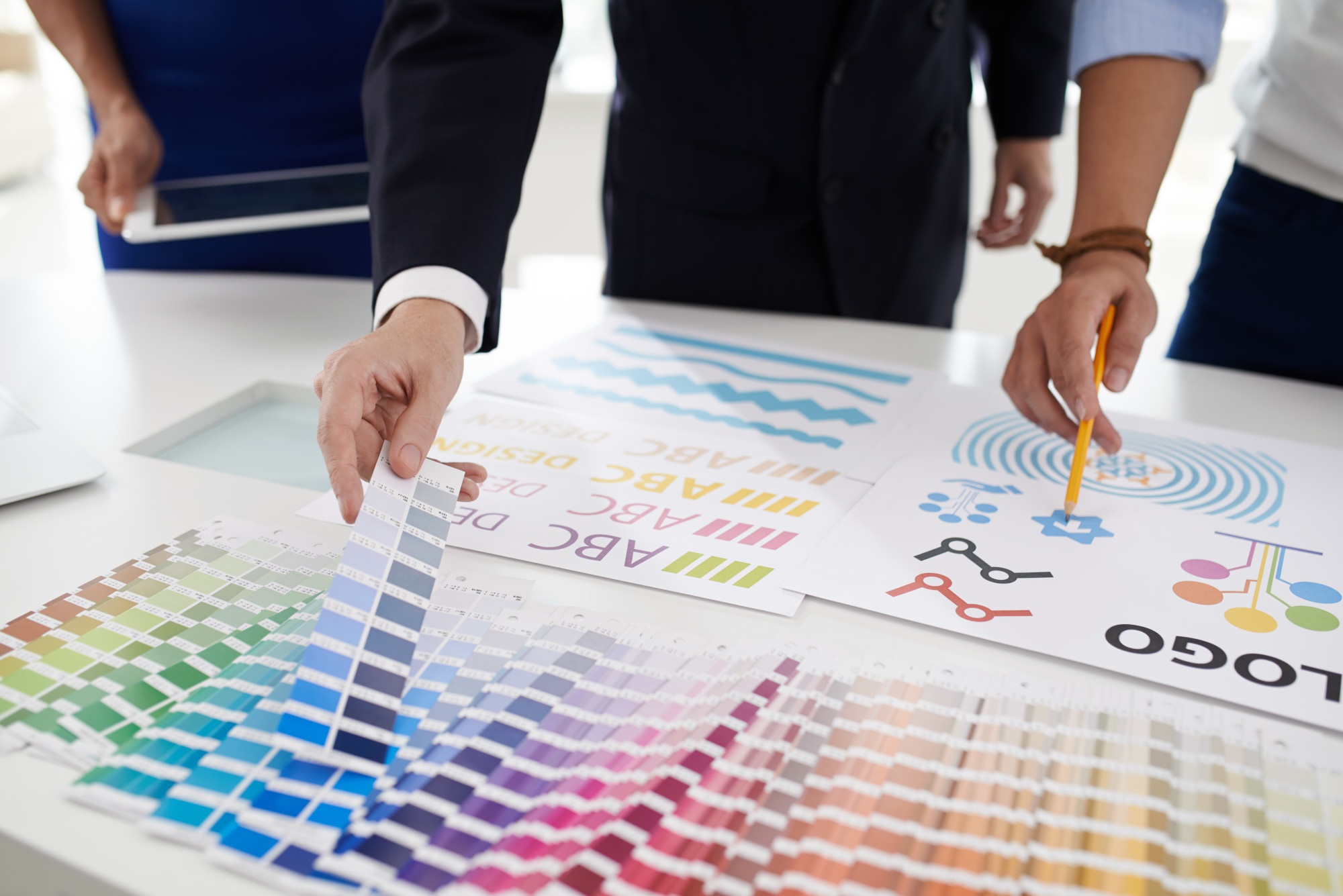
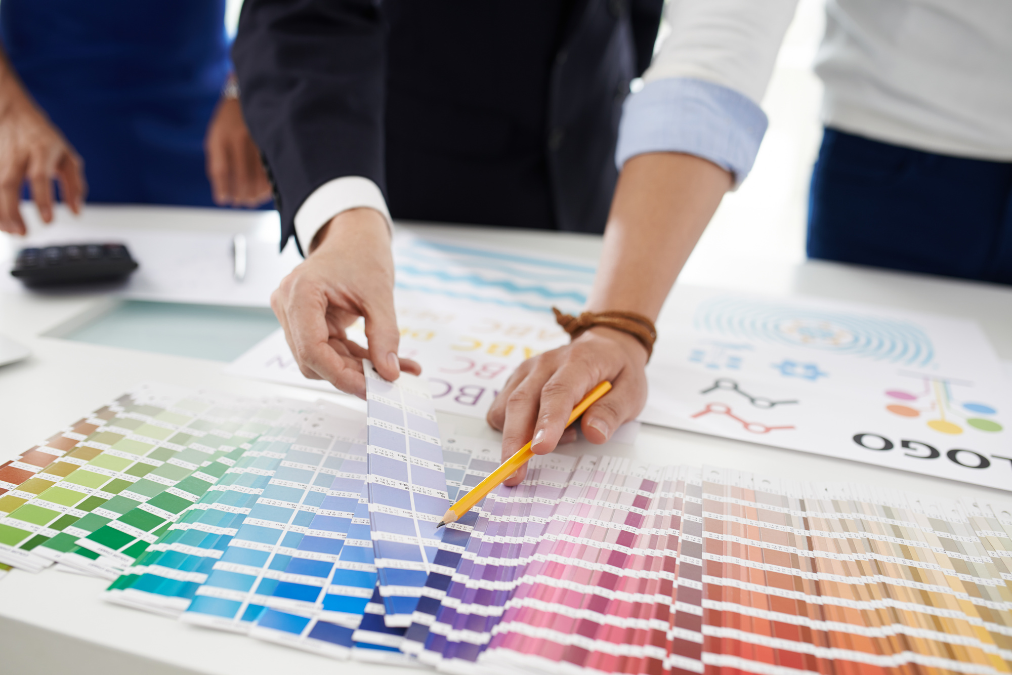
The Psychology of Design: Choosing the Best Colors for a Logo
Posted on November 19, 2019 by Logo Design Tips and Tricks
Did you know that 85% of consumers buy from a certain brand because of the colors used in their marketing materials?
So, if you were thinking of using your favorite color for your logo, think again, as that might not be the best strategy.
Keep reading as we go through the meaning of some of the most commonly used colors in marketing and other tips that’ll be useful for creating your logo. By the end, you’ll have all the tools you need to pick the best colors for a logo!
1. Blue
Blue invokes calmness and confidence. It makes the brand look intelligent, safe and trustworthy. If you want your logo to look professional as can be, this is your color.
Popular for: IT and healthcare
Not so popular for: Food and fashion
2. Red
We all know that red is the color of passion and seduction. This color is often used by marketers because it creates a sense of urgency in the consumer, which many times leads to sales.
Popular for: Sports and food
Not so popular for: Transportation services and baby products
3. Green
As environmental awareness grows, so does the usage of green by brands. This color represents nature, peace, and freshness, and it’s definitely the one to choose if you want to create an eco-friendly brand.
Popular for: Health brands and energy
Not so popular for: Car brands and fashion
4. Orange
If you want your brand to have a friendly image, you should make orange your logo’s main color. It symbolizes energy and boldness, and it’s the ideal one if you want to appeal to young people.
Popular for: Food and entertainment
Not so popular for: Finance and fashion
6. Yellow
Finally, yellow is a very optimistic color, so it’s the way to go if you want to create a joyful, warm image of your brand. This color is also very celebratory and action-oriented.
Popular for: Entertainment and food
Not so popular for: IT and fashion
Choosing the Best Colors for a Logo: Two Extra Tips
As you can see, there are entire definitions behind each color, and that’s something you can’t ignore when designing a logo. But there are other tips you can use in the process:
Choosing a palette will give you a lot more freedom when creating other visual pieces. If you’re not sure what other tones go with your main one, simply generate a color palette from images that are connected to your brand.
- Experiment, experiment, experiment
Even if the first logo you come up with looks good, try it out in other colors. This way you can also show your different creations to other people and ask for their opinion. Remember, many heads think better than one!
Too many strong colors and your logo will be overwhelming. Too many neutral ones and no one will notice it. The secret is in finding a balance between the two.
So, What Color Will It Be?
Don’t worry – you don’t have to make the decision right away. But now you are well-equipped to choose the best colors for a logo, so get thinking!
If you’d like to read more articles on how to create the perfect logo, make sure to keep exploring our blog.


