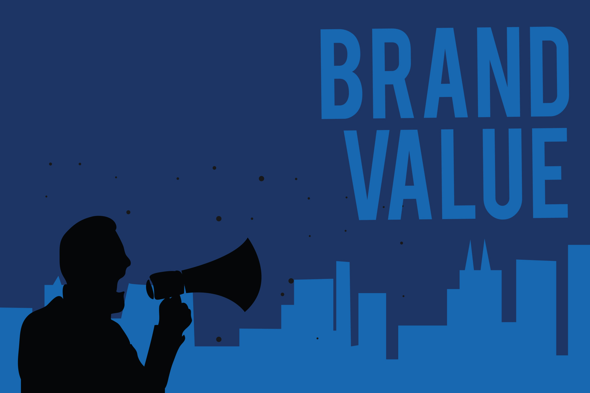
5 Incredible Benefits of Recognizable Logos for Your Business in 2019
Posted on September 16, 2019 by Logo Design Tips and Tricks
There are a lot of businesses out there. In fact, there are 30 million small businesses just on Facebook alone.
With all these different companies, you may be wondering how you can make your business stand out. Having a logo could be your answer.
We have outlined the undeniable benefits of recognizable logos for your business in 2019! Start your successful journey with these awesome benefits!
1. Good First Impression
Having a good logo can help make a great first impression on potential new customers.
A brand logo can actually help a customer decide if they want to buy a product for the first time. The logo is normally one of the first things the customer sees, so you want to make sure the logo is well-designed.
When designing a logo, you want to make sure you pay attention to all of the details. The font, size, and even the color can give your customer a first impression, so make sure it’s a good one.
2. Helps With Brand Identity
Having a good logo also helps with having a brand identity.
If you have the same logo on everything, it helps people associate your product with that brand. This is a great way to create a unique identity for your business.
Your logo won’t just appear on your products. It will appear on marketing material, websites, a business card, newsletters, and brochures. You want to make sure your logo is everywhere, and you want to make sure that people know what your logo stands for.
3. Gives You an Advantage Over Your Competitors
Having a logo can give you an advantage over your competitors as well.
There are so many brands out there on the market, but if you promote your logo, your brand will be promoted as well. Online marketing is key to making sure that customers find your brand, and having an eye-catching, memorable logo, you may beat out your other competitors.
4. Offers Consistency
Having a good logo also offers consistency.
This provides a sense of uniformity in your brand, which can be comforting and reassuring to consumers.
Take Apple, for example. No matter which phone they order, it always comes in the recognizable white box with the Apple logo on it. Consumers are buying from a brand that is familiar to them, so they know what to expect.
5. Helps with Recognition
In addition to all of these, having a logo can really help customers recognize your company.
How many companies do you realize you recognize the logo for? There was even a board game based off of it!
A professional logo can help improve your brand’s recall value. This means that customers will start to learn what to expect when they see your logo attached to something.
Design Recognizable Logos Today!
Having a recognizable logo is a key aspect of making sure that your business takes off.
Without a good logo, your business could get lost amidst all the other businesses out there who do have a logo.
To design a logo today, make sure that you check out the rest of our website!
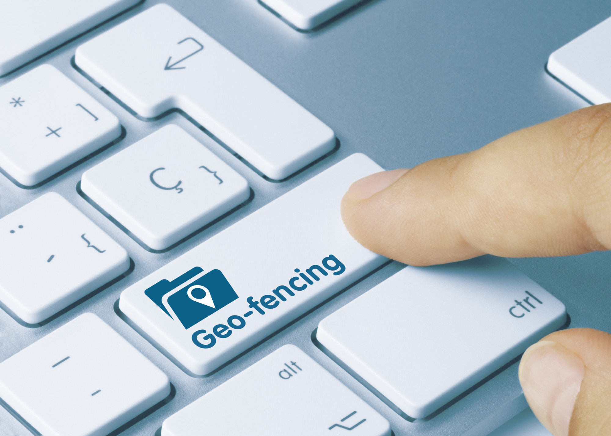
What Is Geofencing Marketing?
Posted on September 14, 2019 by Logo Design Tips and Tricks
Each year more than $200 billion is spent on advertising within the United States alone. Yet, how effective is it if not every single one of your ads is being served to your target audience?
Advertising used to be simply plastering your message in busy places hoping the right eyeballs might stumble upon it. The Internet’s inclusion of digital advertising, however, has changed the game. For those looking to wisely spend their advertising budget, geofencing marketing is practical.
Are you looking to expand your company’s advertising efforts into the world of geofencing technology? Keep reading to learn more about how it can work to enhance your digital reach.
How It Works
Geofence marketing works by establishing areas to capture your audience. These are specific addresses that can be located on any GPS map. The best way to create a list is to brainstorm where your target consumers are.
For example, a business that heavily relies on tourists could geofence nearby hotels for out of town guests. On the contrary, a new restaurant could target rival eatery establishments to get a leg up on the competition.
In order for a person to be served your advertisement through geofencing, they must have a smartphone with its location services turned on. Furthermore, they must use their smartphone in some capacity that triggers a data connection. Fortunately this is no issue since the average American looks at their phone 52 times per day.
Once a target consumer’s phone is activated, your advertisement will follow them for up to 30 days. This also isn’t limited to their smartphone, either. If someone is logged into social media accounts or email on their smartphone, the advertisement will follow them to their computer if logged onto a desktop.
Another feature with geofencing is you can set specific times to capture an audience. This is convenient for temporary events, such as a concert or ball game.
Seeing Results
While this all sounds great, how can you be sure this advanced form of advertising is actually working? Great question!
All reputable geofencing companies should offer transparent digital reporting. This includes how many impressions are being served in addition to the amount of clicks each ad receives, also known as a click-through rate (CTR).
Beyond this, geofencing offers an advantage standard digital advertisement doesn’t for brick and mortar businesses. It’s possible to see when target consumers visit your targeted locations, are served your ad, then visit your business.
This process is called a conversion zone. When you select your targeted addresses you also provide your company’s location so this can be tracked. This feature is helpful in determining which addresses are reaching a larger audience compared to others.
Of course, every company’s needs will vary. These geofencing marketing providers different options whether it’s targeting by zip codes or solely focusing on competing businesses.
Developing a Geofencing Marketing Strategy
Digital advertising has a lot of components, some of which can be a lot to grasp if you’re new to it. With the right approach and outlook, it can be a great tool for reaching a whole new audience while getting the most bang for your buck.
Create a realistic strategy for geofencing marketing. Study your consumers’ habits and where they spend time away from your business.
Are you looking to improve your marketing efforts? Neal Schaffer has a proven track record of helping businesses of all sizes with their digital transformation of sales and marketing through consulting and training. Contact him today to learn more about how he can help.
Worth the Money: The Top Benefits of Facebook Advertising
Posted on September 12, 2019 by Logo Design Tips and Tricks

Facebook had 1.59 billion average daily users and 2.41 billion monthly active users in June 2019.
That’s a lot — about 20.5 percent of the world’s population uses Facebook every day and 32.2 percent use it monthly. (Estimates based on the company’s latest disclosures with the U.S. Securities and Exchange Commission and world population estimates from and an illustration of United Nations data.)
There is so much power for advertisers and marketers on Facebook, not the least of which is the nearly infinite ways to splice the user population for targeted content.
But are you on the fence? Have you never marketed through social sites?
Don’t worry. This post will run through the benefits of Facebook advertising to get you up to speed on what could become a go-to source for online efforts.
Targeting with Wild Specificity
Facebook can help you pare down the specific populations that you want to see your message in pretty amazing ways. Think of any number of demographics to target and then multiply the possible subpopulations by a whole gambit of behaviors get ultra-specific campaigns.
In case you’ve been living under a rock on another planet, the power and specificity of the data that Facebook gathers and offers to marketers have gotten the company in trouble. Its ability to influence specific people is a matter of American national defense issue.
Being Where Customers Live One the Top Benefits of Facebook Advertising
Awareness is all about frequency. The theory behind the classic billboard is that its long-term presence in people’s sightlines will help boost the awareness of a brand as it is seen over and over.
But the problem with the billboard is that it’s not at all targeted and it is only as good as the thoroughfare that it’s exposed to.
Building brand awareness through Facebook advertising puts a “billboard” in the place where people live online.
Since Facebook has such a large user base, Bear Newman of Bear Fox Marketing (https://www.bearfoxmarketing.com/) says that you should utilize Facebook ads, because your audience is bound to be on there somewhere.
An Ad Machine in Every Pocket
According to at least one measure, 96 percent of Facebook users access the social network through cellphones or tablets. That means that marketers and advertisers could be putting the message of their client into millions of people’s pockets.
And it’s hard to say for sure how much time people spend on Facebook. The general zeitgeist suggests that most people spend too much time on Facebook. Some rumors have suggested average daily user time spent on the sight is between 40 and 50 minutes.
Couple that with the fact that smartphone adoption is a runaway train and you should realize that it’s plain foolishness to use Facebook with your ad and marketing efforts.
No Reason Not to Start Now
The backend-user interface for Facebook’s advertising platform is really easy to use and produces a lot of data to analyze. This means that Facebook feeds both your ad and marketing operations and management, and there’s no good reason not to take advantage of the benefits of Facebook advertising.
For more on how to turn those insights into action, hit up our Digital Marketing or Social Media tags to see our latest on how to build your biz with the best internet tools on the planet.
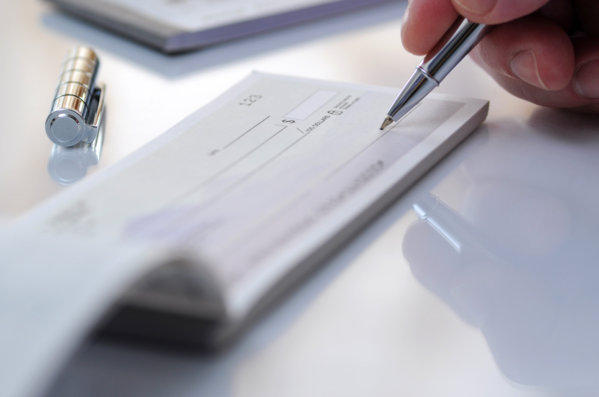
5 Things to Know Before Adding Your Business Logo to Printable Checks
Posted on September 11, 2019 by Logo Design Tips and Tricks
Did you know you have about two seconds to impress a potential customer with your logo?
Of course, you did! And that’s why you have an amazing logo.
So as you’re preparing to create your own printable checks for your business, it’s a great idea to include your logo on them. We’ve got five ways that adding a logo to your business checks pays off.
1. Reflects Highly on Your Business
Because your business check is essentially a reflection on your company, you want your business checks to be the utmost in quality.
Every business check has essential information. But, adding a visual, shows that you’re willing to go the extra mile.
This leaves a positive impression with whoever is handling the check and says that yours is the sort of company with whom people want to do business.
2. Provides Consistency to Build Brand Awareness
Your logo is on your website, your business card, your front door, your advertising, etc. You can even put your logo on a pay stub!
So why not plant it on your business checks too?
To reinforce brand awareness, your visual content should remain consistent. This is Basic Marketing 101.
So even though a business check isn’t technically “content,” putting your logo on there will still contribute to brand awareness.
And customers are far more likely to make purchases from brands they recognize.
Remember, it’s not just the payee who will see these checks. They will likely pass at least one other set of hands before being deposited. That’s an automatic plug for you.
3. Makes Your Checks “Pop”
If you think of your business check is a variation on a business card, then it makes perfect sense to add your logo.
This is especially true if you’re just starting out your business. But it also applies to long-time business owners as well.
Having a color logo makes your business checks stand out and demand attention. It really is a great marketing tool.
4. Establishes Trust
When you make the extra effort to build brand awareness through consistency, it tells a potential customer or client that you’re not just some fly-by-night operation.
That sort of commitment says that you’re a company committed to excellence and that you’re to be taken seriously – that you’re in it for the long haul.
By including the logo on your check, it shows that you’ve made that commitment. With commitment comes trust. With trust comes a successful brand.
5. Will Not Leave You Broke
To add your logo, you don’t need to get your business checks professionally printed. Of course, you can if that’s your desire.
But printing your own checks can help you save money. You can reproduce your logo with an online logo maker to customize your checks.
You just need to learn proper bank procedure and then familiarize yourself with the process and requirements.
Plus, you can print in bulk to ensure that you never run out of business checks. Because almost nothing is as unprofessional as not having a check when you need to pay someone.
Add Your Logo to Your Printable Checks
The extra effort required to create printable checks with your logo is so worth it. It won’t take long, and it’ll create a lasting impression. So make it part of your branding strategy.
And for more great articles on the power of the logo, keep checking back to our site!


