5 Powerful Logo Designs in the Fashion Industry
Posted on July 11, 2019 by Logo Design Tips and Tricks

What do McDonald’s, Starbucks, Gucci, and Nike all have in common?
Every single one of these companies has created a logo that is easily recognizable and identifies each business.
Logos can be whatever you want, you can be as creative as you desire. However, there are certain designs that frequently show up, and for a good reason. They work!
Continue reading about the top 5 logo designs used in the fashion industry that will help you stand out above the rest.
The Top 5 Logo Designs Used in the Fashion Industry
Logo designs are one of the most important things that a business should put thought into. Logos give you the opportunity to tell a story about your business, brand yourself, and even attract customers.
The Gucci logo is one of the most well-known logos and can be seen on almost every product they have. Below are some of the best logo designs that are used in the fashion industry.
1. The Traditional Route
Vintage, classic, and retro looks are a great way to get your company some attention. This style of logos would be best with a company that sells vintage and unique items. The retro look is common in businesses that sell pieces of clothing influenced by the 20th century.
Fonts that are block shaped and monograms are great touches that you can add to your logo if you feel it supports your business.
2. Appeal to Multiple Crowds
When making your fashion logo, you should keep in mind if it is going to be used for kids. When marketing to kids, you have to simultaneously market to the parents who will be buying the product.
Cartoon characters, drawings, and cool fonts are eye-catching for kids. Be sure that this will also be appealing to the adult.
3. Luxurious Logos
Many high-end sellers often have logos that are of equal quality. When selling your product you must make sure that your logo supports your business. In order to make a logo appear more luxurious, you can add small details, gold colors, cursive and thin fonts, and monograms.
Silver, platinum, and black are also colors that embody this type of design. These details will let your customers know that quality is in all aspects of your business.
4. Embrace the Modern World
These days, everything is simplified. Everything has a purpose and looks clean because of the minimalistic style. Companies are beginning to put technology symbols icons in their logos and people are loving it.
If you decide to go with a modern look, you can always spice it up by incorporating vintage and luxury styles.
5. Be Unique
There are common themes that can be found over the years for logo designs but one that will never change is customizing a logo specific to your company. You have the ability to make a logo that is one of a kind, just like your business.
Many companies accomplish a unique look by incorporating a piece of their story or including company icons that people are familiar with. On average, people only spend 5-15 minutes designing a logo, putting in a little more time can give you the chance to create your unique branding.
Tell Your Story
Don’t just design a logo because you need one, make your logo have a purpose. There are many logo designs that can help you reflect a certain image on your company.
Taking the time to focus on what is most important in the company to create a logo could be what shapes your brand. There are no shortages on the types of fashion logos that can be created.
Take a step back and look at your logo, does it portray your company the way you want?
10 Seriously Clever Logos You’ll Love for Creative Design Inspiration
Posted on July 11, 2019 by Logo Design Tips and Tricks
Sometimes it’s hard to tell which logo will hit because it’s not always the most expensive, most well-planned, or time-consuming that ends up among clever logos that define brands perfectly.
Take the Nike swoosh. It cost $35 paid to design student Carolyn Davidson. She needed money to take a class and got the freelance gig from Phil Knight, an accounting professor. He had a company launching a football shoe brand called Nike.
It took 17.5-plus hours to make. No huge ad team. No fortune paid. Although Nike later compensated Davidson with stocks and a diamond ring.
But how do you get the most creative logos without an ad team and marketing planning?
Well, many great logos use these tools. They cost money but are often the recipe for success. So, if you’re looking for a great logo for your business, you can put the right steps into action rather than holding your breath.
To start, look at what’s working for other brands. We’ve put together 10 favorites of ours to help
Keep reading to see interesting logos, then let these ideas inspire you to design your own logo or put together a team that can.
10 of Our Favorite Logos
Many of these we like because they’re logos with hidden meanings. Some are just creative logos that work well. Let them put your brain in creative mode and have fun!
And if you’re stressed about the finances of hiring your team to get your logo and business launched, do your due diligence in planning and budgeting just like when you create your logo.
There are always options in financing if you think it through, brainstorm (like the creative part), and stick to your plans. Even guaranteed payday loans work if you plan it right and stick to that plan.
Now, go check these out.
1. Le Tour de France
They use such fun lettering and the bright orange sun gives it that extra pop. Mostly, we love how there’s a cyclist in the letters and sun. The O, U, and R form the cyclist and the back of the bike, and the sun is the front wheel.
2. The 2024 Olympics in Paris
We seem to love some of the French ones. Check out how those Olympic medal ribbons form the Eiffel Tower.
3. Coffee Night
It’s so simple! Look close and you’ll see the moon in that cup of Joe.
4. Iron Duck Clothing
If you have fashion and ducks, it’s not obvious how to put them together. But this clothing hangar that looks like a duck does the trick.
5. CodeFish
Again, this one is clever and simple. Check out that fish made of code.
6. Sushi
The name of this company may be a bit vague, but the logo isn’t. The H turned into chopsticks in a fun and clever way gives you that quick visual that might just make your mouth water.
7. Beats
You know you gamers look for hidden eggs in the game? This is the logo version.
In case you didn’t see it, the “b” in the white circle is actually half a headphone.
8. Chick-Fil-A
With bright curvy cursive lettering to get your customers’ attention, what more could you want? We’d say it wouldn’t be as good without that chicken in the C!
9. Cisco
Tech giant Cisco has way more panache for a tech giant than you’d think, even just looking at the logo. Why? Because they have a San Fran skyline in the lines above the letters to honor their hometown.
10. Nike
Yes, we love the swoosh. It shows movement. It is called the swoosh, giving it a built-in sound effect to signify speed. You know you want to be fast and those shoes will help. Instant clever branding.
Clever Logos for You
Now that you know some of our favorites when it comes to clever logos, you can start working on yours. Be sure to identify your brand and market clearly so you can convey what you want to the designer and/or ad team.
You can also play around with our free logo maker and get in touch with our team if you want help with further branding. We’re here to help you get the best logo for your needs.
7 Items You Must Include in Your Business’s Rebranding Strategy
Posted on July 11, 2019 by Logo Design Tips and Tricks
There comes a time during every successful company’s lifetime that they start to consider building a rebranding strategy.
Maybe the logo just doesn’t properly express your business’s ideals anymore. After all, you’ve grown!
With that growth has come several different products and avenues that your company takes to maximize efficiency, and your current logo just doesn’t cover all those bases.
OR maybe your company has taken a complete 180º turn from the plan it originally had and found a more meaningful and fulfilling niche it’s serving to.
Whatever the case may be, rebranding can be an exciting-yet-scary time for your business. There may be the pressure to “get it right this time” or fear of clients not adjusting to your new logo.
Below are 7 items you need to have in your rebranding strategy to make it a successful endeavor!
7 Items to Include in Your Rebranding Strategy
Capture the essence of your company’s mission with these 7 ideas and reap the benefits for years to come!
Define the “Why” of Your Rebrand
Let’s face it: the idea of rebranding your company didn’t pop up in your head as an “oooh, that might be fun!” scenario. There’re a few reasons that you’re considering revamping your look.
If you’re looking to keep up with the Goliaths in your market, a rebrand can give you the look and feel of a company that stands just as tall as those industry giants.
Are you merging with another company? Time to update your logo and reflect the exciting news that two groundbreaking companies are joining forces to save the world!
Maybe you simply feel like you’ve outgrown your old (maybe boring?) company logo and want a new logo to get you recharged and ready to take on the next decade as your company’s leader.
Whatever the reason, it’s important that you’re honest with yourself on the true reason(s) for the rebrand. That way, your marketing team can capture the contrast in the new logo and build the right marketing strategy to push it out.
Take this CBD beginners guide, for example. This company wraps its branding around the up-and-coming industry that their products reside in.
Assess Your Company and Its Customers
Of course, you’re hoping that the rebrand helps catch the eyes of new leads, but you also need to ensure the new look won’t compromise your current batch of clients.
After all, they’re the ones that’ve been with you since the beginning, they believed in your company and are the reason you’re as successful as you are!
Once you have the “why” of your rebranding need, it’s time to assess your company’s current situation and see what needs to be improved on to reach that goal.
If the “why” is a new product that you’re launching, assess what your company needs to adjust to prepare for the launch.
After your self-assessment, it’s time to gather the feedback that truly matters… your client’s feedback. They’ll give you a firm understanding of your current brand from their eyes, and what needs to be improved.
Perception is reality, so if your client focus groups have a collective view on your branding that doesn’t line up with the new product, it HAS to be changed.
If you’re not sure what branding would look like with the new product, gather a focus group of people you’d deem as those in your new target market and consider their feedback as well.
Identify the “Disconnect”
After you’ve heard the feedback of your clients and target market, it’s time to see how your company measures up to their ideals.
The reason you’re considering a rebrand is because you know SOMETHING isn’t working, you just may not know what that is yet.
Finding the disconnect between your current brand/logo and your target market is a crucial step to the remarketing process. What needs to stand out more? which pieces of your marketing are failing?
Lucky for you, failure is an opportunity for learning! Even the big companies like Apple and Nike identify holes in their branding each day; it’s all part of building a consistent brand.
Recognizing the previous faults of your old logo will help you easily apply what you’ve learned to the brand-new logo that you roll out!
Give Your New Brand a Holistic Background
Even though it’s fun to create and launch a new logo, it’s not a decision that should just be made by pulling pieces of paper out of a hat.
The new brand that you create needs definition and a background story behind it.
Your story can have many things behind it: your company’s values, motivations, projects, products, origin, future goals, and mission statements, to name several.
All these features to your story will give clients and business partners a firm understanding of what your company stands for and why they should trust you with their business.
Try to define as many details of your new brand as possible: if you chose light blue and yellow as your new colors…. why? Describe what the significance of those two colors and how it applies to your corporate mission.
The depth of your new brand will show customers the amount of thought you put into every decision. Each move you make for your company is done with precision and care, why should your new marketing strategy be any different?
Give Your New Brand a “Test Run”
Remember those client/target customer focus groups from before?
You asked them for their thoughts on your old brand, now it’s time to ask for their feedback on your new look!
Witnessing their initial reactions to your new brand will give you an idea of the reaction you’d see during your launch. Not satisfied with their reaction? Ask them what tweaks they would suggest making to it.
Every rebranding presents kinks and adjustments that need to be made, this test run will allow you to fix those prior to the actual launch. Also, your client’s feedback may have an idea that you can easily include prior to the launch.
Little improvements can make a huge difference in how your new brand is perceived once it hits the open market for the very first time.
Spread the New Brand Across the Board
Alright! You now have a new-and-improved brand with a story that rivals the Harry Potter series… now it’s time to flaunt it!
Put the new logo on every flyer, social media profile picture, website space, and signage piece that you can get your hands on. Place the new mission statement on every bio and website subtitle within reach.
Heck, deck your employees out in swag with the new logo all over it… they’ll love it!
Make sure your employees are up to speed on the new brand’s logo, motto, color scheme, etc. More importantly, be sure to explain the story and thought process of the new brand to them so they can spread the word on the new venture.
Stand with Your New Brand
Be prepared for the long haul with your new brand. Push it out whenever you’re given the opportunity, and back it up whenever you’re questioned on it.
The only thing more important to a brand’s image than its depth, is its consistency. You could have the best logo in the corporate world, but if you never push it out, how will new markets ever find it?
The focus is to “steady the marketing ship” when the times get tough. Even when you’re not seeing great returns or copious amounts of consumer interaction, stand strong and continue to promote your brand.
Companies that promote themselves on a consistent basis stay at the top of their customers’ and prospects’ minds. The pay-off is well worth the time and money investment.
This new brand is your baby, take it with you wherever you go and shout it from the mountaintops!
Get Started with Your New Logo Today!
Now that you have the step-by-step process laid out for your rebranding strategy, it’s time to start coming up with ideas for your new logo!
You can find inspiration for the new design almost anywhere and apply it to a symbol that will be loved by you and your customers for years to come.
Use the Onlinelogomaker.com logo maker to start brainstorming for your new brand’s aesthetic.
This offers you an uncomplicated way of customizing logo ideas to your preference and allows you to save all projects for you to edit later.
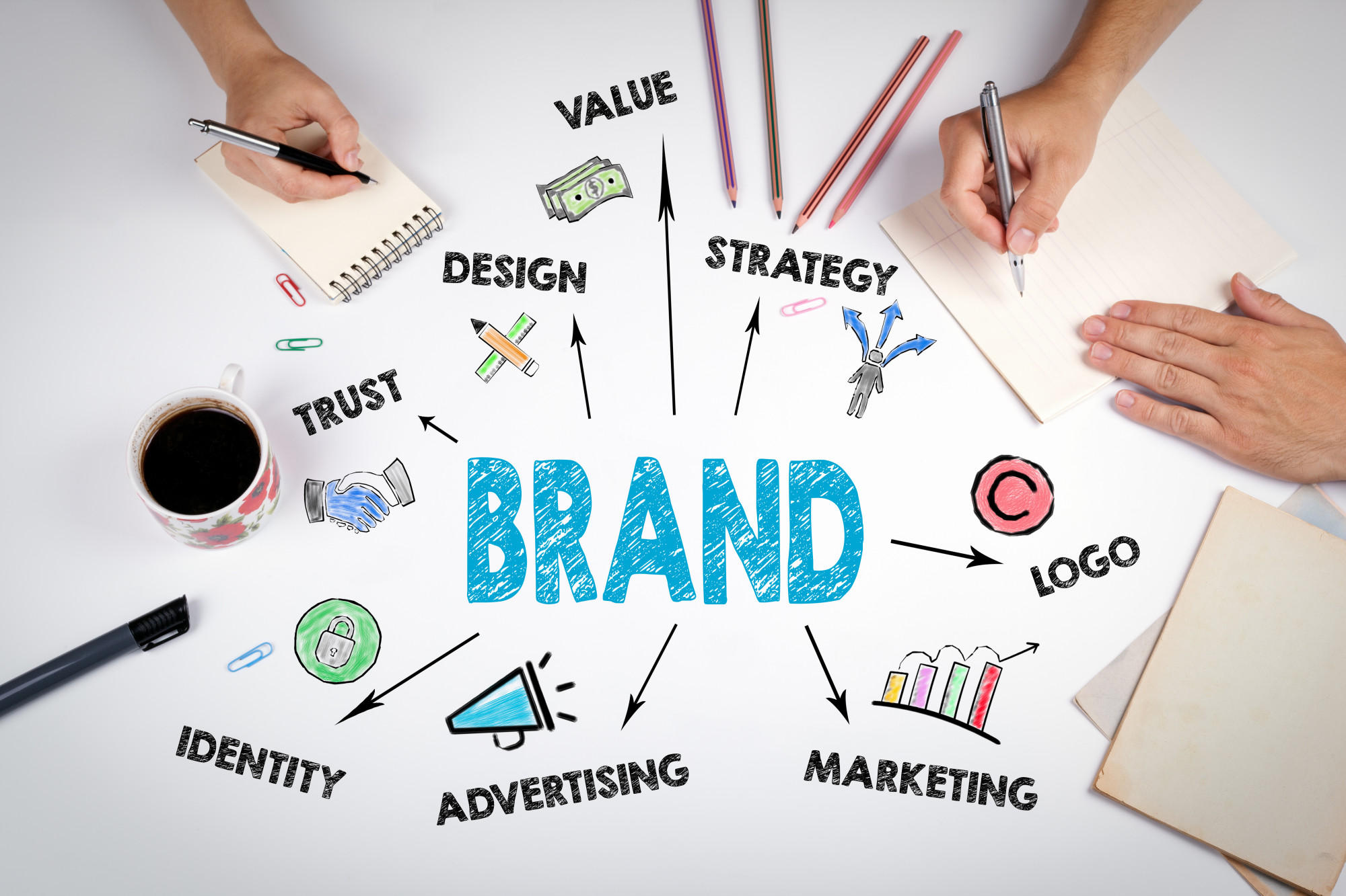
5 Secrets to Strong Branding in the Digital Age
Posted on June 24, 2019 by Logo Design Tips and Tricks
A brand is not a tangible object that you can hold in your hands. A company like Google, which is currently worth a staggering $286 billion, attributes its success to strong branding. If you were to define branding in the simplest terms possible, it’s that emotional connection that a consumer will have to a brand.
Research indicates that 45% of people will stop following a brand if it concentrates on talking about its products only. Another 73% say customer service is the main reason why the fall in love with a particular brand. Branding is, therefore, very important for any business.
Strong Branding in the Digital Age
The digital platform has given rise to so many opportunities for businesses to engage with consumers. It’s, therefore essential that a company knows how to brand on this platform. A proper brand strategy should guide all your brand building activities to ensure that your communication remains compelling and effective.
A brand has many facets to it, including the visual and verbal identity, the tone of voice, and the mission statement or philosophy.
Why Branding Is Important
Branding is important for several reasons including:-
• Branding will help identify and distinguish your company and products from others.
• It’ll determine how people view your company
• It increases the value of a business because people want to deal with a strong company
• The public will trust a company that has taken the time to establish its credibility
• customers will remain loyal to a strong brand due to the emotional connection with the company
• It is important for employee satisfaction and pride
• Branding and marketing are intertwined and work hand-in-hand to increase company awareness
Top Branding Secrets in the Digital Age
Use of digital media can be a boon for business. You reach a wide audience, and you have so many tools you can use to generate awareness for your company.
There are several advantages of branding but you will need to know how to do it right. Let us look into five ideas which will help with branding your company online and offline.
1. Understand Your Audience
Understanding your audience is the most fundamental step when it comes to marketing and branding. Take your time to understand who you’re talking to. Come up with a complete profile of your target.
Take consideration of factors such as education, income levels, age, sex, marital status, among others. You also need to pay close attention to their purchasing behavior and any other interests they may have.
Go a step farther by putting people who fit your profile into a room and talk to them. Focus groups will help you understand how your brand can respond to their needs.
2. Be Clear About Your Brand Values
Look at the leading brands in the market, and you will realize that they all have very clear mission statements. These values form a major part of how they run their businesses and how they communicate with their customers. You can’t start the process of brand-building without a philosophy or guiding statement.
3. A Strong Brand Narrative is Important
Building a strong brand narrative requires that you have a proper understanding of what your consumer is looking for. How does your product benefit the customer, and what makes you unique. If for example, your company deals in luxury items, understanding why an individual will spend large amounts of money on such items is important.
It’ll require that you take into consideration factors such as image, impact, social status, personal life, among others. Now look for a way to tie in that understanding of the consumer into your brand. Whatever communication You send out after that should resonate with your customers so that they connect with it.
4. Have a Personality
Think about your brand as you would a human being. A person with a great personality is likely to have a lot of friends. People will respond well to a brand that has an identity, and one which will help elevate the individual’s status in society.
People know the Mercedes for its elegance and durability. The Ferrari and Lamborghini are a sign of wealth and an aspect of risk-taking. Dove is known for purity, Harley-Davidson motorbikes for rebels among others.
5. Get the Right Branding Support
There are certain aspects you need to consider when working on your branding. These include getting the right name, logo, slogan, among others.
The right brand name will help differentiate you from the competitors. Strong brands have strong names, but get a name that has meaning. Try not to localize it too much in case you scale your business.
Also, consider your target when picking a name, if you’re selling kids products; make the name child-friendly so that it resonates well with the target group
Generating the right slogan is equally important. You will find many online tools to help generate multiple slogans for you. Slogan generating will only be possible if you have a proper understanding of your brand values. Also factor in what makes your product unique. A great slogan is memorable, emotional, states the promise, among others.
The right logo will become the symbol by which people identify your company. Think about the Nike swoosh, Apple logo, Toyota, Mercedes, among others. Even without the brand name next to it, you can identify these companies easily due to the well thought out product branding.
Elevate Your Company Through Proper Branding
We have shared with you invaluable tips on how to build a brand. Strong branding will require that you follow some of the steps we have highlighted above so that you can achieve your goals easily. The things you need to keep in mind are the target market, what makes you unique, what are your values, does your business have a personality, and does it have a good name and logo.
Invest in proper research on your industry. You also need to keep a pulse on what your competitors are doing. They are a great source of information on what to do and what not to do.
Take advantage of the tools and resources available on the online platform. You can also bookmark our website for great tips on how to grow your business.


