7 Ways That a Logo Redesign Can Benefit Your Brand
Posted on May 02, 2018 by Logo Design Tips and Tricks

Your logo is the icon of your business that lets people know who you are. So why would you want to invest in logo redesign?
Believe it or not, there are times when it makes sense to alter your logo, or even start from scratch. Even globally recognized brands update their logo occasionally.
While logo redesign can be risky, it can also be rewarding when performed correctly.
Take a look at seven key benefits that a new logo can bring your business.
#1 – Logo Redesign Keeps Your Image Fresh and Modern
Logos tend to be based on current design trends. Shape, color, font, and other elements are usually dead giveaways as to when the logo was created.
Updating your logo to reflect the current times can serve a few different benefits.
For starters, it shows people you’re not resting your laurels. Rather, you’re actively engaged in what’s happening around you.
It also demonstrates your resiliency and flexibility. You’re not resistant to change, but can keep up with changing markets, tastes, and consumer needs and preferences.
Finally, a new logo can make your brand appear fresh and cutting-edge. What looked great twenty years ago won’t usually have the same impact today. It’s an easy, cost-efficient way to give your brand a boost.
#2 – A New Design Can Attract Attention to Your Brand
When you introduce a new logo in your business, it’s hard for others not to notice.
The right logo will get people talking about your brand. It’s also a great opportunity to build some PR and ignite conversations surrounding your redesign.
Having people notice and comment on your new logo gives you countless brand impressions. Take this surge in publicity to help people learn more about your company and what the new design means for those you serve.
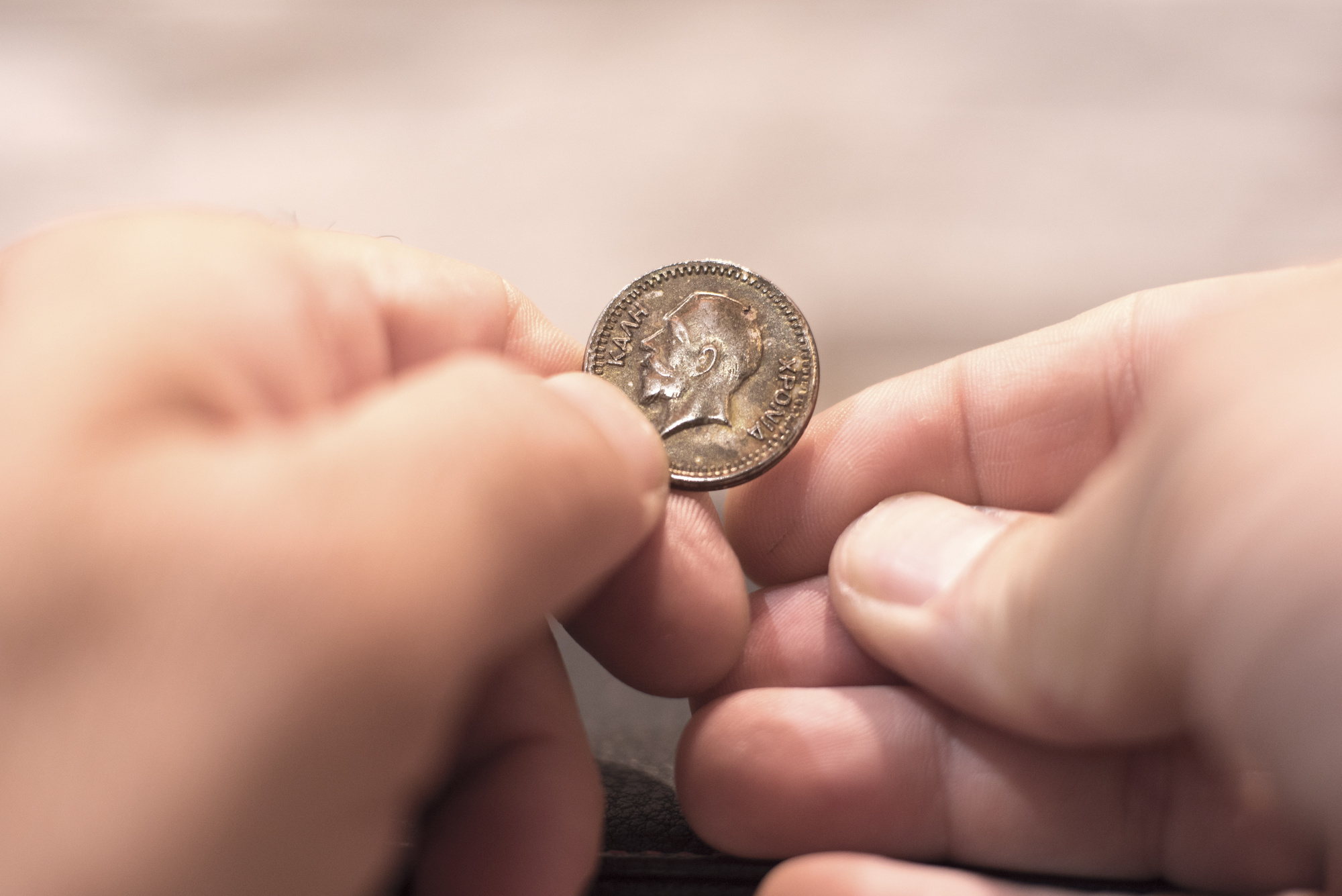
#3 – You Can Use Your Logo to Raise Awareness
Lacoste once changed its iconic crocodile logo in lieu of 10 different animals to raise awareness for endangered species. Each of the 10 animals were members of the endangered species list.
Interestingly, each shirt adorned with one of these new animals was released in limited supply. The number for each was based on the number of how many of each animal remains in the wild.
For example, there were only 157 Kakapo Parrots left, so Lacoste printed 157 shirts with the parrot logo.
In total, there were only 1,775 shirts produced, an alarmingly low number for a group of 10 species.
Many saw the move as risky and controversial, but it certainly attracted attention to the brand.
You can use your own logo to raise awareness for a cause. For example, you can add a ribbon to raise cancer awareness. A subtle nuance won’t alter the overall design, but it can add that little something extra so people will know there’s something fueling the change.
#4 – Change Your Logo for Rebranding Purposes
If you’re undergoing a rebranding strategy, a logo redesign makes perfect sense.
Rebranding itself isn’t a decision to take lightly. It’s an opportunity to connect with new audiences, reshape your image, and highlight your company’s new products and values.
BP’s iconic green and yellow logo saw a drastic redesign in 2003 when it switched from its badge-style logo to a beautiful Helios image.
The Helios resembled a sunflower that sported traditional BP colors. The home run was the imagery linking it to cleaner, better energy and a focus on BP’s environmental soundness.
Logo design should be a part of any rebranding efforts. While you might not be changing your business name, you can alter your logo’s color, font, and other stylings to reflect the new you.
#5 – Tailor Your Logo to New Markets
A new logo can help you break into new markets by appealing to different audience segments.
This one will take a little bit of research to find out what certain audience segments are most responsive to.
Using your new logo to reflect your company’s values and promote yourself correctly can spur new business growth.
Consider using the psychology of color and shape when tailoring your new logo. These elements can have a huge effect on the type of customer your logo will attract. It will also ensure your new design promotes the brand image you’re expecting.
#6 – Simplify Your Logo for Better Visibility
Some logos are complicated. Too much detail can get lost in translation, which makes them less effective.
Complex logos aren’t necessarily a bad thing. For example, Metro Goldwyn Mayer’s classic logo with the lion and elegant framework has remained unchanged for decades.
But printing such a complex logo can prove difficult. You likely won’t retain many of the fine details that make it so unique, which could prevent your logo from being as effective as you expect.
Simplifying a detailed logo can make your message stand stronger. Your audience can immediately recognize what your logo is trying to say.
Remember, it’s not a gallery painting. People aren’t going to stare at your logo for minutes at a time trying to figure it out (unless they’re logo enthusiasts).
#7 – A New Logo Can Boost Your Revenue
All of the above benefits of logo redesign can ultimately lead to an increase in profits.
When people start talking about your new logo, your brand receives exposure. It gives people a chance to learn more about you, your products, your services, and your company values.
By appealing to new audiences, you’re able to share your brand and products with more people than you were before.
Redesigning your logo can also help create top of mind awareness. It makes people think about your company and what you offer. As a result, you could experience an increase in sales, website traffic, social media engagement.
Yes, your new logo can be that powerful.
Wrap Up
Getting a good logo doesn’t have to be time-consuming or expensive.
Our online logo maker allows you to create a high-quality logo quickly and easily. Its simple user interface means anyone can be a logo designer, even if you don’t have a background in design.
Try it yourself for free and get your new logo today!
Challenge Coins: 8 Tips for Creating the Perfect Logo for Your Custom Coins
Posted on April 01, 2018 by Logo Design Tips and Tricks
Making a beautiful logo is a fundamental part of running any business.
Whether you operate in the financial sector, run a travel company, manage a local restaurant, or do home renovations, the right logo can help you stand out. This is something that goes on everything from your company’s branded apparel to business cards and unique promotional items.
Promotional items include classic tools like pens and stress balls, but also distinct pieces that you can give out, like custom coins or special pins. If you’re exploring the option of making custom challenge coins, you can’t pursue this idea without the proper logo.
That’s where we come in. Our design system is here to help you turn your current logo into something that is coin-ready, considering challenge coins are pretty small!
First, though, you need to know a thing or two about logo design.
Below are all the tips you need.
1. Try to Be Timeless
No matter if you’re building a logo from scratch or manipulating your current logo to something that is suitable for custom coins, focus on one thing: being timeless.
This is the only way your logo will be remembered. Many people collect custom challenge coins because they are fun, unique items that are hard to come across. But, they don’t always remember the company that provided a certain coin in the first place.
That’s why your logo design matters so much. The more memorable your logo is, the more likely someone is to remember the actual products and services offered by the company a logo represents.
2. Brainstorm, Brainstorm, Brainstorm
How do you come up with a timeless logo?
By taking the brainstorming stage of the design process seriously. Take a moment to sketch out a few logo ideas before you start the digital version. This helps you get out of your head and visualize which ideas work and which don’t.
To make the brainstorming process even more effective, draw a circle around each logo. This allows you to conceptualize how it will look on the custom coins you want to create.
3. Manipulate Colors and Shapes
Once you have a few quality design ideas, develop them even further.
Take your sketches from pen and paper to a digital screen. Use the online tools provided to play with different colors and shapes. The shapes you use don’t have to be exact representations of a square, triangle, or so on.
But, using shapes as a basic outline for the design of your logo makes a big difference. This puts the concept of shape psychology to work. In logo design, certain shapes can exude a sense of trust, balance, or community – depending on what you want your company’s custom coins to stand for.
Similarly, there’s also a different set of color psychology for logo design. Educate yourself on these matters in order to send a message that is loud and clear (and effective!) to your audience.
4. Make Something Eye-Catching
While you’re figuring out how to relay your company values or purpose through shapes and colors, make sure the logo as a whole can turn heads.
If you aren’t creating a design that is eye-catching, you won’t get the results you’re looking for. Think about how your logo will stand out among many others. This goes for when it’s used on challenge coins, lanyards, and all other kinds of promotions.
Wherever you put your logo, it has to be easy to notice.
5. Brand Your Heart Out
It’s one thing for someone to notice your logo and another for them to recognize it as part of your brand. This is especially true if you have one variation of a logo for regular business purposes and another for your custom coins and other promotional items.
To build brand recognition, you have to make a logo that is a clear representation of your brand. A brand is a complex thing to identify. It’s both the signature colors of your company, as well as the products you offer and the quality of service you provide.
All of these details have to be summed up in your logo.
It can sound like a hard thing to do. But the longer you work at it, the more your brand will become front and center of your logo design.
6. Add a Special Touch
To further encourage brand recognition, think outside the box.
There is bound to be an element of your company that is entirely unique, no matter how many competitors or the amount of exposure you have. Think about things like office traditions and phrases that guide your culture.
Does your company have some sort of mascot or another internal symbol that isn’t necessarily a part of your logo yet? Add it to the design you’ve created and see how much more unique the overall look of the logo becomes.
7. Consider Use and Placement
At the end of the day, regardless of what your logo looks like, it’s going to have a limited amount of space when placed on custom coins. Keep this in mind throughout your design process.
The final version of your logo should be something that is scalable down to the smallest coin, and up to a big poster or even a billboard, too. The best way to achieve this is to keep it from being too busy.
A simple design turns heads when displayed on small pieces and is easy to understand. More so, it’s a classic look that can be used on bigger canvases, too.
8. Don’t Be Afraid to Edit
Throughout the logo-making process, you’re going to make plenty of edits.
This may have you thinking that once all the pieces come together, you’re done. In reality, the “final version” of your logo will go through many edits before it is actually complete.
It’s true that edits can be time-consuming. But, the more attention you pay to the small details and the effort you put into tweaking them, the better the true final edit will be.
Design Your New Logo for Your Custom Coins
Whether you’re building a logo for custom coins or figuring out how to display your logo for bigger uses, you need the right system to do so. Having access to a logo maker turns edits from a big hassle into a simple design process.
To discover just how easy logo making can be, click here.
Our Favorite Logo Ideas for Funny T Shirts
Posted on March 28, 2018 by Logo Design Tips and Tricks

With the online original design t-shirt industry making over $441 million of revenue in 2017 – a 9.5% annual growth since 2012 – it’s a great idea to get your cut of the cloth.
A booming business enterprise, t-shirt printing can be incredibly lucrative if you stand out and do it right. You can have a brand everybody knows, choose a niche that has mass appeal, or you can be funny.
That last one is what the majority of companies should focus on; if they want to be successful, they need to market funny t-shirts.
The best way to do this is through funny logos. For certain brands, this will be their bread and butter. Here are some of our favorite logo ideas for funny t-shirts.
How Can a Logo Be Funny?
There are two ways:
- Funny ha-ha, where the logo is a joke or riff off another famous logo;
- Funny clever, in which the logo doesn’t really convey a brand but instead plays with the idea of what a t-shirt is.
Oftentimes, these two can merge into one awesome logo. Below, we’ll show you both versions of funny t-shirts as well as combinations.
Basically, in order to be chuckle-inducing as a t-shirt brand, you have to have a pulse on your audience and the big issues of the day. Whether you’re catering to Millennials, hitting home the sports niche with current winners and losers, or using the Backpack Kid Meme to your advantage, you want to be relevant and tasteful.
If you get both things on your side, you’ll be profitable with your t-shirt business.
Our Favorite Funny T-Shirts with Logos
Classic Logo T-Shirts
Sometimes it’s best to stick with the famous brands.
If you can safely use the original brand logos of high-end companies like Coca-Cola or Guinness, it’s sometimes subtle humor that wins out. For example, this site gives you access to old-school logos. This “blast from the past” vibe provides a different breed of humor. Those who remember the good old days will get a kick out of these kinds of logo shirts.
Pun T-Shirts
A step past the classic logo, punny t-shirts can either take a well-known brand logo and alter it to the original brand’s benefit, or the logo can be a simple quote with a complementary image.
This is where being relevant is really important. Using a famous quote or image that is neither retro or fresh is funny t-shirt sabotage. Go for timeless phrases or fun photos and throw them onto muted color shirts. You’ll thank us later.
Clever T-Shirts
Lastly, if you don’t want to assimilate with another brand, quote, logo, or image, then go all-out and design your own clever t-shirt.
What does this look like?
Well, you could create your own pattern for an ugly Christmas sweater. Or, print a tie on a t-shirt. Or, have a t-shirt where if someone is wearing it and they put it over their head, viewers see another image on the inside of the shirt.
Printed gun side holsters, a “Baby Loading Please Wait” sign with a loading bar, and the body of a baby for an adult t-shirt create illusions often deemed as clever. These shirts are not just funny – they’re fun. Seriously consider these types of funny t-shirts for your print design.
Ready to Create Your Own Funny Logo?
Hopefully, these ideas for funny t-shirts give you enough creative inspiration to make your own hilarious logo. If you’re ready to get started on your logo, check out our unbelievable online logo maker tool.
7 Great Supplement Branding And Logo Tips
Posted on March 27, 2018 by Logo Design Tips and Tricks
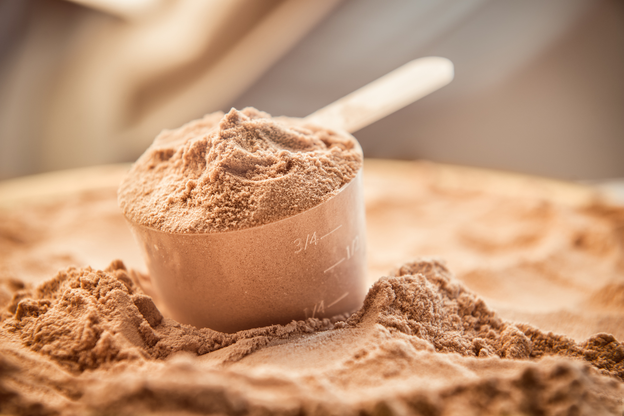
You’ve decided to join the $37 billion-per-year industry that is dietary supplements. Do you know how to brand your product successfully?
Take advantage of great supplement branding to ensure you find quick profits in an industry that isn’t well-known for its advertising efforts.
Here are 7 tips to upgrade your supplement branding and logos.
1. Be Different
In an overly-saturated market like supplementation, your brand needs to stand out.
Make sure your mission resonates differently than the other brands, especially those that don’t take time with their own branding. You want to be known for how professional and knowledgeable you are in the supplement industry.
Create a unique brand mission statement and logo – you’ll never be forgotten.
2. Create for Community
The best thing about a brand is the fans. But how do you get raving, loyal fans?
Develop your brand and logo that exemplifies your ideal customer. You want them to be powerful, healthy, full of life. Your brand should mirror this.
If you make your brand with the community in mind, then it will translate into a powerful influence over those ideal customers and fans.
3. Use Logo Software
If you want to be seen as professional, you’ll want a professional logo.
This doesn’t mean you can’t make it yourself. Logo and branding software can be easily found online, some of them cheap or even free. Use the tools the internet provides and turn your concept art into a real logo.
If you put time and effort into your logo you can exude the message you want to convey, like how America Vitaminas exudes a feeling of restful, flowing sleep with their melatonin suplemento.
Your logo is the first thing people will recognize – it needs to be perfect.
4. Target Your Audience
Research your target clientele, then brand around them. Similar to creating a community, the only way you can begin is by finding where your customers live, what they look like, what their goals are, who they care about, where they work, and more.
Having a clear image of who will be purchasing your products is supplement branding 101.
5. Don’t be Afraid to Upgrade
Let’s be honest: We rarely get it right on the first try.
Thankfully, people will understand. We’re all human. Brands and logos are simply manifestations of human goals. So, if your logo or brand message doesn’t work as well as you originally thought, don’t fear to change them again and again until it’s perfect.
If Coca-Cola and Nike can alter their logos and brands, why can’t you?
6. The Characteristics: Name and Color
Just like the logo, how you name your supplement company will decide who notices you and who disregards you.
Same goes for color. The name, the colors, and the logo all need to invoke trust with the customer.
Optimum Nutrition works because it covers the “nutrition” aspect, their logo is clean and sleek, and their color scheme suggests professional, high-quality whey protein and other products.
7. What’s Your Voice?
How do you communicate your message? This is what your brand is all about.
Having a one-sentence brand mission helps with determining your brand’s voice, logo, name, colors, and everything else. If you are the company’s voice, depict that as best you can. If a family member or your ideal customer is the brand voice, run with it.
Once you establish brand voice, you’ll hopefully pigeonhole your brand to the customers you truly wanted.
Supplement Branding is Key
Give one or more of these tips a try to bump your supplement branding up a notch.
If you want help with crushing your fitness brand’s logo, one that invokes real motivation (and therefore more clientele), check out our guide to design elements.


