How to Create a Dynamic Logo for Your Brand
Posted on December 22, 2017 by Logo Design Tips and Tricks
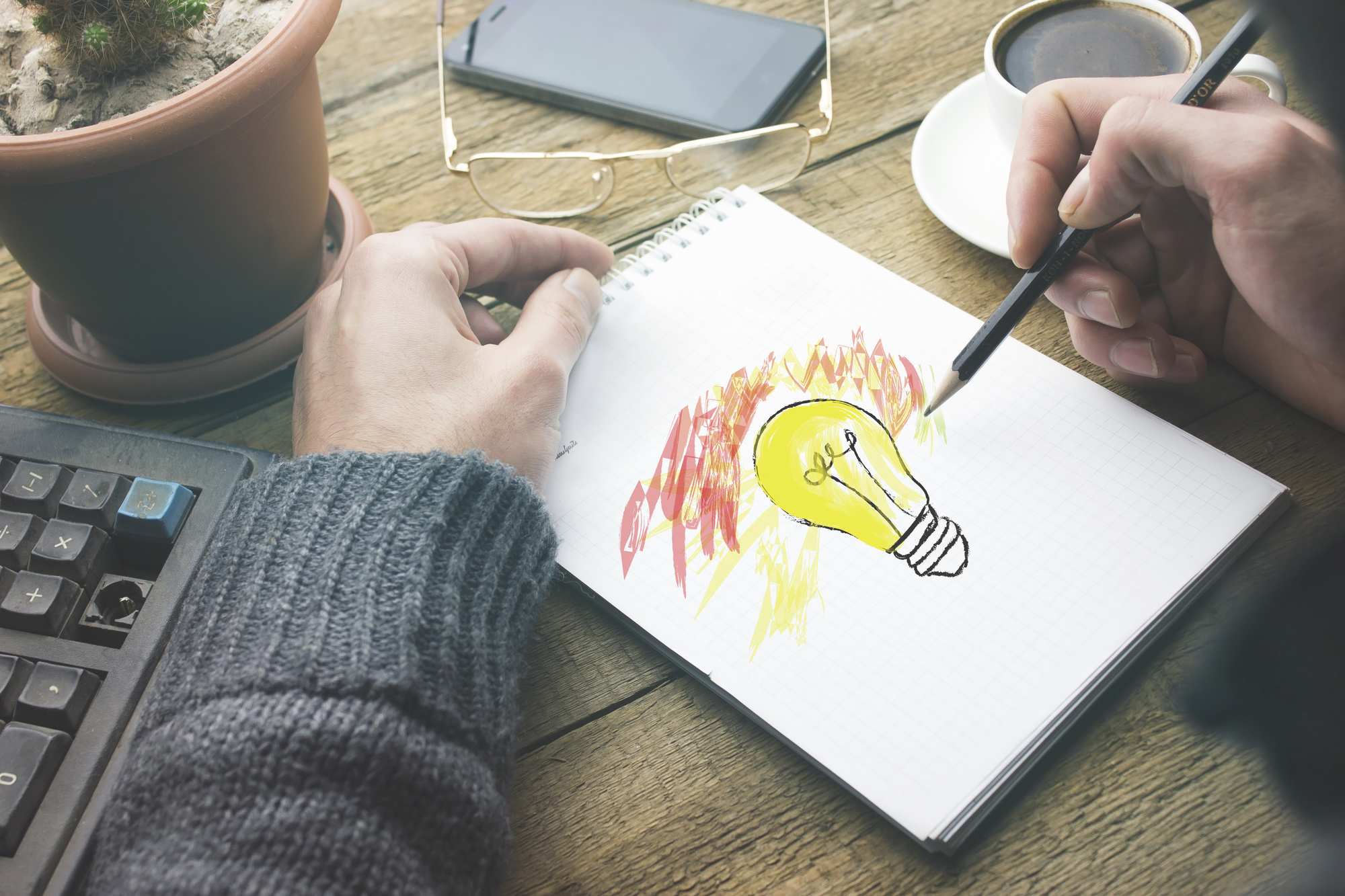
One of the most fundamental aspects of branding is logo design.
Your logo is your first impression every time a new user comes across it. Whether they see on Instagram, pass by it on the street, or notice it on your business card, it matters.
An effective logo can be a powerful way to perk someone’s interest and start creating a relationship. Similarly, a poor logo is a fast-track to losing credibility.
Don’t worry, it’s not that hard to achieve a dynamic logo design.
You just have to know what to do.
Here are six tips to keep in mind when making your own company logo.
1. Keep It Simple
The number one rule to keep in mind is to not overcomplicate your logo.
This doesn’t mean you’ll end up with a boring design. Instead, letting a simple approach guide your creative process will help put all the other elements in perspective.
Trust us, it’s helpful to remember when you get ahead of yourself and start mixing too many colors and playing with fonts.
When you have a focus on keeping things simple, you end up with something timeless. That is the key to any dynamic logo design.
2. Start Sans-Color
Even if you are already clear about which brand colors you want to use for your logo, don’t add them in right away.
First, you have to establish what kind of outline you want.
Doing this in black and white helps you create the most effective dynamic logo design possible. Then, the touch of color brings everything to life.
Such a process may even help cut your design time in half!
It helps you get a clear picture of what is working and what isn’t. With color involved, sometimes it’s hard to tell.
Plus, once you’ve achieved the foundation you were going for, it’s easy to see where the color is missing. You may end up using less than you think to create a look that is stronger than you first imagined.
Don’t forget to consider the psychology of colors, either.
3. Know the Power of Fonts and Shapes
Speaking of psychology, shapes and fonts also have a strong effect on the way a user perceives your brand.
Let’s take a closer look.
The Meaning of Shapes
The difference between a circle or square background may not seem like much at first. But, they couldn’t have more contrasting meanings.
A circle is seen as a sign of trust. It hints towards love, community, and friendship. Many users will also get a feminine sense from a circle-based dynamic logo design.
On the other hand, squares are more masculine. Their straight lines and rough edges are seen as a sign of strength, efficiency, and professionalism.
Triangles are similar to squares. But, on top of being masculine and strong, these shapes create a feeling of balance and stability.
The Emotions of Fonts
You don’t have to add text to your logo, but many companies choose to do so.
In fact, there are a few reasons to incorporate it:
- To display the initials of a brand’s name
- To share a tagline or set of values
- To type the brand name in full
Whichever way you choose to use letters, be mindful of the font you use as well.
A serif font, for example, is the most classic and traditional group. This has a line at the end of each stroke, keeping everything as simple as can be.
Sans serif fonts drop the use of the line. They are associated to be a bit more modern and forward-thinking, which is great for a tech startup or innovative coffee shop.
Handwritten fonts are the most human of all. They are approachable and creative. As such, many lifestyle brands and creative companies are known to use this font family.
For something more sophisticated, yet free-flowing, choose a cursive font. This will ensure your dynamic logo design flows, without losing its professionalism.
Once you’ve chosen the kind of font to create a logo with, there are some more details to consider.
Try different spacing and capitalization options to get your message across loud and clear. You may even end up using two fonts, depending on the rest of your design.
4. Share a Story
It’s one thing to add text, but it’s another to actually tell a story.
The best way to accomplish this is to keep your brand in mind. Think of your company values, initiatives, and the overall feeling you’re trying to create.
Then, use these thoughts to guide how you edit your dynamic logo design.
You don’t have to stick to a single story, either.
If you want to create a sense of stability as well as community, you can use a circle outline and a serif or sans serif font. Dymic.com has a strong example of this.
Similarly, a square-like background with a bold, funky text could also combine well.
5. Add Something Unique
Just when you think your design is done, it’s time to add the final touch.
You’ve gone through all the steps, but have you conveyed everything you wanted to?
Here are two ways you can improve your dynamic logo design.
Blank Space
Go back to the black and white principle, as well as the thought of simplicity.
See if you can take an element out of your design to make use of blank space.
This is a creative way to approach the design process, with a bit of a yin and yang twist. It allows you to add some fun for users as they discover the hidden elements a blank space outlines.
Hidden Messages
That’s right, you can put a hidden message in your logo.
We aren’t talking anything too complicated. But, something like the Amazon smile – reaching from A to Z – or the FedEx arrow can be incredibly effective.
If there’s a symbol that goes hand in hand with your brand not yet included in your logo, make it a part of the hidden message.
6. Think of Various Logo Purposes
Before you click “save” on the logo you create, be sure you can use it on multiple platforms.
This goes beyond the difference between Snapchat and Facebook. It means being able to use your logo in an email campaign, on a company t-shirt, and on a business card.
You should be able to scale the logo and clearly identify all of its parts. If not, you have a bit of editing to do.
Create Your Own Dynamic Logo Design
Now that you have a better understanding of what goes into making a logo, it’s time to get to work.
You don’t need to download fancy software or hire an outside service to do this.
You just need to find the right tools available online.
Click here to make your logo design ideas come to life.
Your Guide To Creating An Awesome Vape Logo
Posted on December 22, 2017 by Logo Design Tips and Tricks
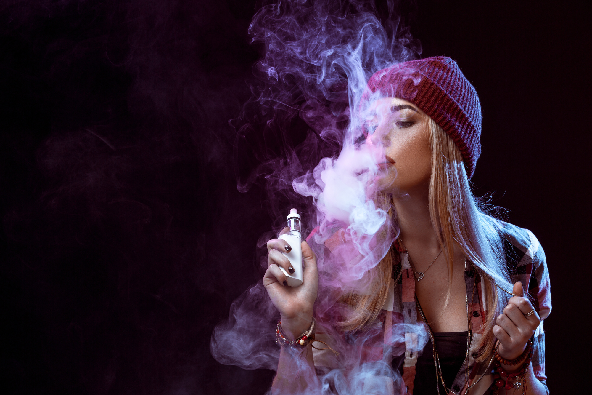
You’ve decided to take your love of vaping to a professional level by starting your own vaping business.
You’ve picked the perfect location for your shop, created an epic website, and you’ve already built up a strong following on social media.
There’s just one problem — there’s a complete lack of consistency in your branding. You’ve noticed that you don’t get many repeat customers, and people frequently send you messages saying they’re struggling to find your products in stores.
What’s the issue?
You don’t currently have a vape logo.
Don’t sweat it — instead, keep reading this post. In it, we’ll tell you what to do — and what not to do — to create the perfect logo for your vaping business.
Select A Recognizable Image
When you’re creating your vape logo, it can sometimes be difficult to select an image that strikes the perfect balance between recognizable and stereotypical.
You want your customers to be able to instantly understand what it is you’re selling, but you don’t want your logo to look like everyone else’s.
One of the best ways to get it right?
Put your own unique spin on familiar images relating to vaping. For example, you could have a vape pen that’s writing your brand’s name out in smoke. You could even show images of people sitting on a bench and vaping together. Or, use each letter of your brand’s name to highlight a different vape flavor.
The possibilities are endless, so there’s no reason to go with a tired design.
Create Your Own Font
One of the best ways to make your vape logo stand out from the competition?
By having your own font created just for your logo and brand. This will help to build your brand recognition, and will ensure that your consumers can instantly recognize your products on a page or shelf containing dozens of others.
It also helps to promote consistency if you use that same font in your blog posts, on social media pages, and on your business cards.
As always, when creating your logo, make sure that you thoroughly test the font for legibility. Even the most beautiful typography won’t do anything to help you if no one can read it.
Pick The Right Trends
When you’re creating your vape logo, it can be appealing to look to current design trends for inspiration.
But you know that vaping isn’t going anywhere — it’s not a passing fad, it’s here to stay. So why would you select a logo that will look completely outdated in just a few months?
Not only is it a poor financial decision, but incorporating too many trends in your logo design can make you look seriously desperate.
When you’re doing trend research, think about which one will still look good in a few years — and select only one trend to use in your design. One of our favorites is the appeal of hand-drawn and professionally-sketched logo designs.
Connect with a local artist, and have them draw a vape pen, some creative clouds of smoke, or anything else you can envision.
Not sure where to start when it comes to creating a hand-drawn logo for your vaping company?
Believe it or not, Etsy lists hundreds of artists who can create the perfect design for your brand for a reasonable price.
Consider Resizing
One of the things don’t want you to ignore when it comes to creating the perfect vape logo?
How legible it will be when resized.
Remember: your logo is the foundation of your entire branding strategy. That means it’s going to have to go in lots of different locations: on your social media pages, on marketing swag like cups and pens, on business cards, and even on your building’s signage.
You might think that you can make your logo as detailed as you want. However, those details are quickly going to end up looking like a jumbled blob when you need to shrink your vape logo down to a smaller size.
When selecting the colors, font, and images you’re going to use, always run tests to see how it will look in different places and in different sizes.
Choose Your Colors Wisely
Finally, when you’re selecting the colors for your vape logo, there are a few things you need to keep in mind.
First of all, to prevent your design from looking too messy, we suggest sticking to a maximum of three colors. Be aware that, especially depending on the specific images and fonts you’re planning to use, too many colors can make your logo difficult to read.
Also, understand that different colors communicate different emotions and have different connotations.
For example, take a look at the red and white flame logo of Vape Street. The red encourages people to take action quickly, which makes sense as the homepage displays several offers and special promotions.
The red color also reminds consumers of flames and smoke — two of the most important elements of vaping.
Ready To Create Your Vape Logo?
Your vaping company isn’t like any of its competitors — so why should it’s logo look like a carbon copy of their branding?
When you’re ready to bring your vape logo to life, try using our free online logo maker to make the process easier than ever.
To start making connections with your target market right out of the gate, we suggest that you dream up several logo options — you could even host a contest to see which of your social media followers can create the best central image for your design.
Then, let your market vote on their favorite logo design.
Once you have your logo, it’s time to start thinking about the rest of your branding strategy. Read up on all the latest branding and design tips on our blog to ensure you blow away the competition.
7 Logo Design Tips for Your Nonprofit Agency
Posted on December 21, 2017 by Logo Design Tips and Tricks
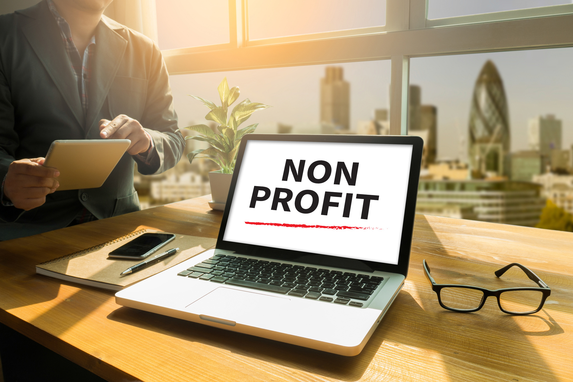
When people hear the word “brand”, they tend to think of major businesses like Apple, Nike, or Coca-Cola. But the reality is, branding and brand awareness is important for any organization, including nonprofits. Many organizations like the World Wildlife Fund, the Red Cross, and Good Will are widely recognized across the world, and proving just how impactful branding can be.
A great way to spread brand awareness for your nonprofit is by creating a high-quality logo. Not entirely sure how to do that? In this article, we’ll cover logo design tips for your nonprofit, so you can stand tall above the crowd and show the world how great your organization is.
What is a Logo?
A logo is a visual representation of your brand or nonprofit. It’s a symbol made up of text and images that help customers identify brands they like and use. Its purpose is to help people understand what you do, what you stand for, and what you value as a nonprofit.
Your nonprofit logo will usually consist of these three things: the logotype, the brandmark, and your tagline.
Logotype
The logotype is your nonprofit organization’s name. It’s the text-only treatment of your nonprofit, which you can then use as a way of identifying and branding your nonprofit.
Brandmark
The brand mark is the visual communicates the elements of your brand that can’t be expressed in words. It’s made of up things like color, design, and symbols. It can take a while for recognition and recall for a brandmark, but if you do it successfully, it can really help people remember your organization.
Tagline
The tagline is the catchphrase you pair with your logotype and brand mark. It’s where you can express the essence of your nonprofit in words, and it should stir a certain feeling in your intended audiences. It should tell a story, explain your nonprofit’s offering, but most importantly, it should be short and simple.
Here are the basic functions of an effective logo:
It Makes You Stand Out from the Competition
The most important function of a logo is that it gives your nonprofit a unique look that makes it different from other nonprofits. This element is very important, especially if your nonprofit offers services like another nonprofit or is easily confused. When it comes to logo design tips for your nonprofit, making your logo different and memorable is incredibly important.
It Identifies Key Information About Your Nonprofit
Your nonprofit logo should provide people with important info about your nonprofit, like the industry you exist in and the services you offer. It should also highlight your base audience and your brand values. So, when thinking about logo design tips for your nonprofit, think about how you can visually communicate this key information to people.
It Builds Brand Recognition
Your nonprofit logo needs to leave a visual impact on people, so that they’ll remember your organization and what you do long after they see it. Logos are great for creating strong visual associations with a business, and that association helps people keep your nonprofit in their mind.
Logo Design Tips for Your Nonprofit
Now that you know what a logo is, and how it can help your nonprofit, you can start working on your own! Here are some important logo design tips for your nonprofit.
1. Focus on the Unique Elements of Your Nonprofit
Even if your organization’s cause is broad, you should focus your energy on what makes it different from similar organizations. Try to come up with a short and specific description of that element, and then cut that description down to two words. By doing this, you can keep the most important ideas in mind when creating your logo.
These words should drive the visual elements of your logo, such as the images, color palettes, and typography.
2. Make it Memorable
The key to memorability is making a logo that is simple, unique, and easily recognizable. This means you should choose an easy-to-read font, use sharp colors, and have a clearly thought out design.
Before you make your logo, you should look at other logos of similar nonprofits, and develop a strategy for making it memorable. One way to test your memorability is to people your logo for fewer than 10 seconds and then see if they can re-draw it with relative accuracy. If they can’t, odds are your logo design isn’t memorable enough.
3. Use Color Effectively
Colors have a psychological habit of sparking emotions and associations in peoples’ brains, so your color palette should be tailored to the response you want to stir in people. When making your logo, think about the basic ideas and qualities of your nonprofit and cause, and reflect on what colors may speak to that best.
Here are some colors and what emotions and associations they spark in people:
- Blue: trustworthiness, tranquility, medical nature,
- Red: boldness, urgency, sexiness
- Yellow: optimism, youth, clarity, invention
- Green: nature, relaxation, growth
- Orange: energy, creativity, friendliness
- Purple: spirituality, wisdom, luxury
- Black: power, precision, sleekness
- Pink: femininity, tenderness, romance
- White: cleanliness, simplicity, purity
Borns Group, a nonprofit that provides fundraising solutions, uses blue and white in its logo. These colors communicate simplicity and trustworthiness, which are important in their field of work.
Regardless of the color you pick, you should always keep adaptability in mind. Your nonprofit logo should be able to be easily adapted to a variety of mediums, from business cards to billboards. You should also think what this logo would look like on t-shirts, how it would appear on black-and-white flyers, and how colors can affect printing costs.
4. Make It Adaptable
When making a logo for your nonprofit, you should always keep adaptability in mind. Your nonprofit logo should be able to be easily adapted to a variety of mediums, from business cards to billboards. If your logo has tiny print size or a lot of text, it’ll be difficult to read online, and if it’s overly complex or detailed, it won’t scale well if it’s enlarged.
5. Make It Lasting
The last thing you want is to make a logo that looks out of date after just a few years. You should aim for a classic design that will look good over time rather than chase after trends. You can make it long-lasting by working with a designer to create a logo that is simple and clean enough to age effectively.
6. Balance Design Elements
Whether you’re using illustration or typography, you need to make sure the design elements of your logo are balanced. If your logo is too cluttered, audiences will be turned off and be less likely to remember it. By balancing white space and giving all the design elements equal weight, you can make a design that is visually balanced and striking.
7.Embrace Key Logo Design Elements
While a nonprofit logo is a unique kind of logo, you should still follow best practices for general logos. Here are important design principles you should keep in mind:
- Simplicity
- Versatility
- Timelessness
- Memorability
- Originality
- Storytelling
Scalability
By implementing these logo design tips for your nonprofit, you can make a truly standout logo for your organization.
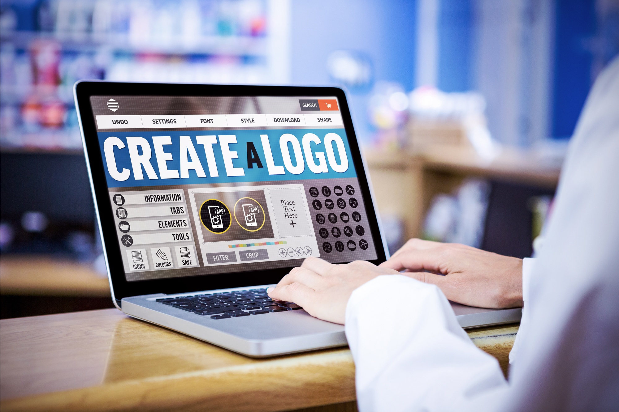
Final Thoughts
Crafting the perfect logo isn’t easy, especially if you’re a nonprofit with limited time and resources. The great thing is that there are free logo design tools you can use to bring your dream logo to life!
Are you a nonprofit looking to create your first logo? Are we missing any logo design tips for your nonprofit? Let us know in the comments!
5 Tips For Creating A Personal Logo For Entertainers
Posted on December 21, 2017 by Logo Design Tips and Tricks
Many people think that personal branding is a sign of vanity. But the benefits that come along with it have made it more and more common. Now people of all professions are using personal marketing techniques to enhance their careers.
This is especially important for people working in the entertainment business. Not only is this industry extremely competitive, it also necessitates a unique identity.
A great way to set yourself apart and also reach your audience is with a personal logo. Designing a good one is crucial, as it can be utilized in many different mediums such as social media and video.
To help get started, we’ve put together 5 tips for a successful logo.
1. Know Exactly Who You’re Targeting
Knowing exactly who your audience is helps guide the design of your logo more than you think. Fortunately, because you’re an entertainer, you probably have a good idea who your target is.
Think about the personality of your audience. If they’re theater-goers and intellectuals, you wouldn’t create the same type of logo a magician would create.
Create a profile of your audience and list several qualities they have. Use this to form your initial ideas for your personal logo. Then you can get started.
2. Know Your Competition
It also helps to know what your competition is doing with their logos. This benefits you in a few different ways.
First, knowing what your competition is doing helps set the bar for quality. Strive to create a logo that reaches this bar and then takes it further.
It also helps you stand out. You don’t want your logo to look like someone else’s, so do your homework and find out what’s already out there.
3. Font and Color
Once you’ve defined your audience and looked at your competition, consider the font style and colors that suit you best.
Color is an important tool in marketing. It’s a good idea to learn about color psychology before making a decision.
For font styles, choose something that’s easy to read, yet interesting. With so many styles available, you should be able to easily find something that suits you. To check out an interesting font style, click here.
4. Be Informative and Concise
When creating a personal logo, it’s important you get across who you are and what you do. A person shouldn’t feel confused by what they’re looking at.
The hard part here is that you also want to be concise. You don’t want a person to have to read too much. Your logo should deliver its message quickly.
A good tactic is to come up with a tagline or motto. You can relate this to your specific craft so people understand what you do. Do not be scared to be funny or dramatic if it suits your personality.
5. Keep It Simple
A simple design is important with any logo. The last thing you want to do is overwhelm or distract someone in the wrong way.
Visually, your logo should pop, but it shouldn’t contain too many bright colors or design elements. If your logo is over the top, it may drive people away instead of pique their curiosity.
Bring Your Personal Logo to Life
These tips are meant to help get you started with your own logo, the right way. This is your personal brand, so it’s up to you bring a little bit of yourself into it. Now it’s time to have fun and express yourself the best way you know how
If you need additional help, we offer logo creation services and tutorials. Learn more today.


