10 Examples of Killer Cannabis Logos You Need to See
Posted on December 04, 2017 by Logo Design Tips and Tricks

The CDB industry is almost raking in a whopping $7 billion each year. There’s no surprise as to why you would want to be a part of it.
As a small business, you’ll need to budget for certain expenses. At a minimum, you’ll need $10,000 out of the gate just to start.
Of course there’s office supplies, rent, and miscellaneous fees. There’s one expense you shouldn’t skimp on, and that’s marketing.
Believe it or not, your cannabis logo is part of your marketing expense. Check out these 10 logo ideas to get started!
1) Oil Of Sunshine
Looking at this golden teardrop logo surrounded by a few radiant spikes, you might not immediately think of cannabis. That’s a big plus for a CDB that wants to retain a bit of mystery.
Once you’re familiar with the brand, the shining drop makes more sense. If you’re not looking for it, though, it’s eye-catching.
Give your logo a bit of sparkle and mystery to get people asking the right questions.
2) Royal Highness
Can a cannabis logo be both “wink wink” and professional looking? Royal Highness proves it can be done.
Let’s face it – the biggest cliche in the cannabis industry is the leaf logo. Royal Highness takes that worn out trope and turns it into a regal lion’s mane.
What’s the main take away? Don’t fear the leaf — but be creative!
3) MedMen
Here’s another fun twist on a pop culture phenomenon. Med Men is a great play on the Mad Men TV show, creating a built-in affinity with their audience.
This cannabis logo is bold and to the point — thick white letters on a maroon background. IT gets to the point and gives you a chuckle.
The lesson here is to play on pop culture and familiarity to build an intriguing logo. It’s sure to strike a chord with your customers.
4) MJ Freeway
This brand is almost a masterclass in logo design. Take a look at their older logos and you’ll see how they matured over the years.
Of course, they started with the typical leaf logo incorporated as the “W” in their name. The next iteration saw the leaf playing a smaller role, but still part of the design.
The next step was to light blue block lettering. While this is a serviceable design, their final idea is a real winner.
Now this company sports a professional and elegant logo consisting of black block letters and a gold filigree icon.
5) Apothecanna
One of the biggest reasons to get into the CDB game is to provide people with medicinal relief. Make that a part of your design strategy!
Look at Apothecanna – they’ve clearly taken inspiration from medicinal packaging. It’s plain lettering and an uncomplicated icon, but the color keeps it interesting.
If you’ve got a message about Quantum 9 how to take CBD oil, look over some medical logos to get an idea.
6) Therapy Tonics
Take the above advice and throw it way back – like the old-fashioned design that Therapy Tonics uses.
Their vintage script and wording takes you back to a time when cough medicine had a bit more than the green stuff in the ingredients. For a company based in the West, it really works.
They even use a rough paper for their business cards. That’s true dedication to their cannabis logo theme!
When creating your own logo, make sure you consider all options – even the very paper it’s printed on.
7) Wurk
Wurk’s logo pulls no punches and yet it manages to be a bit playful. Sometimes simple is best, and Wurk’s design proves it!
The straightforward white font on a bold blue background is no-nonsense. It’s clear enough to stick out in a wallet full of business cards – and your mind.
The one fun detail – the “U” has an umlaut over it. It gives the impression that the logo has a happy face.
Keep it simple – but have a little fun, too!
8) Dixie Elixers
Looking at this cannabis logo, you feel like you’re trying to decipher an alien code. Then it hits you – Dixie.
Whereas the previous logo design was straightforward with their font, Dixie is a bit more mysterious.
It’s beautiful, it’s elegant, and it’s unique. Play around with your choice of fonts until you find something that speaks to you.
9) Whoopi and Maya
If you’re searching for a luxe look for your brand, take some tips from Whoopi and Maya.
The containers their products come in are dark and wrapped with black labels. In gold lettering, the product’s use is displayed – “rub”, “relax”, “savor”.
In smaller, colorful letters, it describes the actual product itself. This is a product you wouldn’t mind having out on the shelf.
Black and gold are a great way to bring a bit of luxury to your brand. This is a great example as to how to make it work for your products.
10) In The Flow
Have you ever seen such an eye-catching design? You’d never guess it was a cannabis logo.
In The Flow’s logo is swirling, multi-colored spiral. It almost looks like an octopus tentacle.
This brand proves that while it helps to keep design trends in mind, it pays to think outside the box.
Don’t be scared to be a little weird. You’ll stand out from the crowd and get your potential customers asking questions.
Bonus Tips For Your Cannabis Logo
Need a few more ideas? Here are a few more things to keep in mind when you’re putting together your cannabis logo.
- Bongs are boring – if there’s one thing more played out than the leaf, it’s a bong. This isn’t the 90s, you can come up with something more relevant.
- Keep it legal – Look into your local laws. You might find that you’ll have to tailor your designs around packaging prohibitions.
- Go pro – Don’t just get anyone to put together your design! A professionally designed logo can be affordable and easy to create.
- Mascots are a miss – Cute characters that promote your product might be seen a a modern-day Joe Camel – and there’s a reason we don’t see him anymore. This is for adults – keep that in mind when you want to get cute.
Now that you’ve got some great ideas, you’re ready to craft the next best cannabis logo! Get creative, be true to you, and start your design today!
Make a Splash: 5 Elements to Consider for a Fluid Pool Logo
Posted on December 04, 2017 by Logo Design Tips and Tricks
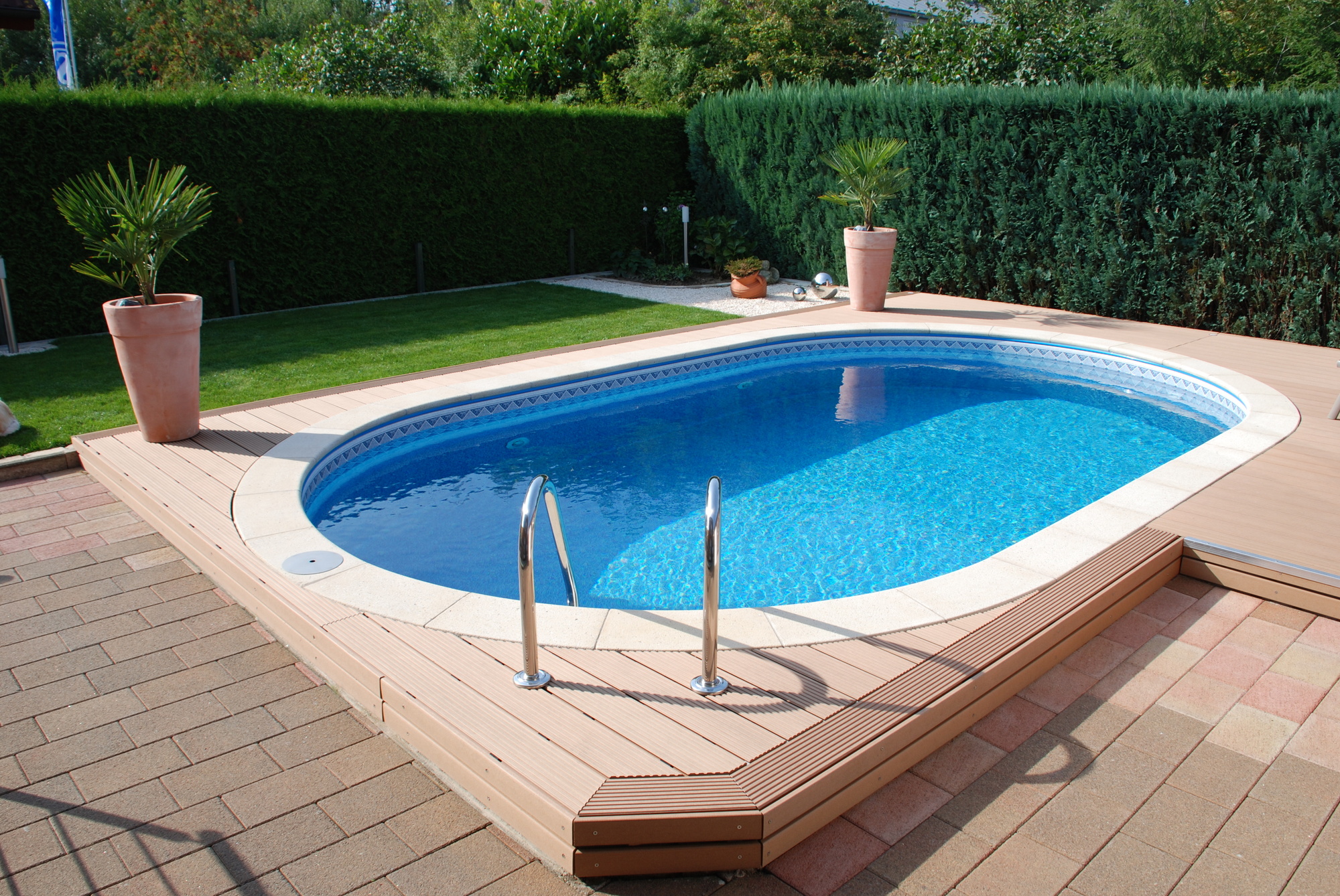
Want to design a pool logo that will catch every homeowner’s eye?
As a business owner, you’re always on the hunt for ways to attract more customers and to establish your brand image.
But before you get caught up in online marketing or promotions, it’s important to spend some time developing a professional logo. The right logo can send a clear and snappy message to consumers and establish your reputation–all in the blink of an eye!
When it comes to crafting the best pool logo, you’ll want to keep several elements in mind. Read on to learn more about what your logo should incorporate to make a splash in the pool market.
1. Choose the Right Message
Every logo is founded on a clear message, one that will stay with customers well past that first glance they give your logo.
The best message is one that reiterates what your company is all about and, as a result, will lead to a new customer relationship.
Before you plunge into crafting the ideal pool logo for your company, start by brainstorming what message you want to communicate to your existing and future customers. A great place to start is your company motto or even a statement of your vision as an organization.
If you install pools for a retiree community, you may want to emphasize an element of freedom and new horizons, for example. If you are a pool remodeling company like Ross Services for U, you’ll want to communicate ideas of renewal or change.
Sometimes it can be helpful to write down a list of keywords and to go from there. For example, your brainstorm list may have the words “facelift,” “comfort,” “sunny afternoons,” and “leisure” on it.
If you’re stumped, browse online for blogs about designing your ideal logo. There is a lot of advice out there when it comes to branding, and sometimes a quick Google search can help you ease that design block.
2. Don’t Forget the Water
Every pool logo has something to do with water. Don’t forget to integrate this element when you are designing your logo, and to match it with the message you want to share with your customers.
When coming up with ways to bring in the water element, try to think outside the box. You may want to do a Google image search of “water” to see what appears. Think also about the variety of forms that water can take, and what emotions we associate with forms of water.
For example, you’ve got water droplets, rain, waves, the ocean, pools and rivers, lakes, and puddles. Of course, each of these images is likely to communicate a different message and emotion to a viewer.
If you bring in an image of the ocean into your logo, you may invite in a sense of expansion and distance. The image of rain will naturally evoke a feeling of being drenched.
Play the matching game to choose which form of water matches the message you want to get across to viewers.
3. Assess Your Competition and Take It Up a Notch
A lot of companies deal with water, so you’ll want to pay attention to the logos of your competitors to make sure you aren’t taking their ideas. Beyond that, checking out the playing field will enable you to take it up a notch when designing your pool logo.
Analyze each logo and ask yourself what message it communicates. How effective is the image in communicating that message? Most importantly, how could you do it better?
In order to take it up a notch, you may want to go more abstract. Let’s say that your competitor has an image of a water droplet in their logo with a distinct color pattern.
This sounds great, but you could take that same water droplet and cut it in half. Or you could change it into a perfect sphere. Or you could transform that droplet into four quarters of a circle, recalling a window. See where we’re going with this?
Often times the most competitive logos are artful and unexpected. They aren’t obvious. Try to go this path when creating your clever pool logo.
4. The Simpler, The Better
No one has time to read a logo or sign that is crowded with information or isn’t straightforward. Keep your customer in mind when designing your logo and keep it simple.
Aim for a minimalist design that still has a clear message and an image. Make sure that this streamlined design can be easily replicated on business cards and outdoor signage.
Choose images that aren’t overly complicated or detailed–less really is more!
5. Bring in the Perfect Colors
If you are designing a pool logo, you’ll likely want to bring in some colors that remind the viewer of water–i.e., blue and white.
When choosing the perfect colors, however, try to avoid the standard blue and white your competitors might have in their logos. Explore different hues and variations of these colors, or bring out a striking contrast with a dark navy and a pale cerulean.
Go to a paint store and take samples of paint swatches if you have to. Choose colors that resonate with your message and image but also set you apart.
Things to Consider When Designing Your Pool Logo
You can make or break your brand image depending on which logo you choose to represent your company. Before you go about designing your pool logo, it’s important to think about some key elements.
Begin by choosing the right message you want to convey to customers with your logo. This could be a message about change if you are a pool remodeling company. It could be one of freedom or inspiration if you cater to new or retired homeowners looking to make a splash with a patio or pool addition.
Once you have your message, match the colors and the theme of your logo to this message. You’ll want to bring in the element of water no matter what, but in a way that carries your company’s message across.
Have experience designing your successful pool logo? Share your thoughts in the comments below!
Eight Expert 3D Logo Design Tips for Your IT Company
Posted on December 04, 2017 by Logo Design Tips and Tricks

Quality of service and pricing help you get and keep customers, but it takes a while for that word of mouth marketing to take hold. You need an edge to help your IT company capture potential customer’s attention. A good logo helps you do that.
In fact, some major tech companies are as easily recognized by their logos as by their names.
Technology has advanced enough that you can take on the whole process yourself with inexpensive or free logo design software. Even better, these days you can create 3D logos that stand out even more.
Of course, a good 3d logo design doesn’t appear out of nowhere. You need to build it up step by step. So let’s jump in and look at some design tips to help you create the best logo for your company.
1. Research the Competition
Every IT company steps into an existing market. That’s true if you help local businesses with their servers or offer cloud computing services nationwide. Before you put pencil to paper or mouse to program, you need to have a handle on what your competitor’s logos look like.
At one level, you just want to avoid creating a logo that resembles an established competitor. If your competitors copyrighted or trademarked their logos, making a similar logo opens you to potential legal trouble. You also don’t want to create accidental marketing for your competition.
Research can also give you some insight into whether any industry standards exist. If most companies in your area of IT use certain shapes, colors, or fonts, you might want to follow suit. It lends your company an air of belonging to the club.
You might also want to buck those trends to set yourself apart. Either way, research informs those choices.
2. Refine Your Brand
Your logo acts as a visual cue to what your brand is all about. Before you can invest your logo with those qualities, you need to refine your brand in your own head.
Figuring out your brand isn’t a simple process, but getting into the right ballpark is usually enough for a new company. The idea is to boil your brand down to one or two defining characteristics.
If you want people to see you as fun to work with, you need a cheerful, upbeat logo. Aiming to make reliability your main business principle, you need a logo that expresses stability. Knowing what you want people to associate your company with will inform every step of your 3D logo design process.
3. Work Through Multiple Ideas
Remember back in high school or college your instructor told you to narrow down your essay idea. The reason is that initial ideas often prove too broad or vague.
The same thing happens in logo design. Your first few ideas are almost always vague or derivative of another logo. Think of these as creative throat clearing.
For example, if you want to express stability, you might jump straight to a mountain. That does express stability but probably doesn’t relate to your company in a meaningful way.
Sketch a dozen or two dozen logos while keeping your brand message in mind. You’ll work through the obvious and then start getting into more relevant ideas.
4. Simplicity Is Best in 3D Logo Design
The promise of 3D logo design is that it creates the illusion of depth. It’s a useful but dangerous option.
That illusion of depth gives you more chances to clutter the image. Say you put five 3D elements into the logo. It might look cool, but it’ll probably confuse the eye of anyone who sees it.
A good logo design keeps things simple. People are much more likely to remember one word or a simple image than something complicated.
While it’s not 3D, you see a great example of simplicity in logo design over at The Scarlett Group.
5. Color Me Impressed
Color is another tool that has the power to alter perception. Gray communicates calm, while purple communicates wisdom. By integrating the right colors into your logo, you can make a statement about your company.
Before you jump into color, you should create a black and white version of your logo. If it doesn’t work in black and white, color probably won’t save it.
You should limit the number of colors you use. Too many colors distract the viewer from the main message. Also, when you scale the image down, colors get muddled.
6. Working with Fonts
Logos that include company names often work, but they can also backfire. You need to choose your fonts with great care because they communicate in ways similar to color.
Serif fonts, for example, convey strength and trustworthiness. San serif fonts are more casual and relaxed.
Your choice of font needs to dovetail with your brand message. If you’re aiming for super-professional, a serif font will serve you better. San serif will give you a more lighthearted, modern feel.
7. Does It Work at Different Sizes
Logos used to appear on business cards, product packages, and the occasional billboard. Now they appear all those places, as well as websites, social media profiles, white papers and even in email inboxes.
That means you need a logo that scales and looks good at all those potential sizes. Adjust the size of your logo to very small and very large in your graphics program. Is it still easy to recognize and understand?
If yes, awesome!
If no, it’s time to revamp the logo into something simpler.
8. Get a Second Opinion
It’s easy to get so fixated on a particular 3D logo design idea that you lose perspective. You overlook obvious things because you spent so much time with the design.
Draft people you trust to give you second opinions about the design. The ideal candidates are people who haven’t seen the design before. Coming at it cold will make their responses similar to the responses of potential customers.
If they tell you it doesn’t work or that you accidentally created an offensive logo, you can trust that they’re probably right.
Parting Thoughts
A good 3D logo design stems from the same design principles as regular logos.
You start with your brand message and create numerous logo designs to filter out the obvious. Keep it simple so that it scales and remains recognizable or readable. Use colors and fonts to support the brand message you want for your IT company.
If you’re ready to tackle the logo design process, check out our free logo maker program.
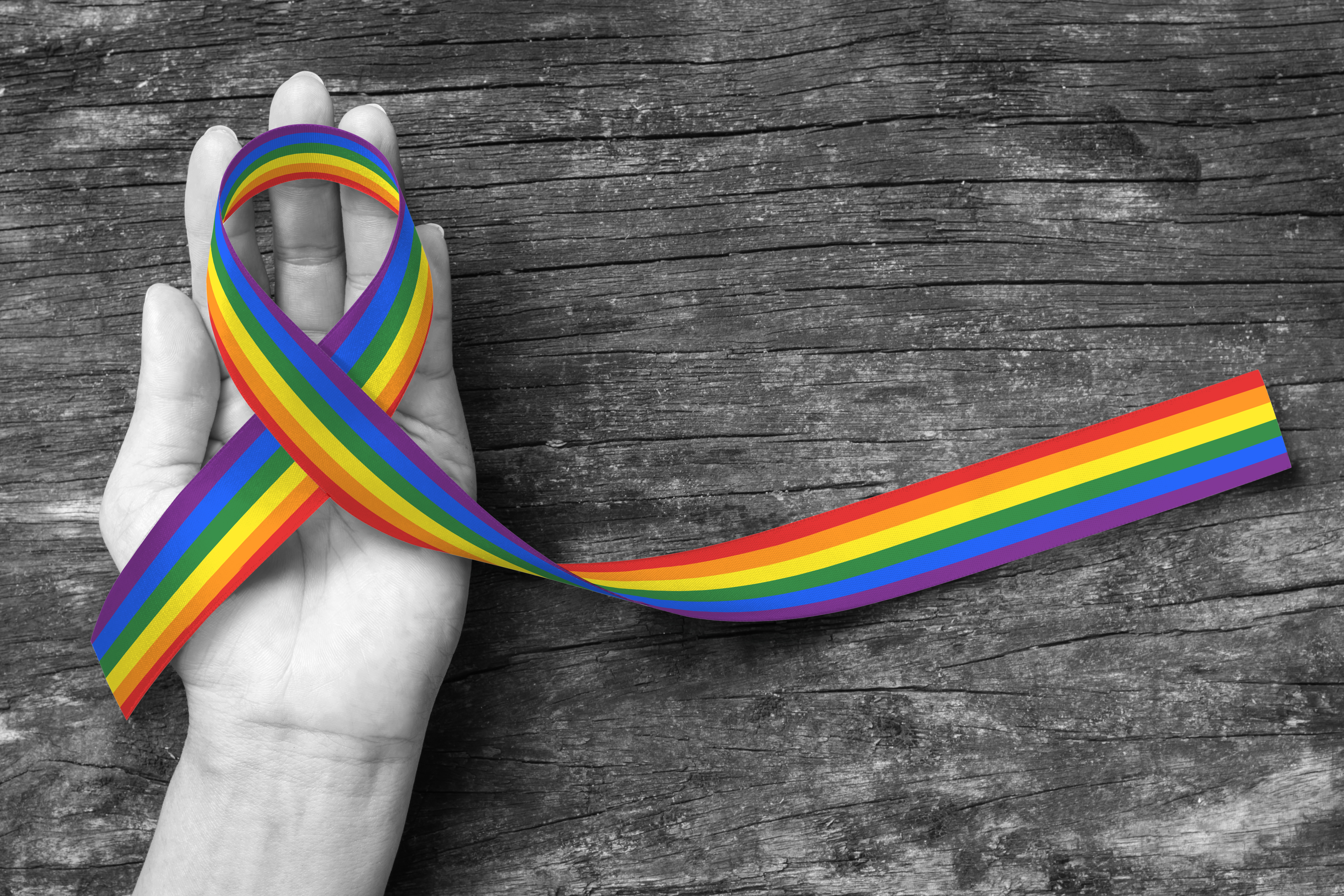
5 LGBT Logo Design Tips to Appeal to Queer Consumers
Posted on November 24, 2017 by Logo Design Tips and Tricks
Did you know the first documented gay rights organization was formed in 1924?
Fast forward nearly a hundred years: An openly transgender candidate was elected to the Virginia House of Delegates in November 2017.
This makes her the first openly transgender candidate to ever be elected into a state legislature in American history.
LGBT rights have come a long way. It’s important to be aware of LGBT issues in order to reach this audience.
Let’s take a look at five LGBT logo design tips to appeal to your queer customers.
1. Understand Your Demographic
It can be helpful to familiarize yourself with common obstacles and achievements surrounding the LGBT community. This knowledge can help you in designing an effective LGBT logo.
Before you try to communicate to the LGBT community through your logo, attempt to connect with them on a human level. Step into their shoes. Make an effort to see things through their eyes.
Then, prepare to create the best LGBT logo around.
2. Be Diverse and Inclusive
Be mindful of symbols or representations that have a history of being divisive or exclusive.
For instance, even though the swastika was originally the symbol of good luck and good health, you wouldn’t want to use it in your LGBT logo. Unfortunately, this peace symbol has become a high-trigger image for most people around the globe.
Be sure you know the history of any logo design you use for your brand.
3. Do Thorough Market Research
Research LGBT perspectives on different topics and causes. Also, find out who is buying your products.
This is especially important if you have a product that is highly specialized, such as the Whizzinator prosthetic. It’s important to do your research to determine who’s buying, who’s interested, and who’s still on the fence.
Then you’ll want to market more strongly to the group that is shown to be buying the most.
When you do your research, less falls through the cracks.
4. Familiarize Yourself With LGBT Symbols
There’s no denying that symbols have power. They can invoke strong emotion and even direct action.
Throughout history, there have been symbols that engender warm, secure feelings such as the peace sign or a cross for some. Others, such as the Confederate flag, can bring up anger, fear, and resentment.
It’s important to become familiar with which symbols communicate certain messages. Rainbows, triangles and the Greek lambda have come to be powerful symbols for the LGBT community.
5. Avoid Stereotypes and Misconceptions
You can best avoid stereotypes by arming yourself with knowledge about the LGBT community as outlined above. Keep away from anything that directly sets them apart from the rest of society.
It can be a fine line. Aim for a balance between acknowledging and honoring the struggles and accomplishments of the LGBT community and also treating them as you would any other consumer.
Create Your Own LGBT Logo Designs
You want an amazing logo design for your brand. You want your design to reach as many people as possible.
That’s where we come in. Our online logo maker helps you create the look you want to gain the business you need.
Are there any other design tips you would add to our list? Comment below!


