5 Elegant Logo Design Tips for an Internet Provider
Posted on September 19, 2017 by Logo Design Tips and Tricks
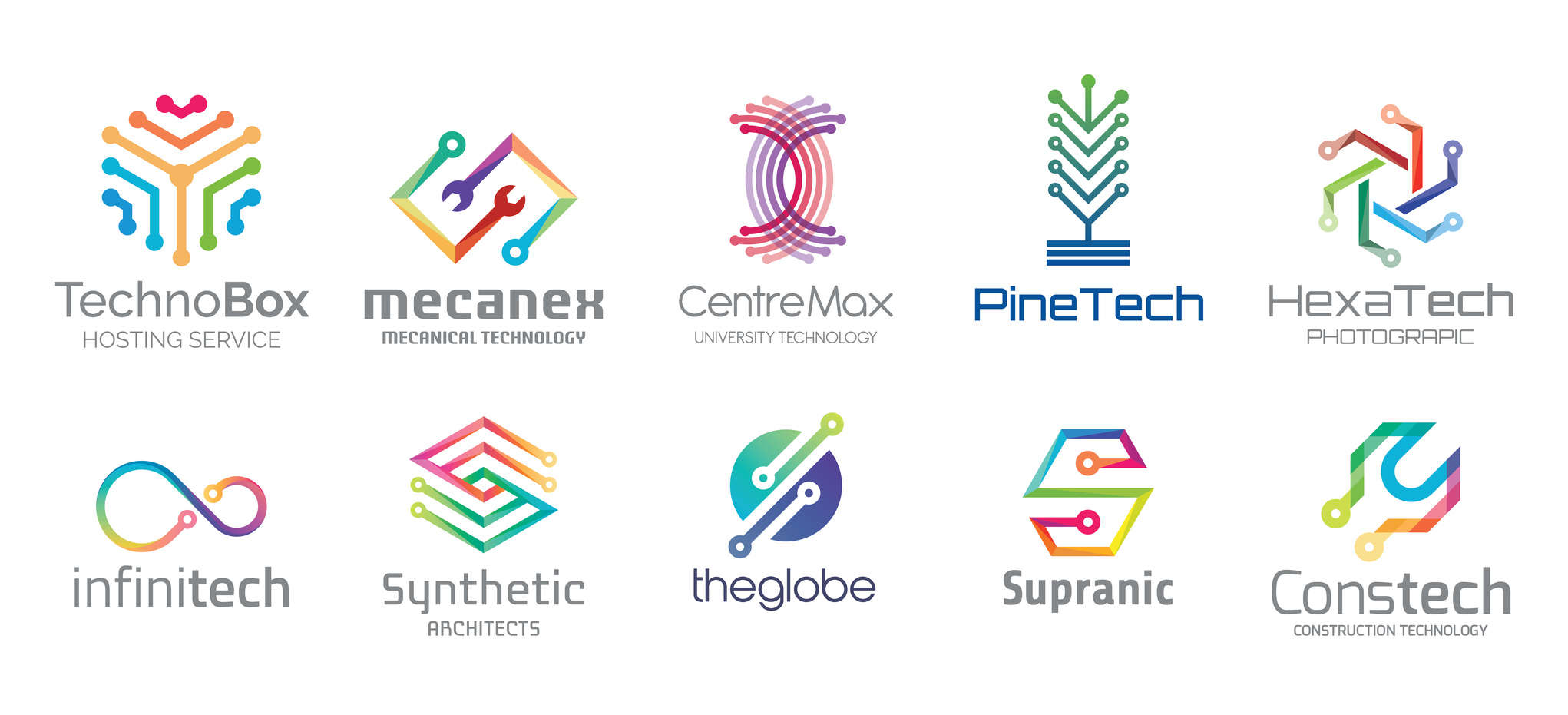
Internet providers are usually thought of as utilitarian companies because of the service they offer. But that doesn’t mean they can’t benefit from an elegant logo design.
A company’s logo is the first thing people notice about it, and it could even be the deciding factor when someone is choosing where to do business. Because of this, company’s take their logos very seriously and it’s important as a designer to understand what makes a logo successful.
Below, we’ve outlined five tips that can help you create an elegant logo design for an Internet provider.
1. Elegant Logo Design Comes from Understanding the Brand
The best logos are those that use visual elements to tell the customer a story about the brand. They hint at the company’s attitude and culture, in addition to communicating the services provided.
To be able to design a logo that does all that, you need to know the company from the inside out. Talk to stakeholders and employees to get a sense of what the company is like. If you understand what about the brand a logo should represent, you’ll be well on your way to the perfect design.
2. Keep It Simple but Interesting
Truly elegant logo design incorporates a balance of elements. This goes beyond just contrasting visual and text elements. You also want to create a logo that does enough to grab a customer’s attention without doing too much that will confuse them.
A customer should want to look at the company’s logo — it should catch the eye with a surprising element. But no one should have to work hard to understand a logo or spend time trying to figure it out. A balance of simple elements working together in a new way keeps a logo interesting without making it complicated.
3. Use Color to Create Emotional Connection
There are certain colors that are very closely associated with emotional reactions and responses. This is important to keep in mind when designing a logo for an Internet provider.
People rely on high-speed Internet to get them through their daily routines. When designing a logo for an Internet provider, you would want your work to inspire confidence that the company will be able to give its customers what they want.
Color is a design element that can help with that. Strong, bold colors would be a better choice than softer pastels, for example.
To understand more about high-speed Internet and why it’s so important for these companies to have the confidence of their customers, click here.
4. Look for Inspiration Everywhere
Inspiration for logo design can come from even the most unexpected places.
A great slogan could come from a customer’s online review. An interesting visual element could be inspired by a building you pass every day on your way to work.
Being open to unconventional sources of inspiration could take your creativity to a new level and help you design a logo unlike anything anyone else has done for the industry. That’s a great way for the company you’re working with to set itself apart from its competition.
5. Trust the Process
Creating elegant logo design takes time, and a truly successful logo cannot be thrown together in a rush. The design process is just that.
Start by brainstorming different ideas and don’t be afraid to pursue several of them. Trial and error can work to your benefit.
What you don’t want is to be so committed to one idea that you try to force it to work even after it becomes obvious that it’s not the best design. Try to keep personal feelings and attachments separate from the work, and you’ll end up serving your client in the best way possible.
Ready to Start Designing?
Online design tools can guide you through the creative process from start to finish. They can help you visualize your ideas and give you a sense of what’s working and what needs to be rethought or tweaked.
For more information, check out our Frequently Asked Questions so you can start designing today.
Creative Education Logo Design Tips and Inspiration
Posted on September 18, 2017 by Logo Design Tips and Tricks

The global education market is massive, exceeding $4.4 trillion in 2012.
It’s set to continue to trend upwards, partially spurred by the growth of mobile learning.
However, as more and more education brands pop up, it becomes increasingly difficult to stand out from the crowd. But a stunning education logo design is the surest way to make the right first impression.
Read on to find out how you can put together an education logo that attracts attention to your brand!
Elements of Education Logo Design
Overall, there are three primary elements of every logo.
Graphics
Most of the time, the graphics, whether an icon or pattern, is what people will notice first.
Your best bet is to find a way to creatively incorporate the end goal of your client in your educational logo design. For example, Moji University’s logo features an academic cap fused with the letter “O” in the name. It doesn’t look forced or out of place, and it blends seamlessly with the font.
Color
Since each color evokes specific moods, they can have a powerful effect on how people view your brand.
When it comes to education logos, certain colors are better suited than others. Blue is a great pick because it’s associated with creativity, productivity, and professionalism.
You can also use two or three different colors to evoke several moods at once. However, make sure the colors compliment each other. Canvas Network accomplishes this well.
Font
The font is just as important to a logo as the graphics. But it has to fit the theme of your design.
The type of font you should choose depends on the type of services you provide. For example, Washington Leadership Academy’s logo font looks very serious and sophisticated. In comparison, A Kid’s World Preschool uses a very playful font for their logo.
Try many different fonts before finalizing your logo to see how they mesh with your graphic.
Making Your Design Adaptable
From Nike to Chanel, great logos have one characteristic in common: adaptability. Logos must adapt to fit anything from small website banners to large billboards. Visitors will hesitate to click for more on your site if your logo looks blurry when shrunk.
The easiest way to improve the adaptability of your logo is to simplify its design. Once you have the full version of your logo, try removing any unnecessary letters or details. Feel free to use initials if you have to.
Another excellent way to make your logo more adaptable is to rearrange its elements. For example, you can move the icon from the top of a logo to the left or right side of the font.
What to Avoid
There are certain mistakes you should avoid when designing a logo.
First, it’s a good idea to look at logos within your industry to see what works. However, avoid copying someone else’s logo. The last thing you want is a generic education logo.
Next, make sure you’re designing a logo for your target audience, not yourself. Just because a logo looks good to you doesn’t always mean potential customers will flock to it.
Finally, remember to keep it simple. Try not to use more than two fonts or three colors in one logo. This not only helps with adaptability but also makes your logo easier to remember.
Final Thoughts
Overall, your education logo design should be simple and adaptable. It should also appeal to your target audience and evoke the right moods.
If you have a few ideas you want to play with, head over to our free online logo maker and start building your own logo!
5 Unique Logo Ideas for Transcription Companies
Posted on September 18, 2017 by Logo Design Tips and Tricks

Logo designs can seem like a minor detail. Just a drop in the ocean of things to consider with a new business.
But, the truth is that a lot rides on having an impactful logo design.
Every aspect of a business should be taken into account when shaping a company’s brand identity, but the logo design deserves special attention. Whether your business is big or small, the logo acts as the first impression that any customer relationship may hinge upon.
A good logo should communicate the personality of the business and make it stand out from competitors.
Read on for guides to unique and compelling logo ideas.
Use the Perfect Niche
The niche is the specific focus of a business that brings them a competitive edge. Businesses can effectively communicate their niche to its customers through bold logo design.
If a company focuses on medical transcription, then incorporating a stethoscope into the logo would clearly show that medical is the business’s focus. It may also be used to signify that the business listens to the heart of its customer’s needs and desires.
Minimalistic Designs
Minimalistic designs with clean lines project a sense of quality.
Simple letters or words is all that is needed with transcription companies to communicate their brand. The use of a clean font translates well with customers so that they know their transcriptions will be clear as well.
The use of a thin and crisp lined geometric border could really make the logo pop.
Use Nature
Nature is an all-encompassing source of relatability. Animals, trees, or water can all be used to convey some emotion. These natural elements presented in an abstract design may be perfect to showcase the business’s personality.
Take a stone for instance. In a transcription companies’ design, a stone makes sense. The most resolute testimonies were once written in stone. Stone gives a sense of strength and integrity. Create a brand identity that is rock solid with this design.
Principium
The beginning of most languages to our knowledge originates from Latin. It would make sense to pay homage to this old language by incorporating it into their logo design.
It doesn’t have to say anything special. Something like Animadvertite would do — it means “take notice.” Anything in Latin can great cool with the right font. Use a simple phrase around the border to give a logo design the edge it needs to stand out.
The Globe
The Earth as a graphic design is instantly recognizable. It connects with the audience no matter their origins. Transcription companies with a transglobal perspective would benefit to encompass the broad spectrum of customers that it may serve.
There are so many unique ways to portray a globe. Try having the continents be constructed of words written in different languages from around the world.
Unique Logos for Transcription Companies
The company logo is an invaluable asset to solidify a successful brand identity. But it can be tough to create an original design. Take these concepts and make them your own with an online logo maker.
Consider utilizing social media to show off a few design ideas you create and to get the feedback you need to make the perfect logo.
If you need an extra boost of inspiration or if you have any questions about designing your logo, please don’t hesitate to contact us.
5 Tips to Spruce Up Your Carpet Cleaning Logo
Posted on September 18, 2017 by Logo Design Tips and Tricks
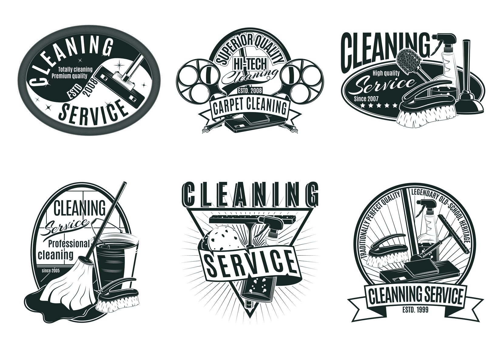
If you’re in the carpet cleaning business, you’re going to want a sharp, clean logo that reflects your superior service.
But coming up with a perfect logo is often harder than you’d think. You’re going to need a bit of help to make the most of your logo making service.
Read on for some quick tips on how you can spruce up your carpet cleaning logo.
5 Tips to Spruce Up Your Carpet Cleaning Logo
1. Think About Color
First, your logo needs to be something that you personally identify with as a business owner. It needs to be something that you take pride in. Something that you’re happy to show off and that you feel really represents your business.
Incorporate a bit of your company’s personality within your carpet cleaning logo. First, you’ll want to come up with colors. Generally speaking, cleaning companies tend to use warmer colors.
Typically, baby blues, oranges, and reds are amongst the most popular. Research shows that color can be hugely influential. Each color brings about a unique emotional effect.
2. Look at Your Competition
It’s a great idea to keep track of the competition. Look at their logo and pay close attention.
What types of colors are they using? If your colors are too similar, you run the risk of confusing customers.
A little similarity isn’t a huge issue. But your logo needs to be different enough that your customer base can clearly tell you apart from the competition.
3. Out With the Old, in With the New
If you’ve already got a logo, you don’t have to scrap all elements of your previous design. Not only can this cut costs, but it can help avoid customer confusion. Changing too much, too fast is a bit of a shock to customers.
There may be aspects of your logo that your audience identifies with, be it a color or image.
Consider how your current logo can be altered. Think about changing specific elements of it instead of changing it entirely.
4. Get Minimal
One of the more popular trends to hit the graphic design market is minimalism. Tons of companies are ditching expensive, convoluted logos in favor of something more simple.
Apple’s logo is a great example of this. It features no text, just a simple white apple with a bite taken out of it. Yet it’s instantly recognizable to millions of people across the globe.
Remember the adage less is more? Well, it’s certainly true when it comes to logo design.
5. Consider How Your Carpet Cleaning Logo Will Scale
Think about how your logo will look when scaled on different platforms. While it may look great at a medium size, images tend to lose clarity when blown up.
Make sure that your logo won’t look too jagged or washed out when made larger.
Conclusion
With these 5 tips, you’ll have a more beautiful carpet cleaning logo in no time! And don’t forget that we offer tons of services to help make your logo more beautiful than ever.
Whether you’re making a complete change or just looking to spruce things up, we can help. Sign up today!


