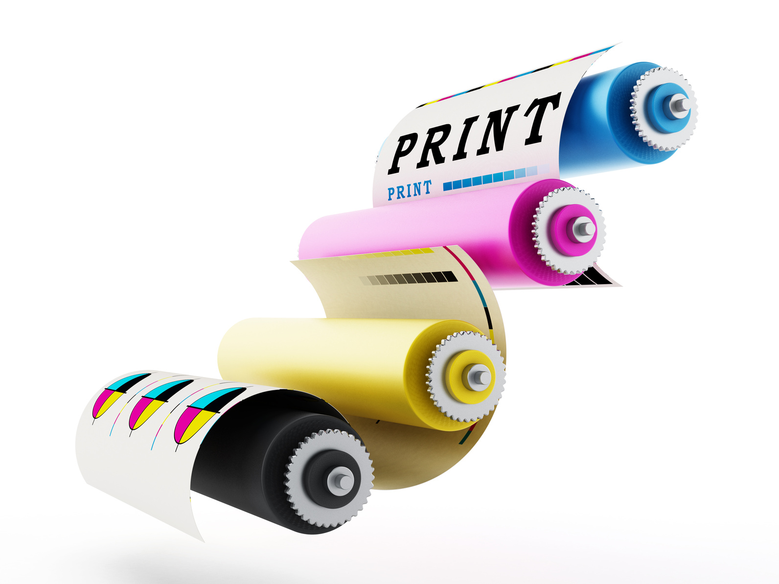
5 Tips for Perfect Logo Printing
Posted on September 15, 2017 by Logo Design Tips and Tricks
Taking a little time to brag about yourself or show off your company, are you?
When it comes to logo printing you need it to be the best. After all, the prints are the greatest representation of you, your style, and your message.
Use these tips to create perfect prints of eye popping, head turning logos for you or your company.
1. Decide Your Product
Before you can dive into making your logo look just right you have to decide where it will be used.
Are you creating a statement for a billboard? Making t-shirts for an upcoming event? Revamping your work ID Card or business card?
Taking these options into consideration will affect how you design your logo.
Resources on the web make it as easy as possible for you to get started.
The people at IDCard even offer free design and same day shipping!
2. Personalize And Create Your Design
Time to show off and be unique!
Websites that specialize in logo printing make it easy for you start from scratch and get exactly what you want.
The options for design are endless and things to consider include text, graphics, shapes, symbols, images, color, size, and style.
Have fun with it! Plan, design, share, revamp and do it all over again to create different options for yourself.
3. Bleeds
Now some technical work. Don’t worry, this isn’t about to get gory.
When printers refer to the the images on a page, a term they use is “bleed”.
You’re probably thinking, well it sounds bad.
Is it?
When you send your logo out for printing, the images and text that you choose need to be a certain distance away from the edge of the page.
If it’s not? The printer may have to resize your logo, change the size of the paper, or make other adjustments.
After all the hard work you put into designing, do you really want someone else touching, moving, and resizing? I’m guessing not.
Avoid this conversation with the printer by making sure your logo follows proper bleed guidelines. They apply to every product you can dream about printing on.
4. Smooth Conversions
Have you ever created something in a document and then tried to copy and paste it somewhere else only to have all of your margins shifted, images re-layered, and font changed? *cringe*
Thankfully, there are suggestions that can help you avoid these problems.
- Create and save your artwork in 300 dpi. Anything lower and you run the risk of having blurry prints.
- Use the correct color scale. RGB (red, green, blue) is best for web materials while CMYK (cyan, magenta, yellow, black) is best for printed material.
- See Bleeds from above.
5. Logo Printing Should Not Be a Rushed Job!
Time can not be stressed enough. Proofread your design, talk with the printer when the job is sent over, and request print proofs.
Nothing would be worse than ordering 500 new business cards only to find out that you entered your phone number incorrectly.
Get started now so you and your company can start printing the perfect logo!
5 Ways Tony Robbins Can Improve Your Life Coach Logo
Posted on September 15, 2017 by Logo Design Tips and Tricks

Tony Robbins has helped billions of people over the last thirty or so years. From books to seminars, the man has inspired, helped, and coached normal, everyday people to achieve the success they never thought possible.
When you want or need something to change in your life, Tony Robbins is what you type into the YouTube search engine box.
Don’t wait for other people to tell you what to do. Grab life by the horns, make your own rules.
He seems to know what he’s talking about. He’s worth half a billion dollars.
If you’re getting into the life coaching game and aspiring to have your own fortune, start with your life coach logo.
Today, we’re talking about your logo and how it impacts your brand.
His Life Coach Logo
Look at Tony Robbins and how he dresses. His outfits are simple, as is his website and logo.
His logo is basic yet bold and clear.
When you’re trying to come up with your life coach logo, think about your message.
What do you represent? What do you want people to take from it?
He Makes It Easy
Look at the colors he uses. Black and white. Simple yet elegant.
Bold. He typically wears dark colors.
This helps keep people focused and not distracted by what he’s wearing and the same goes for his website.
This color scheme symbolizes both balance and simplicity.
Isn’t that what every life coach should be preaching? Americans’ lives have become so convoluted and bogged down with stress and material possessions they can’t even decide what matters to them anymore.
If you want people to remember you and your life coach logo, go with a simple color scheme that conveys the message you want people to associate with your name.
Here’s another way to look at it. If you had your logo printed on 2018 daily planners, would anyone buy them?
Make Your Logo Easy to Remember
Use an easy to read font. Make your logo stand out but don’t make it hard to decipher, as this will make it forgettable.
Most coaches use their name as their life coach logo, just like Tony Robbins.
A great logo doesn’t need to be a symbol. However, if you want to use something everyone knows, you can definitely make it work.
Play around with symbols as well as your name to find what works best for you and your brand.
Your Voice
Right around the time you’re working on your life coach logo, you want to be thinking about your brand. Not just that, you want to compare it to the logo and how they match up.
Establish what kind of coach you want to be. Establish a logo. Make sure they work together.
Tony Robbins came from a broken home and worked hard to get where he is today. A simple man with a simple message and a plain, yet bold logo.
Why can’t you do the same? We know exactly where you should start.
Take your inspiration from this post and jump over to our free logo maker and give it a try.
Create an Original Garden Logo and Watch Your Business Grow
Posted on September 15, 2017 by Logo Design Tips and Tricks

Do you want to grow your garden business?
Then you need a logo that stands out from the crowd and gets customers excited about your company.
With more people gardening than ever, including millennials, it’s important to create a logo that’s fresh, original, and eye-catching.
A great logo will improve every aspect of your business, from your website to your business cards, your staff uniforms to your price labels.
Ready to watch your business blossom? Then follow the tips below to create the perfect garden logo.
Make Your Logo Clever
A logo that includes a clever visual joke will make customers smile – which is exactly what you want them to do.
Try creating a logo with two meanings that both tie into your business. For example, if you specialize in selling plants online, you could create an image of a flower growing from a computer mouse.
If your garden store is located in an area with an iconic skyline, try recreating the skyline using trees and shrubs, or keep the bottom half of the buildings intact and replace the tops with plants.
Not sure where to start?
Brainstorm words, phrases, and images relating to your business, then try different combinations. The most unlikely combo could well result in the best garden logo.
Avoid copying logos that you’ve seen other businesses use – you want to be original, not stale and dated.
Be Smart with Color
Let me guess what you’re thinking – “It’s a garden logo, of course it’s going to be green!”
Stop right there.
If you want to create a truly original logo, you need to think outside the box. While green might be right for some garden businesses, using it as your first choice means you’re missing a chance to stand out.
Do you specialize in selling solar garden lights? Then why not create a black logo with twinkling yellow accents? Way more interesting than green, and it instantly demonstrates your area of specialty.
Even if you’re selling pretty standard products, you can use color in a smart way.
Instead of using a green leaf in your logo, why not use colors that are relevant to your local area? If you’re close to a mountain, you could choose gray and white to emulate a snow-topped peak.
If there’s an interesting local flag, try using those colors in your design.
It’s not easy being green – especially when you’re trying to create an original garden logo.
Don’t Overcomplicate Your Design
It can be tempting to try and incorporate absolutely everything into your logo, but that never looks good.
The best logos are simple enough to be drawn by a small child and easy to remember after seeing them only once or twice.
Try creating a basic design for your logo, then paring it down as far as you can. That means removing textures and shadows, limiting the color palette, and scrapping any unnecessary elements.
You might be surprised at how much better the minimal version looks.
Who’d have thought that you didn’t need a full diagram of your hydroponic growing systems in there?
How to Create an Original Garden Logo
Want a logo that doesn’t make customers roll their eyes?
We’d recommend using clever visual tricks, avoiding cliche color schemes, and keeping your design simple.
Start your logo design today and give your garden business a whole new lease of life.
How to Find Your Painting Company Logo Color Scheme
Posted on September 15, 2017 by Logo Design Tips and Tricks
What’s the secret to designing a stellar logo for your company? It all starts with selecting the right color scheme.
Your logo is one of the first things people think of in association to your brand. The right color palette is so instrumental in branding that it can increase brand recognition by up to 80%.
Color has more of an impact on people’s emotions and decisions than you might think. Before landing on a color scheme, you need to first understand how your customers react to certain colors.
Painting companies can’t afford to get their logo’s color scheme wrong. Let’s find the perfect painting company logo colors the first time around. Read on to learn more.
The Best Color Schemes
There’s no one color scheme that creates the perfect painting company logo.
Colors are at their most effective when they fit the companies brand and brand message. Each color evokes a different response in people. You need to be aware of the different responses and if your color scheme fits your brand.
For example, bright colors are a great way to grab a potential customers attention. However, they can also seem aggressive in some peoples eyes.
Conversely, quieter color schemes can make a logo look more professional. They also can be overlooked in favor of bolder colors.
Let’s take a look at an example of a good color scheme. Rhino Shield of California combines both light and dark colors in their logo.
In other circumstances, a large black figure in your logo could spell certain doom. It could prevent the logo from catching anyone’s attention. However, this logo does a great job of contrasting the darkness with light blue and yellow.
This color scheme helps to create a logo that is both on brand and attention grabbing. This is what you should aim for when deciding between color schemes.
Colors and Responses
A painting company logo should have the right mix of colors in their scheme. The best way to approach this is to understand the types of responses associated with each color.
Let’s first consider the bright colors. These are colors that create strong responses – for better or worse. They can make people feel energetic, warm, or aggressive.
Red is a bright color that evokes a strong response. If you’re looking for something more understated, you could consider an orange or yellow.
Orange is an approachable color that’s associated with fun and energetic brands. Yellow can make customers feel cautious, but it’s also warm and inviting.
Blue is a popular choice for businesses trying to give off a corporate or professional vibe. While not the best choice for painting companies, it can be a good fit for more serious brands. Green is typically associated with earthly brands such as landscaping or food companies.
Typically, it’s best to stick to one or two colors in your logo design. Adding too many colors can make logo’s too busy and hard to read.
A popular alternative to having multiple colors is to add different shades to your logo. This is a great way to spice up a logo without altering the brand message.
If you’re still having trouble deciding on your color scheme, try using a logo maker tool. Play around with it until you find a scheme that’s satisfying.
Your Painting Company Logo
Are you ready to make your logo?
Remember that color schemes are only effective when they stay true to your brand. Make sure you pick a color that fits your company and evokes the desired response from your audience.
Contact us to get started making your great logo today.


