5 Consumer Stats to Inform Your Shipping Logo Design
Posted on August 23, 2017 by Logo Design Tips and Tricks
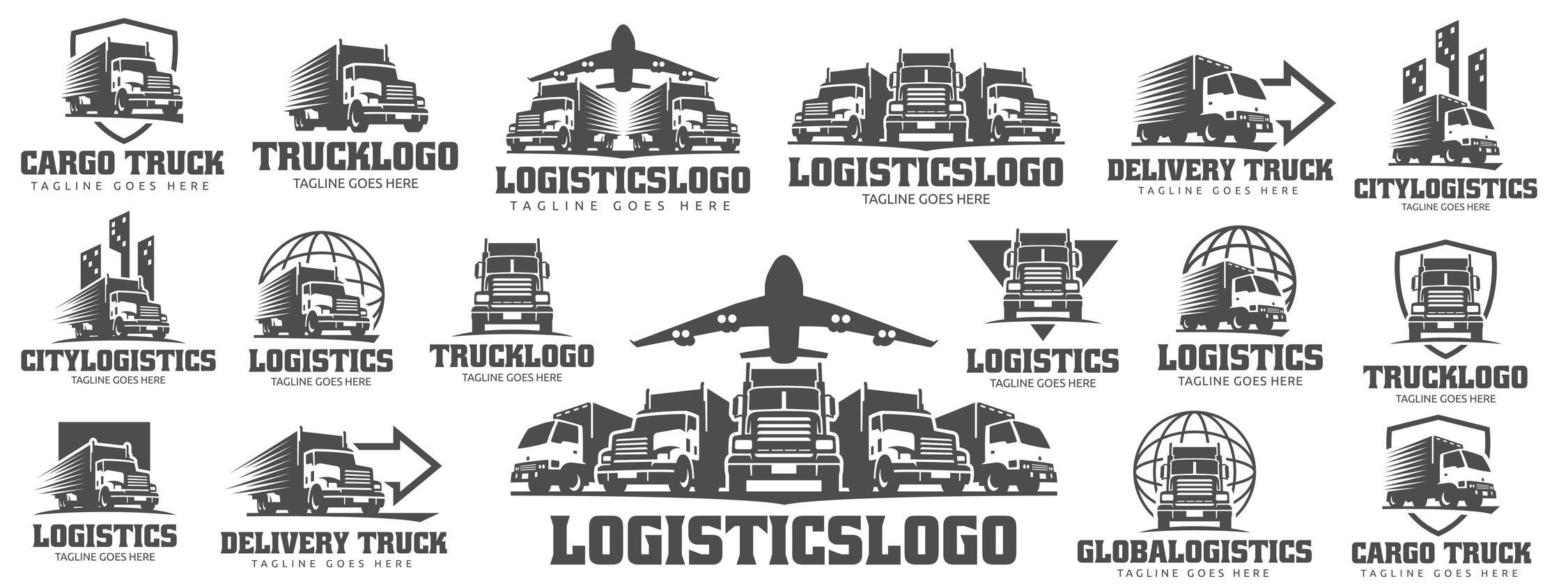
Your brand logo is a symbol of your company’s standards, products, and performance.
However, many retailers do not realize a shipping logo is just as important. Sometimes, it’s the deciding factor in product comparisons.
To stand out throughout the purchase cycle, retailers need to understand consumer opinions. Market perception is just as strong as market demand, especially in communication strategies like logo design.
Translation? If you want to increase your conversions and make more sales, your logo design needs to grab the attention of everyone who sees it — and has to be powerful enough to stick in their minds.
Here Are 5 Consumer Stats to Inform Your Shipping Logo Design
1. 90% Of Consumers Say Free Shipping Is the #1 Incentive
The only thing better than fast shipping is free shipping, according to a recent survey of over 1,400 people.
Some consumers will even wait an extra day or two if it comes at no extra cost to the item purchased.
Electronics and clothing items are usually wanted right away, in which case consumers will pay for shipping. Other things like household items may not be needed as rapidly. Consumers will gladly wait to receive such items for free.
When designing your shipping logo, keep in mind the products you offer.
How much are they worth to your consumer? Enough to pay for shipping?
2. Two of the Top 5 Countries Shopping Online Prefer Digital Currency
Having an online market often means having a global audience.
China is number one in the world for the most frequent online shoppers. Of which, more than half of these consumers prefer digital currency.
India is not far behind. The country places fourth for having the most frequent shoppers per month, yet comes in first place with over 70% of consumers using digital currency.
Customers in Germany, the UK, and the United States are all regularly clicking “go to cart” and “checkout,” too.
This makes digital currency an easy way for everyone to get the latest trends, no matter the shipping address.
3. 50% of Consumers Opt For One-Day Shipping
This statistic highlights the old truth: the faster, the better. It really is that simple.
Many consumers want an estimated time slot of when to expect their package. However, updates are more than welcome. Email or text updates when the package is ready, shipped, and delivered can help.
This has an added benefit of more exposure for your shipping logo. To best tie-in fast shipping to your logo design, think of what reminds you of speed and efficiency.
4. Home Furnishings For Home Delivery Orders Are Increasing
About 30% of consumers are planning to make big, bulky purchases in the coming year.
Retailers need to consider things like special load boards for freight, depending on the total weight and distance traveled.
Retailers have to get the delivery right the first time always, but there literally is more riding on a big order. A trustworthy logo can help establish customer rapport from the start.
5. 82% of Consumers Expect Proactive Communication Throughout the Shipping Process
This is an age-old truth of establishing good relationships – communication.
Using SMS or email strategies are such simple tactics retailers can implement for high customer satisfaction ratings. In fact, of the consumers looking for consistent communication, 45% are tracking by SMS and 85% are checking their emails for updates.
Additionally, the more you send something out to your consumer, the more opportunities you have to expose your logo.
Demand and Design
Designing your shipping logo means taking many things in to consideration.
Your established brand logo and products are the foundation. However, consumer shipping opinions and statistics are important, too. Use the data here to your advantage, especially when it comes time to design your logo.
Have your delivery logos made a difference in customer satisfaction and relations? Let us know in the comments below.
5 Classic NFL Logos to Inspire Your Fan Shop Brand
Posted on August 21, 2017 by Logo Design Tips and Tricks
Want your piece of the $20 million dollar sports merchandise pie?
Then, now’s the time to get serious about branding your NFL fan shop. Specifically, you need a logo that speaks to football fans just like yourself.
Fortunately, you don’t even need to be a graphic designer to pull off a professional logo.
But you do need inspiration.
Let’s take a look at 5 timeless NFL logos to make yours go the extra mile.
San Francisco 49ers
The San Francisco 49ers logo is an ode to the Bay Area’s gold rush beginnings.
Back in the mid 19th century, a group of pioneers embarked on a long, arduous journey to California in search of gold.
The teams’ original logo famously depicted a drunken gold miner shooting guns, but the team eventually adopted their signature red and white-lettered logo in 1962.
The team’s current design is one of the most recognized NFL logos in the game. Since the 60’s, the team also added some gold trim around their logo’s signature oval shape.
While the 49er’s red logo evokes passion and adrenaline, that extra splash of gold represents the high calibre of the team.
Buffalo Bills
This team earned their name and logo from the legendary bison hunter, William Frederick “Buffalo Bill” Cody.
But what truly makes this logo a classic is its simple yet bold red buffalo design.
This logo encapsulates the “less is more” approach, and it translates clearly across apparel, toys, digital products, and more.
Like all Successful NFL logos, Buffalo Bills’ design falls right in line with the following logo principles:
- Memorable
- Simple
- Versatile
- Appropriate
- Timeless
Make sure to keep these principles on hand as you design your NFL UK merchandise logo.
Let’s quickly take a look at three more classic NFL logos that hit the mark.
Pittsburgh Steelers
Six-time NFL champions, the Pittsburgh Steelers, check every box on the 5-point logo design checklist.
The Steelers 3-diamond logo design was originally inspired by the American Iron and Steel Group and was intended to mean the following:
“Steel lightens your work, brightens your leisure and widens your world.”
Oakland Raiders
While the Raiders have notoriously flipped back and forth between Oakland and Los Angeles, their iconic logo has remained in tact.
And who doesn’t love pirates?
This classic logo features a memorable pirate or “raider” with two crossed swords in the background. Rumor has it that his look was inspired by legendary Hollywood actor, Randolph Scott.
St. Louis Rams
The Rams’ logo makes a fantastic case study for colour psychology.
Color plays an instrumental role in how your logo is received and interpreted by sports fans because it elicits an emotional response. In fact, it’s even proven to impact consumer motivation by a staggering 80%!
The Rams’ simple blue and yellow logo creates a balance of both power (blue) and positivity (yellow). These are two emotional responses that encourage fans to believe and participate with the brand.
Ready to Design Your NFL Logos?
With this information fresh in your mind, now’s the perfect time to starting crafting your new sports merchandise logo.
Need even more inspiration for your design?
Learn more about how you can encourage team spirit with your sports logo and check back often for updates.
5 Pest Control Logo Designs Exterminators Need to See
Posted on August 18, 2017 by Logo Design Tips and Tricks

Are you a professional exterminator looking for a new pest control logo? A good logo can make you instantly recognizable online and out on the street, so it’s important you pick one that captures imaginations.
If you’ve been thinking about a new pest control logo, but you’re struggling for inspiration, learn from these 5 great designs.
Then try to make your own logo using our online tools.
Doc’s Pest Control, Inc
This logo, along with its tagline, sets a clear expectation of what you can expect from the Doc’s services – in a memorable and humorous way.
Perhaps humor doesn’t suit all businesses, but a light-hearted touch might be effective in getting customer’s attention within an industry which is quite heavily populated and often takes itself very seriously.
Western Pest Control
Western Pest Control started a competition to get their logo created. They got 191 concepts submitted by 32 designers, and the winner was a very clear graphic.
The shield symbolizes protection, and it’s used quite frequently in pest control. However, it’s also used in other industries where protection is called for, like cyber security and insurance. So the bug image makes it very clear what Western does.
BugBully
This BugBully’s pest control logo looks great. It’s less clean than Western’s, but conveys the same message – the pest is a threat to your home.
And the ‘bug’ looks generic enough to cover all sorts of household insects, so it doesn’t matter whether the company is the best bed bug pest control company or a cockroach specialist. The cartoon covers all the possible angles.
Property Protect
Property Protect incorporates graphics of a bug and a roof to send the message that they’re all about looking after your home as well as the possible insect invaders living inside it.
The magnifying glass signifies the company’s attention to detail, and the color scheme is very clear cut.
Pest Defence
This logo for Pest Defence uses a sword for the ‘f’ in the word ‘defence’.
This demonstrates the attack that Pest Defence will launch for on the bugs in their customer’s households.
The logo definitely sends a clear message.
Try Making Your Own Pest Control Logo
Have you tried experimenting with ideas yourself, so that you have an idea of what you want? Do you want to feature a bug, or would you rather show how you deal with them?
Have you thought about what font you might use, and how to incorporate words into the logo? Do you know what color you want your logo to be, and have you thought about whether it’ll look OK on the side of your van as well as online?
Use our online logo maker to put together your initial thoughts, and find answers to common questions here.
You can make your logo as personal or as general as you like – about the bugs or about yourself. It doesn’t matter.
So long as the final result is eye-catching and tells the world what you do, it will work a charm.
How to Design Casino Logos that Radiate Good Luck
Posted on August 18, 2017 by Logo Design Tips and Tricks
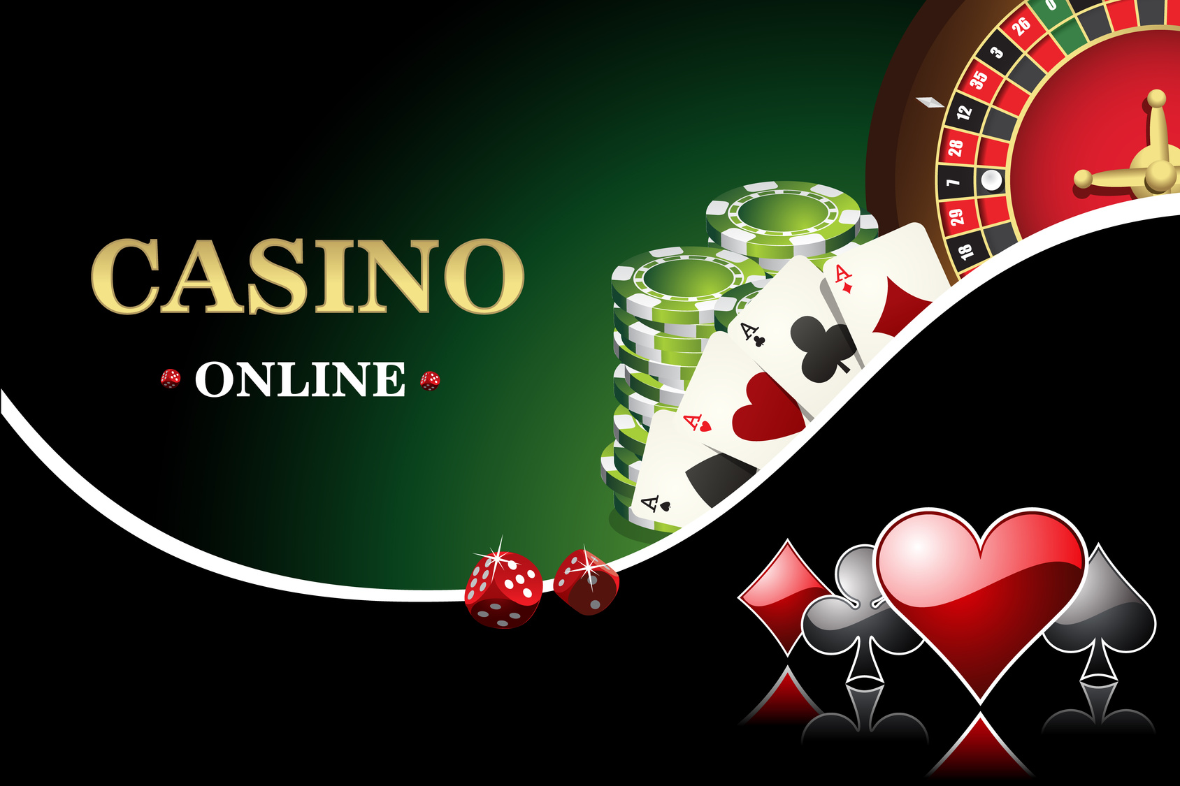
Crafting a great casino logo is like hitting the jackpot — when you do it right you know you’ve struck gold.
Casino logos are crucial to making your brand memorable to customers. With the number of new online casinos cropping up, a good logo will make your business stand out.
So, here is the ‘how to’ guide on creating a winning logo for your online casino.
What Do Casino Logos Say About You?
Here are a few things to consider when brainstorming your casino logos:
- Is there a kind of game or theme you’re using in your logo?
- Is there an audience or customer type you want to appeal to?
- Do you have a specific message you’re trying to send out?
By 2020, online gambling is set to become a $60 billion dollar a year industry.
Making your brand stand out is more important now than ever. While creating your iconic logo, the first step should be deciding what your brand says.
Remember that people are looking for an online gaming site they consider fun and gives them hope in a payout.
Once you have an idea of your brand you can actually start brainstorming a design.
Drafting an Idea
Some questions to ask yourself during the design process are:
- Do you want to be sleek and stylish?
- Do you want to use an old-school call to the casinos of Vegas?
- Do you want a fun and easy-going look?
Now that you have a message for your brand, how can you convey that?
You could use a character with your brand — a cartoon that looks fun and inviting, or you could use the name of your online casino in a memorable way.
Text styles are a common form of logos. There’s a good reason for that since a name will be the most searchable tool to find your specific website.
Consider using an old school pen and paper to draft out your casino name. Then move to an online creator to bring your ideas to the web.
Compare the Competition
Creating a simple draft will give you some form of originality but knowing how other successful businesses in the industry have used their casino logos, can help you improve yours.
There are a number of successful online casinos like Guts, Rizk and Sloty. These websites utilize a variety of different designs that have found them success.
A quick check may give you ideas on how to improve your casino logos design and make it stand out next to other big names in the business.
You could also check other general guides on a good logo design for a different perspective.
Know What Not to Do
Don’t date yourself. Aspects of design can get old and there are a ton of cliches that will make your customer’s eyes roll out of their heads.
When designing, strive for simplicity. Overly complex and gaudy are easy to recognize and will make customers think your site is cheap.
Remember that customers need something they can focus in on and recognize quickly. If your design has too many elements it will push people away.
Simple, memorable and unique are key ideas for designing casino logos.
Strive to Hit the Jackpot
You now have the tools to make a great logo that will draw people into your site. From here you should try to create a few designs to test with online customers.
Getting feedback from a group of people will broaden your ideas and give you valuable perspective.
When you’re ready to learn about the next steps in logo design try out this tutorial to craft a free logo.
A good logo will stick in your customer’s head and have them returning for more chances to win.


