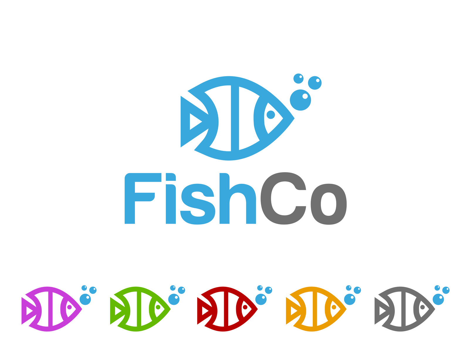
5 Fish Logo Ideas That Swim Away from the Competition
Posted on July 18, 2017 by Logo Design Tips and Tricks
Never discount the importance of a good logo! A logo visually tells the story of your brand, showing off your company’s values and unique voice.
It also helps if your logo is based on a symbol that reflects your actual business. So, whether you have a seafood restaurant or sell column aquariums, using a fish logo can help tell your brand story instantly. Plus, the diverse types of fish mean that with a bit of research, you can create something beautiful and unique.
But, fish are so interesting visually, any company can use them!
We’ve gathered five great ideas for fish logos that you can put your own unique spin on. Read on and get inspired.
1. Make a Friendly Cartoon
A cartoon logo gives you a lot of freedom to exaggerate the interesting appearances of different types of fish. With their big eyes and diverse but simple body shapes, there is a lot of room for you to have fun with your logo design.
You can go the full cartoon route and create a mascot for your brand at the same time. Or, you can make it more subtle and understated, and use the style of the cartoon to show that your company is fun and quirky.
2. Pick the Best Piece
An interesting and unexpected way to use a fish in your logo is to artistically just use a piece of one. If a fish has a unique feature, just showing that off can be subtle and eye-catching.
For example, your logo could be based just on the claw of a crab, or the fin of a shark. Since these designs may end up being more simple, your choice of colour will be especially important. Consider the psychology of colours for your logo. With a simple logo and a great colour choice, you can create something very memorable since colour increases brand recognition by 80%.
This works great for companies that want to show off that they are sophisticated and creative.
3. Mix Your Fish Logo With Text
This one takes step 2 even further. You can creatively incorporate the shape of a fish into your actual brand name.
The round shape of most fish means this can work especially well with curved letters, like C and U. But, when it comes to typography, the world is your oyster!
This is great for brand recognition because your logo and company name work seamlessly together to tell your story.
4. Go Minimalist
Minimalism is incredibly popular at the moment. With their simple shapes, fish lend themselves perfectly to a minimalist logo.
Consider scaling back your colour scheme, keeping it to just two colours or even shades of the same colours. Use as few lines as possible in your illustration, just bringing out the key shapes.
5. Add In Scenery
To further build the aquatic feel of your logo, add in some other watery symbols. Waves, fish hooks, shells and seaweed can all add a little extra flair to your logo.
Just make sure that it doesn’t get too busy or out of control. A strong logo is simple enough to be memorable and instantly recognisable. Don’t try to build a whole scene. Just pick one or two extra elements to add in.
Wrapping Up
These are some great tips to get started designing your fish logo. Want to get it done today?
Check out our online logo maker and build your logo now, no design programs required!
5 Tips to Create a Smoking Stove Logo
Posted on July 18, 2017 by Logo Design Tips and Tricks
You probably think a stove logo may not be your top priority. If you don’t have a good logo, your brand can suffer tremendously.
Consider any of your favorite companies, regardless of industry, and you’ll probably think of a logo.
Here are five tips to bring your visual game up a few notches.
A Good Stove Logo Is Simple
The golden arches, Nike swoosh, and Pepsi logo all have one thing in common.
They are simple logos that instantly communicate a personality.
When creating a stove logo, you should also focus on simplicity. As great as the artist working on your logo may be, customers will not remember a complex collage.
Simple logos are instantly recognizable and memorable. If you want to be iconic, take advantage of simplicity.
Remember, less is more.
Know Your Niche
Whether you’re making furniture or electronic cigarettes, you need a logo that reflects your niche and brand.
It’s no different while making a stove logo. So ask yourself, what is your niche in the industry?
Do you make high-efficiency electric stoves? Does every stove you make have a double sided log burner? Are your stoves modern, or rustic?
If your logo mismatches your niche and brand, you’ll never establish your identity to customers.
Take Advantage of Color
The color is vital to a logo. Before people even see the shape of your logo, they’ll see the colors pass them by as they scroll past an advertisement on their cell phone.
So it’s important that your logo has strong color contrast and uses colors that reflect your brand.
Not taking advantage of colors makes a logo boring and lifeless.
On the other hand, using contrast and color psychology to your advantage will help you sell in any industry.
Make Your Typography Fit
There’s nothing more jarring than a font choice that doesn’t fit the purpose of a logo or other image.
Whether it’s the use of a cursive font at an MMA gym or the always distasteful Comic Sans on a funeral invitation; fonts and images need to match.
When you’re picking a font for your stove logo, use something tasteful and simple: avoid unreadable cursive fonts or anything else with too much going on.
Beyond that, your choice of typeface needs to be matched to your image design.
If the font doesn’t fit, it can take your logo from memorable to unreadable with a click of the mouse.
Use a Free Logo Maker
There’s a lot to consider while designing a stove logo. And when you combine this already difficult responsibility with the learning curve and financial costs associated with software like Photoshop, it can feel scary.
We offer a free logo maker to businesses looking to associate their brand and product with killer visuals.
It’s fun, free, and, most importantly, easy-to-use.
If you’re worried that you won’t be able to use it because you’re not a graphic designer, you can start with a tutorial. So what do you have to lose?
Top 5 Law Firm Logos
Posted on July 18, 2017 by Logo Design Tips and Tricks
Your logo can be the first and last thing a prospective customer sees of your company.
As part of your branding, your logo should speak of the authority and expertise your injury and disability law firm has to offer.
Need some inspiration? Check out these five law firm logos from real firms around the country.
5. Ozarks Family Law
Although not an injury or disability firm, Ozarks Family Law’s logo is worth emulating. It’s stark with its white background and plain black tree. The white owl in the tree is a nice touch, too.
The background, with its scales, is a little busy, so maybe skip that element in your own logo design. It’s hard to tell what you’re even looking at. You have to look beyond the main logo to see the scales, which takes away from the logo’s efficiency.
This logo creates a sense of authority and justice with its legal imagery.
4. Eltringham Law Group P.A.
The Eltringham Law Group P.A. logo also promotes a strong sense of justice.
Unlike Ozarks Family Law, Eltringham has its firm’s tagline right in the logo: “guiding your path to health and justice.”
This tells you what this firm is about upfront. You don’t have to guess if they can serve you. It appears their clientele are those who suffered personal injuries, workplace injuries, or auto accident injuries.
The black background, which is a law office, is not designed to capture attention. Instead, the center white logo draws the eye first, as it should.
3. Thrive Workplace Consulting & Legal
The logo for Thrive Workplace Consulting & Legal is probably the simplest we’ve covered so far.
There’s not necessarily anything wrong with simplicity. In this case, a plain white background lets the colorful Thrive logo shine. Since the logo includes the full name of the company and a brief tagline (“creative solutions”), the background should not claim visual attention.
Your logo shouldn’t be sterile and cold, though. If a client needs a construction accident lawyer, a personal injury lawyer, or any other type of injury and disability lawyer, they need to know who to call. Your logo can convey that.
2. El Toro Personal Injury Law Firm
Another simple logo to consider is from El Toro Personal Injury Law Firm. Again, the service is in the name. This law firm obviously deals with personal injury cases.
That means there’s no need to use imagery to showcase that. Instead, the company chose a visually catchy logo of a bull.
This represents the name of the company, yes, but it goes deeper than that. Bulls take charge. Having a bull for a logo suggests that these personal injury attorneys will take charge for their clients.
1. Our Top Pick for Law Firm Logos? InjuryLegal
Our favorite of these five logos is the one for law firm InjuryLegal.
Like many of the logos we’ve showcased, it features a plain white background. In the center is a man holding up two scales that measure equally. Underneath that is the company name.
Why is this so effective? It’s all about the imagery.
The man, who’s on a crutch, is holding his hand up. It looks like he’s proclaiming victory. The scales, which are of the same weight, suggests the man got the justice he deserved.
Want to design your own logo for your personal injury or disability law firm? Check out Online Logo Maker. You can register for free today to start making stunning law firm logos.
5 Elements to Include in an Office Equipment Logo
Posted on July 18, 2017 by Logo Design Tips and Tricks

Are you struggling for inspiration for your office equipment logo design?
Your logo can have a huge impact on how your customers perceive your company, so it’s important to get it right.
In this article, we’ll give you 5 elements that your logo should have. By the end of it, you’ll have everything you need to make a beautiful logo that makes a statement about your brand.
So, let’s get into it!
5 Things Your Office Equipment Logo Needs
1. Symbols
Our eyes are immediately drawn to symbols.
When people look at your logo, they’ll see the shapes first and the text later, so the symbols you use need to be bold and recognizable.
The best logos don’t need text because they are so well-designed that they tell us the brand on their own.
If you’re not sure about the effectiveness of your logo, remove everything but the symbols and see if it still conveys its message.
Experiment with both angular and circular symbols to see which shapes match your brand the best.
2. Versatility
Your logo needs to look good however it’s used. That means not only on paper but on screen and on promotional products.
It also needs to look great in a variety of color schemes.
Does it have the same impact in black and white, or in a different size? Does it look good digitally as well as in print? If not, you may need to make some changes.
3. Text
A combination of both symbols and text can make a logo more powerful.
Your office equipment logo could include the name of your company or a tagline or slogan to give it more identity.
When choosing the font for your text, make it appropriate for the message you want your brand to send. If you want a soft, elegant image, use a serif font. For something bold and minimal, use sans serif.
Incorporate text into your office equipment logo during the design process rather than just adding it on lazily at the end. That way, they’ll flow together and create something more effective.
4. Color
Colors evoke emotion.
Red is bold and aggressive, blue is calm, orange is bright and fun, and green represents balance and the environment.
Choose the colors for your design carefully to match the image you want to give off. If you don’t, you could throw the entire design off.
5. Creativity
Creativity is last on this list but, certainly not least.
While it’s important to incorporate certain elements into your office logo design, you shouldn’t let them hold back your imagination.
A dose of creativity and inspiration is what makes a logo brilliant, so feel free to try lots of different things.
Some of the world’s most famous logos had to be designed hundreds of times before they got it right, so keep at it. The possibilities are endless.
Design Your Own Logo
Now that you know what your office equipment logo needs, you can get on started on designing one.
Play around with our online logo maker tool and create something that represents your brand the way you want it to.
If you get it right, your logo will improve your brand’s performance.


