The Top Mistakes To Avoid For Your Restaurant Logo Design
Posted on July 13, 2017 by Logo Design Tips and Tricks
Great restaurant logo design can really help your business stand out from competitors on the high street.
A good logo will convey to customers exactly what your restaurant is about – if it’s fancy, family-friendly, or fast and tasty.
A bad logo can make the place look tacky and put off customers. Here are the top mistakes to avoid when looking for a new restaurant logo design.
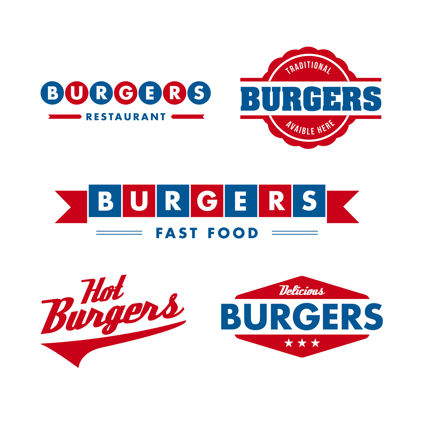
Keep it as Simple as Possible
Think of some restaurant logos – McDonald’s, KFC, Wendy’s. What do they have in common?
That’s right – they’re all very simple. There’s a limited color palette in use and there isn’t very much going on in any of these three.
But we bet you were able to remember them all. And you’re not alone.
A survey from Siegel + Gale found that simple logos were the most memorable. 16% of the 3,000 people asked said Nike was the most memorable, followed by 15.6% saying Apple.
It doesn’t matter if your restaurant is serving fast food or gourmet meals – keeping your logo simple will aid your customers’ memories and help to build brand recognition.
This can be an incredibly powerful marketing tool if you go on to open other restaurants under the same brand.
Choose a Legible Font
Make sure people can actually read the name on your logo. That means choosing a clear font which is easy to read, and setting it at an appropriate size.
There are hundreds of fonts out there, but whatever you choose it should reflect your business. You don’t want a very ‘cartoony’, informal font for a high-end restaurant, or vice versa. It sends the wrong message.
Do some testing before you commit to having your design made up. Ask your friends and family to see if they can read the text, and what they think the font represents. If their answer doesn’t match what you’re looking for, consider making a change.
Don’t Copy Anyone Else
The whole point of having a logo is to differentiate and identify yourself in a busy market. If you copy someone else (inside or outside your industry), it will confuse customers and definitely generate ill-will from the business you’ve copied.
In the worst-case scenario, you could even find yourself on the wrong side of a lawsuit. The owner of the ‘Krusty Krab’ restaurant was pursued by Viacom for use of its trademark last year (the name comes from the popular kids’ show Spongebob Squarepants).
Be original. Stand out.
Cheaper isn’t Always Better…
We know local businesses have limited budgets. But hiring a super cheap designer is not always a great idea.
We’ll admit, there are outliers – some designers might do special rates for smaller companies, for example.
However, chances are that paying someone to create a logo for next to nothing is simply money down the drain.
…but Free Just Might Be
If you’re willing to stick to the key points we’ve set out here, and have a limited budget, you might want to have a go at making your own logo.
We recommend you get feedback on it and refine it sensibly. But if you want to save money and feel like your creative juices are flowing, we say go for it!
3 Steps to Design a Professional Logo That Will Shine
Posted on July 13, 2017 by Logo Design Tips and Tricks

So you have just thought of the perfect idea for a startup or a product that will change life as we know it.
You have all of your ducks in a row to make your impression on the world but there’s just one thing you have to take care of.
Time to design a professional logo.
We’ve already told you about how to optimize logos for searching for search engine optimization, but how do you actually make a logo that stands out?
Come along as we take you through the 3 steps to design a professional logo that will shine.
Be Unique
We can’t stress this enough.
The worst thing you could do for your business is to brand it with a logo that reminds people of another brand.
It can be a scar on your business from the get-go and something that will either be a big mountain to climb or even worse, leave your company dead on arrival straight out of the gate.
Can you really tell the difference between Motorola and Marmot’s logos?
Now that’s a serious design fail.
So remember to unique when you design your professional logo.
After all, you are trying to distinguish yourself from the pack (and avoid a potential lawsuit)!
Stay Simple Yet Exciting
It’s totally understandable that you want everyone to know your brand’s mission statement right away, but slow down.
The last thing that you should do when you design a professional logo is to clutter it with too many descriptive and unnecessary images.
You may think that you are being descriptive and clever, but what you are doing is confusing your audience.
By creating a simple yet effective logo you will directly spark your customer’s interests in a clean and direct way.
Just remember the old saying: less is more.
Don’t overthink it!
Be Timeless and New
This is a delicate balance for your brand to strive for but one that is so important.
Your professional logo should seem new and fresh while tricking your audience into thinking that it has existed forever.
It probably seems impossible right? But hear us out.
If you keep an eye on some of the more classic logos for some of the world’s most popular brands you can get an idea of what has worked.
I mean, think about Pepsi! They have stayed pretty close to the same design since the ’50’s and it still looks fresh today.
So by establishing the right balance between classic design tropes and bright vibrant eye-catching colors, you can be striking and vintage at the same time.
Now that’s the sweet spot.
The Bottom Line on How to Design a Professional Logo
We’re sorry to say it, but now you have no excuse.
By following these 3 steps, you will be able to create a logo that will connect to your audience and leave a lasting impression.
If you have any more questions on how to design a professional logo feel free to send us a message through our contact page.
We are here to help!
5 Logo Design Trends to Promote Your Business
Posted on July 13, 2017 by Logo Design Tips and Tricks

Coming up with the right logo for your brand is hard work. It requires the right idea at the right time and the right artists.
After all, your logo is all about your brand as a whole. It needs to be every bit as exciting and memorable as your business.
That’s why it’s important to keep up with popular logo design trends. If you’re not careful, that great logo may look like old news before you know it.
Read on to learn about some of the hottest trends you can use for your business’ logo today.
5 Logo Design Trends to Promote Your Business
1. Wordmarks
Sometimes coming up with the right logo is all about what worked in the past. For example, wordmarks are still one of the most popular logo design trends. They’ve been around for decades, but there’s something timeless about them.
Sometimes all it takes is the right font to make your brand stand out.
Let’s take Coca-Cola’s logo for instance. It’s like that as soon as you saw the brand name, your mind was able to conjure up the logo.
So what about their logo works? It’s elegant and simple, but also unique and memorable. This is the balance you should strive for when creating a logo.
2. Use of Negative Space
Negative spaces are quite commonplace these days — and for good reason. The more negative space used, the more your logo itself will stand out.
For example, consider the WordPress logo. The blogging platform’s logo is entirely about negative space, with the signature ‘W’ surrounded by a beautiful light blue.
Our brains are trained to recognize negative space and the patterns within, so logos that use negative space are sure to draw attention.
3. Sharper, Rigid Font
Remember in school how you used to doodle bubble letters? They were fun to draw, and the marketing world took this to heart. Unfortunately, bubble letters don’t really stand the test of time.
Instead, more companies are using sharper, rigid fonts. We often consider typography and the types of font we use, but rarely the rigidness.
A good, sharp edge to your text creates a sophisticated look.
4. Minimalism
Minimalism is still one of the more popular logo design trends. For instance, consider Apple’s logo.
It features no text, yet anyone can see it and know exactly what it means. This is what your brand ultimately needs to achieve.
Sometimes less really is more.
5. Hand-Drawn Logos
As our lives get busier and technology becomes more advanced, we sometimes want to go back to the basics. Sites like Easy, for instance, have made millions of dollars through hand-crafted art.
Take the same approach with your logo. A hand-drawn logo feels warm and relatable instead of cold and calculated.
There’s just something more authentic and welcoming about a hand-drawn logo.
Choosing the Right Logo for Your Business
There’s nothing easy about picking the perfect logo. Find the fine line between welcoming and professional; artsy and futuristic.
Get creative, and don’t be afraid to combine ideas. Just like in the business world, sometimes the best logos come about from innovation.
Your logo matters, so get out there and start creating!
How to Choose the Best Logo Font for Your Tour Company
Posted on July 12, 2017 by Logo Design Tips and Tricks
Are you having trouble finding the right logo font? Having a great logo helps to ensure your company stands out from the competition.
Updating your logo is a process that is made up of several parts. One especially important part of logo creation is the font choice.
You don’t want to pick the first font you come across since uninspired font choices can make a business look boring.
It’s important to have the right style, color, and spacing for the font of your logo. In this article, you will learn how to choose the best tour logo for your company.
Begin by Choosing a Popular Typeface
You’ll want to choose a well-known typeface for your font. Two main kinds of typefaces are serif and sans-serif. Serif fonts have more of a classic appeal while sans-serif fonts have more of a modern appearance.
Helvetica is a sans-serif font style, commonly used in public transportation. This font style looks especially great on large billboards. It’s no wonder many companies use Helvetica for their logos.
Garamond is an old style serif font that works well for established companies.
Futura is a sans-serif font with bold, block letters commonly seen on film posters.
You’ll want to fine tune your text after finding the right typeface.
It’s Time to Fine-Tune Your Font
The next step is to fine-tune the font of your logo. Rounded fonts, including Comic Sans MS, invoke feelings of lightheartedness.
Making a font too sharp could make it difficult to read. Rounded lettering makes your logo look more family friendly.
80% of consumers link color to brand recognition which makes color choice important.
Green brings to mind feelings of being in nature. Blue is an extremely popular logo color choice which invokes feelings of trust. Match font colors with emotions you want your audience to feel.
A company providing the best Colosseum tours may want a font that looks historical.
Ensure Letters are Properly Spaced
It’s tough to grow a business when no one can read your logo. You’ll want to choose a font where letters have the proper space.
Fonts with close letters cause a sort of blur effect. Letters too close together often end up looking line a smudge of color.
A logo must be easy to read in any situation. Have people around you look at the logo and read it off. You’ll want to make a clearer font if a reader hesitates for even a moment.
Use Font that is Easy to Adapt to Many Platforms
It’s wise to test fonts on many platforms. You’ll need a logo that looks great on everything ranging from business cards to billboards.
The best way to choose an adaptable font is to test it out across several platforms. You’ll want a font that is easy to read both on small spaces and large surfaces.
Creating a company logo takes time and effort but it’s worth it. Follow these tips and you’ll have the perfect tour company logo that consumers will love.


