How to Build Your Brand With Packaging Logos
Posted on July 07, 2017 by Logo Design Tips and Tricks
Branding is what companies use to help consumers connect with their businesses.
McDonald’s, Nike, Walmart and various other brands have steadily grown their customer base using their logos. Logos are the foundation of all branding — they’re the images your customers will associate with your company.
Having loyal customers can be very valuable for a company. In fact, a loyal customer has an average lifetime value of $1,803. How you execute your branding plays a major role in this.
This includes the logo and packaging you use for your products. The human mind is able to process imagery 60,000x quicker than words. That says a lot about the importance of your logo and any other images used in your branding.
If you’re considering updating or creating a logo for a new or upcoming product, then the following tips may be useful. Let’s review how you can build your brand using packaging logos.
First, Create an MBA Name
We’re not talking about a degree.
An MBA translates to memorable, brandable and available. The idea is to create a name for the product that is easy to remember, simple to brand and not already in use. This is important whether you’re buying a domain name or creating social media profiles.
Talk to Different Manufacturers
Hopefully, you have an idea of which manufacturers you may work with in the future. Your brand won’t make it far if the product is being created by an unreliable manufacturer. If you run out of supply or have a mediocre product, then the result will be dissatisfied customers.
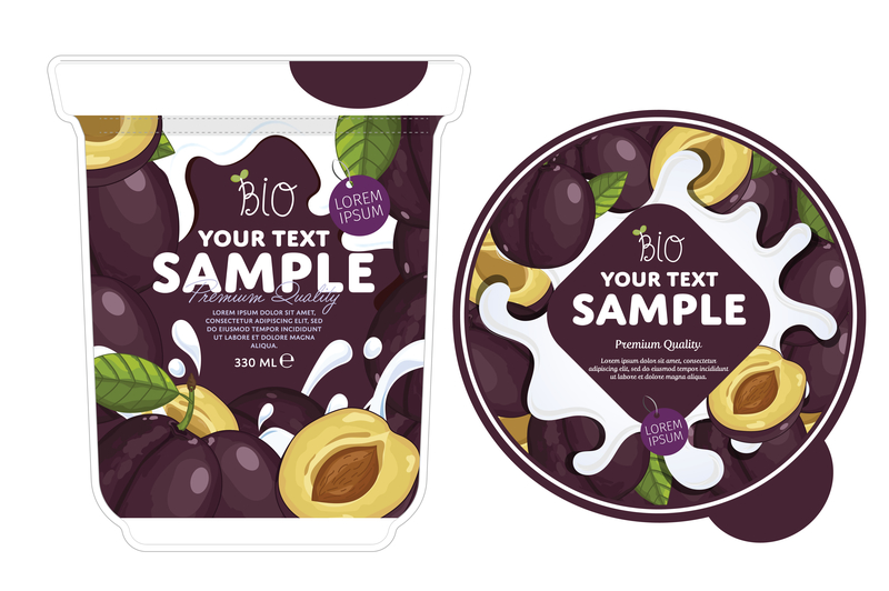
Now, Develop Your Packaging Logos
Your product has a name and manufacturers to create it. Now, you need a logo and packaging for it. The logo you place on your products will help build awareness for your business. Avoid using blank or generic boxes for your goods.
Take advantage of the space on your boxes to place your packaging logos and business name. The key is to make your logos unique. Here are some of the trends packaging design companies are using:
Broken letters
You can have some or all of the letters broken up in your product or business name.
Cropping
This tool is valuable for more than just photos. Not all letters have to be seen for customers to get the idea of what your logo reads.
Form Simplification
Simplicity and neatness are sometimes the best way to go. Some companies rebranded their logos using this style, i.e. Mastercard and Airbnb.
Color palette simplification
The colors used in your logo should also be kept simple by using less color. While color is important for evoking emotion, there is such a thing as too much color!
Photographic textures
This is a new trend on the scene of logo and branding, however, it’s an excellent way to give your business personality. You can really get creative with the different types of textures, such as grass, smoke and flowers.
The beauty of it all is you don’t have to know design. You can simply hire a graphic designer to do it for you. Some even have experts who can help you develop ideas for the best logo for your brand and packaging.
How a Sports Team Logo Creates Team Spirit
Posted on July 07, 2017 by Logo Design Tips and Tricks

When you think about your favorite sports team, chances are you think about a few key elements: the feel of cheering in the stands, the players you admire — and the logo you’ve come to associate with it.
We affix our favorite sports team logo onto our hats, our t-shirts, and the bumpers of our cars. In this sense, we almost become walking (or driving) advertisements for the teams we love and follow.
If this is the case, wouldn’t any team benefit from a dynamic, custom logo?
Today, we’re discussing a few ways your sports team logo can grow community-wide team spirit, build recognition, and boost visibility.
Ready to get started? Let’s go!
1. It Puts an Image to a Name
Over time, a team’s logo almost becomes synonymous with the sport itself.
It’s no longer just a design. Rather, it’s the image behind our college memories, our family’s tailgate traditions, our playfully competitive NCAA free picks, and our favorite Super Bowl parties.
Even a sports logo without any words can become seamlessly woven into the team’s spirit and image. Need an example? Think of the iconic Dallas star.
If you’re a new team, the best way to build your identity is to design a custom logo that stands out from the crowd and makes you instantly recognizable.
This not only allows spectators a visual to attach their attention to — it also joins team players together under the same branding umbrella, building team loyalty.
2. It Adds to Your Credibility
Consider every professional sports team you know. Are there any without some sort of logo? Chances are, you’d be hard-pressed to think of one.
In this vein, take a clue from the playbook of the pros.
A sports team logo instantly gives your team a credibility boost. It sends the message that you’re serious about your players and their abilities, and you believe in your team’s place within your community.
This can also help players — and their opponents — feel as though they’re part of a genuine group. The expected outcome? Improved dedicated and perseverance as they seek to meet these standards for success.
3. It’s Excellent Marketing
A recent study found that even children as young as age 3 can recognize brands and the products they’re associated with.
In fact, almost all of the preschoolers in the study were able to match an image of the Hamburglar to the McDonald’s logo. This reveals that even at a very young age, we’re cognizant of logo marketing, and its effect on product association.
What does this mean for your sports team?
If you’re on a sports team, the team is essentially your “brand.” Thus, when you create a custom logo, you generate a way to market this brand across your community.
Then, when residents and visitors come across your logo locally, such as through sponsorship opportunities or game announcements, they may be more inclined to lend their support.
Create Your Sports Team Logo: Custom Designs That Deliver
Are you searching for a logo that can take your sports team from Pee-wee into the Big Leagues? If so, we’d love to help.
Our online logo maker makes it easier than ever before to create a custom design that best reveals who you are and what you represent.
Register to get started today and blow the competition away!
Why Building a Logo is Essential For Your Freelance Web Design Business
Posted on July 07, 2017 by Logo Design Tips and Tricks
Are you a freelance web designer who’s ready to get serious about their business?
Then building a logo should be at the top of your to-do list.
You might be thinking:
“Do I really need a logo?”
“A logo is a waste of time/money.”
“I’ll get a logo once my business is more established.”
Stop right there.
No matter what phase of business you’re in, creating a logo is essential. It’s the first step in turning yourself into a recognizable brand that people will remember – and buy services from.
If you’re not convinced, look at how much the most successful businesses invest in their logos.
In 2000, oil firm BP spent over $175m introducing their new logo.
Would they have bothered if logos weren’t that important?
No. If you’re ready to learn exactly why you need a great logo ASAP, you’re in the right place.
Get ready to discover the power of the logo.
What does a logo do?
A logo might seem small and insignificant, but that couldn’t be further from the truth. Your logo serves a variety of purposes, from making your business more memorable to advertising your skills.
Read on to find out what a good logo will do for you.
Helps clients remember you
Have you ever visited a restaurant with really unique decor?
Chances are it stuck in your mind.
The same concept applies to business logos.
A unique, memorable image helps clients to remember your brand and recognize you instantly. Maybe a client first notices your logo in a print ad. When they visit your website for the first time, they’ll remember who you are much more easily than if you didn’t have a logo.
This creates a feeling of familiarity and helps build trust, which is essential when you’re a new brand.
Gives an idea of what you do
Your logo should express who you are.
Maybe you specialize in web design for artists? Your logo could be a paintbrush overlapping a cursor. Or perhaps you mainly design websites for tradespeople? Your logo might combine a hammer with a computer monitor.
Whatever you decide on, your logo should give people a pretty clear idea of who you are and what you do.
It doesn’t have to be as obvious as the examples above.
If one of your brand values is simplicity, your logo could be very minimalist to reflect that. Just make sure your logo is unique to your business.
If you’re building a logo that looks like it could work for any web design business, it’s probably not quite right.
Makes your business look more professional
A business without a logo just doesn’t look professional.
A professional-looking logo goes a long way toward building trust and establishing yourself as a legitimate freelancer. This is especially important when starting out, so don’t wait until you’re turning a profit to start building a logo.
Why is a logo so important for freelance web designers?
While building a logo is important for every small business, it’s even more significant when you’re a freelance web designer.
Why?
Because your logo is the first example your customers will see of your design abilities.
If your logo looks sleek, professional and attractive, potential clients will be impressed. If it’s poorly-designed or doesn’t exist at all, nobody will be convinced that you’re up to the task of designing their site.
Who wants a web designer that can’t even design their own logo?
When designing your logo, you should consider the following questions:
- Does this reflect the type of web design I’m capable of?
- Would I be happy to use this logo on a client’s site?
- Does this logo look good online and in print?
- Is this a logo that will make people go, ‘Wow, that’s what I want, too’?
- Is there anything about this logo that could put clients off hiring me?
If the answers to these questions mean that you need a drastic redesign, don’t worry.
It’s better to take some time getting it right than lose clients because of a poor logo design.
How should you go about building a logo?
So, you’re convinced that you need a logo for your freelance web design business… but how do you build it?
Here are some tips to help the design process run smoothly.
Keep it simple
A logo should not be busy or overwhelming.
It’s a quick visual cue to remind people of your business – not a work of art. You should stick to simple shapes, a limited color palette, and not too much text. Remember that the more you add to your logo, the more mental effort it will take for clients to recognize it.
Before introducing a new element, ask yourself if it really needs to be included.
Very often, the answer will be no.
Experiment with designs
It’s rare to hit on the perfect design first time, so try a few different ideas for comparison.
You might try the same design in different colors, arrange elements in alternative formations, or stick with the same base colors for several different designs. Look at the logos side by side, and give a score to each.
If possible, get input from others too, then tally up the final scores to help you decide which logo is best.
Make it timeless
You want your web design business to last for a long time, right?
Then your logo needs to be timeless.
Avoid any gimmicks or design choices that you think will quickly go out of date.
Stick to designs that have been popular for a long time – think bold colors and simple shapes, and look to long-established companies for inspiration.
Don’t get stuck with a logo that looks amazing for a year, then becomes hopelessly dated.
Building a logo is one of the most important things to do if you want your web design business to be successful. Show companies why you’re the perfect person to design their website with a logo that reflects your skills.
There’s no time like the present, so get the ball rolling by sketching out some logo ideas right now.
How to Sell Your Timeshare the Right Way With Logo Redesign
Posted on July 07, 2017 by Logo Design Tips and Tricks
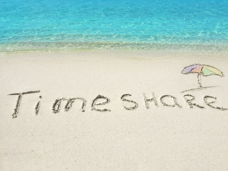
Selling a timeshare isn’t always easy. But once you find willing buyers, it’s similar to selling a house.
As it stands, only 9 million households in the U.S. own at least one timeshare. That leaves plenty of potential prospects.
But if you’ve been unsuccessful in selling your timeshare, you might want to consider redesigning your logo.
This article will take a look at how you can sell timeshares faster with a good logo redesign. Keep reading to find out what steps you can take to garner more attention with your logo!
Simplify Your Current Logo
It may be tempting to completely overhaul your current logo and add many elements and colors. In reality, this is the wrong approach. Often times, complexity works against you.
When redesigning your logo, you want to aim for something simple yet different. Why? Well, there are several benefits to simplifying your timeshare logo.
For starters, a simple logo is direct and easy to remember. It allows your audience to grasp your brand’s message right away since there’s no room for confusion.
Also, simpler logos are easier to scale. Plus, you can use them in any type of media. On the other hand, complex logos are harder to copy and resize properly.
Reassess Your Color Scheme
After your logo is nice and simple, you want to look at your color scheme.
Colors can have a significant impact on what moods your brand evokes. If you choose the right color in your logo, you can strengthen your message even more.
For example, black is an excellent color choice for timeshare resale companies. It signals a powerful, formal message. Blue is also ideal because it gives off a professional and trustworthy vibe.
You can also use red if you want your brand to appear warmer, and green if you want to seem more ethical.
When going through the process of logo redesign, you can try using multiple colors as well. That said, limit your logo to two colors. Otherwise, you’ll water down your message too much and confuse your audience.
Optimize Your Font
Much like colors, fonts can either add to your brand message or subtract from it.
Therefore, make sure your font is consistent with your overall theme. You don’t want to pair a formal symbol with a silly font. Instead, you want your font to compliment the symbol in your logo.
Keep in mind that the most important aspect of any font is legibility. You won’t unload any timeshares if nobody can tell what you’re selling in the first place.
Lastly, if you choose to use multiple fonts in your logo, make sure they compliment each other. This will allow you to highlight certain words. But simplicity comes into play here too, so don’t use more than two fonts.
Start Your Timeshare Logo Redesign
At this point, you probably have a few ideas for your logo redesign project.
Keep in mind that you don’t always need a drastic overhaul to your logo. Simplifying your current logo can help you deliver a stronger message.
Also, don’t forget to consider revamping your color scheme. The right colors can go a long way in setting the mood for your brand.
Start trying out new designs with our free online logo maker tool. Also, feel free to leave a comment below if you have any other redesign ideas!


