5 Tips to Designing an Adventurous Travel Logo
Posted on June 29, 2017 by Logo Design Tips and Tricks
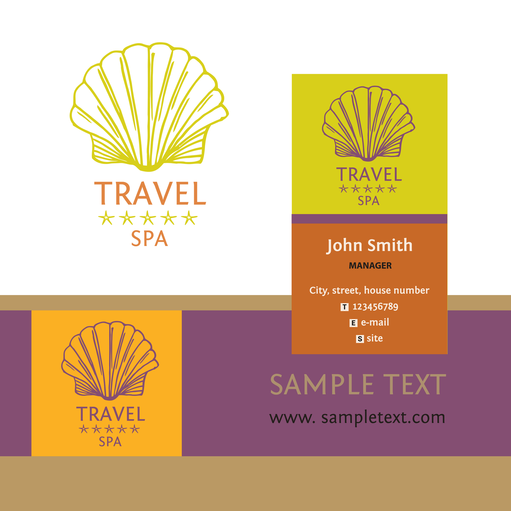
Adventure vacations are a growing part of the travel industry. More people want to make physical activity, nature, and cultural immersion a significant part of their leisure travel.
Agencies that specialize in adventure vacations need a logo that does more than stand out in a crowd. Their logo must convey a sense of exploration and inspire trust.
Here are 5 tips for designing a travel logo to help grab the attention of an adventure traveler.
Ideal Customer
The most important aspect of award-winning logos can’t be seen: an understanding of the ideal or target customer. Effective logos start with a clear understanding of the people who buy the kind of product or service the company sells.
And, the more precise the description of the ideal customer can be, the greater the likelihood of creating a knock-out logo.
Color
Color in a travel logo is essential to setting the right tone for marketing materials in print, online, and clothing and other merchandise.
According to general color theory, orange creates a sense of joy, freedom, and optimism. For adventure travel in natural environments, orange is a good choice. It can work well with green, blue and brown, the colors of plants, water, and earth.
Pairing orange with purple — the color of royalty, reflection, and intuition — can create a striking yet elegant logo, which might be suitable for luxury resorts.
Blue and red are generally not the best choices as the primary color of a logo for adventure travel. Blue is too often seen as cold, official, and staid. Red does convey passion but just as easily represent anger and danger.
Font
Logos often include the name of the company or a tagline. Those that seek to convey strength, adventure, and excitement, use a font with a modern typeface.
Modern fonts convey strength and style. They are seen as progressive, assertive, and chic, three descriptions that align with adventure travel. Examples of modern fonts are Bodoni and Elephant.
Using Didot Italic can heighten the sense of luxury.
Symbols
Logos that use representative graphics and shapes instead of literal ones, allow the client to find a more personal connection to it.
Examples of symbols that can evoke thoughts and memories of adventure are a compass, the globe, mountains, and exotic trees.
For adventure travel agencies that specialize in specific activities such as hot air ballooning, parasailing, or rain forest excursions, using relevant silhouette imagery can be powerful.
Simplicity
The goal of a logo for an adventure travel agency is to instill excitement, trust, and a feeling of possibility in the customer, not overwhelm them with information.
Logos that are simple are more easily recognized and pleasing to look at. They are also more versatile than intricate and complex ones. A good logo can be used in almost any situation without creating visual conflict.
Keeping It in Perspective
Creating a logo is important because it speaks for the company. But it’s not written in stone. Every company has modified their logo over time. So don’t worry if it’s not perfect.
Use these tips to create a great travel logo to attract the right customers. Then, as your business grows and you gain feedback, modifications can be made, if necessary.
Like with adventure travel, the journey is part of the fun.
6 Reasons to Have an Appealing Real Estate Company Logo
Posted on June 29, 2017 by Logo Design Tips and Tricks

As a real estate company, your logo says it all. It gives customers more insight than you may realize into your business.
Since your logo is one of the most identifiable aspects of your brand, it’s important that it looks great.
Without a great logo, you risk losing out on potential customers and significant sales. Read on to learn why you need a great real estate company logo.
1) Build Your Reputation
A real estate company logo is one of the easiest ways to determine if a company is reputable. Your logo presents the “feel” of your company.
Bruce Tait, the founder of a leading branding agency, claims that elements of your brand, such as a logo, define your reputation.
“Branding is the active, thoughtful, and strategic management of that reputation,” says Tait.
2) Become More Memorable
As mentioned above, a logo is one of the most identifiable aspects of a company. That’s because our brains are able to recognize a logo and identify it with a brand.
According to recent studies, 30% of people remember something based on what they see versus what they hear. Using a specific graphic will help your customers remember your brand much easier.
3) Brand Yourself
According to the Small Business Chronicles, “Logos are the chief visual component of a company’s overall brand identity.”
If you are a sole Realtor, developing a brand is essential. It shows that you are greater than just an individual entity.
With a large amount of real estate agents and businesses out there, you need to stand out. Everyone’s vying to show their own houses for sale and seal the deal on a sale.
4) Attract More Customers
A great logo will convey the message of your company. How this message is perceived by the public is relevant in attracting new customers.
Several of Business Insider’s favorite logos are great because they appropriately communicate the company message.
As a society, we are bombarded with subliminal company messages all of the time. Customers look beyond the words you speak to determine if your company truly lines up.
5) Demonstrates Company Longevity
Your company logo gives customers a sense of stability when working with you.
Some of the best company logos are highly regarded because they’re traditional. This leads customers to see that you’ve been successful for quite a while.
Prospective clients like to see that a company is experienced.
6) Make a Good First Impression
It’s likely your logo could be the first interaction a potential customer has with your business. A good real estate company logo should heighten potential clients’ first impression of your business.
According to Malcolm Gladwell, author of Blink: The Power of Thinking Without Thinking, “Buyers make most decisions by relying on their two-second first impressions based on stored memories, images, and feelings.”
If you don’t have a good logo (or worse, don’t have a logo at all), customers may see a lack of professionalism. But having a great logo means customers will trust their decision in working with you.
A memorable logo is something that will stick with customers over time. The goal is to create a logo that is hard to forget while properly capturing your brand’s identity.
Are you looking to create an amazing design for your brand? Sign up now to create a new real estate company logo in just 5 minutes!
An Education Logo Creates Community for Students
Posted on June 29, 2017 by Logo Design Tips and Tricks

With so much discussion currently centered on campus culture, it’s crucial that your school advertises itself as an open, accepting community.
How you brand your school — whether you’re a high school, university, or even nursery — tells potential students and parents a lot about the kinds of dialogues you’re ready to have.
Your education logo especially can also help to foster curiosity and creativity on campus, as it creates a tangible symbol for students and faculty alike to celebrate.
So, what does it take to create a powerful, effective education logo? Read on to find out!
Embrace Symbolism
The image you choose to represent your school is incredibly important. It’s going to be seen on apparel, at sports events, and on the Internet. Whether you’re heading up an online high school or rebranding a historic university, symbolism is everything.
Remember that people associate different branding strategies with different learning styles and classroom environments. For example, picture a school seal that includes a motto written in Latin and shows an image of an open ancient textbook.
What assumptions do you make about the school? Likely, you’re picturing an expensive, private boarding school with a focus on classical education. If that’s what your school is all about, then it’s a perfect education logo.
But if you’re, let’s say, a Montessori Elementary School, it’s likely not the right look.
Instead, you might choose to include lots of bright colors on leaves of a tree or an image that shows two children playing together. These images are far more in line with the values of the school.
Choose Your Colors Wisely
It’s no secret that the colors you choose to include on your school logo make a huge difference — and are especially important to the student body!
Keep in mind that, as with your logo’s image, these colors will represent your school both on and off campus.
It’s a good idea to select colors that have some sort of a contrast, as this will help the lettering of your logo to really “pop.” If you can incorporate a story regarding the history of the school into the colors you choose, all the better.
For example, let’s say that the founder of your school was a nun. You might choose to make your school’s colors black and white, as a nod to the colors of a nun’s habit.
Or, if your school is especially known for a particular program (or even specializes in certifications for specific fields) you might choose colors that relate to that. If you’re a medical school, you might want to go for red and white, to represent the colors of medical aid.
Create Your Education Logo Today
Especially if you’re in education, your logo will likely become the focal point of much of your branding — as well as much of the culture on campus.
You need to make sure you’ve chosen a design that represents a diversity of opinion while staying in line with your values and mission as an institution.
If you need help finding further inspiration, be sure to check out our blog or try our free online logo maker tool.
5 Tips for Designing a Memorable Mortgage Company Logo
Posted on June 28, 2017 by Logo Design Tips and Tricks

Most mortgage company logos are similar. They usually include the same elements: a house, roof, or key.
As a result, designing an unforgettable logo seems like an impossible task. You usually end up with something you’re not 100 percent sure about.
But a memorable logo is 13 percent more likely to get a customer’s attention. It’s also 7 percent more likely to motivate them to learn more about your brand.
Therefore, dedicating time to create a memorable mortgage company logo is worth it.
Read on to learn 5 tips for designing a logo that will stick around!
1. Simplicity is Key
Research shows that the most memorable logos in the world all have one thing in common: they’re simple yet distinctive. Keep this in mind when designing a mortgage company logo.
Obviously, you don’t want your logo to look generic. However, you shouldn’t make it too complex either.
For instance, if you add too much detail to your logo, you may run into issues when scaling. A small detail can look great on a full-size image but appear to be a smudge when you print a smaller version of the logo.
2. Design for Your Customers
Your main objective shouldn’t be to design a logo that’s aesthetically pleasing to you. Instead, it should be to design a stylish logo that focuses on what your customers want.
The process of obtaining a mortgage isn’t what customers find the most thrilling. A mortgage is just a critical step in accomplishing their ultimate goal.
Look for ways to incorporate the positive experiences customers have after getting the house of their dreams.
3. Don’t Neglect the Font
The font is one of the most important aspects of a new logo. A mortgage company like 1st street home loans can’t afford to slap any font on their logo.
To find the right wordmark, type in your company name and switch between fonts. Once you find a font that matches your logo icon and brand personality, begin adding unique features.
Try not to use more than 2 font types in one logo. Otherwise, the harmony and legibility of your logo will suffer.
4. Ignore Trends
If you want to design a mortgage company logo that stands out, your best bet is to avoid trends entirely.
This doesn’t mean you shouldn’t look at successful brands in the mortgage industry for inspiration. But you want to aim for a modern looking logo without the gimmicks.
For example, the corporate swoosh is a no-go. Another common cliche to avoid in the mortgage industry is the roof over the wordmark.
5. Start With Black and White
Ideally, your final logo shouldn’t consist of more than 3 colors. Anything more than that often results in a distracting train wreck.
But you should start your design in black and white anyway. This allows you to focus on the idea itself and ensure that you have a high-quality design.
A logo that looks great in black and white is versatile. The colors you add after should complement the emotions conveyed by the icon.
Creating Your Mortgage Company Logo
These 5 tips will help you create a logo that makes your brand easy to recognize.
Make sure you don’t rely on trends when designing your logo. A gimmicky logo will lose its steam after a couple of years. You want something you can use for at least a decade.
Also, remember not to make your designs too intricate. A complex logo doesn’t always scale well, and it’s often less memorable.
Start trying out new designs on our free online logo maker tool and see what you can come up with!


