The 6 Best Logo Design Tips for Postcard Businesses
Posted on February 15, 2018 by Logo Design Tips and Tricks
The travel industry is one of the fastest-growing markets in the world.
People all over the planet are looking for deals on flights, booking hotels, and planning vacation to-do lists. Many of these travelers are using social media and other internet platforms to check in with loved ones back home or share their story.
But, this is not to say postcards are dead!
Sending a postcard is one of the sweetest ways to say hello to someone you care about from afar. As a postcard business owner, you know this better than anyone.
You may be having trouble reaching your audience, though.
This could mean you need a new digital marketing strategy or a branding overhaul. Or, it could be as simple as upgrading your postcard business’s logo.
The following are a handful of logo design tips and tricks you can use to create a symbol for your brand that is sure to stand out.
1. Start Sans-Color
The foundation of any logo design is to start in black and white.
It doesn’t matter if you already have an awesome gradient or a funky color combination in mind. Using black and white as your base allows all the other design elements to come together as best as possible.
When you put color aside for a second, you can better see the relationship between everything else. This pays off as you work with different lines and curves, or two separate design ideas entirely.
Such comparisons will guide you to the most effective structure for your logo.
From there, working in various shades and tones will be the final touch that brings the logo to life.
2. Think of the Psychology Behind the Logo
A logo is one symbol that can say many things at once.
This is best achieved when logo makers understand the psychology of the design process. The psychology of logos can be broken into two things: shapes and colors.
Shapes
Straight-edged shapes like squares, rectangles, and triangles create a sense of balance.
These elements tell users your company is trustworthy. They are a bit masculine and have an air of power about them, too.
But, this ranges between vertical and horizontal lines. Vertical lines suggest something aggressive while horizontal lines are more about community and togetherness.
This is similar to the way curves and circles make consumers feel. Circles are feminine shapes, used to create a feeling of friendship, stability, and even love.
Colors
Colors carry their own set of emotions, too.
Since postcards are all about togetherness, joy, and sharing fun experiences, you will likely want to stick with the most positive tones in the color wheel.
These are reds, yellows, and oranges. Such shades are all about excitement, passion, play, opportunity, and happiness.
Maybe your postcard business is made of recycled materials or by hand in a local store. Use green in the logo design to reflect sustainability or blue for a sense of trust.
Whatever the emotions you want to evoke, don’t be afraid to play with these rules. You can end up with a multi-colored logo or a design structure that incorporates various shapes.
These concepts are just the foundation.
But, the more you understand them, the better you can use them to your benefit.
3. Play with Fonts
The lines and curves of a logo design create the foundation and the color brings the basics to life. Then, the font adds the missing touch.
Your logo may be the name of your company presented in a unique way. Or, it could be a custom-made symbol that can be displayed with or without the name.
Either way, you need the right font for the job.
Think of a font’s construct in the same way you would breakdown shape psychology. Bold, straight-lined fonts are masculine and serious while those that flow or even look hand-written are feminine and fun.
But, just narrowing your font of choice down between the manly and the girly still leaves you with many to choose from!
You may need to switch back to black and white colors to find the right font. This is an easy edit to do while creating your logo design, and it can make all the difference.
4. Add a Tagline
There is the aesthetics of a font, and then there’s what you are actually trying to say.
Consider adding a tagline to your logo design.
This is something fun and simple to drive your efforts home. Your tagline can be the values you hold your company to or the motto your employees operate on.
It’s a simple touch with lasting benefits. Taglines help users understand who you really are.
This comes in handy if your postcards are focused on one area of the world, or if they are more for feel-good purposes like these postcards are. Taglines can be something that is said in the area or a universal expression of communication and togetherness.
5. Use a Hidden Message
Instead of saying something directly with a tagline, try using a hidden message.
These can turn a beautiful logo design into something iconic.
Hidden messages like those within the FedEx logo or the Amazon symbol are known pretty much all around the world. Even the famous “Golden Arches” are universally recognized as the McDonald’s logo.
Your hidden message shouldn’t be something that needs to be decoded.
It should be subtle enough to fit right into the logo design, yet clear to decipher and understand.
6. Be Timeless
The last thing every great logo has in common is the ability to stand the test of time. All the best logos are rarely ever edited or redone.
There may be small adjustments made as your company grows or the industry changes. Still, the common theme will be easy for anyone to notice.
Such a design accomplishment goes beyond the logo. It makes it easier to build brand recognition and brand loyalty.
Put These Logo Design Tips to the Test
Now that you understand the basics of logo design, it’s time to see what you can do.
You don’t need to spend hours brainstorming or a part of your budget on a graphic designer. You can make your own logo with the help of the right software!
Click here to get started.
Red Means Go: Add the Perfect Accent to Your Painting Services Logo
Posted on December 14, 2017 by Logo Design Tips and Tricks
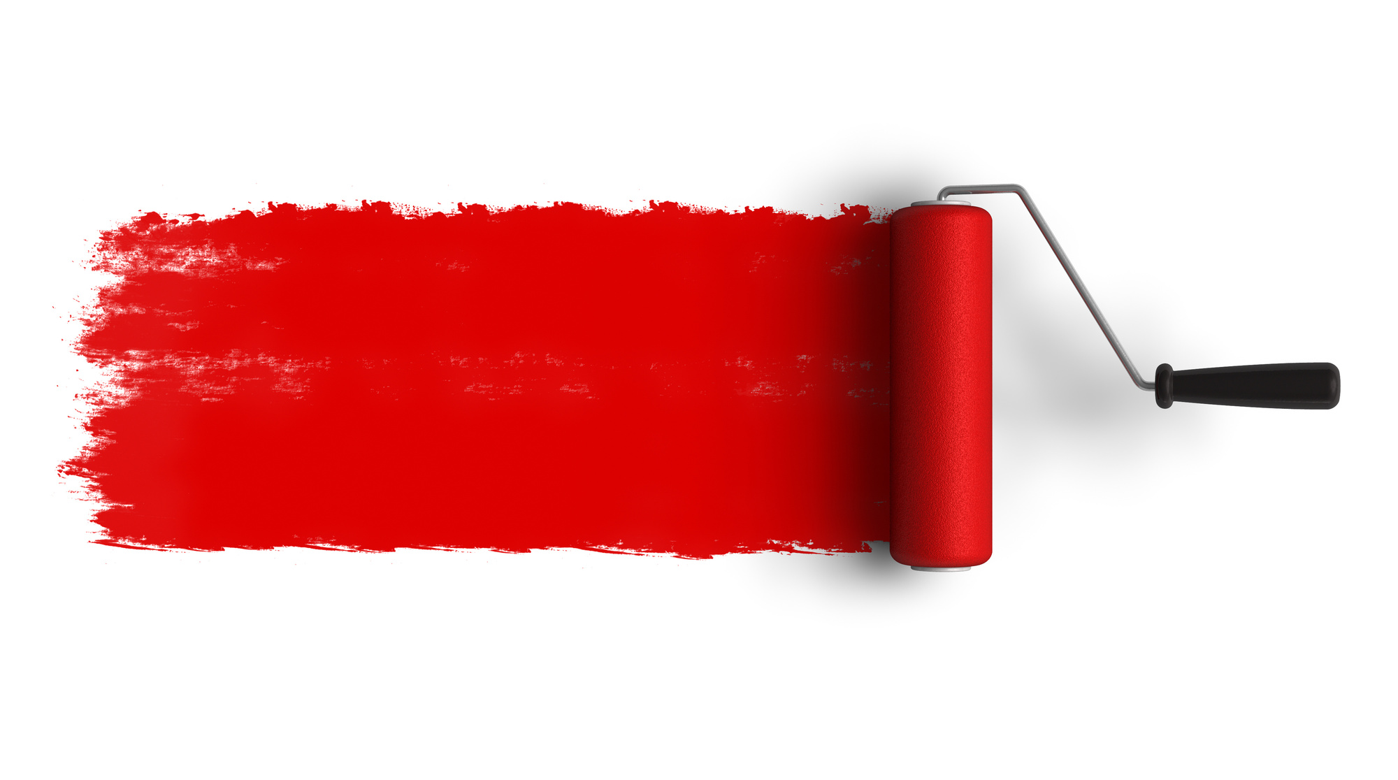
The Fire Colors: Red, Orange, and Yellow!
When designing a logo for your painting company you want something that’s vibrant, fresh, and colorful.
Many people might think that a red logo is something to stay away from. But consider all the big corporations who use the color in a powerful way. It makes a strong statement.
Let’s discuss how you can develop a business logo that incorporates red, maybe some yellow and a hint of orange. We’ll let you decide where you take it next.
Why Does Your Painting Business Need a Logo?
A logo is your brand identity.
The purpose of a logo is to act as an accurate representation of your company. That doesn’t mean it needs to be a literal representation. Don’t think a painting company logo is limited to paint brushes or cans of paint.
That’s not to say it doesn’t work. You can view here an example where including a paintbrush works well.
A logo gives life to your brand. It translates what your company has to offer into an illustrated story. The design behind a logo must also take the target audience into consideration.
An effective logo design accomplishes 3 goals:
- Customers choose your brand over all others
- Customers connect on a personal level with your brand
- Customers remember your company long after using your service
Take a guess. Which elements of a logo are best at accomplishing these goals? what would you choose?
You might be surprised to learn that the colors used in a logo complete all 3 of those goals. That’s why your choice of color is not something to take lightly.
It’s an emotional thing.
Understanding the Emotions of Color
Swiss psychologist Carl Jung (1875-1961) pioneered the concept of color psychology. Jung, credited with the introduction of art therapy said: “colors are the mother tongue of the subconscious.”
Study after study, researchers draw the same ultimate conclusions. Color isn’t a simple design element used to add some flair. Colors affect emotion.
The marketing and web design company, WebPageFX, conducted a study about the effects of color and customer perceptions. Here’s what they found:
- It takes less than 90 seconds for a person to make a subconscious judgment about a logo. Most people agree their assessment is based on color alone.
- When asked why they buy a particular product, 85% of consumers claim color is their underlying reason for buying.
- 80% of people share the opinion that color increases brand recognition.
Color choices convey very different images depending on the way they are used. Keep reading to find out if the Fire Colors are exactly what you need to spice up your logo.
Red Logo
One of the primary colors, this crimson king is a very strong color.
Often associated with the command “stop,” this color signals caution. It is also known to stimulate strong emotions such as passion, power, and excitement.
A common color choice for flags, red symbolizes pride and strength.
The strength of emotion elicited from red makes it great for stealing the eye’s attention. Take a moment to find something with multiple colors. Notice how your eye is immediately drawn to the red?
A red logo has the potential to be a real attention grabber.
Fanning down the embers a little, red can also evoke a sense of warmth.
When brainstorming your logo write down qualities that come to mind. Now check out this summary of what a red logo can represent to see if you find inspiration.
- Act as a signal — command to stop and pay attention
- Strong emotion — passion, excitement, pride, aggression
- Excitement — vitality, adventure, danger
- Power — strength, energy, courage
- Temperature — warm, hot, burning
With that powerful of a repertoire, red is one color to be careful with when designing a logo. To cool the emotions, your painting service logo may want to think about associating red with an image from nature. A rose, an apple, or a striking sunset tempers the drama, while still allowing red to pack its punch.
Another way to keep red in your design is to offset it with other colors.
Yellow Logo
Another of the three primary colors (the third is blue).
Upon seeing yellow the image that first comes to most people’s minds is the sun. In fact, yellow is the brightest color tone the human eye is capable of seeing.
The color yellow triggers the logical (left) side of the brain. For that reason, it is frequently associated with learning, thoughts, and creativity. It helps awaken the mind and bring new ideas to life.
Remember the Rubber Ducky?
He (or she) is traditionally yellow. Many children’s toys and clothes are yellow. When viewed within a logo design it can represent youthfulness, fun, and imagination.
Yellow is the true optimist of the rainbow, evoking happiness, confidence, and promise for the future.
The aspects to consider for a yellow logo include:
- Youthful — fun, active, energetic
- Creative — imaginative, thinking outside the box, unique
- Optimistic — bright, confident, happy
When using yellow be cautious of the colors you pair it with for your logo. Use contrasting, darker colors (hey, what about red?). Lighter colors will wash it out making it difficult to notice.
Orange Logo
Orange is one of the secondary colors on the color wheel. It is created by combining various shades of red and yellow.
While not as urgent as a red logo, an orange logo is just as energetic. It is another color that can stand out. But it does so in a more natural, approachable way.
Orange tends to awaken the fun a playful side of our personalities because of its bright glow. This brightness translates to other warm feelings. It can be upbeat and friendly or produce feelings of comfort and well-being.
Of course, we can’t forget the color’s namesake in this discussion. The citrus color reminds us of its naturalness. It suggests a fresh take on ideas.
Orange is also a natural when it comes to being outgoing. It defines friendliness and encourages socializing. (Have you ever seen an orange juice commercial with only one person in it?) This creates a sense of being approachable.
Use orange to illustrate these traits in your company:
- Youthfulness — fun, active, energetic
- Creativity — imagination, uniqueness, innovative
- Freshness — natural, glowing, warm
- Open — friendly, welcoming, familiar
An interesting side note is that the color orange is used less frequently in logo designs. This presents a fantastic opportunity to create something unique.
Command Attention with Your Logo
Red logo, yellow logo, orange logo, gee. Or perhaps a combination of three.
It may read like a Dr. Seues book, but there’s nothing wrong with that. Everyone remembers who Dr. Seuss is and his memorable phrases.
No matter what colors you decide to go with, make sure your logo stands out. Make it memorable and customers will think of you first when they have a painting project to complete.
Are you ready to get creative? Are you inspired to design a logo for your painting company?
We hope our breakdown of the fire colors shows you how easy it is to understand the emotions behind color. The next step is just as simple. Creating your own logo.
You have the ideas, and the tools are right here. Start designing a free logo today.
5 Things To Consider When Designing A Financial Logo
Posted on December 14, 2017 by Logo Design Tips and Tricks

Financial companies rely on a reputation for trust and integrity. Everything from mission statement to the company logo needs to reflect this along with the company’s core values.
According to Edelman, trust is a foundation of banking. One small but powerful part of building a trustworthy image is the company logo.
A logo is a key component of company branding. Potential customers need an immediate, memorable, and positive view of the company.
Read on for five things to consider when designing a financial logo.
1. Identify Your Audience
Think about the demographics of your target audience. Age, lifestyle, and profession are some that pertain to financial companies. Also, focus on words or images that highlight those concepts that you want the logo to reflect about your company.
From there you can begin to formulate color schemes, fonts, images, and so on.
2. Find Your Inspiration
A financial logo should be unique. While you will study designs used by other financial companies, keep your mind and eyes open. Look into the company history or the biographies of the founder and CEO. Observe the architecture of the headquarters building.
Think of the company’s mission statement and image. What visual images does that inspire? There may be something in one of these places that inspire ideas.
3. Consider Your Color Palette
Colors impact the impression left by a financial logo. Bright colors tend to appeal to younger audiences. Then again, bold colors like red and orange are often associated with chance, which isn’t a desirable effect for a financial company.
The logo should have a no more than three prominent colors. You should be able to reproduce it in different formats for marketing purposes.
4. Design for Multiple Formats
Most of the time, people see the company’s logo online or in smaller formats like brochures and business cards. The logo design should still look good when minimized.
That said, the logo should also look striking at its largest scale, such as on the side of a building.
Finally, consider how the logo looks when reprinted in black and white. If grayscale obscures your logo, you may need something with better contrast.
5. Timeless Over Trendy
A successful financial institution becomes a mainstay. The financial logo should be one that will stand indefinitely. The logo should have a touch of class and avoid any trendy designs that may date it a dozen years from now.
Often the best logos are ones that feature a representative element of the company’s name. The industry will change over time, and the company will adapt. But its name and core mission will most likely stay the same.
While it’s not a financial institution, one logo everyone knows is the simple apple of Apple, Inc. And given the current rate of AAPL stock, this company certainly qualifies as a mainstay.
Another option is using an abstract design. Abstract images give off an air of elegance because they are visually like fine art. Since they do not depict actual objects or things, they do not become outdated.
Design Your Financial Logo
Most of the above tips have to do with planning and brainstorming a design. Complete that process, and you’re ready to create your logo. A quick and easy way is to use an online tool.
If you have any questions about using our logo design tool, please contact us.
How To Create The Perfect Toy Company Logo
Posted on December 13, 2017 by Logo Design Tips and Tricks

Children are all about visuals. When something pops out at them that they like, it doesn’t matter what it is. They want it!
If you’re marketing to kids, it’s not enough for the toy to look cool. All the branding has to be eye-catching.
Does your toy company have a boring logo? It won’t matter how great your product is if your logo isn’t great, too.
Every toy company needs a great logo to grab children’s attention and bring in sales. Read on to learn how to create the perfect toy company logo.
Think About Your Target Audience
Sure, you know that your target consumers are children. But, to have a really great toy company logo, you should know even more about your target audience.
This will affect other decisions you’ll make for your logo as you work on the design.
What’s the exact age group and gender you’re aiming to sell to? What will appeal to a 4-year-old might not have the same effect on a 7-year-old.
After you know the “who,” you’ll have to figure out the “how.”
How Will Your Logo Be Used?
The way your logo will be used should directly influence your design.
Will you be using your toy company logo on tiny letterhead? Maybe blown up and used on a trade show booth?
If you’re using it across a lot of platforms you have to design accordingly. The logo will have to look just as attractive at all sizes.
A certain font you want to use might only be legible at a large size. Something that looked great on a small logo could look blurry when expanded.
Using a free logo maker can be beneficial if you plan to use your logo for different things. The logo you made doesn’t look perfect blown up to a bigger size? Design another, similar logo that works for the larger size.
When designing a logo on your own, you have more freedom to play around.
Use Other Logos Only for Inspiration
When dreaming up the design for your toy company logo, look to other logos for inspiration.
Look at logos of competing brands. Take note of what you like. Ask yourself what worked for that logo.
Notice the things you would change. You can even get inspiration from logos you don’t like at all. What made that logo so unsuccessful to you?
Consider all of this new information when you’re designing. But, make sure it stops there. The last thing you want to do is make your logo too similar to someone else’s.
Logos are a huge part of brand recognition. When people look at your logo, they should only be thinking about your company.
People will be wondering what that logo reminds them of. The worst case scenario is they confuse your company with another.
The design should be unique and so should the color scheme.
Choose the Right Colors
Choosing the right colors for your logo is one of the most important aspects of design.
Color is a big part of brand recognition. Research shows that consumers make a judgment on a product with 90 seconds of viewing it. Over 60% of that judgment is impacted by the color of the product.
The right color in your logo can make or break how people judge your brand. That’s why you should take some time considering the best color scheme to use.
Go back to thinking about your target audience.
Maybe your primary consumers are 8 to 11-year-old girls. Your first thought might be to make your logo princess pink. Perhaps that’s the right choice for your brand.
But, consider if your product is something boys would enjoy as well. A pink logo will be immediately alienating to them.
Perhaps a more neutral shade would be a better choice.
Click for more inspiration for a toy company logo. It’s a great example of color usage and simple, streamlined design.
Keep it Simple and Streamlined
Think about some of the best logos you’ve seen from the biggest brands in the world: Apple, FedEx, Facebook. One thing they all have in common is that their designs are simple and sleek.
If your logo has too much going on, it will immediately look amateurish. Less is more.
But, that’s great news for you!
You don’t have to be an artist to design a logo. There’s no need to add a bunch of bells and whistles. A simple picture or the name of your company in a nice font will make the biggest impact.
Active vs. Passive Logos
How can a logo be active or passive? They’re two-dimensional, after all.
What makes a logo active or passive is the story that it tells.
Think again about the Apple logo. When it was first designed, it was just an apple. Later on, they revised the logo to have a bite taken out of it.
That’s active. Someone is eating the apple.
The Twitter logo is another example. The original logo design was the bird sitting idle. The revised logo shows the bird in flight.
The Twitter bird is flying off to send your tweet out to the world.
When thinking about your logo, ask yourself, “what’s the story I want to tell about my brand?” How can you make that story more active?
You’re Ready to Design Your Toy Company Logo
With these tips, you’ll be well on your way to designing a great logo for your toy company. Take some time to sketch and brainstorm. The more effort you put into dreaming up a great design the happier you’ll be with the final product.
Are you not sure you’ll be able to figure out how to design a logo on your own? It’s easier than you think.
Before you get started, check out this logo maker tutorial. By the time you’re finished reading you’ll know exactly what you’re doing.


