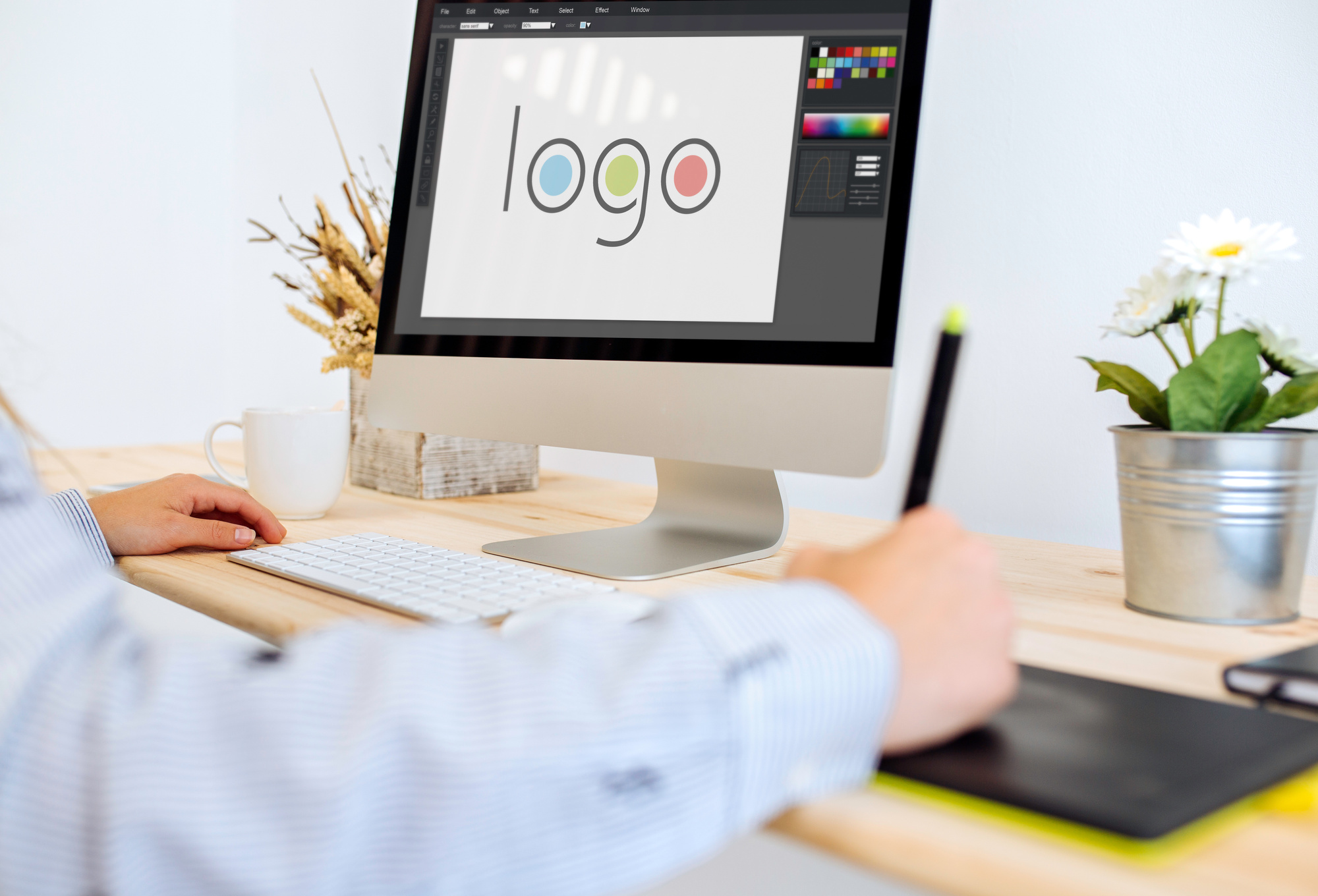
7 Hard & Fast Rules of Logo Making
Posted on July 05, 2018 by Logo Design Tips and Tricks
Branding is the best way to get your company noticed. It’s what you could call the summation of your marketing campaign, or even the face your company. What image you choose to project can make or break your business.
One of the biggest aspects of branding is your logo. Your chosen graphic becomes the figurehead for your company and makes your first impression.
Flashy logos project a different brand vision than subdued, text-only logos. It’s up to you what type of logo you want to project to consumers; just ensure it’s unique and representative of your vision.
However, despite the enormous variety in logo making, there are some hard and fast rules that good logos should follow. Deviate from the standard too much and you’ll send customers running in the opposite direction.
To help you get started we’re breaking down 7 rules for logo making that every business should follow. Let’s get started.
Logo Making 101
Logos are more important today than ever to represent your company. The explosion of the internet and web-enabled devices mean we’re becoming more and more visually oriented. U.S. adults spend over 10 hours per day looking at screens, and thus inevitably looking at logos.
Think tech companies for a second. Facebook, Twitter, Instagram, etc. You’re probably picturing either the website itself or its logo. They’re one excellent example of the capitalizing on screen-time with memorable logos.
So it all begs the question, what goes into a successful logo? What do you need to succeed? How do you create a logo as ubiquitous as Facebook’s or Twitter’s?
Well…
Hire a Professional
First and foremost, it’s best to consult a professional. This doesn’t mean you can’t have control over the creative process. In fact, it’s important that you do remain in control over most aspects of your logo.
However, complete control doesn’t mean shutting down suggestions from the people who design logos day in and day out. Professional logo designers know what works and what doesn’t.
Plus, they have the expertise in actually creating your logo. Chances are your staff doesn’t have an in-house graphics professional. Logo design programs like InDesign and Illustrator take years to learn, and even longer to master.
Unique to Your Brand
Though just because you need to find a professional doesn’t mean you can’t start brainstorming in the interim. As we touched on above, keeping your logo unique is priority number one when it comes to initial design.
Think of it this way. You want your logo to remind people about your company. If it’s too similar to another company’s logo, the entire premise is gone before it started.
If you’re selling cars you want people to think of your dealership when they see tour logo. Not your dealership and the one right down the road. You need to capture as much consumer attention as possible.
Balance
So how do you keep your logo unique? Balance makes a good starting point. By balance, we mean keeping the elements of your logo proportional to one another. You don’t want the text to overpower the graphics, and vice versa.
Likewise, you don’t want color to overtake your entire design. Too much color can actually distract from parts of the logo. If someone only sees florescent yellow they might miss the text-based branding.
Scaling
After balance you’ll want to take into account how your logo scales. By scaling, we’re referring to how it looks in small, medium, and large formats. It’s almost certain that you’ll use your logos across different mediums that require different logo sizes.
The key to creating something that scales well is two-fold. First, you need to ensure the logo elements scale. This means text that doesn’t become unreadable and graphics that still look reasonable, small or large.
Second, ensure the logo gets created in the vector file format. Vector graphics use mathematical designs to create your image, and also so don’t distort when scaled.
Typography Matters
We already mentioned text several times above. While we are talking about text (again) we’re focusing this time specifically on the font. The font you choose can make or break your overall design, including your scaling.
Always strike a balance between eye-catching and readable. You want to draw in consumers but also ensure your writing is legible no matter the logo’s size or the consumer’s distance from the logo.
Match Your Brand
You can have a unique, scaling, balanced, logo with high-quality typography but still find it’s worth nothing if the logo doesn’t match your brand. After all, your chosen design needs to represent your brand in the eyes of the consumer.
The way you choose to make this happen is entirely up to your creative team and the professional you’ve hired. Twitter’s logo reminds people they’re “tweeting” with a small bird.
Facebook’s logo consists of just a blue styled “F”. It’s less direct than Twitter, but still invokes the same universal thought, “Oh, that’s Facebook.” Google, on the other hand, takes the most direct approach. Their logo is simply “Google.”
The variance in some of the most prominent logos shows that despite your choice, it’s all about capturing your brand image. Google doesn’t need much of an image, while Twitter keeps it whimsical with their bird.
Keep it Simple
Finally, just keep it simple. People need to think about your company when they see or remember your logo. You want to stay memorable, but not as the brand that has that one cool logo.
Why? While it does sound great that you’re memorable, chances are nearly 100 percent (ok, they’re 100 percent) that your company doesn’t sell logos.
Choosing a Logo Maker
Choosing a professional logo maker means finding someone known for high-quality work who has the time, experience, and resources to make sure your logo fits your vision. Logo making is time-consuming; let a professional do the work while you focus on other parts of your business.
5 Questions You Need to Ask Yourself When Designing Your Company Logo
Posted on May 14, 2018 by Logo Design Tips and Tricks
In 2013 there were almost 28 million small businesses in the United States alone. With so much competition, how can your company stand out from the crowd?
One of the best ways is through a strong company logo that conveys a specific message about your brand. But it can be hard to know where to start when it comes to designing your logo.
That’s why we’ve compiled the 5 questions to ask when designing a logo for your company!
Check them out below.
1. What Type of Logo Do I Want?
Let’s start with the basics. Your first step in designing your logo is to think about what kind you want. Keep in mind that there are a lot of different types of logos.
Here are some of the most popular categories:
-
Letterform. These are logos made up one single letter. McDonald’s, Honda, and Uber all use a letterform logo.
-
Wordmarks. These are words or abbreviations that make up a logo. Basically, a wordmark is when a company name is spelled out. Some examples are CNN, Google, and HP.
-
Characterization. This category includes a mascot that represents your brand. Geico and Progressive both do this in their marketing.
-
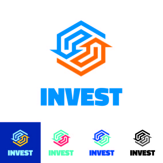
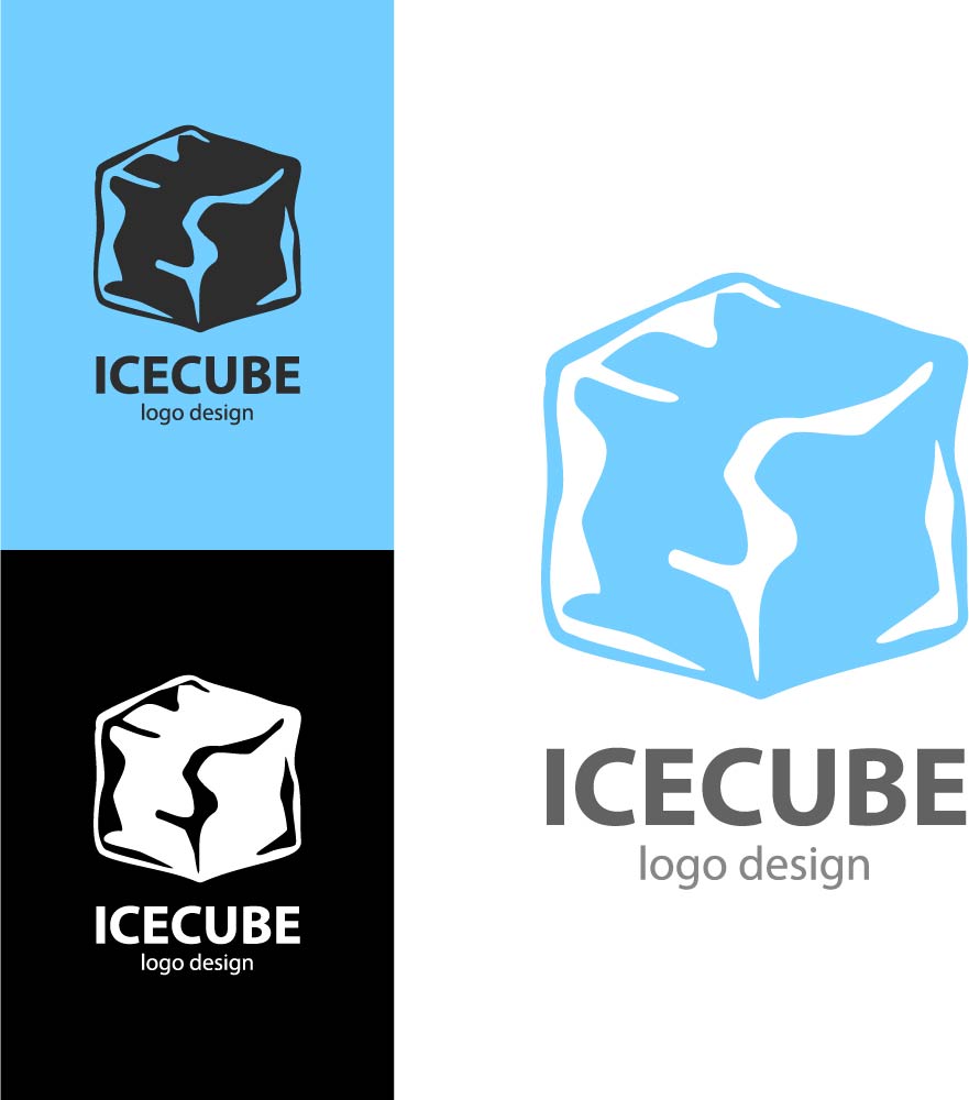
Pictoral. Pictoral logos utilize imagery, either literal or representative. A few examples are Apple, Starbucks, and Twitter.
-
Abstract. These include images or graphics that don’t represent anything recognizable. Think Sprint or the Nike swoosh.
So how do you pick? Well, there’s no one rule to follow. Remember, this is an art! But there are some general tips you could consider.
If you have a short and memorable name, a wordmark is a great logo type. These are typically the easiest to understand for consumers, especially if your brand is new.
An abstract logo can be very powerful, especially if it mirrors your brand’s personality, but they usually take longer for your customers to understand. Your consumers might need to see it multiple times before grasping the idea or recalling it.m However, when they do, it can be very powerful.
2. What Do I Want to Communicate through My Logo?
No matter what, you want your logo to provide an immediate sense of who you are as a company. It should convey your brand’s personality and give a little insight into the type of business you are.
For example, think about this. Is your company fun, energetic, and youthful? Or do you want to portray an image of seriousness, depth, and years of experience?
Your logo leaves an impression on your audience the second they see it. You want your logo’s communication to align with the attributes of your company, products, and services.
You also may want to send these messages:
- Your company and products unique
- You are a professional and trustworthy organization
- You are successful
- You’re different than your competitors in a key way
3. What Colors Should I Use?
Color choice is a crucial part of logo design. This is because different colors can send various messages. There is even a whole area of marketing dedicated to understanding the psychology behind color.
Think about some logo examples for a moment.
McDonald’s, KFC, Wendy’s, and Dairy Queen all have predominantly red logos. Pizza Hut, Arby’s, and Burger King have a lot of red in their logos as well. How come? Red is known to be stimulating, exciting, and associated with activity.
So when you’re driving down the road, looking for a fast food restaurant, the hope is that red will catch your eye and be stimulating to you so you will decide to eat there.
Yellow, on the other hand, is known to be happy, energetic, and even fresh. Subway uses this in their marketing with their image of freshness in a crowded fast-food marketplace. Blue is associated with calmness and reliability.
Do research to see what you think your target market will relate to. Remember, there are differences in color preference between ages, genders, and generations.
4. What Fonts Should I Use?
Fonts are another important part of the equation. Just like colors, fonts can convey certain emotions and give distinct impressions.
A toy store is going to want to use a whimsical, fun font that displays youth and is inviting to children. A surgical center for adults, on the other hand, will probably want to convey reliability and expertise with a strong, straightforward font.
Think about your brand’s personality. If you haven’t done so already, take some time to think of the top 5 adjectives you want to describe your company. Then look online for fonts that match up.
You can also use more than one font in your logo, but keep it limited to two. You don’t want to go overboard and make your logo look unorganized or cluttered.
5. What Mistakes Should I Avoid?
When it comes to logo design, there are some common mistakes that you want to avoid at all costs.
First of all, make sure you differentiate yourself from your competitors, especially if you only have one or two. It’s best to go in a different direction as far as type, color, or font.
The last thing you want is for your target market to confuse you and a competitor. Instead, try to stand out.
Also, think about the different places you will use your logo. You’ve probably thought about your logo on paper or in the top corner of your website. But where else will you potentially use it?
Consider how it will look on various types of marketing materials, such as:
- A billboard or other large-scale ad
- Your different packaging materials
- Screenprinted on a t-shirt or hoodie
- As an app icon
- In a square or circle format for your social media pages
Final Thoughts on Questions to Ask When Designing a Logo
Now that you’ve thought through these questions to ask when designing a logo, what’s next?
It’s time to get started! Begin thinking through your ideas and brainstorming potential options.
And if you need a free, reliable software to create your logo, check out our logo maker. We’ve helped millions of brands make beautiful logos over the years.
6 Graphic Design Rules to Consider When Crafting Your Logo
Posted on May 06, 2018 by Logo Design Tips and Tricks
Designing a logo isn’t exactly rocket science, but it doesn’t come naturally to everyone. Even the most experienced graphic designers have trouble coming up with the right symbol to represent an entire company.
A logo has to be original, bold, and easy to memorize.
Luckily, there are many tricks and tools available to make logo design easier. Whether you’re a professional visual artist or an entrepreneur trying to build a business from scratch, you should start your creative process with standard graphic design rules. This builds a strong foundation for the final logo design to be something incredible.
Here are the key principles you need to know to guide your logo-making process.
1. Start with the Basics
Every creative project begins with brainstorming. When building a logo, the first stage has nothing to do with an online logo maker or software program. The final digital design begins on paper.
Get a plain sheet of paper out and sketch ideas. Write down the words you want to be associated with your brand and let these offer some guidance for whatever you draw.
You can use symbols that represent your services and products, but don’t be afraid to think outside the box, too. Maybe the final logo has nothing to do with what you offer, but what you want to stand for or where your company is based.
The more personal you can get, the better. But, it all begins with what you put on paper then develop further with the help of other graphic design rules.
2. Find the Perfect Font
Once you have a foundation established for your logo, play with the font.
This goes for logos that are just one or two words, as well as logos that are mostly symbols. Logos made to spell out company names or values need to be legible and standout among competitors. Logos that are just symbols – like a classic swoosh or a set of golden arches – will sometimes be accompanied by the company names (i.e. – Nike and McDonald’s).
Whatever your final design looks like, make sure you have the perfect font to match.
3. Play with Colors and Shapes
As you’re deciding on the font you want for your logo, try out different shapes and colors, too. These two graphic design rules are interchangeable in the design process.
Sometimes the shapes come first in order to set a foundation, and then the typeface is chosen to pair certain lines and curves. Sometimes, the font comes first and helps determine the other shapes in the logo. Still, the main objective is to create a design that combines every detail in a seamless, stunning fashion.
This isn’t just about turning heads, either. It’s about making consumers and competitors alike feel something. The colors and shapes you include in the final design will have a major effect on the values and emotions associated with the logo.
4. Keep Everything Clean
Deciding on fonts, colors, and shapes is often the longest part of the logo-making process. You can be an expert on all the graphic design rules in the world, but you still have to get everything just right. One way to ensure the logo is coming together well is to keep everything clean.
What does “clean” mean, though?
It means your gradients should blend well and each line should be sharp and significant. It means the spacing between each letter should be thought out and there should be one guiding principle that is clear to recognize. A clean logo is one that is bold and timeless but doesn’t try too hard.
5. Make Sure the Logo Can Scale
Another variation of a “clean logo design” is a design that can scale.
To be able to scale means the logo will fit well anywhere you put it. The final edit should be able to go on your website as well as your social media posts. It will sometimes need to be blown up for billboards and promotional posters, then used as a smaller version for business cards and company apparel.
Every time, though, the logo should be consistent. Of all the graphic design rules you use, this is arguably the most important. The last thing you want to do is create a logo that looks stunning online, then blurred or difficult to understand when printed.
Keep this from happening by saving the final edit in high-resolution. If you can save it as a vector, even better. Vectors are pretty much impossible to make blurry or confusing; they scale perfectly for car wraps and business signs as well as for pens and stamps.
6. Always Think About the Brand
Last but not least, always keep your brand at the front of your mind.
Many new business owners mistake a logo as the brand itself. This is a costly error; a brand is so much more! Branding refers to everything from your marketing tools to the quality of service provided in addition to your logo.
In short, the brand of a business is everything users associate with the company. The logo is often what makes these feelings and experiences come to mind as users notice it on various mediums. When a person sees your logo on their screen, on a street sign, or walking past someone using your product, what do you want them to think?
That should be what guides your design process from start to finish. Consumers interact with a wide range of companies day in and day out. The right logo can be what makes them stop and feel something, which begins to create a dialogue with current and potential users alike.
Using Graphic Design Rules for Beautiful Logo Design
Ready to see what the power of great design can do? Wonderful – stick to the graphic design rules mentioned above and you’re sure to create a logo that’s worth showing off.
This may take a few hours or a few days. You may know in your gut the final design looks perfect, or you may need to ask for insights and further ideas from business partners. Either way, the process will result in a beautiful logo.
For more advice to help you every step of the way, check out some more of our blog posts today.
Challenge Coins: 8 Tips for Creating the Perfect Logo for Your Custom Coins
Posted on April 01, 2018 by Logo Design Tips and Tricks
Making a beautiful logo is a fundamental part of running any business.
Whether you operate in the financial sector, run a travel company, manage a local restaurant, or do home renovations, the right logo can help you stand out. This is something that goes on everything from your company’s branded apparel to business cards and unique promotional items.
Promotional items include classic tools like pens and stress balls, but also distinct pieces that you can give out, like custom coins or special pins. If you’re exploring the option of making custom challenge coins, you can’t pursue this idea without the proper logo.
That’s where we come in. Our design system is here to help you turn your current logo into something that is coin-ready, considering challenge coins are pretty small!
First, though, you need to know a thing or two about logo design.
Below are all the tips you need.
1. Try to Be Timeless
No matter if you’re building a logo from scratch or manipulating your current logo to something that is suitable for custom coins, focus on one thing: being timeless.
This is the only way your logo will be remembered. Many people collect custom challenge coins because they are fun, unique items that are hard to come across. But, they don’t always remember the company that provided a certain coin in the first place.
That’s why your logo design matters so much. The more memorable your logo is, the more likely someone is to remember the actual products and services offered by the company a logo represents.
2. Brainstorm, Brainstorm, Brainstorm
How do you come up with a timeless logo?
By taking the brainstorming stage of the design process seriously. Take a moment to sketch out a few logo ideas before you start the digital version. This helps you get out of your head and visualize which ideas work and which don’t.
To make the brainstorming process even more effective, draw a circle around each logo. This allows you to conceptualize how it will look on the custom coins you want to create.
3. Manipulate Colors and Shapes
Once you have a few quality design ideas, develop them even further.
Take your sketches from pen and paper to a digital screen. Use the online tools provided to play with different colors and shapes. The shapes you use don’t have to be exact representations of a square, triangle, or so on.
But, using shapes as a basic outline for the design of your logo makes a big difference. This puts the concept of shape psychology to work. In logo design, certain shapes can exude a sense of trust, balance, or community – depending on what you want your company’s custom coins to stand for.
Similarly, there’s also a different set of color psychology for logo design. Educate yourself on these matters in order to send a message that is loud and clear (and effective!) to your audience.
4. Make Something Eye-Catching
While you’re figuring out how to relay your company values or purpose through shapes and colors, make sure the logo as a whole can turn heads.
If you aren’t creating a design that is eye-catching, you won’t get the results you’re looking for. Think about how your logo will stand out among many others. This goes for when it’s used on challenge coins, lanyards, and all other kinds of promotions.
Wherever you put your logo, it has to be easy to notice.
5. Brand Your Heart Out
It’s one thing for someone to notice your logo and another for them to recognize it as part of your brand. This is especially true if you have one variation of a logo for regular business purposes and another for your custom coins and other promotional items.
To build brand recognition, you have to make a logo that is a clear representation of your brand. A brand is a complex thing to identify. It’s both the signature colors of your company, as well as the products you offer and the quality of service you provide.
All of these details have to be summed up in your logo.
It can sound like a hard thing to do. But the longer you work at it, the more your brand will become front and center of your logo design.
6. Add a Special Touch
To further encourage brand recognition, think outside the box.
There is bound to be an element of your company that is entirely unique, no matter how many competitors or the amount of exposure you have. Think about things like office traditions and phrases that guide your culture.
Does your company have some sort of mascot or another internal symbol that isn’t necessarily a part of your logo yet? Add it to the design you’ve created and see how much more unique the overall look of the logo becomes.
7. Consider Use and Placement
At the end of the day, regardless of what your logo looks like, it’s going to have a limited amount of space when placed on custom coins. Keep this in mind throughout your design process.
The final version of your logo should be something that is scalable down to the smallest coin, and up to a big poster or even a billboard, too. The best way to achieve this is to keep it from being too busy.
A simple design turns heads when displayed on small pieces and is easy to understand. More so, it’s a classic look that can be used on bigger canvases, too.
8. Don’t Be Afraid to Edit
Throughout the logo-making process, you’re going to make plenty of edits.
This may have you thinking that once all the pieces come together, you’re done. In reality, the “final version” of your logo will go through many edits before it is actually complete.
It’s true that edits can be time-consuming. But, the more attention you pay to the small details and the effort you put into tweaking them, the better the true final edit will be.
Design Your New Logo for Your Custom Coins
Whether you’re building a logo for custom coins or figuring out how to display your logo for bigger uses, you need the right system to do so. Having access to a logo maker turns edits from a big hassle into a simple design process.
To discover just how easy logo making can be, click here.


