Does Your Window Company Need a New Logo?
Posted on December 14, 2017 by Logo Design Tips and Tricks

Does your window company need a new logo? Maybe. But maybe not. This is a big and drastic undertaking and should never be taken lightly. You should never shake things up for the sake of shaking things up.
But a new logo and rebrand certainly does have its time and place. And a lot of companies have found new success after a new logo.
So is it right for you? Keep reading to find out.
We’re Not All Pepsi
Listen, we would all love to have Pepsi’s marketing dollars and fan base, so we could pull off a full rebrand every couple of years. Take a look at their many logos over the years.
But here’s the thing. Constant re-brands is a part of their brand. Some time ago, they decided to differentiate themselves from Coke by establishing Pepsi as the younger and edgier brand.
Coke was to be the American institution, and Pepsi wanted to be it’s younger and wilder sibling.
But Pepsi is Pepsi and has billions of marketing dollars at their disposal to spread the word of their rebrand, and change the logo on a billion cans. None of us are Pepsi.
As a window company, it’s highly unlikely your brand or position is young, hip, and edgy. So, a new logo every 5 years for you is only going to cause you to water down your branding.
When is it Not Time for a New Logo
There is always the, “if it ain’t broke don’t fix it mentality.” So should you stick with your original logo? Here are some situations where the answer is probably yes.
1. Your sales are stagnant:
It’s really easy to scapegoat your brand when your sales are underperforming. But it’s actually rarely to blame.
Your brand could be the problem, but it takes a lot of research to determine if your brand is failing, or your brand execution is failing. Too many people assume it’s the former.
This is particularly true of new brands. Some people will pull the plug on a new logo, and switch back to the old one after only about a year. Or even worse, they will pay money to have a new-new logo designed.
You need to give a new brand time to ripen and mature. And you need to give yourself enough time to promote it and incorporate it.
Marketwire is an example of this. As a global leader in press release distribution, they rebranded in 2012, to reflect a move to doing more than press releases and rolled out a new logo and a new tagline “Beyond Words.” It was well received.
But then, a year later, they rolled out another rebrand, another logo and inexplicably added a “D” to their name to become Marketwired. This was almost universally met with head-scratching and was seen as a big step back.
2. Your logo is already popular
Let’s not forget what happened to the Gap. In 2010, they decided to change up their already-iconic logo. The new logo was fine and actually looked good. But the existing logo was so beloved by customers there was an uproar.
In the end, The Gap had to go back to the “old” logo in a matter of days.
if your window company already has a logo that people like and recognize, there is probably no reason to change it up, unless, one of the situations in the next section apply to you.
When is a Good Time to Change Your Logo
Here are the situations when a new logo is appropriate and could really help your window company.
1. Your offering has changed
Maybe you’re a window company that is expanding into blinds and patio doors. If you feel your logo is a little to windows-only, you could rebrand and launch a new logo that doesn’t pigeonhole you as much to one offering.
2. You’re attacking a new market
Let’s say someone like Blinds and Design decided they were going to target just home builders and interior designers. That would be a serious shift from business-to-customer to business-to-business, so that could necessitate a new logo.
You will have a new target market, so you may need a new logo that will better resonate with your new audience.
That being said, you’re going to need more than a new logo. You’re going to need new messaging and a total re-brand as well. Too many people think a new logo is a rebrand. It’s actually far more complex than that.
3. A merger or new acquisition
This one is a no-brainer. If you acquire, get acquired by, or merge with another company, it’s time for a new logo.
You will need a new logo to combine the elements of multiple brands coming together as one. The mentality here is always “It’s a new day. It’s a new company. Stronger, yet still united.”
4. You didn’t put much thought into your logo the first time
You’re a startup who just feels the need to have “something” to stick on your website and letterhead.
But over time, your business grows and matures and your logo that never really meant anything is becoming more meaningless.
Now you have the time and resources to create a logo that actually means something to you and your target audience. So take advantage of your chance to do things right the second time.
Ready to Create a New Logo for Your Window Company?
We have been the go-to-choice for new logos for over 2 million brands worldwide! And we can help you create a logo you and your customers will fall in love with.
Let us show you how to create an amazing logo design for your brand. Right now. For free! You can start by clicking here to create your account.
How to Create a Fabrication Logo for Your Metal Shop
Posted on October 09, 2017 by Logo Design Tips and Tricks
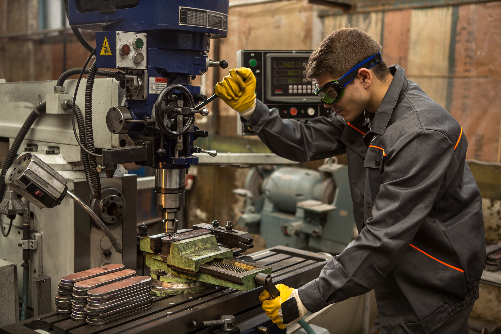
It’s no longer enough to be a seriously talented fabricator. Even opening up a metal shop is not enough. With so much competition, steps must be taken to separate one metal shop from another.
That’s why branding is necessary. It’s a way to help others recognize the work and associate it with a particular company.
One way to brand is by creating a fabrication logo. Not sure how to create one? Keep reading to learn how.
Start By Matching the Style to the Industry
Think about some of the most easily recognizable logos around. Companies like Coca-Cola, Target, and IBM all have logos that make sense for the type of industry they represent.
It’s a smart idea to take a look at what other metal shops have as their logos to get some ideas. Then choose one that best represents the work being performed.
Keep in mind that colors, words, and artwork are all part of the branding package. Good branding that lasts shouldn’t confuse anyone.
Have it Represent the Companies Core Values
Every part of a fabrication logo represents what a metal shop is about. Every company should have core values, meaning the reason why that company started to produce work in the first place. Even companies like DECIRON, which makes iron railings, has core values they want their customers to understand and relate to.
A well-branded logo will represent all of that. So be sure to match the design to the companies vision, who the target audience is, and of course, the benefits of buying from the company.
Fonts, symbols, and pictures are all part of representing core values, so make sure that if there are preferences, that they are shared with the logo designer.
Keep It Simple
It would be confusing if Ben and Jerry’s ice cream featured a pig on their packaging. Or if SquareSpace featured a circle on their logo.
A well-branded fabrication logo isn’t about bringing out every bell and whistle, it’s about creating something that makes an impact and is memorable. If it’s too confusing, people will ignore it.
So keep the logo simple and memorable so customers can easily identify it with the great metal work that’s produced by the company.
Make It Stand Out From the Pack
The competition today for any business is fierce. It’s no longer enough to just have a storefront sign and think business will take care of itself.
This is especially true if the work isn’t being provided for just a local area. It has to stand out to get people to take notice. So make sure the color, theme, fonts, and wording means something and are memorable.
McDonald’s golden arches stand out everywhere it’s featured because it’s so memorable. The Mercedes Benz symbol is another logo everyone can quickly envision because it stands out from the pack.
Make the Fabrication Logo Relevant for Now and the Future
Most companies want to stay in business for a long time. It’s vital to choose a logo that can stand the test of time.
Jif has used the same logo since 1966. So keep in mind the future when envisioning a logo. What’s trendy now might not be so relevant in five or ten years.
Start Creating a Logo Now
Creating the perfect logo for branding purposes doesn’t have to cost an arm and a leg. In fact, with our free logo maker, anyone can make their own logo in 10 minutes or less.
Not sure how to get started? That’s okay, check out our tutorial to learn how.
5 Ways to Include Hidden Symbolism in Roofing Logos
Posted on August 30, 2017 by Logo Design Tips and Tricks
To succeed in the roofing and construction industry you want to be memorable for all the right reasons. A well-designed logo that embodies your business and sticks in customers’ minds is essential. A memorable logo is more likely to make people tell their friends about your business. It also encourages them to use your services again themselves.
Some of the most effective roofing logos use hidden symbolism to give their brand an extra boost in today’s competitive market.
But how do you include hidden symbolism to your roofing logo? Here are 5 ideas to get you started.
Secondary Imagery
Have you ever looked twice at a logo only to see something you didn’t the first time? That second glance would have picked up on the logo’s secondary imagery. Major brands like the Pittsburgh Zoo and PPG Aquarium and the Spartan Golf Club use this technique brilliantly.
Including secondary imagery in your logo lets you say many things about your brand at once. This gives your customers a more complete idea of who you are as a company. Incorporating it in a clever or subtle way also gives your logo the extra pop it needs to be more memorable.
Use Symbols
Symbols represent self-contained ideas and are understood more immediately and consistently than words. They’re also more universal – not requiring language or any related visual elements to lend meaning.
As a roofing company, symbols of a house, roof tiles, or windows are just a few that would suit your logo.
Negative Space
Negative space or white space is the space between the lettering and visual elements of your logo. Using white space to create symbols or secondary typographic imagery is a perfect way to incorporate a hidden meaning into roofing logos.
So, when you look at your logo, teach yourself to look at what’s not there. Clever use of negative space is one of the strongest tools at a logo designer’s disposal.
Clever Typography
Proper typography is an essential element of roofing logos, but it can also lend your design hidden symbolism if used cleverly. Consider the negative space between letters – can you use it to form a secondary image? Do any letters of your brand name resemble an appropriate symbol?
Letters that have an arched shape lend themselves to roof imagery, which would suit roofing logos well. For example, a company like Arlington Roofing Co could make use of the A and N in their brand name.
Create Depth With Color and Shading
Logos need to be able to work in greyscale or color, but by using different shades you can create hidden meaning in your roofing logo that’ll work in any format.
Roofing logos bring to mind imagery of buildings, construction, and arched roofs – by shading different areas of your typography or visual elements, you can create the effect of roof tiles or walls. The limit is really your imagination!
Start Designing Quality Roofing Logos With Our Free Tool
Creating a roofing logo that won’t fail is no easy task, but with a bit of creativity and our free tool, you’re ensuring your roofing company stands out from the crowd!
5 Tips on How to Design a Metalworking Logo
Posted on August 17, 2017 by Logo Design Tips and Tricks
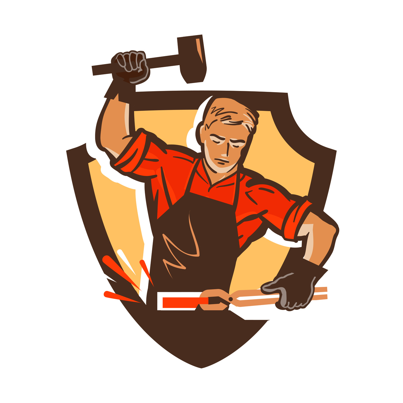
The process of metalworking dates back over 10,000 years.
Nowadays, thousands of metalworking companies vie for their stake in a massive industry. Fortunately, a memorable logo increases your odds of grabbing consumer’s attention by 13%.
So, what goes into crafting a memorable new logo?
As it turns out, some design components of successful logos are universal. Others are more industry-specific. That said, there are ways you can use proven components to create an original brand image.
Here are 5 tips you can use to design a sharp metalworking logo for your company!
1. Don’t Fall Into the Cliche Trap
There are logo cliches in each industry. For instance, in this industry, anvils and gears are painfully common.
The reality is that some trends are not worth following. Many become dated quickly, while others prevent you from sticking out from the crowd.
Focus on the values of your business and design a logo around that. Just because everyone else uses a symbol doesn’t mean you should.
2. Use Color With Purpose
You can use certain colors to differentiate yourself from others in your industry. However, you can also use it to elicit certain moods.
For example, blue signals dependability, while people tend to associate purple with creativity. Incorporate orange into your logo if you want to appear more enthusiastic than your competitors.
Furthermore, if you use more than one color, make sure they compliment each other. Try using a color wheel as a reference.
3. Choose a Fitting Font
A good font type brings a logo together.
To find your font, start by typing out your company name and scroll through your options. For starters, a couple of fonts that fit the theme of the industry are Zwodrei Bold and Very Damaged.
Always consider the legibility of your font. If it looks like it will be unreadable on business cards or t-shirts, choose a new one. Overall, you want your logo to be versatile.
You can also blend your symbol with your font. For example, the Martin Awards logo replaces the tittle in the letter i with a shooting star.
4. Avoid Overcomplicating Things
People all over the globe can recognize the golden arches of McDonald’s or the Nike swoosh. There are a couple reasons for this.
For one, simple logos are easy to recognize. Adding endless components bogs down your overall design. A simple design is straight to the point and doesn’t confuse anyone.
Second, simple logos embody versatility. You can shrink them or enlarge them with ease.
5. Consider Using Negative Space
If you look around this industry, few companies use negative space in their logos. This provides the perfect opportunity to stand out.
Start by analyzing all the letters in your wordmark. Look for a shape in the negative space of a letter, and see what relevant symbols fit in there. For example, the negative space in the letter N makes a triangle.
Don’t force using negative space for the sake of it. Just consider it as a clever way to differentiate your brand.
Piecing Together Your Metalworking Logo
The tips above will help you create a metalworking logo that people can latch onto.
Avoid imitating the designs of other companies in your industry. After all, the purpose of designing a logo is to present a unique, recognizable face for your company.
Also, try not to go too crazy with fonts. You want a harmonious image, so limit yourself to a maximum of two fonts per logo if you can.
Now that you have some inspiration, use our free online logo maker tool to bring your ideas to life!


