3 Design Tips for Your Health and Safety Logo
Posted on October 04, 2019 by Logo Design Tips and Tricks

When you think about health and safety, what do you think of?
You probably think of that warm and cozy feeling of security. You feel protected. Like a guardian angel is watching over you.
So how do you convey this message in your health and safety logo when trying to bring in new clients for your training business? You want quality.
Keep reading, we’ve got three tips to take your logo from “ugh” to “ugh-mazing”.
Your Health and Safety Logo
Shape up
When you think of health and safety logs, you may think of crosses.
The most famous example of this is the Red Cross.
You have also seen a similar looking green cross. The difference is the green cross is a universal sign for life and represents professional healthcare and the red cross is copyright-protected. So you cannot use the red cross without permission.
The International Standards Organization recommends using a white cross on a green background to represent first aid.
Origins
The cross does have religious significance and has for nearly two thousand years. However, the use in first aid didn’t come about until the 1800s.
It was adopted as a way to communicate with combatants that those who wore the cross were on the battlefield to administer first aid and help wounded soldiers to safety.
It quickly because known as a way of saying “Please don’t shoot”. Here we are, nearly two centuries later, and the symbol has found its way into almost every first aid and healthcare logo that exists today.
Dare to be different. While using a cross is perfectly acceptable, make your logo stand out with something newer and bolder.
Colors
Red, green, and white are used in the everyday health and safety logo for a reason. But they’re also boring.
Your logo is part of your brand. Do you want your brand to be washed away in a sea of green and red crosses with every other training business out there?
Use yellow and gold to depict clarity and warmth like The American Society of Safety Engineers.
Oranges and blues are being used by tech start-ups across the board. Think about Firefox, Amazon, Walmart, IBM.
Not only do these color schemes look great when paired together, they also provide part of their brand message. Blue symbolizes dependability, trust, and strength while orange represents cheerful confidence and friendliness.
The combination says, “We’re here for you and have great customer service!”
Throw in a touch of green with your health and safety logo and your brand will scream the right message to your customers.
Utilize What Isn’t There
Use your negative and white space in a health and safety logo. Crosses and circular life rafts are boring and dated.
Think of how NBC uses the peacock and how Fex Ex uses the arrow in their logo.
Find ways to stick in the classic symbols of health and safety without actually putting them into the logo itself!
Logo creation can be an expensive and tedious task. Luckily, we’ve got you covered. If you’re having issues with visualization, check out our free logo maker tool.
What Are the Best Fonts for Fitness Logo Design?
Posted on October 02, 2019 by Logo Design Tips and Tricks

Whether you’re opening your own fitness studio or trying to get your YouTube workout channel off the ground, you know that the way you brand yourself is incredibly important.
There’s probably no aspect that’s more important to the success of your brand than your logo.
Fitness experts may spend hours creating the perfect image and coming up with a great company name. But rarely do they spend enough time on typography, or font when it comes to their fitness logo design.
Typography is crucial when it comes to branding.
But which is the best typography option for your fitness logo? Here are a few of the best ones!
1. Modesto
Are you looking to catch a potential client’s attention from hundreds of feet away? Are you planning to advertise on billboards or signs?
If so, Modesto, created in 2000, has exactly what you need.
It’s eye-catching without being aggressive and can work with a variety of colors. It’s all-caps look communicates to clients that you’re serious about helping them with weight loss and their other fitness goals.
For those not afraid to sweat, it’s a great choice!
2. Helvetica
Sometimes, there’s nothing wrong with going with a classic. Especially if your gym is primarily focused on strength training or high-intensity workouts like kickboxing, this is a great solution.
It looks best in black and white.
3. Rockwell
If you want your fitness logo design to call to mind rugged Americana (think Olympic champions) then this bold option is a great choice for you.
It’s easy to read, even from a distance, and it can be easily resized to stay legible both online and in print. Use it in red or blue for an extra pop!
4. Bobber
If your fitness business does things a little outside of the box, then this is the option for you. It caters to a more “hipster” clientele, which means it’s great for the millennial market in a larger city.
Plus, especially if you own a cycling studio, this font (inspired by motorcycles) is a great fit!
5. Custom Typography
Of course, the last and perhaps the strongest typography option for a fitness logo design is to have a unique font created specifically for your brand.
It not only ensures that no one else has it, but it communicates to your clients that you’re willing to go the extra mile — just like they should be!
It’s an investment in your branding and one more thing that makes you that much more memorable.
Especially if you advertise online, where the market is even more competitive, this will really help to set you apart.
Create Your Fitness Logo Design Today
Thanks to this post, you now know some of the best typography options you can use when dreaming up your fitness logo.
What else can you to to take your logo to the next level? Try out your designs in our free online logo maker tool.
Also be sure that you keep reading our blog for more branding tips as your fitness business continues to grow!
5 Tips to Create a Killer Music Logo Design
Posted on September 30, 2019 by Logo Design Tips and Tricks

As a musician, your band is everything to you.
But when it’s time to create a music logo design, it might be a challenge to come up with an option that does your sound — and your fans — justice.
Sometimes, the process is just as tough as cutting an album! You’ll have conflicting opinions, creative blocks, and more.
Don’t worry — we’re here to help. Read on for our top 5 design tips for band logos.
1. Get Inspiration From Your Lyrics
If you’re feeling stuck, you can always look to your lyrics for an answer! Think of your biggest hit. Is there a particular line that your fans love to scream out with you at concerts?
Use those lyrics to inspire your logo design!
2. Get Your Own Font
Typography, or font, plays a huge role in logo design. Even if you decide to switch up the colors or even design of your logo later on, having a font that’s all your own can help you to keep things consistent.
Most bands will likely want to have a custom font created, especially as their fan base grows. If you can’t afford that yet, just focus on making a few letters stand out! You can color them a different shade, make designs out of them — pretty much anything you can think of.
3. Choose Your Colors Wisely
The colors you choose can also say a lot about the type of music your band plays. Blacks, reds, and silvers will work well for the heavy metal genre. If you’re into easy listening music, go for relaxing greens and blues.
Make sure you have at least two colors in your design to help things really pop –especially if you plan to wear your own merch onstage.
4. Let Your Genre Guide You
If you’re a classical music group, it probably won’t make much sense for you to have a logo that includes spotlights of different colors, raining glitter, or neon hues.
But if you create popular techno songs, that design would be a great fit!
Make sure that your design is consistent with the type of music you play. Keep in mind that if you’ve recently changed your sound, it might be time for a logo redesign.
5. Let Your Fans Help
You’d be nothing without your fan base! Show them you appreciate their input by letting them influence your music logo design.
You can ask them to help you to create images, have them vote on the final options, or just drop hints about your upcoming logo reveal on your social media accounts.
Remember, these are the people who will wear your logo and advertise your band. You have to make them happy.
You’re Ready To Make An Awesome Music Logo Design!
Thanks to this post, you probably have more than one idea you’re itching to try out.
Creating a music logo design is a lot like writing a song — you might not always get it right the first time. To test out your options before you make a final decision, use our free online logo maker tool.
Also, be sure to check out our blog and website for more advice on how to turn your band into a brand (while staying true to yourself and your music.)
Here’s How to Choose the Best Logo Colors for Your Brand
Posted on September 26, 2019 by Logo Design Tips and Tricks
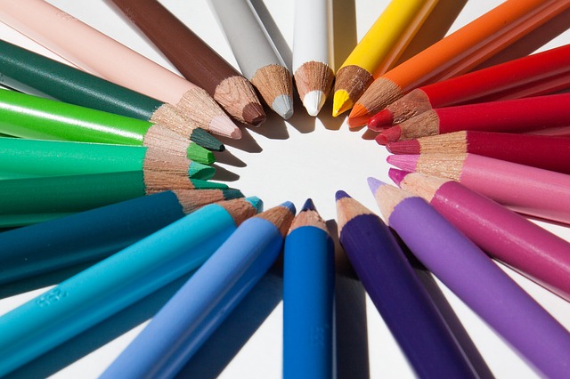
The color of a brand is one of the first things we notice when we look at a logo. In fact, colors have a psychological effect on how we react.
That’s why choosing the best colors for logos is so important. These colors will have a longlasting effect on your brand and marketing.
When we think of successful companies like McDonald’s, we imagine red and yellow. Amazon is black and yellow, while Facebook is blue. Picking the right color can help your business make a lasting impression.
The right logo colors can improve a customer’s brand perception and enhance your client base. Continue reading to learn how to choose the best colors for logos.
Less is More
When it comes to creating a logo, choosing fewer colors is best. This is because too many colors can make it difficult to print your logo on different backgrounds. You will also need your logo to look good at various sizes.
For example, if you were to make a label with your logo on it. It should be just as identifiable at that size as if it were on a t-shirt or printed wall decal. This is known as scalability.
Having only a few colors on your logo makes it easier to be consistent with your brand. Repetition is key when it comes to marketing. If you are able to use the same colors on all of your products and merchandise, it will stick better in your customer’s minds.
Know Your Industry
Before you can create your logo and choose colors, you must first understand your target audience and what will appeal to them. Knowing what appeals to your demographic will affect what colors you use along with how your logo will look overall.
The colors you use have a strong impact on who you are trying to attract. So be sure to research your industry before picking a color. In fact, each color has its own psychological meaning.
For example, red is a color that evokes power, passion, and strong energy. Pink is considered a more feminine color and tends to make us think of vulnerability, love, and tenderness. Green is fresh and reminds us of nature, growth, and prosperity.
The shade of the color you choose can also determine its meaning. So keep that in mind.
How Will it Look?
Depending on where you will be printing your logo, on a t-shirt, paper, or decal, the colors you choose may look different. This is because the ink of your printer may not be as complex as the digital color palette you’ve chosen for your logo.
Find a professional graphic designer who can help you choose colors that look great no matter what medium you put your logo onto. Sometimes it’s better to go with simpler colors so that they are easier to reproduce.
Best Colors for Logos
We hope this guide helps you choose the best colors for your logos. Each brand is unique and some colors may work better than others for your industry. With some research and strategic planning, you’ll find the perfect colors for your business!
Looking for more tips on improving your logo? Check out our blog for more amazing ideas.


