5 Fantastic Financial Logo Design Ideas
Posted on January 11, 2018 by Logo Design Tips and Tricks
Last year financial satisfaction hit a 24-year high in the United States. With the stock market in great shape and more income for investing there has never been a better time to grow your financial company.
For branding purposes, a financial logo can communicate the strengths of your experience and create a bigger customer base. The old adage that a picture is worth a thousand words comes into play when designing a logo.
When done properly your financial company logo will stand out and catch the eye. What’s more, it will help your company stand out from the competition.
Here are 5 ideas to make your logo the best for your brand:
1. Understand Your Brand Strategy
The first ideas for a logo design begin close to home. It is important you understand your brand and strategy to create a logo to reflect your goals.
If you cater to a specific clientele, type of investment, or geographic location, you may want to incorporate these ideas into your logo.
2. Study What Works for Your Financial Logo
Taking a look at the competition can be a big help when designing a logo. Too many newcomers to graphic design get overwhelmed when they look at winning designs though.
They think, “all the great ideas are taken” when they study good examples. The truth is, there are unlimited possibilities when creating a great logo design.
A firm like FutureAdvisor depends on a combination of lines, colors, and perspective to carry their branding to new and existing clients. Your firm can use existing ideas and change them to fit the unique qualities of your company.
Don’t feel limited by logo examples in finance either. Winning logos in every market sector might inspire your new design.
3. Animal Themes
One of the benefits of using animals is that they already connotate ideas for any audience. A lion may convey being king of the jungle while an eagle can soar above the landscape and bring perspective.
Wouldn’t you consider an advisor who has an “eagle eye” to help you see more clearly?
4. Symbolic Graphics
As with animals, there are a great many logos that depend on symbols to carry the message about a brand. Money and wealth are often associated with financial services and can be used to attract clients.
But it’s important to think out of the box. You may want to convey stability or creativity. Younger investors may respond better to the imagery of going fast or being revolutionary.
5. Colors and Lines
There are no limits to creating a great logo design. While a pyramid can symbolize stability and tradition, it can also be tilted, warped, and cracked in a design.
Taking a traditional design and altering with bold colors or dramatic lines is a good way to bring the best of both worlds.
Get the Help You Need
In every case, it’s important to experiment and find the graphic that works for you. Online Logo Maker can help.
Use our tutorial now to discover how easy it is to create a financial logo that looks great and attracts new business.
The Use of Logos in Web Design: 7 Golden Rules
Posted on January 08, 2018 by Logo Design Tips and Tricks
The use of logos on a website, or really anywhere in the world, plays an important part in company branding.
Your website is the perfect place to showcase your logo. But if you don’t know how to use a logo or where to put them, you could miss out on attracting new customers.
Want to know how to utilize your logo the right way on your website? After you read this post, you’ll have a website you’ll be proud of.
Let’s get into it.
A Guide to the Proper Use of Logos
Logos and symbols play an important role in brand recognition and identity. If you don’t think that logos are important, think about some of the popular images you’re exposed to every day.
Think about how iconic McDonald’s golden arches or the white cursive on a bottle of coke is. Those images resonate with you because companies have strategically been using their logo correctly for years.
You may not be as big as McDonald’s or Coca-Cola, but you can follow these simple tips to get the most out of your logo when you put it on your website.
Keep the Look Consistent
There’s a reason why some companies have thick notebooks full of notes on how to properly use logos.
Logos are designed to build brand identity and recognition with people. This is why it’s important to make sure that you pick one logo, and stick to it.
The only times your logo should change should be when you’re resizing it so it can look good on a website or social media. Don’t experiment too much with different colors or fonts. Keep everything simple and recognizable.
Sometimes there may be exceptions to this rule. You may want to add a small awareness ribbon to the corner of your logo if you’re supporting a cause or may want to add a touch of red and green for the holidays.
Despite these special occasions, make sure your logo looks the same when it’s on your website.
Keep Placement Consistent
When you’re designing a website, people should be able to tell where your logo is going to appear.
Once again, consistency is important when it comes to the proper use of logos online.
Having logos appear randomly on the page is a poor website design practice. You don’t want people to have to hunt for the logo if they want to see it.
If your logo appears in the top right corner of the website on the home page, it should appear in the top right corner of every page. The consistency helps improve brand awareness and makes the design of the website look cleaner.
Make It Work for You
If you really want to make the most of the use of logos on your website, don’t just make it a plain image.
Your logo could also be a button that links people to other places on your website. Many people choose to have the logo link people back to the homepage.
Other people like to get creative with what their logo can link to. Some have the logo link to the contact us page instead of the home page, and others treat it like a fun easter egg you can click on and find pictures and other items.
Go Center for “Print” Look
Is your website a blog, or do you post a lot of information and current events? Are you a fan of print media and want your site to look like a magazine or newspaper?
Instead of placing your logo on the top left or righthand corner, consider placing it in the center at the top of your website.
Take a moment to look at websites like the New York Times, Washington Post, Vogue, or Wired. They all started off as print newspapers or magazines, and they all have their logo in the top center of their website.
Logos that are placed in the center of a website evoke a newspaper-like look. It mimics the masthead you’d see in a traditional newspaper. If you want to give your site some authority, go for the center placement.
Remember Its Purpose
A logo is supposed to help with branding and become a way for people to identify your business, but it’s not the main attraction of the website.
Don’t make the logo take up too much space or look too flashy or loud. People are on your website to learn about your business, not look at your logo.
Incorporate other visuals into your website. Don’t forget about adding pictures, video, and other visual elements to make your website standout. And also be sure to fill it with some excellent copy.
Keep Everything on Theme
Your website should compliment your logo. The layout themes and colors should look great with the logo, and help bring attention to it subtly.
Take time to think about the kind of colors your logo has, and what colors would best compliment them on your website.
This website does an excellent job of incorporating logo colors into the site’s colors. The green, blue, and white in the logo are reflected in the green mountains, blue sky, and white clouds of the first image you see.
Have Different Options
Branding is important when you’re on your own website, but what happens when you’re being promoted on a website you don’t own? You could be writing a guest post for a blog, or simply have an advertising partnership with a different business.
To ensure the best use of logos on other websites, have different sizes and file types of your logo ready to send out.
This will ensure that your logo looks great on whatever website it’s featured on.
Wrapping Up
Getting the use of logos right on your website can be easy if you follow key rules. As long as you stay consistent and remember its purpose, you can’t go wrong.
Do you want to learn more about creating logos? Check out our post on how to choose the right font for your logo.
If you have experience working in web design or have tips for our readers, be sure to tell us about it in the comments section!
9 Reasons Your Music Logo Design Should Have SEO In Mind
Posted on January 08, 2018 by Logo Design Tips and Tricks
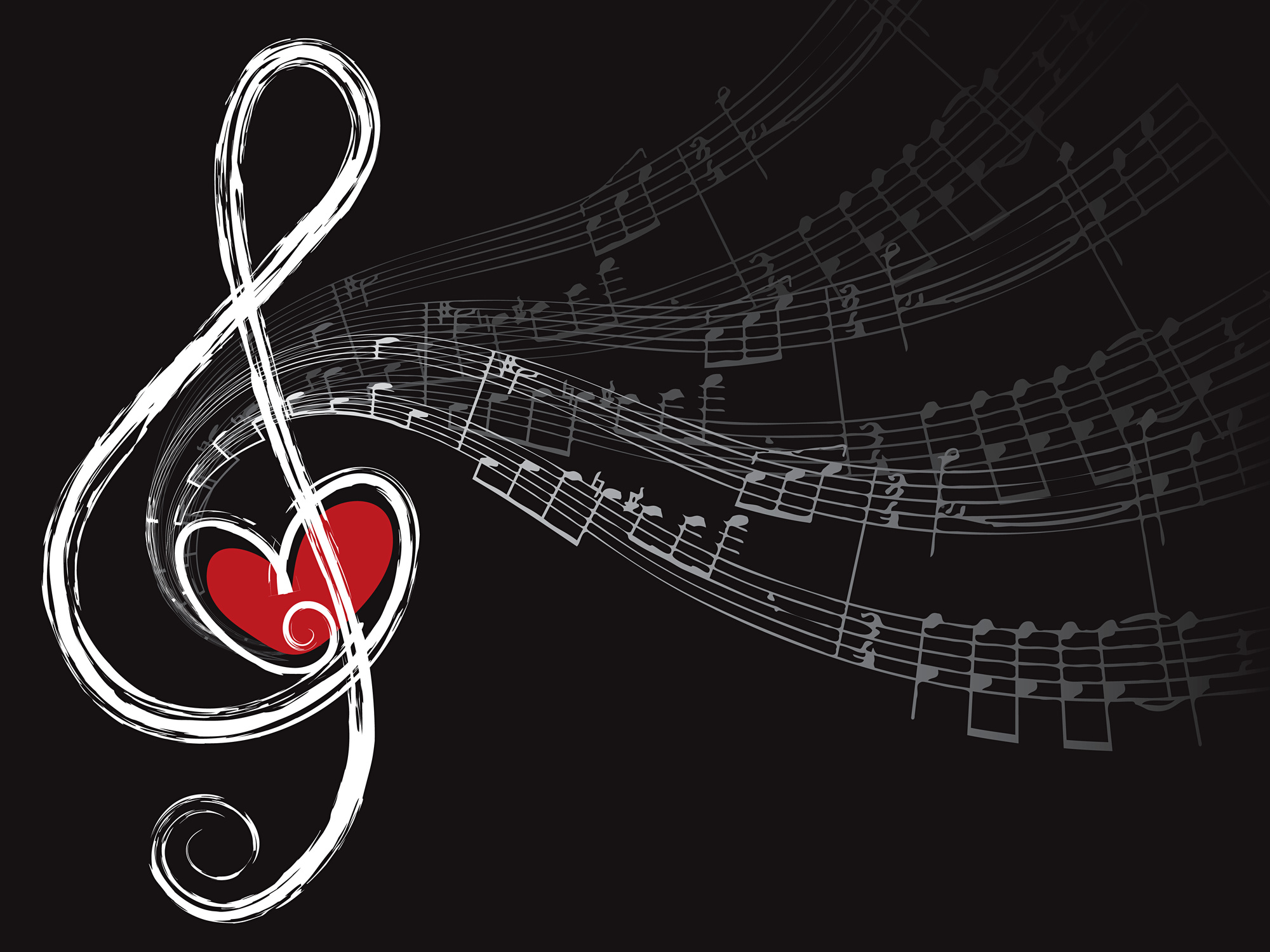
There are a lot of things to consider when it comes to music logo design.
You want your project to stand out with a great logo. That’s where most people start and end their design project.
Most people don’t think that a logo has anything to do with SEO. The fact is, your logo design can influence how your website is found in search engines.
Keep reading for the 9 reasons why your music design logo needs to have SEO in mind.
1. Google Is About a Good User Experience
Google’s success revolves around one thing – providing a superior user experience. That means making sure that the search results they provide users are relevant and useful.
That also allows them to dominate the market, with 92% of searches worldwide.
Let’s say they started to give people bad results, such as websites with bad links, or take to long to load, or results that had little to do with the search term. Do you think people would continue to rely on Google?
Probably not.
Not only would people search elsewhere, but Google’s revenue would drop.
What does your logo have to do with Google’s fortunes? Ultimately, it’s your job to give website visitors the best experience possible. That includes your logo.
2. Your Logo Is Your Website’s First Impression
First impressions are huge on the internet. An eye-tracking study done at the University of Missouri gave some insights as to how people generally look at websites for the first time.
What they found was that a website’s logo was one of the elements that people actively look for. They’d then spend about 6.5 seconds on the logo before deciding to move on.
A lot can happen in those 6.5 seconds. A visitor may decide whether they want to move on to another site or do they want to continue to read more about your project.
You’ll need to design your logo with the user in mind and make it appealing and recognizable.
3. You Need People to Stay on Your Website
The more time people spend on your website, the higher you’ll rank in search engines.
According to the above-referenced study, people can develop a first impression in as quickly as 2.58 seconds. Your logo can be the difference between someone staying on your site or deciding to go elsewhere for what they need.
That’s all it takes for someone to decide if they want to stay or go to another site.
Remember, Google is about providing a great user experience. If someone goes to your website and doesn’t stay that signals to Google that your website isn’t giving their users a good experience.
That will ensure your website doesn’t rank well in search engines, especially Google.
4. You’re Missing an Opportunity to Get Your Logo Seen
Google’s Image search is the leading search engine for images, too. In music logo design, you need to focus on the user experience.
There are also a couple of technical things to take care of when you upload your logo to your website.
5. File Image Name Can Influence SEO
The file name of the image can be optimized so it’s easier to be found in search engines.
For example, let’s say your music logo design for a new pop artist named Julie. Your file name can include a little information about Julie. A file name can look like this:
“https://www.yourdomain.com/images/julie-new-pop-artist.jpg”
It’s a minor change, but it can make a big difference in your SEO traffic.
6. Use Alt-Text in Your Logo
When Google and other search engines scan the internet, their robots can’t read images. Therefore, it’s up to you to tell search engines what an image looks like.
Alt text is used in images to describe images to search engines. You can use it as an opportunity to describe your music category, location, or any other relevant information.
A word of caution. You may be tempted to insert as much as information as possible. Don’t do it because it will look like spam to search engines and users.
An example would be if your music logo design is for an album cover. Your alt-text on the image can read “album name, band name, music category”
7. A Logo Can Add Credibility to Your Project
Whether you’re online or offline, you need to be credible. Your logo and web design can go a long way to making you credible and that can happen quickly.
How does credibility impact SEO?
One important part of SEO is backlinks. To get quality backlinks, you will need to reach out to music blogs to write a guest post or ask them to link to your website.
If you want them to say yes, your logo and website better stand out.
8. You Create Trust Immediately
Your logo is also a way to create instant trust with visitors.
A study done by British researchers found that 94% of first impressions are influenced by design. They also found that design led people to decide whether or not they trusted the company behind the website.
When you create trust, you’re giving yourself a chance for someone to look for more information and potentially contact you.
9. Website Content Still Matters
In case you haven’t figured it out by now, music logo design is tied to the user experience.
In a matter of seconds, someone will visit your website, look at your logo, and form a first impression. From that first impression, that person will decide what to look at next.
Having a blog on your website will not only keep your website fresh and up to date but also impacts SEO.
The more web pages you have on your website, the more chances you have to rank in search results. There’s much more to content than meets, the eye.
That’s why you want to partner with content experts who can guide you in the right direction.
Optimise and Grow Online content marketing packages are created to assist brands with everything from website design to content creation.
Music Logo Design That Has an Impact
There’s much, much more to music logo design than throwing an icon together with some text because it looks cool.
You have to make your logo with your message and the audience in mind. That will translate into a better user experience and add credibility to your project.
Online Logo Maker is an easy way to create a logo without a lot of headaches. We have the templates, images, and fonts so you can create a killer logo.
Create your free account and get started today.
7 Tips For Creating An Awesome Online Business Logo Design
Posted on December 30, 2017 by Logo Design Tips and Tricks
Online brand positioning has a direct effect on a business’s exposure, and thus, a direct effect on revenue. Creating a brand people remember all starts with a good logo.
However, coming up with and designing a memorable one isn’t easy. There’s an art behind it.
Furthermore, it’s essential to create something that properly represents your business and that you’re proud of. You don’t want to put something out there quickly only to realize six months down the road that it’s not effective.
Given the number of advertisements we see every day, it’s more important than ever to establish something unique. This seems like an impossible task, but there are techniques that will help you out.
Before you begin the design process, consider the following 7 tips for creating a quality online business logo design.
1. Stand Out From the Crowd
Just about every major business has a logo. Although it’s increasingly difficult to be original with so much company branding out there, you should always attempt to stand out in your industry.
It’s important to take a look at what your competition is doing with their logos. Which logos do you think work? Which ones don’t?
Looking at the competition gives you an idea of what kind of creative level you should strive for. Keep in mind this doesn’t mean you should imitate. In fact, you want to do what nobody else is doing.
Remember, in order for a logo to be successful, it needs to be appropriate for its industry. Think about what you do and what imagery it triggers. Then, find a unique take on that imagery.
2. Understand Your Audience
You’re branding to a specific audience, so you must know exactly who that audience is. This goes further than just simple demographics. What does your audience care about and why do they need your product?
Create a customer profile by asking yourself some questions and taking notes. What are your target audience’s interests? What are their spending habits and what other products and services are they interested in?
These things may seem trivial, but if you know your audience, you’ll create an online business logo design more likely to catch their attention—especially when you’re designing for an aliexpress dropshipping store.
Think of it this way. A bakery wouldn’t create a logo that’s more fitting for a nightclub. Doing so would confuse people, so know your audience intimately before you start designing.
3. Consider Your Colors
Color choice is a crucial decision and has a huge effect on a consumer’s perception. Every color creates a feeling in our minds, so you need to consider a few things when choosing yours.
Extremely bright colors are good for catching the eye, but if overused can overwhelm a potential customer. More muted and subtle tones achieve a certain level of sophistication. They can also go unnoticed.
Think about the philosophy behind your product or service. What do you represent? Then, think about the following colors and how humans perceive them.
- Orange – happiness, enthusiasm, creativity
- Red – energy, power, love
- Green – growth, fertility, money
- Blue – stability, wisdom, truth
- White – purity, cleanliness, safety
These are just the basics. Look for more exhaustive information on color before getting started.
4. Simplicity
The last thing you want from your online business logo design is for someone to have to try to dissect it. You also shouldn’t try to get too much information across at once.
Keep in mind that your logo will need to display well across a number of devices such as laptops, tablets, and smartphones. A web company like RdyToGO web design incorporates responsive design for this reason.
You also want to try to design something that will look good against different backgrounds. Keeping it simple is the best approach.
Simplicity goes a long way when trying to achieve something memorable. In an instant, your logo should tell someone who you are and give them an idea of what you do.
5. Think About Your Typography
We may not realize it, but the typography of a logo does a lot to our perception of a brand. Your business name is central to your logo, so you need to pick a font style that’s both interesting and represents who you are.
There are seemingly countless font styles out there. It’s easy to portray yourself as classy and sophisticated with a cursive typeface. Or, be bold and to the point with block letters.
The most important thing to consider here is that your brand name needs to be unique and also easy to read. Online consumers are impatient. If a font style is hard to read or turns them off, they’ll go to a competitor.
6. Negative Space
Sometimes it’s what’s not there that makes a logo great. Negative space is the area in a logo that’s not being used. In addition to creating a very clean look, negative space creates a sense of motion and immediacy.
It also helps call attention to the actual brand name or imagery. A few great examples are the NBC and FedEx logos. By using white space, they actually achieve a more impactful response.
Negative space is also great for creating a very minimal look, which is popular right now. This goes back to remaining modern and relevant with your branding.
Years ago, online logos resembled billboards or storefront signs. Today, however, your online business logo design needs to be fresh and up-to-date with modern trends.
7. A Good Balance
It’s been found that the shape of a logo impacts the way consumers react to it. Circular shapes evoke feelings of softness and comfort while angular shapes induce harsh or hard feelings.
Aside from shapes, it’s important your logo has a good balance. If too much emphasis is put on one side of your logo, it could be off-putting to a consumer.
Instead, try to achieve a consistent balance across the entire design. It’s fine to have a prominent element to one side as long as it’s balanced out by something else.
Start Creating Your Online Business Logo Design
Taking the tips above into consideration will drastically improve your end result. Remember, a logo isn’t just an image, it’s your business identity. It’s important you create something that speaks to consumers about who you really are.
For more information on creating quality logos, check out our tutorial today.


