5 Things To Consider When Designing A Financial Logo
Posted on December 14, 2017 by Logo Design Tips and Tricks

Financial companies rely on a reputation for trust and integrity. Everything from mission statement to the company logo needs to reflect this along with the company’s core values.
According to Edelman, trust is a foundation of banking. One small but powerful part of building a trustworthy image is the company logo.
A logo is a key component of company branding. Potential customers need an immediate, memorable, and positive view of the company.
Read on for five things to consider when designing a financial logo.
1. Identify Your Audience
Think about the demographics of your target audience. Age, lifestyle, and profession are some that pertain to financial companies. Also, focus on words or images that highlight those concepts that you want the logo to reflect about your company.
From there you can begin to formulate color schemes, fonts, images, and so on.
2. Find Your Inspiration
A financial logo should be unique. While you will study designs used by other financial companies, keep your mind and eyes open. Look into the company history or the biographies of the founder and CEO. Observe the architecture of the headquarters building.
Think of the company’s mission statement and image. What visual images does that inspire? There may be something in one of these places that inspire ideas.
3. Consider Your Color Palette
Colors impact the impression left by a financial logo. Bright colors tend to appeal to younger audiences. Then again, bold colors like red and orange are often associated with chance, which isn’t a desirable effect for a financial company.
The logo should have a no more than three prominent colors. You should be able to reproduce it in different formats for marketing purposes.
4. Design for Multiple Formats
Most of the time, people see the company’s logo online or in smaller formats like brochures and business cards. The logo design should still look good when minimized.
That said, the logo should also look striking at its largest scale, such as on the side of a building.
Finally, consider how the logo looks when reprinted in black and white. If grayscale obscures your logo, you may need something with better contrast.
5. Timeless Over Trendy
A successful financial institution becomes a mainstay. The financial logo should be one that will stand indefinitely. The logo should have a touch of class and avoid any trendy designs that may date it a dozen years from now.
Often the best logos are ones that feature a representative element of the company’s name. The industry will change over time, and the company will adapt. But its name and core mission will most likely stay the same.
While it’s not a financial institution, one logo everyone knows is the simple apple of Apple, Inc. And given the current rate of AAPL stock, this company certainly qualifies as a mainstay.
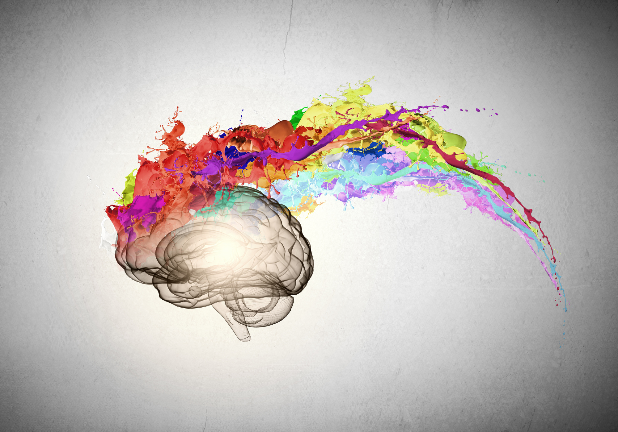
Another option is using an abstract design. Abstract images give off an air of elegance because they are visually like fine art. Since they do not depict actual objects or things, they do not become outdated.
Design Your Financial Logo
Most of the above tips have to do with planning and brainstorming a design. Complete that process, and you’re ready to create your logo. A quick and easy way is to use an online tool.
If you have any questions about using our logo design tool, please contact us.
7 Powerful Strategies for Creating the Best Ecommerce Logo Design
Posted on December 13, 2017 by Logo Design Tips and Tricks

What’s so important about eCommerce logo design?
Ecommerce is growing at a rate of up to 12%. That is good and bad news for your business. The competition has never been fiercer for online customers.
There are more opportunities to capture online consumers sales. Content-first strategies add value to the customer experience. Subscription services help you retain customers and increase value as well.
Does your brand offer heavy discounts at strategic times? This should be communicated in your logo and branding.
If you’re ethically sourcing, your marketing and logo should have a humanitarian element. Niche markets need specific branding elements as well.
All of these strategies center around a unique value proposition. You can offer customers something others don’t. Unless you’re Amazon, that’s the only way to compete.
The steps you take have a bigger impact than you think. Here’s how to get the most value after the most visual part of your business.
What Does Ecommerce Logo Design Have to Do with Value?
Your logo is often the first touchpoint consumers have with your business. The effort you put into ecommerce logo design will affect your chances of success.
Logos help consumers recognize your brand immediately. Your logo should reflect the unique aspects of your brand. It will become a symbol of quality and trust to your customers.
In time, your logo will be a vehicle for customer loyalty and advocacy. Keep these opportunities in mind during your ecommerce logo design.
We’ll review the practical and aesthetic qualities of your logo. Then we will discuss how they will affect your target market.
How Do I Get Started with Ecommerce Logo Design?
Your logo design should be part of your greater brand strategy. Developing your brand doesn’t begin with your logo. But it is a way to build a bridge between your brand and your customers.
Both your brand and your logo should not be created in a vacuum. How accessible is your logo to your target market?
Consider on what device your consumers will view your logo. Think about the circumstances in which your consumers will view your logo, and their specific tastes. These are just a few considerations moving forward.
7 Strategies for Ecommerce Logo Design
Why did you create your ecommerce business? Your path to success begins with this question. Here is how your logo design is a part of that journey.
Your ultimate goal is to service your customers. Your logo will be an extension of this. If successful, it will become a beloved symbol for you and your customers for years.
The following seven strategies will help you create an ecommerce logo that will provide lasting value for your business.
1. Understand Your Demographic
As an SMB, appealing to the vast majority of ecommerce shoppers might not be part of your strategy. Your logo plays a key role in penetrating niche markets. It also needs to make sense for your business.
You can study target demographics to learn what colors and designs appeal to them. You should consider certain images that resonate in this market. Creating variations on these well-liked symbols can boost your appeal.
If you’ve already had success with customers, look at their trends and analytics. Consider what types of customers are succeeding and which are not. Both factors will contribute to your new logo design.
2. Differentiate from Your Competition
You will face avid competition in any market. Competitors in niche markets may have more devoted customers than in others. You can capture your share of the market with personalization.
You can begin by looking at existing customers. Here are some factors to consider when looking at customer data:
Who are your best customers, people who shop with you regularly? And what is your bounce rate? These are people who visit your site then leave abruptly.
You should consider your customers’ lifetime value. The sales per customer over time will indicate the “stickiness” of your brand.
Identify if any customers are at risk. These are customers who may stop buying from you. What about your brand is turning them away?
Finally, How are you personalizing your logo for these customers? Understanding why customers buy or bounce can create opportunities for a better design.
Take your findings to a logo design professional to add nuance to your design. Your new logo can suggest improvements to happy customers. It can suggest positive changes to unsatisfied ones.
3. Determine Your Message
What is your logo saying about your brand? Your logo should make a clear statement to customers. It will be their starting point for their relationship with your brand.
There are several brand elements that can help you determine your design. Is your brand exciting? Is it wholesome?
Are you providing a service? Is what you are selling for children? Any of these can factor into your design.
4. Think About Longevity
What is the long-term value of your logo? You can’t commit to a logo you plan to change a year later.
Your logo should not be ambiguous. But it shouldn’t close you from opportunities to expand your business. Be sure you’re not committing to a value statement that is short sighted.
You may want to expand into new markets in the future. You may want to appeal to different demographics. There are resources that can help you strike a balance between an inclusive and targeted design.
5. Select Design Elements
There is a psychology behind logo design. Most consumers claim a logo’s color is a top contributor to their decision to buy.
The two most important logo qualities are shape and color. Consumers will develop a first impression based on these elements.
Another factor is representation. A baker might include wheat in their logo, for example. A skateboard company might choose fire and skulls. Neither appeal to the same demographic.
You can learn about your target market by looking at your competitors’ logos. Determine how you will distinguish your logo from successful ones.
6. Optimize Your Logo for All Platforms
Ecommerce shoppers will access logos on different platforms and devices. You need to optimize your logo for each of them. Failing to do so could drive away business.
When optimizing your logo, you should consider how it will appear on all major browsers. Also consider how it will look on all types of PCs and mobile devices.
Do you have a mobile app? Your logo should be optimized for mobile display. If you have a responsive website, ensure your logo will adapt to all variations.
7. Include Your Logo in Your Brand Strategy
Your logo is only a representation of your brand value. You’ve designed a winning logo. How will it be a part of your experience?
Will you have secondary logos? Are you part of an affiliate program? Dropified app affiliates create logos specifically for referrals.
Consider the factors outlined in ‘Determining Your Message.’ Whether you’re selling humanely sourced dog treats or intense thrills, your logo will accompany those messages and experiences.
You’ve got a clear idea of how you’ll change your customers’ lives. Now give them something they’ll recognize and share. Your logo will be a vehicle for business success.
Getting Started is Easy
Anyone can achieve a high-quality ecommerce logo design. Contact Online Logo Maker and begin crafting your successful logo today.
Does Your Company Logo Pass the Color Psychology Test?
Posted on December 13, 2017 by Logo Design Tips and Tricks
You’ve created a logo design for your company. You’re excited about how it looks, you’ve gotten good feedback from coworkers, and you’re ready to debut your new brand. But have you checked to make sure that it passes the color psychology test?
People tend to have the same reactions to colors, which means that marketing executives can predict how consumers will react to a logo. Every color has a different connotation, and you want to make sure that the colors in your company’s logo are sending the right message.
Read on to discover how to find the right color for your company.
1. Learn How To Pass The Color Psychology Test
Before choosing a color for your company logo, you should know what kind of message you want to send. Do you want people to see your brand as something expensive and exclusive, or do you want to seem affordable? Is your image young and fun, or stable and dependable?
The color that you choose has a huge impact on what people will think of your company. Since green is associated with nature, for example, companies usually use green if they want people to associate health or environmental friendliness with their brand.
On the other hand, companies use red if they want to give the impression of being bold or daring.
If you don’t know the psychology of color, your business could be giving the wrong message without realizing it.
2. Remember Gender
Men and women respond to color differently, so you should know who your target audience is and choose your colors with them in mind.
23% of women list purple as their favorite color, for example, while only 1% of men do. If you’re using purple to market your company towards men, you might be turning customers away without even realizing it.
Similarly, pink is still seen as an exclusively feminine color. If you’re not creating a women’s lifestyle brand or something similar, you should tread carefully using colors in shades of pink.
Colors like blue, white, silver and black are more neutral. You can even combine these colors for great results — check it out!
3. Use Emotion
How do you want people to feel when they see your logo? Emotions are a huge part of marketing, and they’re also an important aspect of the color psychology test.
Yellow inspires people to feel happy, hopeful, and optimistic. Think about the McDonald’s iconic golden arches, for example, and how their marketing always tries to inspire a feeling of happiness.
Blue, on the other hand, is a color that signals to the consumer that they can trust your brand. It’s a common color for finance and healthcare industries to use.
Design Your Logo Today
Now that you know how color can influence what people think of your business, use your new skills to create your logo. Our online logo maker helps businesses create the perfect logo for them, even without graphic design experience.
How will you use color in your business’ logo? Are there any tips that we missed? Let us know in the comments below!
How To Create The Perfect Toy Company Logo
Posted on December 13, 2017 by Logo Design Tips and Tricks

Children are all about visuals. When something pops out at them that they like, it doesn’t matter what it is. They want it!
If you’re marketing to kids, it’s not enough for the toy to look cool. All the branding has to be eye-catching.
Does your toy company have a boring logo? It won’t matter how great your product is if your logo isn’t great, too.
Every toy company needs a great logo to grab children’s attention and bring in sales. Read on to learn how to create the perfect toy company logo.
Think About Your Target Audience
Sure, you know that your target consumers are children. But, to have a really great toy company logo, you should know even more about your target audience.
This will affect other decisions you’ll make for your logo as you work on the design.
What’s the exact age group and gender you’re aiming to sell to? What will appeal to a 4-year-old might not have the same effect on a 7-year-old.
After you know the “who,” you’ll have to figure out the “how.”
How Will Your Logo Be Used?
The way your logo will be used should directly influence your design.
Will you be using your toy company logo on tiny letterhead? Maybe blown up and used on a trade show booth?
If you’re using it across a lot of platforms you have to design accordingly. The logo will have to look just as attractive at all sizes.
A certain font you want to use might only be legible at a large size. Something that looked great on a small logo could look blurry when expanded.
Using a free logo maker can be beneficial if you plan to use your logo for different things. The logo you made doesn’t look perfect blown up to a bigger size? Design another, similar logo that works for the larger size.
When designing a logo on your own, you have more freedom to play around.
Use Other Logos Only for Inspiration
When dreaming up the design for your toy company logo, look to other logos for inspiration.
Look at logos of competing brands. Take note of what you like. Ask yourself what worked for that logo.
Notice the things you would change. You can even get inspiration from logos you don’t like at all. What made that logo so unsuccessful to you?
Consider all of this new information when you’re designing. But, make sure it stops there. The last thing you want to do is make your logo too similar to someone else’s.
Logos are a huge part of brand recognition. When people look at your logo, they should only be thinking about your company.
People will be wondering what that logo reminds them of. The worst case scenario is they confuse your company with another.
The design should be unique and so should the color scheme.
Choose the Right Colors
Choosing the right colors for your logo is one of the most important aspects of design.
Color is a big part of brand recognition. Research shows that consumers make a judgment on a product with 90 seconds of viewing it. Over 60% of that judgment is impacted by the color of the product.
The right color in your logo can make or break how people judge your brand. That’s why you should take some time considering the best color scheme to use.
Go back to thinking about your target audience.
Maybe your primary consumers are 8 to 11-year-old girls. Your first thought might be to make your logo princess pink. Perhaps that’s the right choice for your brand.
But, consider if your product is something boys would enjoy as well. A pink logo will be immediately alienating to them.
Perhaps a more neutral shade would be a better choice.
Click for more inspiration for a toy company logo. It’s a great example of color usage and simple, streamlined design.
Keep it Simple and Streamlined
Think about some of the best logos you’ve seen from the biggest brands in the world: Apple, FedEx, Facebook. One thing they all have in common is that their designs are simple and sleek.
If your logo has too much going on, it will immediately look amateurish. Less is more.
But, that’s great news for you!
You don’t have to be an artist to design a logo. There’s no need to add a bunch of bells and whistles. A simple picture or the name of your company in a nice font will make the biggest impact.
Active vs. Passive Logos
How can a logo be active or passive? They’re two-dimensional, after all.
What makes a logo active or passive is the story that it tells.
Think again about the Apple logo. When it was first designed, it was just an apple. Later on, they revised the logo to have a bite taken out of it.
That’s active. Someone is eating the apple.
The Twitter logo is another example. The original logo design was the bird sitting idle. The revised logo shows the bird in flight.
The Twitter bird is flying off to send your tweet out to the world.
When thinking about your logo, ask yourself, “what’s the story I want to tell about my brand?” How can you make that story more active?
You’re Ready to Design Your Toy Company Logo
With these tips, you’ll be well on your way to designing a great logo for your toy company. Take some time to sketch and brainstorm. The more effort you put into dreaming up a great design the happier you’ll be with the final product.
Are you not sure you’ll be able to figure out how to design a logo on your own? It’s easier than you think.
Before you get started, check out this logo maker tutorial. By the time you’re finished reading you’ll know exactly what you’re doing.


