Creating a Fashion Logo to Rock Your Brand
Posted on November 10, 2017 by Logo Design Tips and Tricks
How important is a logo, anyway?
It’s actually pretty dang important.
So, designing a trendy fashion logo that will set your brand apart while depicting your style may seem overwhelming.
That is why we’ve created a list of four essential characteristics that will help you create a fashion logo you’ll be proud to wear.
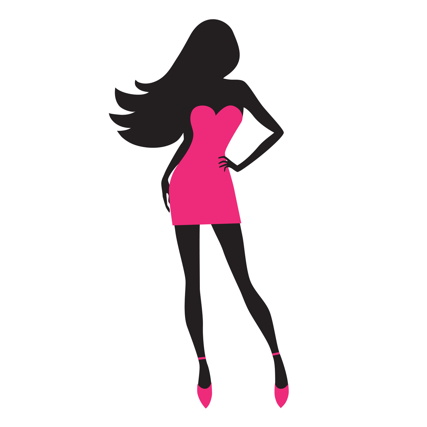
Match the Logo to Your Fashion Style
What styles are you selling? What is the personality of your clothing brand(s)?
Your logo should answer these two vital questions.
For example, Pin Up Dresses incorporates vintage colors and an old-timey frame of a busty woman to perfectly market their sexy vintage clothing.
Know Your Market
Who are you selling to?
Create a fashion logo that fits the taste and lifestyle of your target audience.
If your shoppers are primarily young professionals, then your logo should be clean but also modern and trendy.
If your shoppers are young women who want to look hot in a Halloween costume, then don’t be afraid to create a more mature logo.
Find how to define your target market here.
Stand out Against the Crowd
Fashion logos, especially, should creatively stand out against competitors.
One of the easiest ways to attract attention is to be visually appealing and different.
Research the logo trends within your fashion niche, including colors and fonts. Try out different options that will set your brand apart.
Color
Science shows that the colors you choose have a huge impact your brand’s visual identity. Be sure to choose to colors that not only fit the mission of your brand, but also appeal to your target audience.
For example, if you’re selling children’s clothes, then choose colors that are bright and playful.
Fonts
Like colors, fonts also invoke feelings and quickly prioritize the text for the audience.
Choose fonts that portray the style of your fashion brand and highlight what you’re selling. For example, use a bold-faced font to feature the specific clothing style like “dresses“.
Simply Grab Attention
When all else fails, follow two rules.
One: make sure your logo is simple enough to understand
Two: make sure your logo grabs attention and creates interest.
When your audience sees your fashion logo, they should immediately understand exactly you’re representing.
They should not only know you’re representing fashion, but have an idea of what type and style of fashion that is.
In addition, your image should stick in the minds of your audience.
Research has proven that relevant images not only build retention, but also lead to higher engagement rates on social media.
Let’s Get Rockin’
So, you’ve thought about the style and personality of your brand.
You’ve pinpointed your target market.
Now, you’ve got the essentials to designing a rocking fashion logo in the back pocket of your favorite denims.
I’d say you’re ready to get designing!
Onlinelogomaker.com has all the tools you need to create a visually appealing, relevant, and artistic logo. Get started by watching the helpful tutorials here.
6 Things You Can Learn from Iconic Music Logo Design
Posted on November 10, 2017 by Logo Design Tips and Tricks
Music is one of the most unifying symbols in all of the world. People from all different cultures and backgrounds love and cherish it. That’s why your music logo design needs to be unifying as well.
If you want your logo to be recognized and enjoyed by a large population, it’s time to take some notes from some of the most iconic music logos of all time.
Here are six lessons we can learn from the most well-recognized music logos.
1. Follow Your Own Style
While looking through dozens of logos, it’s easy to see that there is no one right style.
Instead, the thing that makes all of the best logos memorable is that they connect well with the music being played. For example, imagine seeing a jazz band with a logo that resembled KISS.
It would probably seem a bit jarring. Why is that? Our brains associate the sharp and bold letters with hard rock or heavy metal type of music.
Jazz, on the other hand, represents music with quite different characteristics. What works for one style might not work for another.
The better you understand the music that is being played, the easier it will be to find the right style for your music logo design.
2. Add the Instrument
The next lesson is to incorporate the star musical instrument. This can be an effective way to add recognition to your logo.
By adding an instrument into your design, you are giving a hint to your audience what your music is going to be like before you even begin playing. This will help build the excitement.
Also, if your logo is crafted well, it will help improve the audience’s perceptions of you from the start. In fact, did you know that sense of sound and sight are often intertwined?
A study was done on the comingling of senses. The more often the brain sees a symbol and associates it with a sound, the more memorable it will. Also the more likely it will hear the sound when it sees that symbol.
This is a great way to help your music to become well known. Don’t worry if you don’t have an instrument and you rely purely on your voice, just add in a microphone!
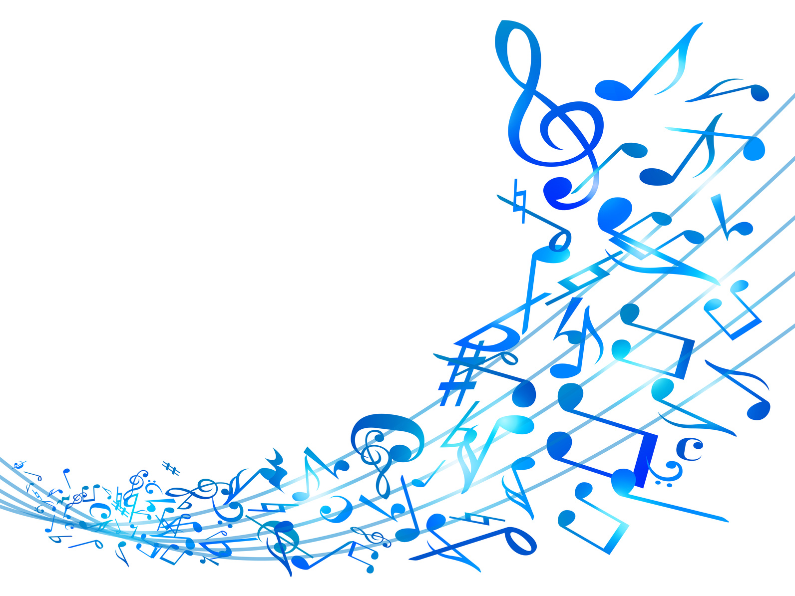
3. Play with Musical Symbols
Another great option is to add in musical symbols. Many of the most iconic music logos have a fun musical symbol hidden away.
This not only makes the design more fun but it delights the audience as well! This is an especially great option if you don’t have just one instrument that you feel like you can incorporate.
Some popular musical symbols are:
- Notes
- Sharps or Flats
- Treble or Bass Clef
- Expression Symbols
There are many other musical symbols besides these. However, these are the most commonly known ones.
Expression symbols refer to the parts in the music that tell you how to play the note or phrase. Things such as fermatas and crescendos fall in this category.
Take care when choosing your symbols. Just like when choosing the style of your music logo design, you also need to choose symbols that correspond to the type of music being played.
For example, it wouldn’t make sense for a bass player to have a logo that includes the treble clef when they never play in that register.
Try recording your music with Eastwood Sound and Vision, and write down the symbols or sounds that stick out most.
4. Keep it Simple
The fourth lesson we can learn from iconic musical logos is to keep it simple. It may seem tempting to put the face of every band member on your logo. However, this probably won’t become an iconic music logo design.
It’s important to keep in mind that your logo has to be simple and easy enough to understand whether it’s the size of a stamp or up on a billboard.
Small details can easily get lost, especially when the logo is shrunk down in size. Also, the more details and features you have on your logo the easier it is for them to become a distraction.
Decide beforehand what you want your logo to represent and then add only those elements that uphold that idea.
5. Make it Readable
The fifth lesson is to make sure your logo is readable. This of course only applies if you have typography in your design.
Typography can play a huge role in any logo design. Big blocky fonts mean something completely different than thin cursive fonts.
There’s a reason we don’t see metal bands with cursive fonts. In our brains, they just don’t go together. That’s because fonts and typography have subliminal meanings for all of us.
If your music is heavy and loud, choose a font that mimics that feeling. If the music is more lyrical and sweet, look for thin and elegant fonts.
Check out our guide for how to choose the right font. And remember when you are choosing one that it needs to be readable as well.
If you have any concerns about this, ask someone not involved what they think it says.
6. Be Unique
The last lesson we learned while looking at the most iconic music logos is to be unique.
This can be difficult with all of the hundreds of thousands of music designs floating around the world right now. However, if you want your design to be remembered it needs to be different.
Find what makes your music different and unique and think about ways to incorporate it into your design. Don’t be afraid to start over. Sometimes the best ideas come after multiple failed attempts.
Create Your Perfect Music Logo Design Today
Need more help making your perfect music logo design? Luckily we have just the thing for you! Check out our 5 tips for creating a killer music logo design.
By following these steps you’re sure to create an amazing logo that will take your band or songs to the next level.
Have questions about any of our tips? Send us a message! We can’t wait to help you create your dream design.
4 Logo Tips for Your Industrial Supply Company
Posted on November 10, 2017 by Logo Design Tips and Tricks

Your industrial supply company is one of the best. Shouldn’t your logo be one of the best as well?
Your branding is one of the first ways your customers interact with your company. It can even affect their perception of your company before they even use your product or service.
So whether you’re rethinking your logo or making it for the first time, here are four logo tips that will win your customers over from the start.
Finding The Logo For Your Industrial Supply Company
1. It’s Timeless
The first tip is to design your logo so that it stays timeless. What is popular today probably won’t be popular in 10 or 20 years.
Oftentimes people that design based solely on today’s trends, find themselves redesigning their logo every time those trends go out of style.
Logo redesigns won’t kill your business. However, they should be avoided as much as possible. Otherwise, you will lose some of the memorability of your brand.
Instead be sure to choose symbols, colors, and design trends that are classy and timeless. This will ensure that your logo benefits you for years to come.
2. It Follows Psychological Patterns
The next tip to designing your logo is to follow the psychological patterns. Did you know shapes portray meanings to our brain that we might not even recognize?
Our brains tend to associate circular and round shapes with unity, feminity, and endurance. On the other hand shapes with angles, such as triangles and squares, represent power, masculinity, and stability.
When adding new symbols, choose ones that coordinate with your desired branding.
3. Think about Social Media
The third tip is to think about how to use your logo on social media.
Social media is a growing channel for most businesses. As you design your logo think about how it will be shown are social media. Is it recognizable in a thumbprint photo? Is it easy to add to your photos and posts?
Knowing the answer to these questions will give you a leg up on the competition.
Another way to get ahead is with Source 4 Industries. They provide useful materials for any industrial supply company.
4. Don’t Be Afraid of Color
The last tip is not to be afraid of color. Did you know color increases brand recognition by 80%? With these kinds of statistics, there’s no reason not to add them.
Just be sure that you also create a black and white logo for circumstances when you can’t use your colored one.
Another thing to keep in mind when adding colors is that they can mean different things for different people. For someone blue might represent sadness, while someone else might consider it calming.
Thinking about adding in red? Check out what a red logo does for your company and branding.
Get Started on Your Industrial Supply Company Logo Today
These tips will help you create a great industrial supply company logo. However, if you are still looking for more tips, you can check out our guide to choosing a logo.
Or you can comment below! We love hearing your questions.
Why Are Flat SaaS Logos So Popular?
Posted on November 10, 2017 by Logo Design Tips and Tricks

The art of logo making is a blend of creativity, strategy, and character.
It pushes designers to use classic skills to make something completely unique and timeless. Many individuals making logos will go through various stages of editing before deciding on a final product.
Much of the time, this process will include playing with flat design as well as drop shadows and other real-life effects.
While popping logos and bold aesthetics may work for some companies, SaaS logos have seen more success with flat design.
Here are some of the benefits and basics of using this style for your SaaS branding strategies.
What Is Flat Design?
Flat design is defined as a simple, minimalistic approach to aesthetics.
Rather than playing with abstract icons and fancy details, it aims to get straight to the point. Flat design leaves no room for interpretation. It allows brands to communicate a clear, concise message and helps users better recognize their preferred SaaS companies.
The main goal of this stripped-back style is to focus on usability.
Not only does it make things easier to understand, but it creates a sharp distinction between the tech world and other objects. SaaS logos with a foundation in flat design will often feature bright colors, sharp edges, and stick to a two-dimensional platform.
It allows users to understand logos at a glance, rather than having to figure them out.
SaaS Companies Using Flat Design
Don’t mistake the simplicity of flat design for boring. Just look at SaaS logos like Hubspot and Trello.
Hubspot’s logo is mostly a plain typeface. There are no bold curves or fancy scribbles, but there is a timeless feel to the way each letter flows together.
Mix this with the bold, network-like “o”, and this SaaS logo is a force to recognize. The network shape speaks to the culture and purpose of Hubspot, without going over the top or being too much.
Trello’s mix of fun lettering and a simple icon is the pinnacle of what flat design can do.
With just one sleek work board, the possibilities of project management are communicated. Trello works to make managing an easier, more streamlined process for all parties involved.
Add the character of the lettering and the innovation of the company easily shines through. Everything is tied together with one shade of blue, which is rather subtle. This logo is a true balance of bold design and classic communication tactics.
The Basics of Flat Design for SaaS Logos
Shapes
The use of flat design allows developers to make shapes stand out.
Instead of relying on drop shadows, attention is naturally drawn to certain shapes and logo elements. The simple foundation creates a spotlight for the fun elements to take center stage.
Think of Genio cleaning software for example. Although this SaaS logo plays with color gradients, the clean-cut typeface instantly draws attention to the genie bottle in the “o.”
There is no need for fancy details or strong digital effects. The mix of flat design principles and the need to create something unique are enough to make a bold impression without trying too hard.
Colors
Another way to add character to SaaS logos with flat design is to embrace bright colors.
Colors create a mood. They attract the eye and enhance the user experience.
Some SaaS companies use a mix of bold colors with more subtle tones. The subtle details create a bigger pop for certain parts of the logo. Other companies have successfully broken traditional color rules.
Google, for example, has a bold mix of primary colors.
They took a chance in bending conventional rules about what color mixtures to use and which to avoid. Now, all Google products are easily recognized. They are consistent from the traditional logo to other services like Chrome, Maps, and Google Home.
Colors are a crucial aspect of branding. Your brand colors will be used on all your company logos and business cards. They are an integrated part of your software’s interface, too.
The more you play with colors from the beginning, the more room you have to mix things up as your product line expands.
This is one of your biggest opportunities to stand out when using flat design. Take it and run with it as you choose between different options for logos.
Adaptability
Another bonus of flat design for SaaS logos is how well everything adapts on different devices.
Your software is likely going to be accessed from a desktop, mobile phone, and tablet. A strong logo looks good on all platforms. It performs well blown up on a television when screen sharing, as well as on a small phone screen.
Making such transitions easier for users creates strong brand recognition.
It speaks to your company’s attention to detail and commitment to interface excellence.
For companies looking to launch new product lines entirely, a strong logo can help tie everything together. It makes your company versatile, yet united.
Designing for Character and Function
At the end of the day, the main purpose of SaaS companies is to make life easier.
No matter if you’re operating in the business sector or developing a new health app, your product should improve everyday systems and operations.
As such, make it a point to design a SaaS logo that speaks to the ease of using your product.
Having a foundation in flat design gets the message across loud and clear. It makes users focus on who you are and what you do.
Flat design takes out the guesswork.
It creates a subtle balance of unique shapes, bold hues, and simple typography. Together, all the elements come together to make your services stand out.
Build Your Custom SaaS Logo
Making a logo from scratch is not as difficult as it seems when you use the right resources.
Sometimes, all it takes is recognizing what industry trends are working and why. If you are building your SaaS brand, try flat design in your next round of logo ideas.
You may be surprised at the powerful designs you come up with, and how well the final product performs in your market.
To get to work on creating your logo, click here.


