How to Create a Fabrication Logo for Your Metal Shop
Posted on October 09, 2017 by Logo Design Tips and Tricks

It’s no longer enough to be a seriously talented fabricator. Even opening up a metal shop is not enough. With so much competition, steps must be taken to separate one metal shop from another.
That’s why branding is necessary. It’s a way to help others recognize the work and associate it with a particular company.
One way to brand is by creating a fabrication logo. Not sure how to create one? Keep reading to learn how.
Start By Matching the Style to the Industry
Think about some of the most easily recognizable logos around. Companies like Coca-Cola, Target, and IBM all have logos that make sense for the type of industry they represent.
It’s a smart idea to take a look at what other metal shops have as their logos to get some ideas. Then choose one that best represents the work being performed.
Keep in mind that colors, words, and artwork are all part of the branding package. Good branding that lasts shouldn’t confuse anyone.
Have it Represent the Companies Core Values
Every part of a fabrication logo represents what a metal shop is about. Every company should have core values, meaning the reason why that company started to produce work in the first place. Even companies like DECIRON, which makes iron railings, has core values they want their customers to understand and relate to.
A well-branded logo will represent all of that. So be sure to match the design to the companies vision, who the target audience is, and of course, the benefits of buying from the company.
Fonts, symbols, and pictures are all part of representing core values, so make sure that if there are preferences, that they are shared with the logo designer.
Keep It Simple
It would be confusing if Ben and Jerry’s ice cream featured a pig on their packaging. Or if SquareSpace featured a circle on their logo.
A well-branded fabrication logo isn’t about bringing out every bell and whistle, it’s about creating something that makes an impact and is memorable. If it’s too confusing, people will ignore it.
So keep the logo simple and memorable so customers can easily identify it with the great metal work that’s produced by the company.
Make It Stand Out From the Pack
The competition today for any business is fierce. It’s no longer enough to just have a storefront sign and think business will take care of itself.
This is especially true if the work isn’t being provided for just a local area. It has to stand out to get people to take notice. So make sure the color, theme, fonts, and wording means something and are memorable.
McDonald’s golden arches stand out everywhere it’s featured because it’s so memorable. The Mercedes Benz symbol is another logo everyone can quickly envision because it stands out from the pack.
Make the Fabrication Logo Relevant for Now and the Future
Most companies want to stay in business for a long time. It’s vital to choose a logo that can stand the test of time.
Jif has used the same logo since 1966. So keep in mind the future when envisioning a logo. What’s trendy now might not be so relevant in five or ten years.
Start Creating a Logo Now
Creating the perfect logo for branding purposes doesn’t have to cost an arm and a leg. In fact, with our free logo maker, anyone can make their own logo in 10 minutes or less.
Not sure how to get started? That’s okay, check out our tutorial to learn how.
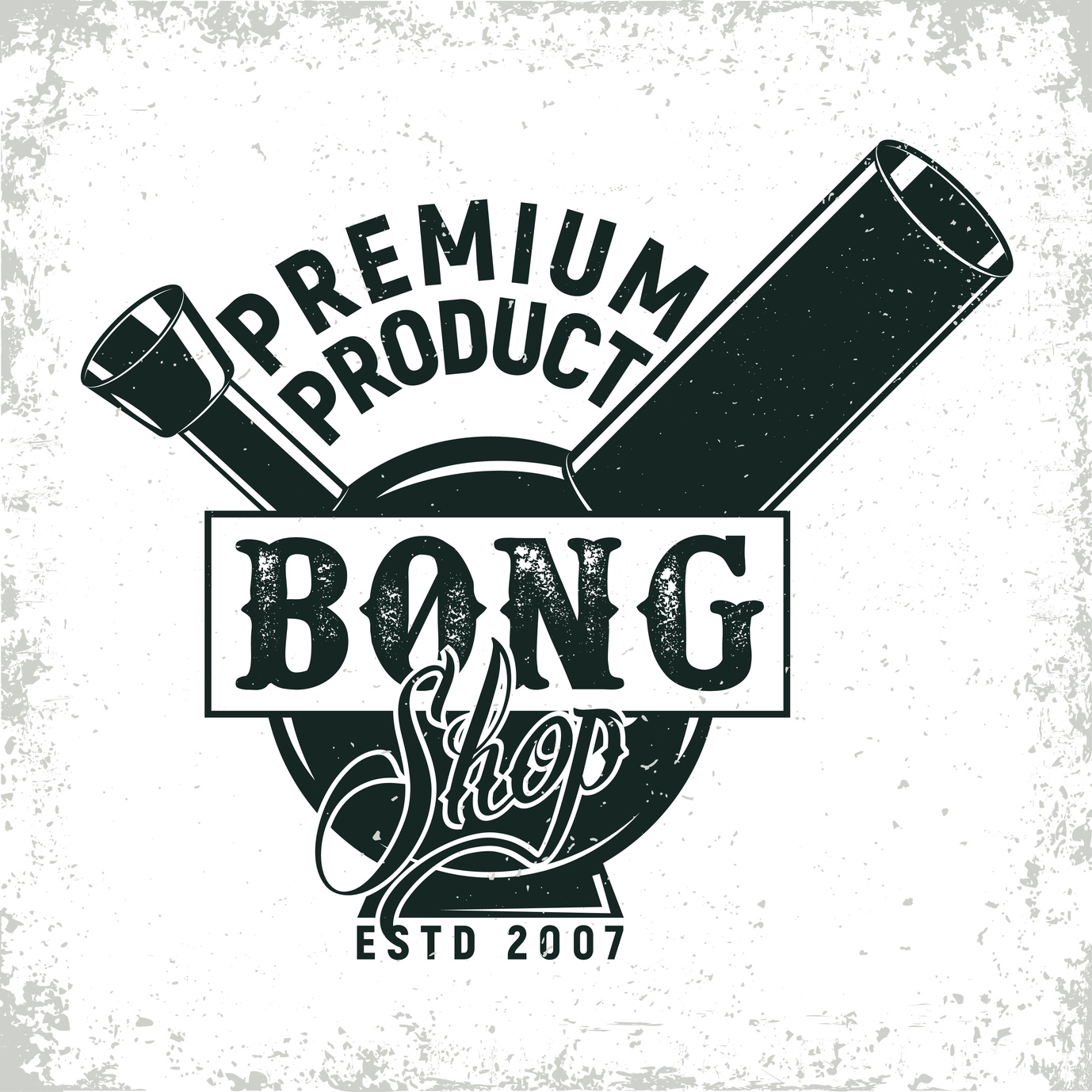
3 Bong Logo Design Tips Your Headshop Needs
Posted on October 08, 2017 by Logo Design Tips and Tricks
With weed stocks going through the roof and marijuana becoming legal in more and more states, there’s never been a better time to get involved in the smoking industry.
Whether you already have a company or are looking to get involved, it all starts with the right logo design. You need a logo that helps you stand out, get noticed, and land sales.
If you’re unsure of where to get started, keep reading to learn about 3 bong logo design tips that your headshop needs to know.
1. Avoid Short-term Trends
It can be tempting to jump on the bandwagon and create a logo that reflects designs or trends that are popular right now.
Many companies are integrating marijuana leaves into their logos. But the spike in popularity of anything marijuana-related won’t last forever.
Instead, consider creating a more classic, timeless bong logo design. Simple shapes and decorative elements, solid colors, subtle patterns, and the right typography all work together to create classic designs.
The exception to this rule is if your company specializes in marijuana sales as well as bongs. If so, then incorporation marijuana references is a great tactic to help target potential clients and let them know what you’re about.
But even if you choose to incorporate these references, it’s still a good idea to strive for a sleek, classic look.
2. Consider Your Brand or Audience
If you’re looking to redesign your logo, your company likely already has a brand or style that you use to make all of your materials cohesive.
Unless you’re redesigning your brand as well, your new logo should reflect your brand.
If you’re a new company looking to create your first logo, then you have a little more freedom. Your logo is a great place to establish the branding that you’ll want the rest of your company’s design to reflect.
To start creating that brand, think about your audience. Do you target mostly younger customers? Older? Are you located in a town where smoking is viewed as a fun recreation?
Each of these questions can help you create a logo that will target the wants of your clients. For instance, a fun, youthful logo will target young customers who enjoy using bongs for fun. A more classic design will better target older customers.
If your customers are many ages and from many different backgrounds, you’ll need a logo design that targets all potential customers.
3. Make it Unique
Your company is unique. Maybe you offer custom designs. Or you have unique color and pattern options. Or, like Brother with Glass, you have an extensive inventory and are known for great customer service.
The last thing you want to do is create a logo that looks just like that of your competitors.
While looking at other bong logo designs can help spark creativity, take care to make sure that your logo is entirely your own. Use different fonts, shapes, and colors to make your design unique and recognizable.
Creating an Awesome Bong Logo Design for Your Company
With these tips and a little creativity, you can create a bong logo design that helps you and your company stand out from the crowd.
If you need a little help creating your own awesome design, our free logo maker can help! Our simple tool makes it easy for anyone to create an outstanding logo. Check it out to start creating your own today!
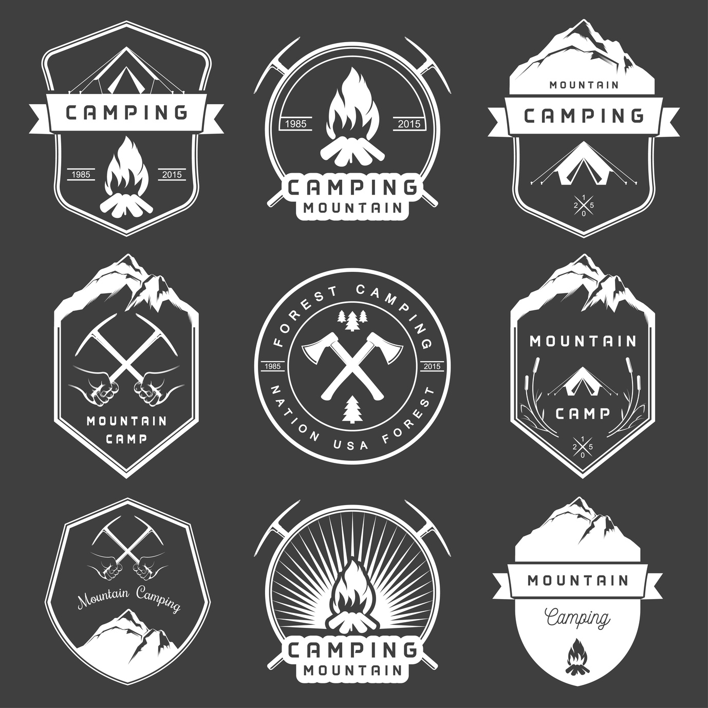
5 Smart Logo Design Tips for Camping Supplies Companies
Posted on October 08, 2017 by Logo Design Tips and Tricks
In designing a logo for a camping supply company, it is important to use SMART logo design tips to make the process easier.
What does the acronym “SMART” stand for?
Simple, Memorable, Appropriate, Resizable, and Timeless.
These rules are the perfect guidelines for how to create a quality logo for a camping or outdoor supply company. Keeping things “SMART” provides a way to double check a logo once it is finished.
Read on to learn tips based on this easy logo lingo.
1. Keep it Simple
Simplicity is key in developing a logo and increasing brand recognition.
Simpler logos are easier for consumers to recognize. It’s difficult to convey any clear message through a complicated logo.
Think of some of the most familiar logos that we are see daily: Apple, Starbucks, and McDonald’s. One of the key components of these logos is that they are all straightforward and clean.
Adopt a “less is more” mentality in designing a logo.
2. Make it Resizable
There is no telling where your logo will end up. Promotional materials could range from small pens and t-shirts to stickers and large posters.
This means that it’s important to design a logo in vector format. This ensures that it can be resized to fit anything perfectly, without loss of picture quality.
3. Ensure it’s Memorable
Human attention spans today are comparable to that of goldfish.
Most of that information we process will never be remembered. When it comes to smart logo design, simplicity helps with a person’s memory. Other factors could include color, icons, or font.
Think about the design, and consider the different shapes and colors that will be used.
Frame it for the audience of outdoor-friendly people. Don’t overestimate the attention span or memory of individuals.
4. Consider if it’s Appropriate
Your target demographic should be on the forefront of your mind during the design process.
A simple swap of logos from different brands can convey an entirely new message to the consumers.
You don’t want the logo to be too fancy for the audience that loves the sun and the dirt of the outdoors. You want the brand’s message to come through.
Think about what they like, and try to encapsulate their interests into the style of your logo.
5. Keep it Timeless
The last thing you want is to create a smart logo design that doesn’t stand the test of time.
Memorable logos change little as decades pass. Don’t design something that is “trendy.” Instead, make something that is going to stay relevant and on-brand for many years to come.
Keep it unique to your brand, and never worry too much about what others are designing.
Smart Logo Design for Camping Supply Companies
One example of a camping supply company with an excellent logo is everstryke pro.
It is simple, timeless, appropriate, resizable, and memorable. It also promotes the brand of everstryke firestarter well.
All and all, the is no one system of designing a logo, and that is the beauty of creativity.
The best thing to do in the design process is to consider all the points you would like to accomplish with the design through this basic SMART outline.
Ready To Get Started?
If you need help creating your camping logo, feel free to check out our free logo maker. Or, you can choose from one of our hundreds of templates.
What’s your favorite method to creating the best logos? Let us know in the comments below.
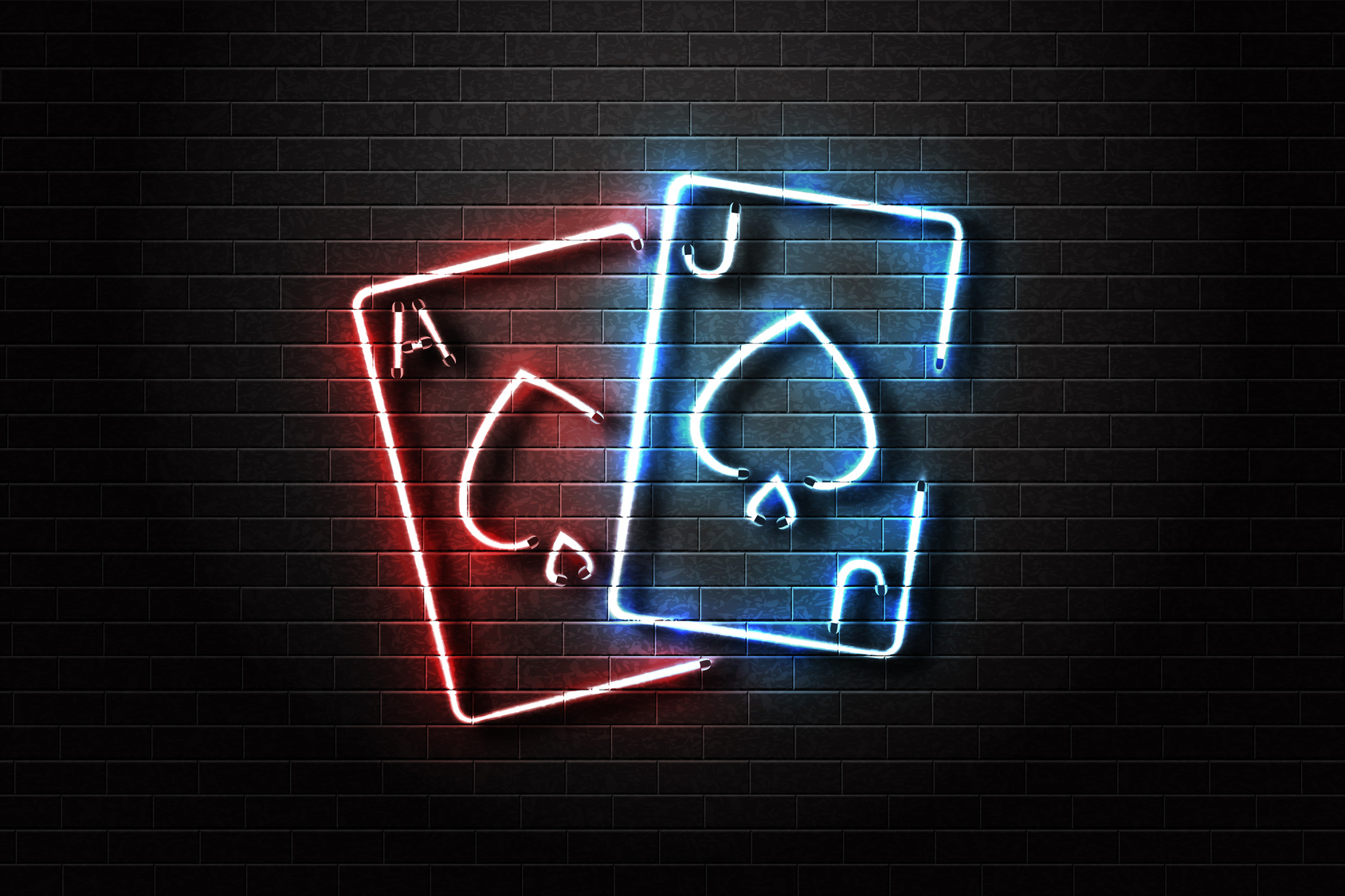
What Makes a Highly Successful Casino Logo?
Posted on October 08, 2017 by Logo Design Tips and Tricks
Few aspects of your business are as important as your marketing logo. It’s how your casino is represented to the world. And since you’re facing some pretty remarkable competition, you’ll need to make sure you’re getting the most out of your logo.
Whether you’re starting a brand new casino business or just looking for a redesign, you don’t have to be an artist to create a great-looking logo.
Here are some of the most important elements to help you create a successful casino logo.
Elegance And Simplicity
Some logos are just too busy for their own good. Be it too many colors or too many images, your customer can get distracted quite easily if you’re not careful.
That’s why it’s important to make efficiency and simplicity your biggest target goals. After all, some of the most effective logos in history are simple. Apple’s famous logo doesn’t even feature any text!
Sensory overload is a very real phenomenon. So when you’re beginning to design your casino logo, ask yourself, “Could this be simplified?”
It Sets Your Business Apart
There’s no shortage of competition within the casino industry. Accordingly, you’re going to need to set yourself apart from the competition.
And while this may sound difficult if not hopeless, there are a few easy things you can do to diversify.
First, look at your competition’s logo. Take some time to digest their logo, including geometric shapes, colors, text, and images. While there will undoubtedly be a bit of overlap, try your best not to replicate their design.
You can also incorporate local elements into your design to give your casino logo a more region-specific design. MPL Casino does a great job of this. Notice the small leaf on their design, as well as the Canada-specific color scheme.
A Great Casino Logo Incorporates Color Psychology
Psychology has actually been a huge part of casino design for decades now, and you can use it within your logo. People have unique reactions to certain colors and associate them with certain feelings or memories.
For an example, think about reds, oranges, and yellows. You likely think of fall when the three colors are combined.
You’ll want to incorporate this same general principle into your logo design. What kind of mood are you trying to set with your logo? Simple and subdued (cool colors) or exciting and energetic (warm colors)?
Research color psychology and determine how you can use color to set the right mood with your logo.
Your Brand Should Steal The Show
It’d be great if every business was as successful as Apple, you’ll want to ensure that your brand is front and center. While it doesn’t need to be the largest graphic on the logo, it should be sizable enough that it can be read at a distance.
And each of the previous elements should be incorporated into your text. Remember, simplicity and elegance are key and you can use colors to set a mood.
Your Logo Design Matters
You can’t afford to have a poorly designed casino logo, so take efforts into your own hands. Use our software to create an exciting and effective new logo that your audience is sure to love.
You can have a brand new logo in just 5 minutes! Sign up today and see just how much of a difference your gorgeous new logo can make.


