5 Creative Real Estate Logo Design Tips
Posted on October 11, 2017 by Logo Design Tips and Tricks
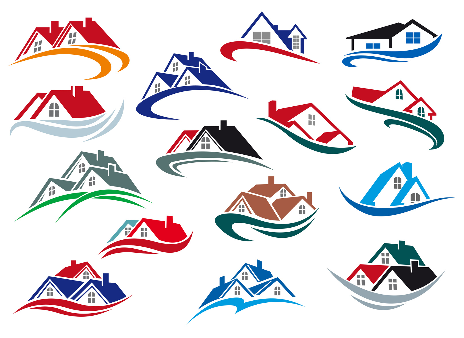
According to recent statistics, there are over 80,000 real estate brokerage firms in the United States. In order to stand out from the competition and make yourself known, it’s important to build a trustworthy brand. Spending time on your real estate logo design is one way to do this.
Your logo makes it easier for potential clients to remember your firm. They’ll see the logo posted on “For Sale” signs, and printed on business cards. This recognition will help build your credibility.
So what are you waiting for? Here are five easy tips for designing a great real estate logo.
1. Keep it Simple
One of the most important rules to remember when designing a new logo is to be simple. Complex logos that use too many colors or design features are hard to understand quickly. Also, it is easier for customers to remember simple logos.
When designing your logo, choose a basic color palette with 2-4 colors. If you decide to use a combination of graphics and text, select one graphic feature and one font for the logo.
2. Think about the Medium
No logo exists in a vacuum. Your logo will be used everywhere from your website, to your pens, to billboards. When designing the logo, make sure it will fit well and look good where you plan to use it.
If you plan to use the logo in many different kinds of places, you may want to consider making more than one version. This way, you can use the smaller or shorter version in places where there is less space to print.
3. Make Use of Colors
One of the factors that make logos so recognizable is the choice of colors. For instance, Coca-Cola is instantly recognizable because of its famous red and white color combination.
When choosing colors, consider what you want those colors to say about your brand. Colors like blue tend to communicate trustworthiness, while green indicates new beginnings, nature, or wealth.
4. Choose Your Font Carefully
No matter how interesting your color is, it will not be useful unless folks who see it associate it with your brand. For this reason, you want to make sure that the font you use to include your company’s name in the logo is clear and easy to read.
5. Don’t be too Generic
While your logo design should always err on the side of simplicity, it is possible to be too minimalistic. You want to add enough unique features so that your logo represents your brand specifically.
For instance, if your real estate business specializes in rent to own homes in Utah, it shouldn’t look the same as a business that sells luxury homes in Palm Springs. Make sure that the color and design choices align with your company’s image and mission.
Developing the Perfect Real Estate Logo Design
With these tips in mind, you will be able to create a unique logo that makes your real estate business stand out.
Ready to work on your new real estate logo design?
Check out our free online logo maker to get started today!
5 Elegant Logo Design Tips for a Financial Services Firm
Posted on October 11, 2017 by Logo Design Tips and Tricks

If your brand is a face, then your logo is the eyes. As a financial services firm, when people look into that logo, how do you want them to see you?
You’re within an industry that relies heavily on gaining customer’s trust. They need to feel safe and secure working with you.
The best way to communicate that through your logo is by creating an elegant design. You want to make someone stop and think, “Wow, they look credible.”
They say it only takes 10 seconds for a person to form an impression of a logo. Use these 5 elegant logo design tips to send the right message the first time.
1. Choose Symbols Carefully
The symbol you incorporate into your logo is its backbone. In the financial services industry, you have to be a little more cautious with what you choose.
But, that doesn’t mean you have to pick something totally overused and redundant. Check out Intrinio Fintech Marketplace for example. Their logo is an eggshell that is held together by graphical lines.
2. Keep it Simple
This is such an essential element to not just an elegant logo but to all logos. Your design can’t be too overbearing for your reader to look at.
When your logo is too flashy, you’re removing the message it’s trying to speak.
A good way to see if your logo is too out-there is to test it on a duo-tone background. This will show your logo in black and white, where you’re more likely to notice an error.
3. Create a Timeless Design
You want your customers to know you’ve been there in the past, present, and future. So, to show your company’s longevity, go for an elegant logo design that’s timeless.
Don’t go along with trends just because they’re popular right now. They will fade and depreciate over time. Instead, go for icons that won’t become outdated.
For instance, pick up on lighter versions of bold colors. For instance, light green, blue, and red are all colors that resonate well over time. (Just ask Coca-Cola.)
4. Show Welcoming Side
A great way to build trustworthiness is to show your caring side. One route financial service companies could take is to add a human element to their logo.
You could incorporate an animated figure in or personify other items. For instance, Hands on Banking shows a figure-balancing money, work, their home, and degree.
5. “Conservative Animal”
A highly popular trend in financial service logo design is to use animal imagery. You’ll see lions, bulls, deer antlers, etc. which usually communicate strength.
The key is to give it a modest look. You can use contrast colors and geometric shapes, or insert the animal into the typeface.
Need an Elegant Logo Design?
Our online logo maker is fast and easy for anyone to use. Simply create your design and save it to your account for later access to unlimited downloads.
Oh, and did we mention that it’s free?
So, let’s get started! Click here to create your new logo in under 5 minutes.
How Staffing Agencies Can Benefit From A Free Custom Logo
Posted on October 11, 2017 by Logo Design Tips and Tricks

When starting a new company or re-branding an existing one, your logo can mean the difference between catching someone’s attention or watching them pass you by. Staffing agencies have the added challenge of appealing to both job-seekers and employers, making an eye-catching logo a must.
But how do companies come up with an enticing logo? There are a few things to keep in mind as you brainstorm design options.
What Staffing Agencies Need to Know About Logo Design
A logo is often the first thing people notice about a brand. Take a look around and note of all of the items around you with prominent logos and labels.
From your laptop to your bottle of water, to your sneakers; all of these product brands can be easily identified according to their logo.
As a staffing agency, you want to be seen as approachable, reliable, and effective in finding the right candidate for a job. When designing a logo, think of these traits and how you can get them across visually.
If your agency’s name is evocative of an item, consider how you can incorporate that in your design. For example, think of Apple and their easily recognized logo.
Also, think about which colors best represent your company. If you want to highlight professionalism and trustworthiness, blue is your color. If you want to signify growth and learning, green will work well.
It all boils down to what you want people to think of when they see your logo.
Having a focus group to come up with words or phrases may help in determining what type of style, color, and imagery will help you accomplish your goals.
Need more inspiration? Take a look at the logo for Scope Recruiting, which incorporates geometric shapes in different shades of blue. The color blue makes them feel professional, while the different shades and shapes have a modern appeal to them.
How to Get Started with Logo Design
Thanks to free online web tools, custom logo design has become very user-friendly.
You can upload an image you’d like to incorporate, you can add text and adjust the size and fonts, add shapes, symbols, and more.
Again, you’ll want to do some basic brainstorming before getting started so you’ll have an idea of how you want the logo to look. Once you have that in mind, you can get started adding these features and see how they all come together.
And with free custom logos available, you won’t have to break the budget. No need to hire a professional designer or agency – you’re in control of the process from start to finish.
Reaping the Benefits of Your Logo
All businesses benefit from building a consistent brand image. Staffing agencies in particular need to work extra hard since individuals and companies are looking to them as experts in the field.
Having a well-thought-out logo will instill a greater sense of confidence that you have the skills and resources to get the job done.
In addition, as your agency builds a strong online presence and reputation, people will start to recognize your logo on its own. It also builds a foundation for a unified online presence, not only through your website but also through blogging and social media. Your logo can be used as a profile image across all networks.
To get started, check out this tutorial on how to build a free custom logo.
The Key to Designing the Perfect Renovation Logo
Posted on October 09, 2017 by Logo Design Tips and Tricks
Your logo says a lot about your business. A great renovation logo can grab a customer’s attention while setting you apart from the competition.
Our world is painted in brand logos. The best logos communicate to customers with a few simple features that stick in their minds and create familiarity.
If you’re about to design a new renovation logo for your business, there are several key factors you’ll want to keep in mind.
Let’s take a closer look.
Think Outside the Box
You want a logo that distinguishes your brand from your competitors. It’s vitally important that your logo clearly stands out from the rest.
While imitation may be the best form of flattery in some areas of life, that’s not true with logo design.
You might be tempted to throw a cliche industry icon into your logo.
Don’t do it.
Think of it this way, Apple’s logo isn’t a computer. Virgin Atlantic’s logo isn’t an airplane. Mercedes’ logo isn’t a car.
Think of what defines your business as being unique and incorporate that into your logo design.
Define Your Color
First, think about the personality of your renovation business.
While bold and bright colors might grab attention, they can also seem brash and out of place.
More muted colors boast of sophistication but could be more easily overlooked.
Did know that every color in the spectrum will bring a different feeling and emotion to your logo’s message?
It’s called the Psychology of Color and it works like this:
- Orange: Friendly, youthful and creative
- Red: Sexy, bold and energetic
- Green: Organic, instructional and growth-driven
- Yellow: Optimistic, inventive and sunny
- Purple: Evocative, spiritual and wise
- Blue: Medical, tranquil, professional and trustworthy
- Pink: Fun and flirty
- White: Simple, pure and clean
- Black: Powerful and credible
- Brown: Steady, rural and historical
You can see that many of these colors will convey specific messages about your renovation business that are very relevant.
For example, if you’re running a bathroom remodeling showroom, you’d want to promote tranquility (blue), boldness (red), and credibility (black).
Keep it Simple
You want your logo to have a balanced combination of quirky and simple. It has to be interesting but at the same time, you don’t want people sitting there analyzing it.
The FedEx logo is a good example. It’s a simple Logotype with a bit of a twist. The image uses negative space that creates an arrow which indicates speed, direction, and precision.
Amazon also uses only its name but refers to its vast amount of inventory with an arrow pointing from A to Z.
You can get inspiration from these, and other successful logos.
Your Renovation Logo Helps Define Your Business
These are a few simple tips to help you create a great logo for your chosen industry.
Take time to design a few different variations and run them past friends, family members, and long-time customers. Sometimes it takes another set of eyes to help you see what you couldn’t see on your own.
Now it’s time for you to get started on your new renovation logo.
Make it great!


