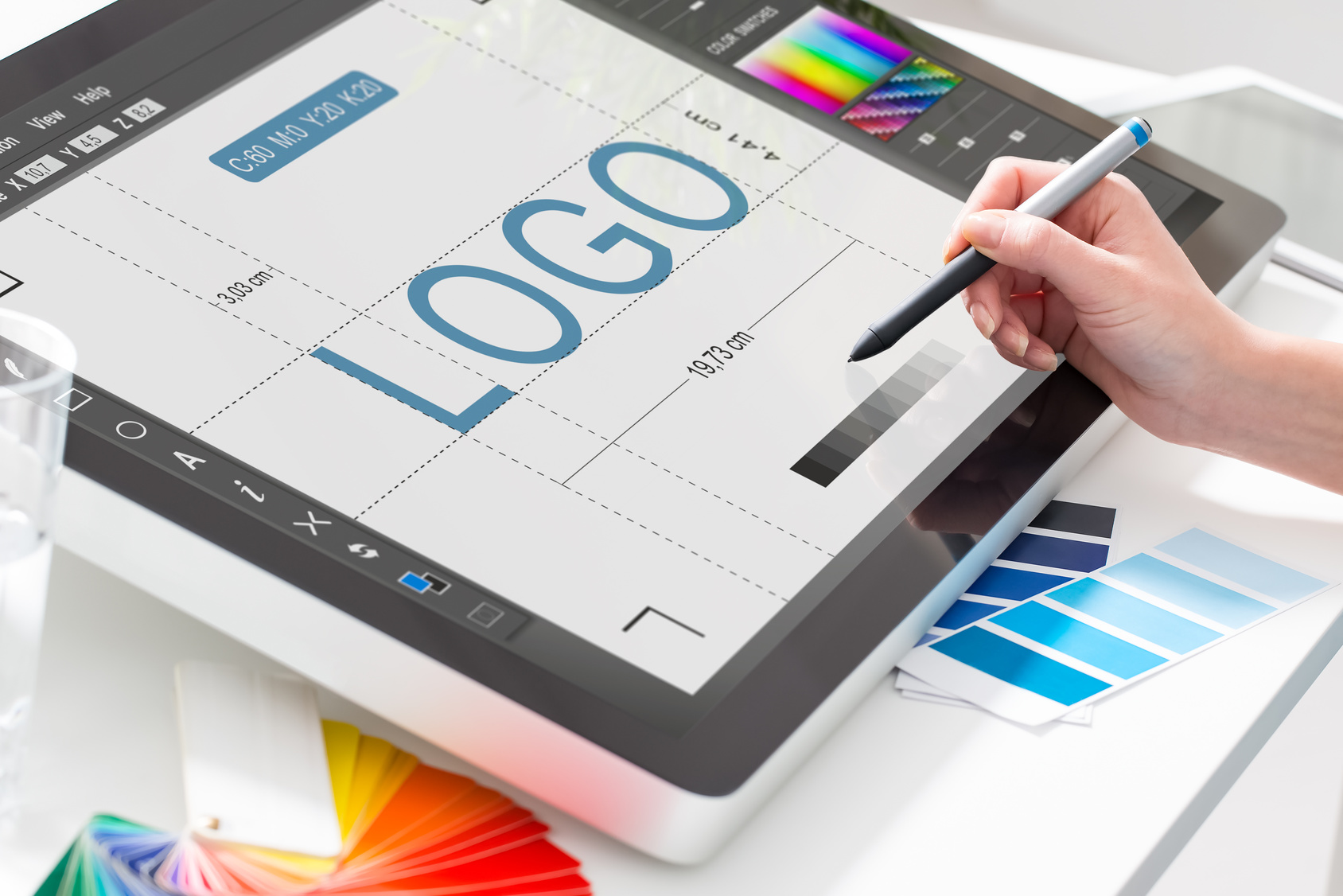
How to Make a New Logo for an Orthodontics Company
Posted on September 15, 2017 by Logo Design Tips and Tricks
The days are long gone when you could grab new business with a listing in a telephone book. Even shop signs in the street need to be eye-catching to snag attention.
Designing logos for orthodontics companies doesn’t need to be difficult. They’re marketing their services, just like any other service provider.
With almost 80% of American teenagers and 25% of adults visiting the orthodontist, it’s also a growing sector.
Read on to find out how to design a new logo for an orthodontics company.
1) Don’t Use Cliches in Your New Logo
The logo needs to communicate what the practice does and what services they offer. Patients need to understand this at a glance.
But don’t confuse a logo with an advertisement. There’s no need to shoehorn every service into the logo itself.
That’ll lead to confusion among potential patients and split your audience base. Stick to one main proposition for the new logo and let their advertisements fill in the blanks.
That way, patients will come to associate the logo with the company values.
But try to stay away from using images of teeth. It’s too obvious and the logo will be lost among a sea of similar logos.
Look at the logo for Orthodontic Associates as an example. Not a tooth in sight!
Instead, they use the essence of what they do to inform the shape of the logo.
2) Pay Attention to Font and Color
Choosing typography can make or break a logo. Serif fonts can look serious and professional, but also too formal and dated. San-serif fonts can look friendly and modern, or boring and generic.
Never, ever use Comic Sans in a logo, especially for a medical service provider.
Try out a range of fonts to see which ones best communicate the values of the company.
You can also make the logo recognizable through a use of color. Pale blues or greens help reinforce ideas around hygiene and care.
Patients automatically associate orthodontists with those colors. That saves you needing to use obvious imagery in the design.
Check it makes sense in monochrome. You never know when someone may only have a black and white printer!
3) Consider Sizing Options
A logo doesn’t just exist as a single entity. It appears across websites, business cards, invoices, signage, and even vehicles.
An orthodontics company is likely to use the logo on staff uniforms. So make sure the logo works with equipment like embroidery machines. Otherwise fine lines or details may be lost.
Check to see how the logo looks at larger sizes too. The company may want to use it splashed across the window of their office.
Designing a logo that works across a range of formats will limit your choice of fonts, shapes, and colors anyway. You can focus on sharing the vision of the orthodontist without being distracted by design options.
Next Steps
Remember the key points to logo design: keep it simple, make it recognizable, and ensure it works in different forms.
Now fire up the logo maker and get started on the new logo.
5 Tips for Retail Logo Design to Enhance Your Business
Posted on September 12, 2017 by Logo Design Tips and Tricks

A logo can make a huge difference in the success of a business. It’s the identity of the business’s brand; the small symbol that represents everything a company stands for.
One of the biggest challenges for every business is creating a logo that is not only meaningful, but eye-catching.
But, how do you make an effective retail logo?
Here are 5 tips to use to create a retail logo design that will enhance your business.
1. Use Colors that Evoke a Specific Feeling
While you may be tempted to use your favorite colors when creating a logo, you must first consider how well those colors go together.
Do they evoke a feeling that you want to be associated with your business?
A manufacturer of hunting equipment may have a preference for purple and pink, but that doesn’t mean that he or she should use those colors in the logo. Outdoorsy colors like dark green and brown would convey the feeling of hunting in a much more suitable manner than purple and pink.
Think of what your company represents, and pick colors that symbolize that representation.
2. Forge Your Own Font
While it’s not the easiest task to carry out, creating a font can help to give your retail logo instant recognition.
Company’s who have created their own recognizable font include Intel, General Electric, and Airbnb, to name a few.
There are a number different thing you can do to try and forge your own font, including everything from illustrating software, to borrowing from other fonts, to free writing, and more.
The goal is to find a style of text that distinguishes you from all other businesses.
3. Embrace Simplicity
A logo is supposed to represent your business. A messy, busy, and confusing retail logo suggests that your company is also messy, busy, and confusing.
Clearly, this is not the image you want for your company.
You want your logo to evoke simplicity and organization. To consumers, this will mark your company as a poised and professional organization that knows what it’s doing.
Don’t over-design for over-designing’s sake.
Looking for another way to embrace simplicity? Click Here.
4. Use Space
When designing a logo, what isn’t there is just as important as what is there.
This point goes along with the point of embracing simplicity. You don’t want to overwhelm the consumer’s mind. You want him or her to understand what he or she is seeing the instant eyes are laid on the logo.
Don’t cram words together too closely. Don’t overlay tons of unnecessary shapes. Let the relationship between shapes and space create a fully fledged logo.
5. Give Your Retail Logo Meaning
While it’s possible to make an interesting logo by just plopping some shapes down on paper, the majority of intriguing logos have a deeper meaning behind them.
The FedEx logo, for instance, forms an arrow that points forward; representing the forward progress of both the company and its packages.
Think about why your company exists and what you intend to accomplish with it. Then make a logo that conveys this idea in some way.
Don’t Underestimate the Power of a Great Logo
A company’s logo is the device by which the buying public thinks of that company. When people think of Nike, they think of the “swoosh.” When people think of Twitter, they think of the blue bird.
Creating a logo that’s memorable and unique to your company will ensure that consumers recognize you.
Looking to make a logo that’s memorable and unique?
OnlineLogoMaker.com makes it incredibly easy to create detailed, attractive, and effective retail logos.
Get started with OnlineLogoMaker.com today!
Your Ultimate Guide to Travel Logo Design
Posted on September 12, 2017 by Logo Design Tips and Tricks

$2.7 billion is the average amount travelers in the United States, both resident and international, spend per day. And the United States travel industry generates $2.3 trillion each year.
To survive in this massive industry and maintain growth, you need to adapt to the trends and find ways to stand out from the competition.
Creating a memorable logo is one of the best ways to do this. A travel logo that catches someone’s eye, tells the nature of your business, and represents your brand can have a tremendous impact on the overall growth of your company.
But how do you create a logo with such a strong impact? This guide will tell you everything you need to know about travel logo design.
Know Your Audience
To create the perfect travel logo design, you need to understand your target audience.
Think about the kind of travelers you attract or would like to attract. Are they luxury travelers? Budget backpackers? College students on spring break?
Whatever the case, your logo needs to speak to them.
For example, if you’re trying to attract luxury travelers looking for holiday accommodation, you’ll want to create a logo that has a sleek and elegant design. Think about using colors that promote sophistication, such as black and gold.
Trying to attract more of the party-going crowd? Then you’ll want a logo that’s bright, bold and fun.
Consider Symbols
Symbols are a big part of the travel industry.
Planes, arrows, compasses, and suitcases are all commonly used to symbolize an escape from everyday life.
Using a symbol can be a good way to let your audience members know you’re a travel company. However, if you choose to use a common symbol, make sure it has a unique twist to it so your audience members can easily distinguish it.
Choose Colors Carefully
Just like symbols, colors are a great way to evoke emotion.
Several studies point to the fact that color can actually affect people’s perception of a brand.
So, choose your colors wisely.
Black and gold are great colors if you want to evoke sophistication. Yellow, pink, and orange are great if you want to exude a fun, youthful attitude. Green is often associated with the environment and is a great color if you’re an eco-friendly travel company. For adventure travelers, you might want to go for a bold color like red.
Incorporate Location
Implementing elements of your local culture can be a great way to set your travel logo apart if you’re located in a specific location.
For example, if you’re located in Colorado, you might want to consider incorporating mountains into your logo. Or, if you’re located in Florida, you might want to add elements of the ocean into your logo.
Travel Logo Design: Wrap Up
We hope this article helped inspire you to start creating your travel logo.
Got any questions about getting started on your design? Drop us a comment below.
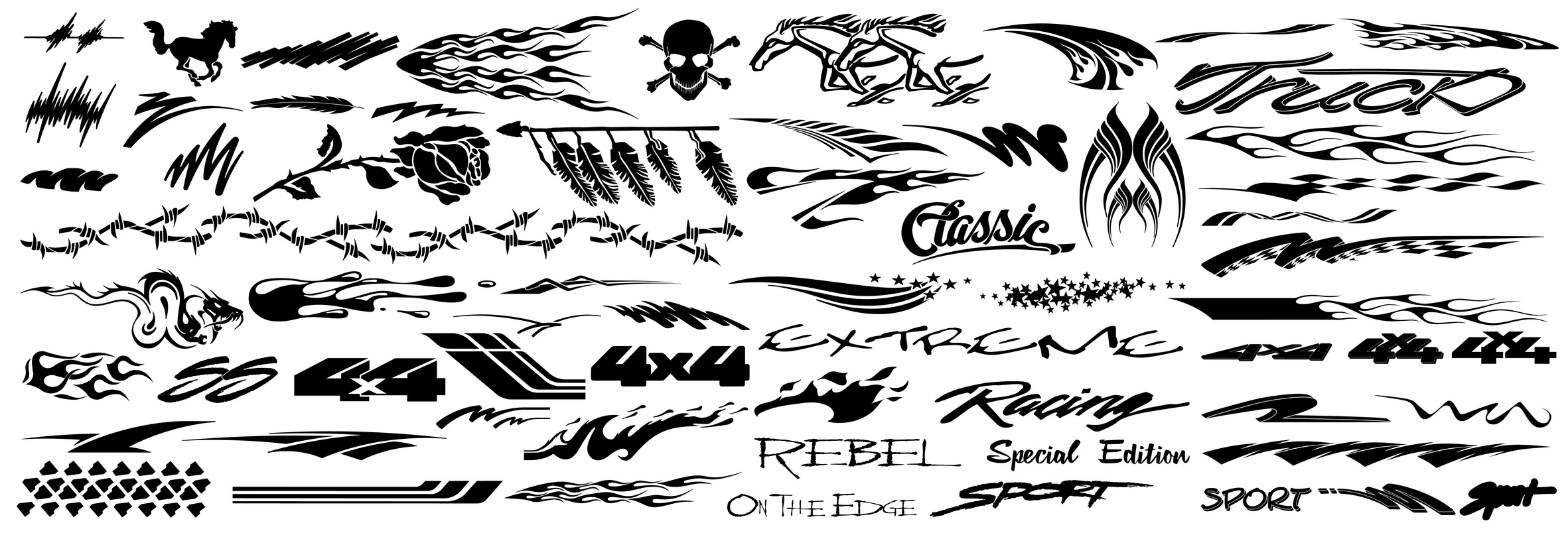
4 Tips to Designing a Memorable Auto Logo
Posted on September 08, 2017 by Logo Design Tips and Tricks
What do companies like Nike, Apple, and McDonald’s have in common? When you think of them, the image that comes to your head first is most likely their logo.
If you are an automobile dealer, it is very important that you have a memorable auto logo so your products stay in your client’s minds and the public consciousness.
Here are 4 tips to designing a one-of-a-kind, creative logo:
Choose The Right Font
People without an artistic eye may not realize that font is an extremely important aspect of an effective logo. The font you decide will dictate how people perceive your brand.
You want your logo to communicate professionalism and sophistication. If you choose a font that is too casual or light-hearted you may not be taken seriously by your consumer base.
For example, fonts that are more square exude trustworthiness, while rounded fonts are more suited for lifestyle or entertainment companies. Your font is even more important if you want your logo to be font-only.
Many companies go this route successfully. But you should hire someone to design a unique font just for your company so that you font-only logo still stands out.
Decide On A Color Scheme
Colors can also go a long way to communicate your brand to your consumers. The color you choose speaks to consumers about the types of services you offer.
For example, brighter colors typically represent energy, youthfulness, and passion. Darker colors represent comfort, simplicity, and elegance. An auto logo would likely feature darker colors, but it depends on how you want to be represented.
If you want to appeal to a younger generation of car consumers, a brighter color scheme might work. But you may be choosing those colors at the expense of other demographics, like families.
When it comes to colors, your target audience is everything. Once you decide on who you are trying to appeal to, cater your strategy toward them.
Narrow Down the Design
After picking the font and the color scheme, make sure you choose a unique design that works perfectly for where you will be placing it.
If you plan on selling merchandise, choose a logo design that people might want to wear on a t-shirt. If your logo will be on a sign outside of your business, make sure it draws people in without being too distracting.
The best logos straddle the line between familiarity and freshness. You want your consumer base to trust you and your products while also exhibiting a contemporary sense of style.
An Auto Logo Should Be Simple
For an automobile dealer like Wackerli Subaru, simplicity is key. You want your logo to reflect the same understated elegance of your cars. If you over do it, you risk losing credibility with your target audience.
Also, the less of your logo there is, the easier it will be for your audience to remember it. Your logo should be designed to stand the test of time while being creative enough for your consumer base to resonate with it.
The Takeaway
Make sure your logo accurately communicates everything you want your brand to stand for, and you will connect with your audience in a substantial way.
If you have any more questions about designing an auto logo, please contact us!


