What to Know About Having a Logo Engraved on a Trophy
Posted on September 15, 2017 by Logo Design Tips and Tricks

Is it time for company awards again? Are you sponsoring a big event in your area?
If the answer to either of these questions is, “yes”, you need to get a trophy with your company logo engraved on it.
Engraving a logo is your chance to add a personal, yet professional touch to any award. It expresses your pride to be a part of something bigger than your business and offers a great opportunity to build brand recognition in the community.
Plus, the recipient will likely put the trophy on display, which is further company exposure.
Before sending your logo engraving order in, there are a few things to be aware of. We have everything you need to know about the process below.
1. File Format and Resolution
Do not make the mistake of thinking you can use the high-res logo file you have saved for brochures and other prints.
The best way to send your logo to get engraved is in a vector file.
High-res files are actually small pixels combined to make an image. When scaled up or down, they tend to lose their sharpness.
Vector files, on the other hand, remain sharp and smooth no matter how big or small you manipulate an image. This is because they are made of connecting lines, points, and curves.
On your computer, vector files are categorized as AI or EPS.
However, you can sometimes submit files as a PDF. If you opt for PDF, double check the resolution of your logo.
Resolution standards can vary across engraving companies, but they tend to be much higher than files used for web design or traditional print. The average resolution is around 300 DPI.
It is also good practice to submit the highest form of resolution, no matter the company minimum.
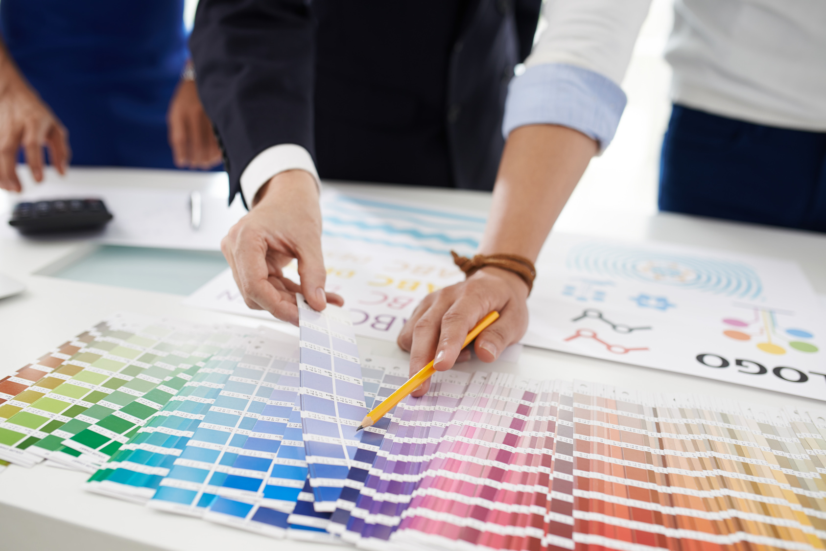
2. Color
Once you understand the required file format, consider the color of your logo.
If your standard logo has any form of color, it has to go. The only thing an engraving machine will pick up is solid black lines.
This should be an easy fix, since it is not advised to have many colors in your logo anyway.
3. Proof
Just like your company logo went probably went through a series of proofs before the final edit, ask your engraving company for a proof of your trophy.
Is the logo as big as you thought it would be? Do you think it would look better on a different part of the trophy or plaque?
The answer to these questions will be clear once you see an example of the final trophy. The proof allows you to be hands-on when creating the finished product.
Making edits before any actual engraving has been done saves time and money in the long run.
To get an idea of some trophy options and proofs, click here.
Get Your Trophy Logo Engraved
Ordering a logo engraved for the first time can be tricky if you are not prepared.
Always keep a vector file handy for special situations, and a solid black and white file helps, too. Remember to ask for proofs, then sit back while you wait for the final product!
Have you recently had a logo engraved on a trophy or other surface? Tell us about your experience in the comments below!
5 Tips for a Recognizable Hotel Logo
Posted on September 15, 2017 by Logo Design Tips and Tricks

Getting lost in the crowd? Bleeding customers to competitors?
Strong branding will make or break businesses in competitive industries.
And the hospitality industry is competitive.
In this article, we examine what makes a hotel logo stand out in the crowd.
1. Simple and Versatile
Hotel logos must be instantly recognizable at a distance while having enough personality not to seem bland up-close. As hotels flaunt their logos on everything from huge outdoors banners to business cards and office stationary, logos must be concise and versatile. Visit the website of Lana Thai Villa to check out an ideal such logo.
Keeping a logo simple is essential. Overburdened designs are tiresome and encourage the customers to look away. Too many flashy and clashing elements, and customers might not even be able to recognize the logo.
2. Design that Conveys a Message
Logos are supposed to outline a brand’s identity through a single, powerful image. They are the visual representation of a brand and the design must symbolize all the values that the brand aims to offer.
Logo design and branding in general are should be aligned with business goals and take into account all aspects of a company. A misaligned branding strategy can do more harm than good, and a hotel logo that fails to outline the unique features of a business might be its downfall.
3. Keeping Up With Times
Hotels, like all businesses, evolve. For that reason, frequent rebranding and logo redesigns are important to remain relevant. An outdated hotel logo may be as harmful as a logo designed by amateurs.
When redesigning a logo, businesses should focus on keeping all that is relevant for their brands while updating stylistic elements that may have gone out of fashion. Businesses that opt for ‘trendy’ logos often pay the price as trends shift. On the other hand, businesses focusing on timeless qualities and longevity have more robust brands that can successfully undergo rebranding.
4. Color Combinations
The most successful corporate logos cleverly combine a small number of colors for maximum impact. The color combination is the first thing a customer will notice, and this first impression will tell them a lot about a business.
There are literally hundreds of different logo color combinations to convey the right branding message for a hotel logo.
5. Combining Elements
Designers supercharge logo design by combining different elements for synergistic effects. Especially for unique business propositions and companies that don’t quite fit the mold, a logo that strategically incorporates elements will work best.
Different elements can increase contrast, tell a story or just outline a unique aspect of a hospitality business that makes it stand out in the crowd. However, too many elements might burden the design, diluting the message. A careful balance of elements is important in logo design. To see an logo that seamlessly combines elements, visit the website of Lana Thai Villa.
Need the Perfect Hotel Logo for Your Business?
Regardless of size and scope, any business in the hospitality industry will benefit from a clean and professional logo. Businesses of all sizes and scopes need recognizable hotel logo.
Need a reliable logo quick and easy? Check out Online Logo Maker, the comprehensive online solution to create professional logos with zero hassle.
3 Medical Logo Design Tips for Your Ultrasound Business
Posted on September 15, 2017 by Logo Design Tips and Tricks
When you’re in the business of selling ultrasound equipment, you want your brand to convey one of trust and reliability.
And a big part of this starts with one of the smallest components of your marketing efforts — your medical logo.
In fact, your company’s logo is crucial in representing your brand.
Are you ready to have a logo that works as hard as you do? Read on to discover how to create a powerful medical logo.
Having A Strong Medical Logo Increases Your Brand Recognition
Does your logo represent your brand in a professional way while conveying that message of trustworthiness?
In creating your medical logo for your ultrasound equipment sales, you’ll want to keep the following three tips in mind:
1. Keep It Simple
The medical industry has a positive reputation for being clean and sterile.
You want your logo to echo this — to a degree. Keeping it clean and simple will keep viewers from getting confused. But if it’s too sterile, it will translate as boring. So tread that line carefully.
Your logo should not leave the viewer trying to guess what your company sells. It should be clear that you sell ultrasound equipment. The logo for Enterprise Ultrasound is a great example of this.
Also, if there are too many colors, characters, fonts or embellishments that don’t lend to this, leave them out of the design.
Plus, an intricate logo with extraneous elements will be more difficult to reproduce on your products.
The key to getting the right balance of character and minimalism is to make the most use of white – or negative – space. This is the area of your logo where there is an absence of any objects or elements.
Having enough white space allows for the viewer’s eyes to rest and focus on the more important parts of your logo. So clear the background of extra elements.
If you want the most powerful impact, try for an image that summarizes your ultrasound sales with a simple symbol or image. It will be more easily remembered.
2. Design with Your Message in Mind
Your logo is going to form the initial impression your customer will have about your brand. So what’s the feeling you want to impart? As we mentioned before, trust and reliability are key in medical equipment sales.
Find a way to tailor your logo to your message without being too obvious. You could include your company name in the logo, but it might be more powerful to leave it out.
Plus, you also want to use an appropriate design that will help you to achieve a distinct identity – something that makes you stand out from the competition.
3. Make It Memorable
It might sound a little out there, but gaining a basic knowledge of the psychology of shape and color could be just what you need to give your logo design some real leverage.
Different colors affect people in different ways. For example, red is warm and vibrant, so a red logo is often used in the food industry. Blue, on the other hand, is the color of trust and responsibility. That’s why it’s so often used in the medical industry.
Like colors, shapes can also stir certain feelings. And so can the shapes of fonts. Circles and more rounded fonts project positivity and unity. Squares, triangles and sleek and angular fonts portray stability and formality.
Just be sure that your logo is memorable for the right reasons!
Create A Powerful Medical Logo
With these tips, you are ready to go!
And don’t worry. You don’t need to seek out a graphic designer. Employ the services of an online logo maker and start getting results today!
How to Make a Great Digital Consulting Logo
Posted on September 15, 2017 by Logo Design Tips and Tricks

If you’re trying to design a digital consulting logo, it helps to have a few tricks up your sleeve.
There are a variety of ways to use basic human psychology to design an appealing and engaging logo for your business.
If you make strong choices, you could make millions more than your weak-logo-owning competitors. Make weak choices, and you’ll be just another face in the crowd.
So here’s how to do it the right way.
Do These Colors Work?
A lot of people think of colors as a matter of personal choice. And while everybody has a favorite color, this shouldn’t be the primary consideration when it comes to your brand.
One of the reasons McDonald’s has a successful logo is the effect of colors on the human mind. Just combining red and yellow has been proven to make people more hungry.
You work in digital consulting. So you may not think there’s much you can learn from McDonald’s. But the truth is that colors will always impact the way potential customers view your company.
You probably will want to communicate objectivity and seriousness with your brand. Nobody wants their consultant to make purely emotional decisions: you should use a logo that reflects the desire of your customers.
To do that, we recommend combining blue and gray in your logo.
What’s In A Shape?
Colors have a strong impact on your brand. So, too, do shapes.
It goes without saying that a digital consultant will use different shapes in their logo than an erotica publisher. But what can you do to give your logo the extra punch it needs?
The answer is: design something sleek, minimalist, and familiar. Perhaps the best digital consulting logo on the web comes from Centric Digital.
Centric Digital’s logo subtly represents the thrill of a retweet. That alone makes it one of the strongest logos in the game.
Does This Fit My Brand?
There are plenty of great logos out there in your industry. You can, and should, take inspiration from these logos. But there’s a difference between being inspired by a logo and making it the basis of your own.
You should not design a logo without considering your own brand. If you don’t have a coherent brand identity, yet, it’s time to articulate it.
It’s a lot easier to build a logo to fit your brand than it is to build a brand to fit your logo. So before you know what your logo is, make sure you know who you are.
Am I Paying Too Much For My Digital Consulting Logo?
There are a lot of graphic designers out there. A professionally designed logo can cost you thousands of dollars.
Instead of bankrupting your company designing your logo, you should make it for free with us.
If you want to get started on designing your free logo, you should take our tutorial. Then, when you’re ready, get registered for our service!
We look forward to helping your brand succeed.


