How to Design Casino Logos that Radiate Good Luck
Posted on August 18, 2017 by Logo Design Tips and Tricks
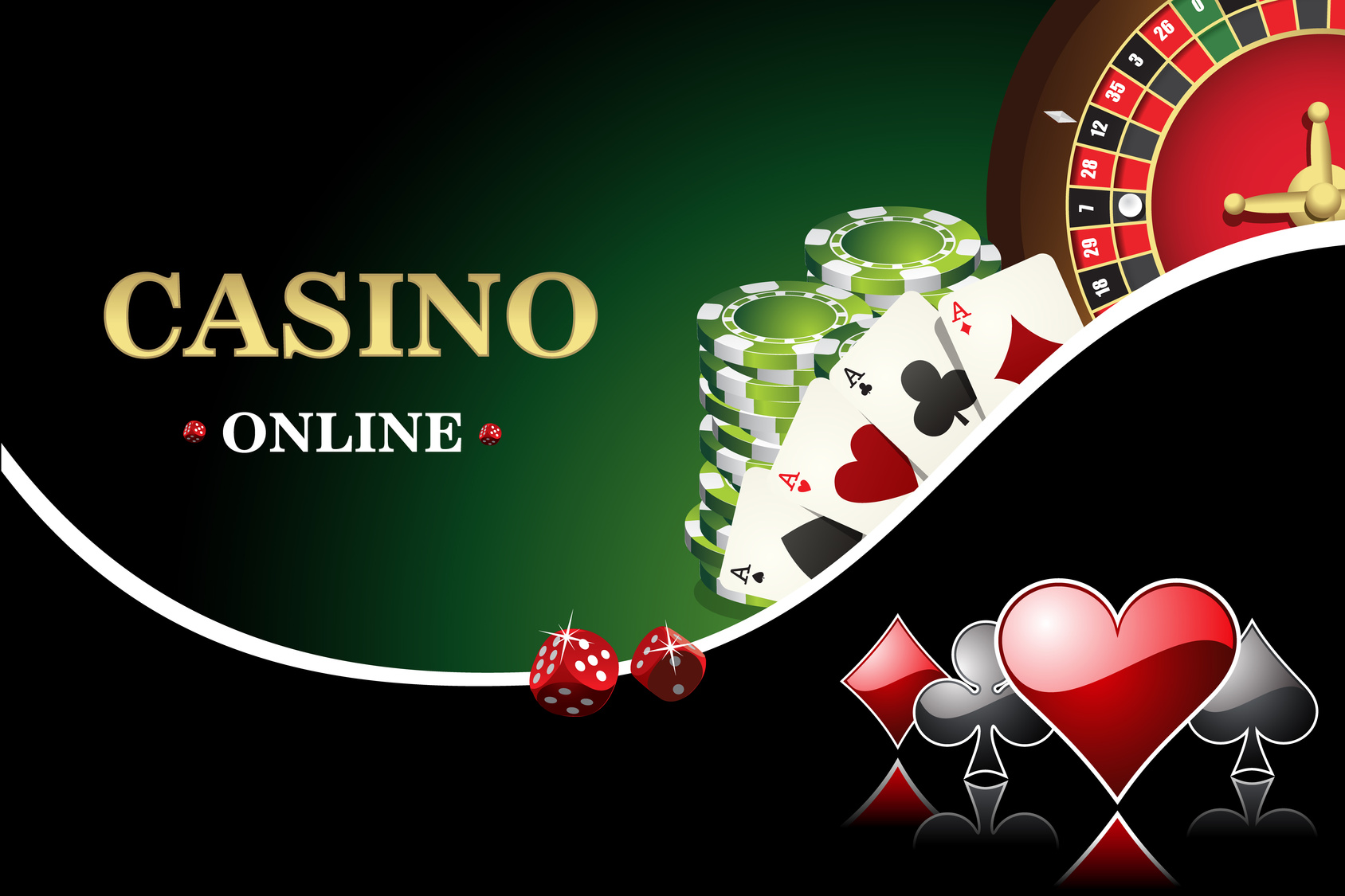
Crafting a great casino logo is like hitting the jackpot — when you do it right you know you’ve struck gold.
Casino logos are crucial to making your brand memorable to customers. With the number of new online casinos cropping up, a good logo will make your business stand out.
So, here is the ‘how to’ guide on creating a winning logo for your online casino.
What Do Casino Logos Say About You?
Here are a few things to consider when brainstorming your casino logos:
- Is there a kind of game or theme you’re using in your logo?
- Is there an audience or customer type you want to appeal to?
- Do you have a specific message you’re trying to send out?
By 2020, online gambling is set to become a $60 billion dollar a year industry.
Making your brand stand out is more important now than ever. While creating your iconic logo, the first step should be deciding what your brand says.
Remember that people are looking for an online gaming site they consider fun and gives them hope in a payout.
Once you have an idea of your brand you can actually start brainstorming a design.
Drafting an Idea
Some questions to ask yourself during the design process are:
- Do you want to be sleek and stylish?
- Do you want to use an old-school call to the casinos of Vegas?
- Do you want a fun and easy-going look?
Now that you have a message for your brand, how can you convey that?
You could use a character with your brand — a cartoon that looks fun and inviting, or you could use the name of your online casino in a memorable way.
Text styles are a common form of logos. There’s a good reason for that since a name will be the most searchable tool to find your specific website.
Consider using an old school pen and paper to draft out your casino name. Then move to an online creator to bring your ideas to the web.
Compare the Competition
Creating a simple draft will give you some form of originality but knowing how other successful businesses in the industry have used their casino logos, can help you improve yours.
There are a number of successful online casinos like Guts, Rizk and Sloty. These websites utilize a variety of different designs that have found them success.
A quick check may give you ideas on how to improve your casino logos design and make it stand out next to other big names in the business.
You could also check other general guides on a good logo design for a different perspective.
Know What Not to Do
Don’t date yourself. Aspects of design can get old and there are a ton of cliches that will make your customer’s eyes roll out of their heads.
When designing, strive for simplicity. Overly complex and gaudy are easy to recognize and will make customers think your site is cheap.
Remember that customers need something they can focus in on and recognize quickly. If your design has too many elements it will push people away.
Simple, memorable and unique are key ideas for designing casino logos.
Strive to Hit the Jackpot
You now have the tools to make a great logo that will draw people into your site. From here you should try to create a few designs to test with online customers.
Getting feedback from a group of people will broaden your ideas and give you valuable perspective.
When you’re ready to learn about the next steps in logo design try out this tutorial to craft a free logo.
A good logo will stick in your customer’s head and have them returning for more chances to win.
Why You Need a Strong Clothing Storage Logo for Referral Marketing
Posted on August 17, 2017 by Logo Design Tips and Tricks

As a company, your logo is your identity.
It’s the image people visualize when they think of your product or services. In the fashion industry, storing clothes is a service you have to provide.
But are you utilizing all the opportunities available?
It makes all the difference in sales.
In this article, we’re going to focus on why a great logo is necessary for your storage units.
Not only will compelling advertising help you to use all the space you’ve already purchased, but it is also an essential component to referral marketing.
What Your Logo Can Do for You
A recent study has confirmed how 91% of the buyer market prefers visual advertisement over traditional options.
So, think about all the visible space your storage unit has and all the free advertisement it offers.
Promoting your storage logo is a great marketing strategy.
Since referrals are often trusted, designing a slick, likable logo is great for your brand’s reputation.
How Does a Storage Logo Prompt Referrals?
When designing the best logo for your storage units, you have to consider the referral marketing strategy.
Here are some significant factors:
- How do you define the importance of your reputation?
- What resources do you need?
- Does your logo translate on a website?
The Importance of Brand Reputation
Although referrals don’t automatically become your clients, the strategy is a slow burn.
It works on visual imprinting rather than instant gratification.
In a reputation-based referral, you’re working with clients who’ve never worked with you before.
Instead, they have seen or heard of your logo somewhere before. Since your logo is what’s winning your customers, you want an impressionable and unforgettable logo design.
With many storage facilities sitting around in the proximity of busy roads or industrial areas, the chance to advertise your brand is everywhere.
This is a great opportunity for any clothing niche, from shoe storage to fur storage.
A Versatile Logo for Your Website
A logo is more than your brand name and some graphic — it needs to be translatable.
What do we mean?
Have a logo that motivates the viewer.
A unique logo persuades an audience to act by having them search for the details.
This can be done through design alone. Or you can incorporate your logo into action buttons, such as QR or Snapchat codes.
Either way, you’re bringing in traffic through your brand and solidifying a referral marketing strategy.
Have the Right Resources
Don’t invest in your business without taking the time to make the right logo for your brand.
You need a compelling design whether you display it on the side of a truck or the web. We want to help.
We have visual experts waiting to assist you through the process of making the right storage logo for your brand. Contact us today.
How have storage logos helped you in referral marketing? Have you seen an increase in sales? Let us know in the comment section below. If this article helped you, make sure to share it on social media with your colleagues and friends.
5 Killer Logo Redesign Ideas for Accommodation Websites
Posted on August 17, 2017 by Logo Design Tips and Tricks
The logo of a business can make or break the customer’s connection with the brand. The thumbnail logo sized image seems small, but it has a huge impact on brand recognition and relations. A logo can even express the difference between one company and its competition.
In the accommodation world, staying ahead of the competition is key. For companies who haven’t been having success with their logo, there’s no reason to start over. It may just need a modern logo redesign to regain its power. We’re teaching how to do that below.
Logo Redesign
Simplify Design
Logo design trends in 2017 have companies simplifying their logos. When it comes to logos, minimalism is in. Are there complementary colors that could get deleted without losing the image’s integrity? Then they should go.
A simplified logo is more visually appealing, modern and will make customers take a second look.
Delete Logo Words
Another trend in logo design is editing the logo to lose the words altogether. Companies should only do this if they have a high recognition level with their logo’s image already. Starbucks employed this strategy in 2011. They removed the wording from outside their central mermaid image, leaving her alone.
The result was a fresher and easier to print logo, with the same amount of recognition. Not ready to make that jump? Some companies are trying out both worded and non-worded logo versions. Non-word logos look great as small profile pictures and the worded logo can appear on the site itself.
Change the Lettering
Hand-lettered or text changes in a logo are another noticeable logo redesign technique. The image of the logo stays the same, while the company’s name is presented in a fresh new way. The changes don’t need to be extreme.
Companies have succeeded by something as simple as changing capitalization around. Other companies, like https://www.whistlerpremier.com/accommodations, deleted letters and replaced them with a readable image. As long as the consumer can read it, the possibilities are endless.
Stay Original
It’s easy to look at competitors logos and get ideas for a logo redesign, but using the same format is tacky in the end. A logo should be used to differentiate one business from another, not make them all blend in together.
One marketing professor from UEA suggests this can be achieved by changing logo colors. What differentiates one company from its competition? Are they greener? More trustworthy? He suggests companies use color psychology to assert that.
Get a Fresh Pair of Eyes
Breaking a cycle is hard and can hinder the logo redesign process. The easiest way to break the cycle is to get a new pair of eyes on the redesign team. Someone who isn’t familiar with the original logo will be able to point out subtle aspects the team has long forgotten.
Teams can use this new insight along with knowledge of the company’s brand and values. The combination of old and new will create the perfect logo. The resulting image will be the best of both worlds.
Wrapping Up
Redesigning a logo is a long and labor intensive process. It’s hard to leave the familiarity of an old image, but consumers will appreciate a new one. Using these tips along the way will make the process a little easier. Start redesigning a logo today.
How to Create a High Quality Tech Logo
Posted on August 17, 2017 by Logo Design Tips and Tricks
When people look at your tech logo, you want them to put you in the same class as brands like Microsoft, Apple, and Google.
Every company starts logo development with an idea of what they want to tell the world through their logo. Once you’ve created your brand style and voice, how will you use your logo to convey that?
Here are the tips you need to know!
The Basics for Tech Logo Creation
It doesn’t matter if you’re sitting in your office or at a computer gaming desk, your business can’t truly begin until you have a logo.
What is the first thing that you notice about your competitors and their logos? What makes them stand out and what does it say about their company?
Your logo should do the same thing for yours. For inspiration, look no further than Google.
Every part or branch of their business, everything that company represents, is right in the logo. Now, how do you duplicate this kind of success?
Colors
Think about the tech companies you admire. Their logos are probably using simple color schemes. You’ll often see blues, golds/yellows, and orange. There is a brilliant method to this creative madness.
Blue
You’ve heard “The sky is the limit”? Blue has always been associated with the sky.
Between cloud management systems and apps, as well as innovative start-ups constantly pushing the limits of what is possible, it’s no wonder why blue is a popular choice for tech logos.
This color also represents trust, professionalism, and productivity. Sounds pretty good, right? Consider using blue in your logo if this is the message you would like to represent.
Gold and Orange
These colors represent fun, friendliness, and optimism. You can expect any brand that utilizes these colors to have a focus on customer service.
Combining these schemes says this is a brand that is bold, innovative, with a focus on enjoying what they do and making sure their customers enjoy their product or service.
Fonts
Be modest. Keep any wording simple while utilizing a tech-friendly font.
You want to grab the attention of your potential customer with a bold statement. Say as much as you can while using the least about of space possible. Think American Express, Ford, Target, and Coca-Cola.
Shapes
The shapes used in your tech logo are where you can really go nuts. The messages of shapes are just as versatile as colors are. However, tech start-ups rarely hesitate to use a variety.
When you think of a square or rectangular logo, you probably think of brands like Microsoft and American Express. You probably think that’s the route you should take.
Think again. What about brands that utilize the power and brilliance of lines! Think IBM, Soundcloud, and AT&T.
Shapes are where your creativity can really help to mold your brand into something that is all your own. Play around with our free logo designer to get an idea of what you want.
The Wrap Up
A new tech logo is going to be the foundation of your business and your brand. It will be the first thing seen by customers, investors, and potential employees.
What do you think? Did we nail it? Leave your comment below, we’d love to hear from you.


